


An Unusually Tall Candle Often Has a Minor High or Minor Low Occurring within One Day of It异常高的蜡烛通常会在一天内出现小幅高点或小幅低点
I looked at tens of thousands of candles to prove this, and the study details are on my web site, ThePatternSite.com.
Figure 1.1 shows examples of unusually tall candles highlighted by up arrows. A minor high or low occurs within a day of each of them (before or after) except for A and B 除了 A 和 B 之外,每个信号的一天内(之前或之后)都会出现小幅高点或低点. Out of 11 signals in this figure, the method got 9 of them right, a success rate of 82% (which is unusually good).
import yfinance as yf

stock_symbol='MLKN'
df = yf.download( stock_symbol, start='2006-12-15', end='2007-04-01')
df 
from matplotlib.dates import date2num
import pandas as pd

df.reset_index(inplace=True)
df['Datetime'] = date2num( pd.to_datetime( df["Date"], # pd.Series: Name: Date, Length: 750, dtype: object
                                           format="%Y-%m-%d"
                                         ).tolist()
                                # [Timestamp('2017-01-03 00:00:00'),...,Timestamp('2017-06-30 00:00:00')]
                         )# Convert datetime objects to Matplotlib dates.

df.head()
df_candlestick_data = df.loc[:, ["Datetime",
                                 "Open",
                                 "High",
                                 "Low",
                                 "Close",
                                 "Volume"
                                ]
                            ]

df_candlestick_data
!pip install mpl-finance
https://github.com/matplotlib/mplfinance/blob/master/src/mplfinance/plotting.py
from mpl_finance import candlestick_ohlc
from matplotlib.dates import date2num, WeekdayLocator, DayLocator, DateFormatter, MONDAY
import matplotlib.pyplot as plt
import numpy as np
import datetime
from matplotlib.dates import num2date

# Create a new Matplotlib figure
fig, ax = plt.subplots( figsize=(10,6) )

xdays=[]
# convert the (number of datetime) to a (date string)
for index in df_candlestick_data.index.values: # [13497.0, 13500., ...,13500.][index]
    xdays.append( datetime.date.isoformat(num2date( df_candlestick_data['Datetime'][index]
                                                  )# datetime.datetime(2006, 12, 15, 0, 0, tzinfo=datetime.timezone.utc)
                                         )
                ) # ['2006-12-15', '2006-12-18', ...,'2007-03-30']

# creation of new data by replacing the time array with equally spaced values.
# this will allow to remove the gap between the days, when plotting the data
data2 = np.hstack([ df_candlestick_data.index.values[:, np.newaxis], df_candlestick_data.values[:,1:]
                    #[[0], ...], [[35.77999878, 35.95999908, 35.36000061, 35.40000153], ...]
                  ])#[[1], ...], [[35.40999985, 35.63000107, 34.43000031, 34.49000168], ...]
# array([[ 0.        , 35.77999878, 35.95999908, 35.36000061, 35.40000153],
#        [ 1.        , 35.40999985, 35.63000107, 34.43000031, 34.49000168],
#        ...
#        [70.        , 33.50999832, 33.88999939, 33.25      , 33.49000168]
#        ])

# Prepare a candlestick plot
# 1
# candlestick_ohlc(ax, quotes, width=0.2, colorup='k', colordown='r', alpha=1.0)
# quotes : sequence of (time, open, high, low, close, ...) sequences
#          As long as the first 5 elements are these values,
# time : we use an (integer index list) to replace the (Datetime list) #########
ls, rs=candlestick_ohlc( ax, data2, # data
                         width=0.6,# fraction of a day for the rectangle width
                         colorup='yellow', colordown='r',
                         alpha=1.
                       )
# returns (lines, patches) where
#        lines is a list of lines added and
#        patches is a list of the rectangle patches added

# https://matplotlib.org/stable/api/_as_gen/matplotlib.lines.Line2D.html
for line in ls:
  line.set_c('k')
  line.set_linewidth(1.)
  line.set_zorder(5)

for r in rs:
    r.set_edgecolor('k')
    r.set_linewidth(1)
    #r.set_zorder(1)
    r.set_alpha(1)
    #r.set_facecolor('w')

# 2
# set the ticks of the x axis with an (integer index list)
ax.set_xticks( np.arange( len(df_candlestick_data) ) )
# 3
# set the xticklabels with a (date string) list
ax.set_xticklabels(xdays, rotation=45, horizontalalignment='right')

# Set Date Format
# ax.xaxis.set_major_formatter( DateFormatter('%Y-%m-%d') )
# ax.xaxis.set_minor_locator( DayLocator() ) # minor ticks on the days
ax.xaxis.set_major_locator( WeekdayLocator(MONDAY) ) # major ticks on the mondays
ax.xaxis_date() # treat the x data as dates

#justify
ax.autoscale(enable=True, axis='x', tight=True)
# rotate all ticks to 45
plt.setp( ax.get_xticklabels(), rotation=45, horizontalalignment='right' )

plt.tight_layout()# Prevent x axes label from being cropped
plt.show()
2 two subplots with volume
from mpl_finance import candlestick_ohlc
from matplotlib.dates import date2num, WeekdayLocator, DayLocator, DateFormatter, MONDAY
import matplotlib.pyplot as plt
import numpy as np
import datetime
from matplotlib.dates import num2date
import numpy as np

# Create a new Matplotlib figure
fig, axes = plt.subplots( 2, 1, figsize=(10,6),
                          sharex=True,
                          gridspec_kw={'height_ratios': [3,1]},
                          )
fig.subplots_adjust(hspace=0.)

xdays=[]
# convert the (number of datetime) to a (date string)
for index in df_candlestick_data.index.values: # [13497.0, 13500., ...,13500.][index]
    xdays.append( datetime.date.isoformat(num2date( df_candlestick_data['Datetime'][index]
                                                  )# datetime.datetime(2006, 12, 15, 0, 0, tzinfo=datetime.timezone.utc)
                                         )
                ) # ['2006-12-15', '2006-12-18', ...,'2007-03-30']

# creation of new data by replacing the time array with equally spaced values.
# this will allow to remove the gap between the days, when plotting the data
data2 = np.hstack([ df_candlestick_data.index.values[:, np.newaxis], df_candlestick_data.values[:,1:]
                    #[[0], ...], [[35.77999878, 35.95999908, 35.36000061, 35.40000153], ...]
                  ])#[[1], ...], [[35.40999985, 35.63000107, 34.43000031, 34.49000168], ...]
# array([[ 0.        , 35.77999878, 35.95999908, 35.36000061, 35.40000153],
#        [ 1.        , 35.40999985, 35.63000107, 34.43000031, 34.49000168],
#        ...
#        [70.        , 33.50999832, 33.88999939, 33.25      , 33.49000168]
#        ])

# Prepare a candlestick plot
# 1
# candlestick_ohlc(ax, quotes, width=0.2, colorup='k', colordown='r', alpha=1.0)
# quotes : sequence of (time, open, high, low, close, ...) sequences
#          As long as the first 5 elements are these values,
# time : we use an (integer index list) to replace the (Datetime list) #########
ls, rs=candlestick_ohlc( axes[0], data2, # data
                         width=0.6,# fraction of a day for the rectangle width
                         colorup='yellow', colordown='r',
                         alpha=1.
                       )
# returns (lines, patches) where
#        lines is a list of lines added and
#        patches is a list of the rectangle patches added

# https://matplotlib.org/stable/api/_as_gen/matplotlib.lines.Line2D.html
for line in ls:
  line.set_c('k')
  line.set_linewidth(1.)
  line.set_zorder(5)

for r in rs:
    r.set_edgecolor('k')
    r.set_linewidth(1)
    #r.set_zorder(1)
    r.set_alpha(1)
    #r.set_facecolor('w')

#axes[0].set_xticks([]) # remove xticks
axes[0].spines['bottom'].set_visible=False

# Create a new column in dataframe and populate with bar color
i = 0
while i < len(df):
    if df_candlestick_data.iloc[i]['Close'] > df_candlestick_data.iloc[i]['Open']:
        df_candlestick_data.at[i, 'color'] = "yellow"
    elif df_candlestick_data.iloc[i]['Close'] < df_candlestick_data.iloc[i]['Open']:
        df_candlestick_data.at[i, 'color'] = "red"
    else:
        df_candlestick_data.at[i, 'color'] = "black"
    i += 1
# 2
# set the ticks of the x axis with an (integer index list)
# axes[1].set_xticks( np.arange( len(df_candlestick_data) ) )
axes[1].bar( np.arange( len(df_candlestick_data) ),
             df_candlestick_data['Volume'].values,
             color=df_candlestick_data['color'].values,
             edgecolor=['black']*len(df_candlestick_data),
             width=0.6,
            )

# 3
# set the xticklabels with a (date string) list
axes[1].set_xticklabels(xdays, rotation=45, horizontalalignment='right')

# Set Date Format
# ax.xaxis.set_major_formatter( DateFormatter('%Y-%m-%d') )
# ax.xaxis.set_minor_locator( DayLocator() ) # minor ticks on the days
axes[1].xaxis.set_major_locator( WeekdayLocator(MONDAY) ) # major ticks on the mondays
axes[1].xaxis_date() # treat the x data as dates

#justify
axes[1].autoscale(enable=True, axis='x', tight=True)
# rotate all ticks to 45
plt.setp( axes[1].get_xticklabels(), rotation=45, horizontalalignment='right' )


#axes[1].set_yticks([]) # remove yticks
axes[1].spines['top'].set_visible=False
#axes[0].set_xticks([]) # remove xticks


plt.tight_layout()# Prevent x axes label from being cropped
plt.show()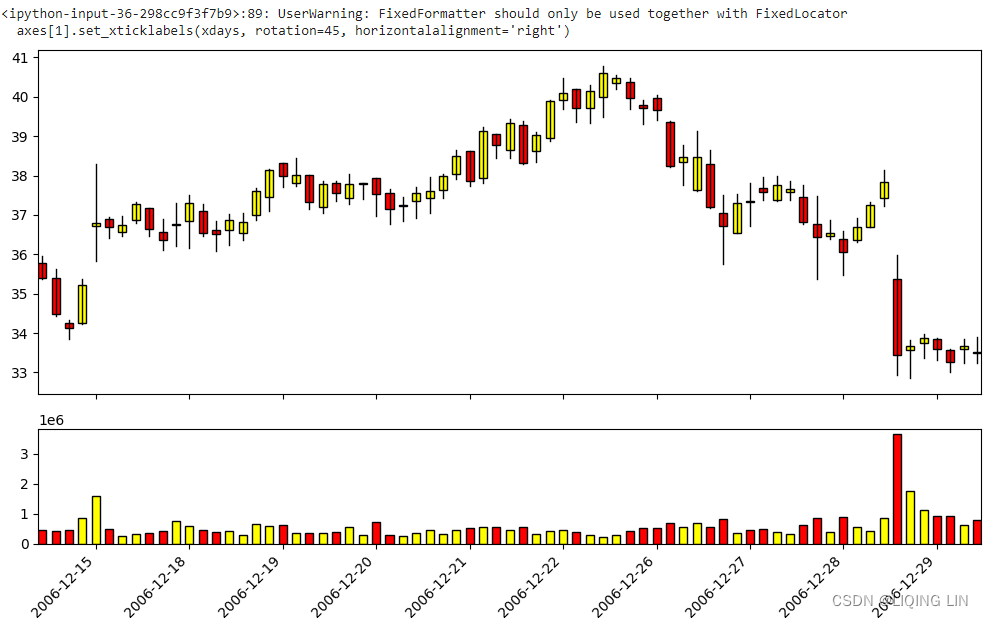
1 one subplot with volume
from mpl_finance import candlestick_ohlc
from matplotlib.dates import date2num, WeekdayLocator, DayLocator, DateFormatter, MONDAY
import matplotlib.pyplot as plt
import numpy as np
import datetime
from matplotlib.dates import num2date
import numpy as np

# Create a new Matplotlib figure
fig, ax = plt.subplots( figsize=(10,6) )

xdays=[]
# convert the (number of datetime) to a (date string)
for index in df_candlestick_data.index.values: # [13497.0, 13500., ...,13500.][index]
    xdays.append( datetime.date.isoformat(num2date( df_candlestick_data['Datetime'][index]
                                                  )# datetime.datetime(2006, 12, 15, 0, 0, tzinfo=datetime.timezone.utc)
                                         )
                ) # ['2006-12-15', '2006-12-18', ...,'2007-03-30']

# creation of new data by replacing the time array with equally spaced values.
# this will allow to remove the gap between the days, when plotting the data
data2 = np.hstack([ df_candlestick_data.index.values[:, np.newaxis], df_candlestick_data.values[:,1:]
                    #[[0], ...], [[35.77999878, 35.95999908, 35.36000061, 35.40000153], ...]
                  ])#[[1], ...], [[35.40999985, 35.63000107, 34.43000031, 34.49000168], ...]
# array([[ 0.        , 35.77999878, 35.95999908, 35.36000061, 35.40000153],
#        [ 1.        , 35.40999985, 35.63000107, 34.43000031, 34.49000168],
#        ...
#        [70.        , 33.50999832, 33.88999939, 33.25      , 33.49000168]
#        ])

# Prepare a candlestick plot
# 1
# candlestick_ohlc(ax, quotes, width=0.2, colorup='k', colordown='r', alpha=1.0)
# quotes : sequence of (time, open, high, low, close, ...) sequences
#          As long as the first 5 elements are these values,
# time : we use an (integer index list) to replace the (Datetime list) #########
ls, rs=candlestick_ohlc( ax, data2, # data
                         width=0.6,# fraction of a day for the rectangle width
                         colorup='yellow', colordown='r',
                         alpha=1.
                       )
# returns (lines, patches) where
#        lines is a list of lines added and
#        patches is a list of the rectangle patches added

# https://matplotlib.org/stable/api/_as_gen/matplotlib.lines.Line2D.html
for line in ls:
  line.set_c('k')
  line.set_linewidth(1.)
  line.set_zorder(5)

for r in rs:
    r.set_edgecolor('k')
    r.set_linewidth(1)
    #r.set_zorder(1)
    r.set_alpha(1)
    #r.set_facecolor('w')

# 2
# set the ticks of the x axis with an (integer index list)
ax.set_xticks( np.arange( len(df_candlestick_data) ) )
# 3
# set the xticklabels with a (date string) list
ax.set_xticklabels(xdays, rotation=45, horizontalalignment='right')

# Set Date Format
# ax.xaxis.set_major_formatter( DateFormatter('%Y-%m-%d') )
# ax.xaxis.set_minor_locator( DayLocator() ) # minor ticks on the days
ax.xaxis.set_major_locator( WeekdayLocator(MONDAY) ) # major ticks on the mondays
ax.xaxis_date() # treat the x data as dates

#justify
ax.autoscale(enable=True, axis='x', tight=True)
# rotate all ticks to 45
plt.setp( ax.get_xticklabels(), rotation=45, horizontalalignment='right' )

ax2 = ax.twinx()

ax2.bar( np.arange( len(df_candlestick_data) ),
        df_candlestick_data['Volume'].values,
        color=df_candlestick_data['color'].values,
        edgecolor=['black']*len(df_candlestick_data),
        width=0.6
      )

max_price=np.max(df_candlestick_data[['Open','Close', 'High', 'Low']].values )#40.79
min_price=np.min(df_candlestick_data[['Open','Close', 'High', 'Low']].values )#32.85

min_price_tick = np.floor(min_price) # 32.0
max_price_tick = np.ceil(max_price)  # 41.0
num_y_ticks=10

#spacing=(max_price_tick-min_price_tick)/5
spacing=(max_price_tick-min_price_tick)/num_y_ticks # 0.9
min_price_tick= np.floor(min_price_tick-spacing) # 31.0

min_volume=df_candlestick_data['Volume'].min() # 222 400
max_volume=df_candlestick_data['Volume'].max() # 3 638 400

min_floor_volume=np.floor( np.log10( min_volume + 1e-10 ) )#5.0 : 222 400 ==> 5.34713478291002 ==> 5
max_ceil_volume=np.ceil( np.log10( max_volume + 1e-10 ) ) # 7.0 : 3 638 400 ==> 6.560910443007641 ==> 6

#min_volume_base = np.floor( min_volume/( 10**(min_floor_volume) ) ) # 5
min_volume_tick = 1*10**min_floor_volume # 100 000#min_volume_base *

#max_volume_base= np.ceil( max_volume/( 10**(max_ceil_volume-1) ) ) # 6
max_volume_tick = 3.0 * 10**(max_ceil_volume) # 30 000 000
ax.set_ylim(min_price_tick, max_price_tick )
ax2.set_ylim(min_volume_tick, max_volume_tick )

plt.tight_layout()# Prevent x axes label from being cropped
plt.show()
from mpl_finance import candlestick_ohlc
from matplotlib.dates import date2num, WeekdayLocator, DayLocator, DateFormatter, MONDAY
import matplotlib.pyplot as plt
import numpy as np
import datetime
from matplotlib.dates import num2date
import numpy as np

# Create a new Matplotlib figure
fig, ax = plt.subplots( figsize=(10,6) )

xdays=[]
# convert the (number of datetime) to a (date string)
for index in df_candlestick_data.index.values: # [13497.0, 13500., ...,13500.][index]
    xdays.append( datetime.date.isoformat(num2date( df_candlestick_data['Datetime'][index]
                                                  )# datetime.datetime(2006, 12, 15, 0, 0, tzinfo=datetime.timezone.utc)
                                         )
                ) # ['2006-12-15', '2006-12-18', ...,'2007-03-30']

# creation of new data by replacing the time array with equally spaced values.
# this will allow to remove the gap between the days, when plotting the data
data2 = np.hstack([ df_candlestick_data.index.values[:, np.newaxis], df_candlestick_data.values[:,1:]
                    #[[0], ...], [[35.77999878, 35.95999908, 35.36000061, 35.40000153], ...]
                  ])#[[1], ...], [[35.40999985, 35.63000107, 34.43000031, 34.49000168], ...]
# array([[ 0.        , 35.77999878, 35.95999908, 35.36000061, 35.40000153],
#        [ 1.        , 35.40999985, 35.63000107, 34.43000031, 34.49000168],
#        ...
#        [70.        , 33.50999832, 33.88999939, 33.25      , 33.49000168]
#        ])

# Prepare a candlestick plot
# 1
# candlestick_ohlc(ax, quotes, width=0.2, colorup='k', colordown='r', alpha=1.0)
# quotes : sequence of (time, open, high, low, close, ...) sequences
#          As long as the first 5 elements are these values,
# time : we use an (integer index list) to replace the (Datetime list) #########
ls, rs=candlestick_ohlc( ax, data2, # data
                         width=0.6,# fraction of a day for the rectangle width
                         colorup='yellow', colordown='r',
                         alpha=1.
                       )
# returns (lines, patches) where
#        lines is a list of lines added and
#        patches is a list of the rectangle patches added

# https://matplotlib.org/stable/api/_as_gen/matplotlib.lines.Line2D.html
for line in ls:
  line.set_c('k')
  line.set_linewidth(1.)
  line.set_zorder(5)

for r in rs:
    r.set_edgecolor('k')
    r.set_linewidth(1)
    #r.set_zorder(1)
    r.set_alpha(1)
    #r.set_facecolor('w')

# 2
# set the ticks of the x axis with an (integer index list)
ax.set_xticks( np.arange( len(df_candlestick_data) ) )
# 3
# set the xticklabels with a (date string) list
ax.set_xticklabels(xdays, rotation=45, horizontalalignment='right')

# Set Date Format
# ax.xaxis.set_major_formatter( DateFormatter('%Y-%m-%d') )
# ax.xaxis.set_minor_locator( DayLocator() ) # minor ticks on the days
ax.xaxis.set_major_locator( WeekdayLocator(MONDAY) ) # major ticks on the mondays
ax.xaxis_date() # treat the x data as dates

#justify
ax.autoscale(enable=True, axis='x', tight=True)
# rotate all ticks to 45
plt.setp( ax.get_xticklabels(), rotation=45, horizontalalignment='right' )

ax2 = ax.twinx()

ax2.bar( np.arange( len(df_candlestick_data) ),
        df_candlestick_data['Volume'].values,
        color=df_candlestick_data['color'].values,
        edgecolor=['black']*len(df_candlestick_data),
        width=0.6
      )

max_price=np.max(df_candlestick_data[['Open','Close', 'High', 'Low']].values )#40.79
min_price=np.min(df_candlestick_data[['Open','Close', 'High', 'Low']].values )#32.85

min_price_tick = np.floor(min_price) # 32.0
max_price_tick = np.ceil(max_price)  # 41.0
num_y_ticks=10

#spacing=(max_price_tick-min_price_tick)/5
spacing=(max_price_tick-min_price_tick)/num_y_ticks # 0.9
min_price_tick= np.floor(min_price_tick-spacing) # 31.0

min_volume=df_candlestick_data['Volume'].min() # 222 400
max_volume=df_candlestick_data['Volume'].max() # 3 638 400

min_floor_volume=np.floor( np.log10( min_volume + 1e-10 ) )#5.0 : 222 400 ==> 5.34713478291002 ==> 5
max_ceil_volume=np.ceil( np.log10( max_volume + 1e-10 ) ) # 7.0 : 3 638 400 ==> 6.560910443007641 ==> 6

#min_volume_base = np.floor( min_volume/( 10**(min_floor_volume) ) ) # 5
min_volume_tick = 1*10**min_floor_volume # 100 000#min_volume_base *

#max_volume_base= np.ceil( max_volume/( 10**(max_ceil_volume-1) ) ) # 6
max_volume_tick = 3.0 * 10**(max_ceil_volume) # 30 000 000
ax.set_ylim(min_price_tick, max_price_tick )
ax2.set_ylim(min_volume_tick, max_volume_tick )
ax2.set_yticks([])

ax.set_title(stock_symbol)

plt.tight_layout()# Prevent x axes label from being cropped
plt.show()
Figure 1.1 shows examples of unusually tall candles highlighted by up arrows. A minor high or low occurs within a day of each of them (before or after) except for A and B 除了 A 和 B 之外,每个信号的一天内(之前或之后)都会出现小幅高点或低点. Out of 11 signals in this figure, the method got 9 of them right, a success rate of 82% (which is unusually good).
 Figure 1.1 The up arrows highlight candles taller than average向上箭头突出显示高于平均水平的蜡烛. A minor high or minor low occurs within plus or minus one day of most of the tall candles大多数高蜡烛的正负一天内会出现小幅高点或小幅低点.
Follow these steps to use the results.
- 1. The tall candle must be
- above the highs of two and three days ago (for uptrends) or
- below the lows of two and three days ago (for down-trends).
- 2. Find the average high-low height of the prior 22 trading days (a calendar month), not including the current candle.
- 3. Multiply the average height by 146%. If the current candle height is above the result, then you have an unusually tall candle.
Expect a peak within a day from unusually tall candles 67% of the time during an uptrend and a valley within a day 72% of the time in a downtrend. Additional peaks or valleys can occur after that, so the minor high or low need not be wide or lasting. However, if you have a desire to buy a stock after a tall candle, consider waiting. The chances are that price will reverse and you should be able to buy at a better price如果您想在高蜡烛之后购买股票,请考虑等待。 价格很可能会反转,您应该能够以更好的价格购买.
get last week data sum()
#week=df[['Open']].resample('W').mean().shift(-3)#.shift(1, freq='W')
#df.index.day_name()

df = pd.DataFrame({ 'Date': pd.date_range("2005-12-31", periods=368, freq='D'),
                    'sales': np.random.randint(1000, 10000, size=368)
                  })

#df.reset_index(inplace=True)

df['DayName']=df['Date'].dt.day_name()

# simplier solution with strftime
df['YW'] = df['Date'].dt.strftime('%G-%V')

# solution with isocalendar
# The zfill() method adds zeros (0) at the beginning of the string,
# until it reaches the specified length.
df['YW1'] = df['Date'].apply(lambda x: str(x.isocalendar()[0]) + '-' +
                                       str(x.isocalendar()[1]).zfill(2)
                            )

df['week']=df['Date'].apply( lambda x: int( x.isocalendar()[1] ) )

df['week']-=1
Y_lastweek=[]
for dti in df['Date'].index:
    if df['week'].iloc[dti] !=0:
        Y_lastweek.append( str( df['Date'].iloc[dti].isocalendar()[0] ) + '-' + str(df['week'].iloc[dti]) )
    else:
        Y_lastweek.append( str( df['Date'].iloc[dti].year-1) + '-52' )
df['Y_1W']= Y_lastweek

df['lastWeek_totalSales']=0
for dti in df['Date'].index:
    df.loc[dti,'lastWeek_totalSales'] = df[df['YW'] == df['Y_1W'].iloc[dti]]['sales'].sum()
df.set_index('Date', inplace=True)
df
df[-10:]


 4141
4141

 被折叠的 条评论
为什么被折叠?
被折叠的 条评论
为什么被折叠?
 到【灌水乐园】发言


