【项目记录】【Python】多元线性回归和数据可视化(模糊化热力图heatmap、等高线contour)

项目描述:

给定数据库(dataframe格式),目标:

  1. 根据数据库中特定字段(var1,var2)筛选出所需样本;
  2. 对样本中特定维度(x)进行归一化;
  3. 自定义坐标轴标签;
  4. 绘制模糊处理的热力图;
  5. 进行多元线性回归;
  6. 绘制等高线。
步骤:
导入第三方库
# IMPORT
import matplotlib.pyplot as plt
import numpy as np
import math
import pyodbc
import pandas as pd
from matplotlib import ticker
from sklearn.linear_model import LinearRegression
导入数据并筛选

        这里我们自己生成一组数据,共100*100个点。

# 构造数据
a = 0.5
b = 0.8
c = 1
x = np.linspace(0,5,100)
y = np.linspace(0,1,100)
z = a*x*x + b*y*y + c #热力图的第三个维度
var1 = 'var1'
var2 = 'var2'
data = {'x':x,'y':y,'z':z,'var1':var1,'var2':var2}
df0 = pd.DataFrame(data)
df1 = df0[(df0.var1 == var1) & (df0.var2 == var2)]

x=np.array((df1.x-df1.x.min())/(df1.x.max()-df1.x.min())) #归一化
y=np.array(df1.y)
X,Y=np.meshgrid(x,y)
z=[]
for j in range(len(x)):
    z_row=[]
    for k in range(len(y)):
        z_value=a*X[j][k]*X[j][k] + b*Y[j][k]*Y[j][k] + c
        z_row.append(z_value)
    z.append(z_row)

#导出热力图看效果
plt.pcolormesh(x,y,z)
plt.colorbar()

效果图: 

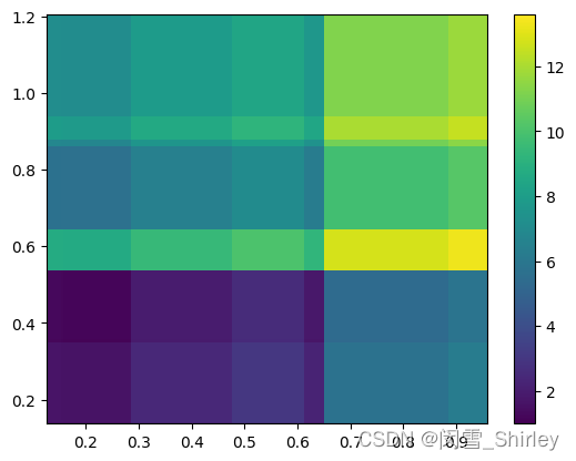
由于这里样本量足够多,且数量关系十分明确,所以效果看起来还挺理想。

绘制热力图

在实际中画热力图时,为了让原本数量关系没那么明确、样本量也不一定够多的数据展现出一定的规律性,我们采用方格模糊化的做法。

  • 构建方格

        自定义方格的尺寸,以及模糊半径,绘制热力图。热力图展示出方格对应的中心点(xc,yc)以h为半径的圆内所有点的z的平均值大小。

#定义方格的尺寸大小以及模糊半径(h)
grid_size=0.05
h=0.05

#创建方格,方格边框坐标(x_grid,y_grid)
x_min=min(x)
x_max=max(x)
y_min=min(y)
y_max=max(y)

x_grid=np.arange(x_min-h,x_max+h,grid_size)
y_grid=np.arange(y_min-h,y_max+h,grid_size)
x_mesh,y_mesh=np.meshgrid(x_grid,y_grid)

#方格中心点坐标(xc,yc)
xc=x_mesh+(grid_size/2)
yc=y_mesh+(grid_size/2)
cround=(xc+h)*(xc+h)+(yc+h)*(yc+h)

#输出方格边框点以及方格中心点,选一个方格中心点画出模糊半径
plt.grid(False)
plt.scatter(x_mesh, y_mesh) # the boundary of grid
plt.show

fig = plt.figure()
ax = plt.subplot(111)
ax.scatter(xc,yc) # the center of grid
cir = plt.Circle((pd.DataFrame(xc)[10][10],pd.DataFrame(yc)[10][10]),h, color='r',fill=False)
ax.add_patch(cir)
plt.show()
plt.show()

效果图: 

  • 计算每个方格中心模糊半径内的z的平均值intensity,生成intensity_list
intensity_list=[]
for j in range(len(xc)):
    intensity_row=[]
    for k in range(len(xc[0])):
        z_list=[]
        n=0
        for i in range(len(x)):
            for l in range(len(y)):
                #CALCULATE DISTANCE
                d=math.sqrt((xc[j][k]-x[i])**2+(yc[j][k]-y[l])**2) 
                if d<=h:
                    z_value=z[i][l]
                    n=n+1
                else:
                    z_value=0
                z_list.append(z_value)
        if sum(z_list) != 0:
            z_mean=sum(z_list)/n
        else:
            z_mean=np.nan
        intensity_row.append(z_mean)
    intensity_list.append(intensity_row)
print(pd.DataFrame(intensity_list)) #22*22 matrix, 484 points
  •  绘制热力图
intensity=np.array(intensity_list)
cm=plt.cm.get_cmap('Blues')
cm.set_bad(color='whitesmoke',alpha=0) #设置“坏值”(Nan)的颜色,这里设置为透明
plt.pcolormesh(x_mesh,y_mesh,intensity,cmap=cm) 
plt.xlim((0.00,1.00)) #限制x轴范围(0.00,1.00)
plt.xticks([])
plt.colorbar()

效果图:


这里可以看到因为模糊处理,效果一般,但是如果修改gridsize和模糊半径的话,可能会得到更好的结果。

多元线性回归
  • 生成point list

       首先生成point list,每一行表示一个点

# 计算point list
point_list=[]
for j in range(len(xc)):
    for k in range(len(xc[0])):
        point_row=[]
        point_row.append(xc[j][k])
        point_row.append(yc[j][k])
        point_row.append(intensity_list[j][k])
        point_list.append(point_row)
#print(point_list)
print(pd.DataFrame(point_list)) # 484*3 matrix, 484=22*22
  • 生成多元线性回归中的解释变量和被解释变量

       通过对point list切片,切出多元线性回归中的y(被解释变量,在这里为z)、x1、x2(x1和x2一起组成解释变量)。

#剔除缺失值
point_list = pd.DataFrame(point_list)
point_list = point_list.dropna()

#切出x_regression和y_regression
x1=point_list.iloc[:,0]
x1=np.array(x1).reshape(-1,1)
x1_2=x1*x1
x2=point_list.iloc[:,1]
x2=np.array(x2).reshape(-1,1)
x2_2=x2*x2
x_regression=np.concatenate([x1_2,x2_2],axis=1)
y_regression=np.array(point_list.iloc[:,2])
  • 进行多元线性回归,导出拟合优度、系数以及截距
#多元线性回归
model = LinearRegression()
model = LinearRegression().fit(x_regression, y_regression)

epsilon=model.intercept_
alpha=model.coef_
R2=model.score(x_regression, y_regression)
print('coefficient of determination:', R2)
print('intercept:', epsilon)
print('slope:', alpha)
  • 绘制等高线
n=100 #取足够多的点来平滑曲线
x_plot=np.linspace(x_min,x_max,n)
y_plot=np.linspace(y_min,y_max,n)
X_plot, Y_plot = np.meshgrid(x_plot,y_plot) 
z_plot=(alpha[0]*X_plot*X_plot+alpha[1]*Y_plot*Y_plot+epsilon)*100 #赋z的值
plt.contourf(X_plot,Y_plot,z_plot,alpha=0)
C=plt.contour(X_plot,Y_plot,z_plot,8,linewidths=1,colors='black') #8:等高线数量
plt.clabel(C,inline=True,fmt='%1.0f %%') #小数转为百分比

plt.show()

效果图:


 PS 这里同样用真实值(a,b,c)绘制了一个等高线图,效果图和代码为:

n=100 #take enough points to make the contour smooth
x_plot=np.linspace(x_min,x_max,n)
y_plot=np.linspace(y_min,y_max,n)
X_plot, Y_plot = np.meshgrid(x_plot,y_plot) #generate a grid matrix
z_plot=(a*X_plot*X_plot+b*Y_plot*Y_plot+c)*100 #generate the value of z
plt.contourf(X_plot,Y_plot,z_plot,alpha=0)
C=plt.contour(X_plot,Y_plot,z_plot,8,linewidths=1,colors='black') #8:the number of contours
plt.clabel(C,inline=True,fmt='%1.0f %%') #transfer decimals to percentages

plt.show()


 其实相差也没那么大。

将等高线和热力图放在一起,并自定义坐标轴标签
(偷懒不改成中文了,原本是用英文写的注释)
#set the theme and background
plt.grid(True)
plt.style.use('seaborn-darkgrid')

#construct axis ,ticks and labels
plt.ylim((-0.025,1.00)) #limit the y-axis to range(-0.025,1.00)
plt.xlim((0.00,1.00)) #limit the x-axis to range(0.00,1.00)
plt.gca().yaxis.set_major_formatter(ticker.PercentFormatter(xmax=1, decimals=0)) #transfer decimals to percentages,decimals: the number after the decimal point
my_label = ['a','b','c', 'd', 'e', 'f']
plt.xticks(ticks=[0.0,0.2,0.4,0.6,0.8,1.0],labels=my_label)
plt.plot(x, y, alpha=0) #alpha: transparency
plt.ylabel(''r'$\Delta$ Competitiveness')
plt.xlabel('ASP') 

plt.twiny()

#construct heatmap
intensity=np.array(intensity_list)
cm=plt.cm.get_cmap('Blues')
cm.set_bad(color='whitesmoke',alpha=0) #define the color of Nan
plt.pcolormesh(x_mesh,y_mesh,intensity,cmap=cm) 
plt.title(var2 + '+' + var1)
plt.xlim((0.00,1.00)) #limit the x-axis to range(0.00,1.00)
plt.xticks([])
plt.colorbar()

#construct contours
n=100 #take enough points to make the contour smooth
x_plot=np.linspace(x_min,x_max,n)
y_plot=np.linspace(y_min,y_max,n)
X_plot, Y_plot = np.meshgrid(x_plot,y_plot) #generate a grid matrix
z_plot=(alpha[0]*X_plot*X_plot+alpha[1]*Y_plot*Y_plot+epsilon)*100 #generate the value of z
plt.contourf(X_plot,Y_plot,z_plot,alpha=0)
C=plt.contour(X_plot,Y_plot,z_plot,8,linewidths=1,colors='black') #8:the number of contours
plt.clabel(C,inline=True,fmt='%1.0f %%') #transfer decimals to percentages

plt.show()

效果图:

 
OVER

  • 2
    点赞
  • 6
    收藏
    觉得还不错? 一键收藏
  • 1
    评论

“相关推荐”对你有帮助么?

  • 非常没帮助
  • 没帮助
  • 一般
  • 有帮助
  • 非常有帮助
提交
评论 1
添加红包

请填写红包祝福语或标题

红包个数最小为10个

红包金额最低5元

当前余额3.43前往充值 >
需支付:10.00
成就一亿技术人!
领取后你会自动成为博主和红包主的粉丝 规则
hope_wisdom
发出的红包
实付
使用余额支付
点击重新获取
扫码支付
钱包余额 0

抵扣说明:

1.余额是钱包充值的虚拟货币,按照1:1的比例进行支付金额的抵扣。
2.余额无法直接购买下载,可以购买VIP、付费专栏及课程。

余额充值