<!DOCTYPE html>
<html lang="en">
<head>
<meta charset="UTF-8">
<meta http-equiv="X-UA-Compatible" content="IE=edge">
<meta name="viewport" content="width=device-width, initial-scale=1.0">
<title>Document</title>
<style>
.frame {
width: 50%;
margin: 40px auto;
text-align: center;
}
button {
margin: 20px;
}
.custom-btn {
width: 130px;
height: 40px;
color: #fff;
border-radius: 5px;
padding: 10px 25px;
font-family: 'Lato', sans-serif;
font-weight: 500;
background: transparent;
cursor: pointer;
transition: all 0.3s ease;
position: relative;
display: inline-block;
box-shadow: inset 2px 2px 2px 0px rgba(255, 255, 255, .5),
7px 7px 20px 0px rgba(0, 0, 0, .1),
4px 4px 5px 0px rgba(0, 0, 0, .1);
outline: none;
}
/* 1 */
.btn-1 {
background: rgb(6, 14, 131);
background: linear-gradient(0deg, rgba(6, 14, 131, 1) 0%, rgba(12, 25, 180, 1) 100%);
border: none;
}
.btn-1:hover {
background: rgb(0, 3, 255);
background: linear-gradient(0deg, rgba(0, 3, 255, 1) 0%, rgba(2, 126, 251, 1) 100%);
}
/* 2 */
.btn-2 {
background: rgb(96, 9, 240);
background: linear-gradient(0deg, rgba(96, 9, 240, 1) 0%, rgba(129, 5, 240, 1) 100%);
border: none;
}
.btn-2:before {
height: 0%;
width: 2px;
}
.btn-2:hover {
box-shadow: 4px 4px 6px 0 rgba(255, 255, 255, .5),
-4px -4px 6px 0 rgba(116, 125, 136, .5),
inset -4px -4px 6px 0 rgba(255, 255, 255, .2),
inset 4px 4px 6px 0 rgba(0, 0, 0, .4);
}
/* 3 */
.btn-3 {
background: rgb(0, 172, 238);
background: linear-gradient(0deg, rgba(0, 172, 238, 1) 0%, rgba(2, 126, 251, 1) 100%);
width: 130px;
height: 40px;
line-height: 42px;
padding: 0;
border: none;
}
.btn-3 span {
position: relative;
display: block;
width: 100%;
height: 100%;
}
.btn-3:before,
.btn-3:after {
position: absolute;
content: "";
right: 0;
top: 0;
background: rgba(2, 126, 251, 1);
transition: all 0.3s ease;
}
.btn-3:before {
height: 0%;
width: 2px;
}
.btn-3:after {
width: 0%;
height: 2px;
}
.btn-3:hover {
background: transparent;
box-shadow: none;
}
.btn-3:hover:before {
height: 100%;
}
.btn-3:hover:after {
width: 100%;
}
.btn-3 span:hover {
color: rgba(2, 126, 251, 1);
}
.btn-3 span:before,
.btn-3 span:after {
position: absolute;
content: "";
left: 0;
bottom: 0;
background: rgba(2, 126, 251, 1);
transition: all 0.3s ease;
}
.btn-3 span:before {
width: 2px;
height: 0%;
}
.btn-3 span:after {
width: 0%;
height: 2px;
}
.btn-3 span:hover:before {
height: 100%;
}
.btn-3 span:hover:after {
width: 100%;
}
/* 4 */
.btn-4 {
background-color: #4dccc6;
background-image: linear-gradient(315deg, #4dccc6 0%, #96e4df 74%);
line-height: 42px;
padding: 0;
border: none;
}
.btn-4:hover {
background-color: #89d8d3;
background-image: linear-gradient(315deg, #89d8d3 0%, #03c8a8 74%);
}
.btn-4 span {
position: relative;
display: block;
width: 100%;
height: 100%;
}
.btn-4:before,
.btn-4:after {
position: absolute;
content: "";
right: 0;
top: 0;
box-shadow: 4px 4px 6px 0 rgba(255, 255, 255, .9),
-4px -4px 6px 0 rgba(116, 125, 136, .2),
inset -4px -4px 6px 0 rgba(255, 255, 255, .9),
inset 4px 4px 6px 0 rgba(116, 125, 136, .3);
transition: all 0.3s ease;
}
.btn-4:before {
height: 0%;
width: .1px;
}
.btn-4:after {
width: 0%;
height: .1px;
}
.btn-4:hover:before {
height: 100%;
}
.btn-4:hover:after {
width: 100%;
}
.btn-4 span:before,
.btn-4 span:after {
position: absolute;
content: "";
left: 0;
bottom: 0;
box-shadow: 4px 4px 6px 0 rgba(255, 255, 255, .9),
-4px -4px 6px 0 rgba(116, 125, 136, .2),
inset -4px -4px 6px 0 rgba(255, 255, 255, .9),
inset 4px 4px 6px 0 rgba(116, 125, 136, .3);
transition: all 0.3s ease;
}
.btn-4 span:before {
width: .1px;
height: 0%;
}
.btn-4 span:after {
width: 0%;
height: .1px;
}
.btn-4 span:hover:before {
height: 100%;
}
.btn-4 span:hover:after {
width: 100%;
}
/* 5 */
.btn-5 {
width: 130px;
height: 40px;
line-height: 42px;
padding: 0;
border: none;
background: rgb(255, 27, 0);
background: linear-gradient(0deg, rgba(255, 27, 0, 1) 0%, rgba(251, 75, 2, 1) 100%);
}
.btn-5:hover {
color: #f0094a;
background: transparent;
box-shadow: none;
}
.btn-5:before,
.btn-5:after {
content: '';
position: absolute;
top: 0;
right: 0;
height: 2px;
width: 0;
background: #f0094a;
box-shadow:
-1px -1px 5px 0px #fff,
7px 7px 20px 0px #0003,
4px 4px 5px 0px #0002;
transition: 400ms ease all;
}
.btn-5:after {
right: inherit;
top: inherit;
left: 0;
bottom: 0;
}
.btn-5:hover:before,
.btn-5:hover:after {
width: 100%;
transition: 800ms ease all;
}
/* 6 */
.btn-6 {
background: rgb(247, 150, 192);
background: radial-gradient(circle, rgba(247, 150, 192, 1) 0%, rgba(118, 174, 241, 1) 100%);
line-height: 42px;
padding: 0;
border: none;
}
.btn-6 span {
position: relative;
display: block;
width: 100%;
height: 100%;
}
.btn-6:before,
.btn-6:after {
position: absolute;
content: "";
height: 0%;
width: 1px;
box-shadow:
-1px -1px 20px 0px rgba(255, 255, 255, 1),
-4px -4px 5px 0px rgba(255, 255, 255, 1),
7px 7px 20px 0px rgba(0, 0, 0, .4),
4px 4px 5px 0px rgba(0, 0, 0, .3);
}
.btn-6:before {
right: 0;
top: 0;
transition: all 500ms ease;
}
.btn-6:after {
left: 0;
bottom: 0;
transition: all 500ms ease;
}
.btn-6:hover {
background: transparent;
color: #76aef1;
box-shadow: none;
}
.btn-6:hover:before {
transition: all 500ms ease;
height: 100%;
}
.btn-6:hover:after {
transition: all 500ms ease;
height: 100%;
}
.btn-6 span:before,
.btn-6 span:after {
position: absolute;
content: "";
box-shadow:
-1px -1px 20px 0px rgba(255, 255, 255, 1),
-4px -4px 5px 0px rgba(255, 255, 255, 1),
7px 7px 20px 0px rgba(0, 0, 0, .4),
4px 4px 5px 0px rgba(0, 0, 0, .3);
}
.btn-6 span:before {
left: 0;
top: 0;
width: 0%;
height: .5px;
transition: all 500ms ease;
}
.btn-6 span:after {
right: 0;
bottom: 0;
width: 0%;
height: .5px;
transition: all 500ms ease;
}
.btn-6 span:hover:before {
width: 100%;
}
.btn-6 span:hover:after {
width: 100%;
}
/* 7 */
.btn-7 {
background: linear-gradient(0deg, rgba(255, 151, 0, 1) 0%, rgba(251, 75, 2, 1) 100%);
line-height: 42px;
padding: 0;
border: none;
}
.btn-7 span {
position: relative;
display: block;
width: 100%;
height: 100%;
}
.btn-7:before,
.btn-7:after {
position: absolute;
content: "";
right: 0;
bottom: 0;
background: rgba(251, 75, 2, 1);
box-shadow:
-7px -7px 20px 0px rgba(255, 255, 255, .9),
-4px -4px 5px 0px rgba(255, 255, 255, .9),
7px 7px 20px 0px rgba(0, 0, 0, .2),
4px 4px 5px 0px rgba(0, 0, 0, .3);
transition: all 0.3s ease;
}
.btn-7:before {
height: 0%;
width: 2px;
}
.btn-7:after {
width: 0%;
height: 2px;
}
.btn-7:hover {
color: rgba(251, 75, 2, 1);
background: transparent;
}
.btn-7:hover:before {
height: 100%;
}
.btn-7:hover:after {
width: 100%;
}
.btn-7 span:before,
.btn-7 span:after {
position: absolute;
content: "";
left: 0;
top: 0;
background: rgba(251, 75, 2, 1);
box-shadow:
-7px -7px 20px 0px rgba(255, 255, 255, .9),
-4px -4px 5px 0px rgba(255, 255, 255, .9),
7px 7px 20px 0px rgba(0, 0, 0, .2),
4px 4px 5px 0px rgba(0, 0, 0, .3);
transition: all 0.3s ease;
}
.btn-7 span:before {
width: 2px;
height: 0%;
}
.btn-7 span:after {
height: 2px;
width: 0%;
}
.btn-7 span:hover:before {
height: 100%;
}
.btn-7 span:hover:after {
width: 100%;
}
/* 8 */
.btn-8 {
background-color: #f0ecfc;
background-image: linear-gradient(315deg, #f0ecfc 0%, #c797eb 74%);
line-height: 42px;
padding: 0;
border: none;
}
.btn-8 span {
position: relative;
display: block;
width: 100%;
height: 100%;
}
.btn-8:before,
.btn-8:after {
position: absolute;
content: "";
right: 0;
bottom: 0;
background: #c797eb;
/*box-shadow: 4px 4px 6px 0 rgba(255,255,255,.5),
-4px -4px 6px 0 rgba(116, 125, 136, .2),
inset -4px -4px 6px 0 rgba(255,255,255,.5),
inset 4px 4px 6px 0 rgba(116, 125, 136, .3);*/
transition: all 0.3s ease;
}
.btn-8:before {
height: 0%;
width: 2px;
}
.btn-8:after {
width: 0%;
height: 2px;
}
.btn-8:hover:before {
height: 100%;
}
.btn-8:hover:after {
width: 100%;
}
.btn-8:hover {
background: transparent;
}
.btn-8 span:hover {
color: #c797eb;
}
.btn-8 span:before,
.btn-8 span:after {
position: absolute;
content: "";
left: 0;
top: 0;
background: #c797eb;
/*box-shadow: 4px 4px 6px 0 rgba(255,255,255,.5),
-4px -4px 6px 0 rgba(116, 125, 136, .2),
inset -4px -4px 6px 0 rgba(255,255,255,.5),
inset 4px 4px 6px 0 rgba(116, 125, 136, .3);*/
transition: all 0.3s ease;
}
.btn-8 span:before {
width: 2px;
height: 0%;
}
.btn-8 span:after {
height: 2px;
width: 0%;
}
.btn-8 span:hover:before {
height: 100%;
}
.btn-8 span:hover:after {
width: 100%;
}
/* 9 */
.btn-9 {
border: none;
transition: all 0.3s ease;
overflow: hidden;
}
.btn-9:after {
position: absolute;
content: " ";
z-index: -1;
top: 0;
left: 0;
width: 100%;
height: 100%;
background-color: #1fd1f9;
background-image: linear-gradient(315deg, #1fd1f9 0%, #b621fe 74%);
transition: all 0.3s ease;
}
.btn-9:hover {
background: transparent;
box-shadow: 4px 4px 6px 0 rgba(255, 255, 255, .5),
-4px -4px 6px 0 rgba(116, 125, 136, .2),
inset -4px -4px 6px 0 rgba(255, 255, 255, .5),
inset 4px 4px 6px 0 rgba(116, 125, 136, .3);
color: #fff;
}
.btn-9:hover:after {
-webkit-transform: scale(2) rotate(180deg);
transform: scale(2) rotate(180deg);
box-shadow: 4px 4px 6px 0 rgba(255, 255, 255, .5),
-4px -4px 6px 0 rgba(116, 125, 136, .2),
inset -4px -4px 6px 0 rgba(255, 255, 255, .5),
inset 4px 4px 6px 0 rgba(116, 125, 136, .3);
}
/* 10 */
.btn-10 {
background: rgb(22, 9, 240);
background: linear-gradient(0deg, rgba(22, 9, 240, 1) 0%, rgba(49, 110, 244, 1) 100%);
color: #fff;
border: none;
transition: all 0.3s ease;
overflow: hidden;
}
.btn-10:after {
position: absolute;
content: " ";
top: 0;
left: 0;
z-index: -1;
width: 100%;
height: 100%;
transition: all 0.3s ease;
-webkit-transform: scale(.1);
transform: scale(.1);
}
.btn-10:hover {
color: #fff;
border: none;
background: transparent;
}
.btn-10:hover:after {
background: rgb(0, 3, 255);
background: linear-gradient(0deg, rgba(2, 126, 251, 1) 0%, rgba(0, 3, 255, 1)100%);
-webkit-transform: scale(1);
transform: scale(1);
}
/* 11 */
.btn-11 {
border: none;
background: rgb(251, 33, 117);
background: linear-gradient(0deg, rgba(251, 33, 117, 1) 0%, rgba(234, 76, 137, 1) 100%);
color: #fff;
overflow: hidden;
}
.btn-11:hover {
text-decoration: none;
color: #fff;
}
.btn-11:before {
position: absolute;
content: '';
display: inline-block;
top: -180px;
left: 0;
width: 30px;
height: 100%;
background-color: #fff;
animation: shiny-btn1 3s ease-in-out infinite;
}
.btn-11:hover {
opacity: .7;
}
.btn-11:active {
box-shadow: 4px 4px 6px 0 rgba(255, 255, 255, .3),
-4px -4px 6px 0 rgba(116, 125, 136, .2),
inset -4px -4px 6px 0 rgba(255, 255, 255, .2),
inset 4px 4px 6px 0 rgba(0, 0, 0, .2);
}
@-webkit-keyframes shiny-btn1 {
0% {
-webkit-transform: scale(0) rotate(45deg);
opacity: 0;
}
80% {
-webkit-transform: scale(0) rotate(45deg);
opacity: 0.5;
}
81% {
-webkit-transform: scale(4) rotate(45deg);
opacity: 1;
}
100% {
-webkit-transform: scale(50) rotate(45deg);
opacity: 0;
}
}
/* 12 */
.btn-12 {
position: relative;
right: 20px;
bottom: 20px;
border: none;
box-shadow: none;
width: 130px;
height: 40px;
line-height: 42px;
-webkit-perspective: 230px;
perspective: 230px;
}
.btn-12 span {
background: rgb(0, 172, 238);
background: linear-gradient(0deg, rgba(0, 172, 238, 1) 0%, rgba(2, 126, 251, 1) 100%);
display: block;
position: absolute;
width: 130px;
height: 40px;
box-shadow: inset 2px 2px 2px 0px rgba(255, 255, 255, .5),
7px 7px 20px 0px rgba(0, 0, 0, .1),
4px 4px 5px 0px rgba(0, 0, 0, .1);
border-radius: 5px;
margin: 0;
text-align: center;
-webkit-box-sizing: border-box;
-moz-box-sizing: border-box;
box-sizing: border-box;
-webkit-transition: all .3s;
transition: all .3s;
}
.btn-12 span:nth-child(1) {
box-shadow:
-7px -7px 20px 0px #fff9,
-4px -4px 5px 0px #fff9,
7px 7px 20px 0px #0002,
4px 4px 5px 0px #0001;
-webkit-transform: rotateX(90deg);
-moz-transform: rotateX(90deg);
transform: rotateX(90deg);
-webkit-transform-origin: 50% 50% -20px;
-moz-transform-origin: 50% 50% -20px;
transform-origin: 50% 50% -20px;
}
.btn-12 span:nth-child(2) {
-webkit-transform: rotateX(0deg);
-moz-transform: rotateX(0deg);
transform: rotateX(0deg);
-webkit-transform-origin: 50% 50% -20px;
-moz-transform-origin: 50% 50% -20px;
transform-origin: 50% 50% -20px;
}
.btn-12:hover span:nth-child(1) {
box-shadow: inset 2px 2px 2px 0px rgba(255, 255, 255, .5),
7px 7px 20px 0px rgba(0, 0, 0, .1),
4px 4px 5px 0px rgba(0, 0, 0, .1);
-webkit-transform: rotateX(0deg);
-moz-transform: rotateX(0deg);
transform: rotateX(0deg);
}
.btn-12:hover span:nth-child(2) {
box-shadow: inset 2px 2px 2px 0px rgba(255, 255, 255, .5),
7px 7px 20px 0px rgba(0, 0, 0, .1),
4px 4px 5px 0px rgba(0, 0, 0, .1);
color: transparent;
-webkit-transform: rotateX(-90deg);
-moz-transform: rotateX(-90deg);
transform: rotateX(-90deg);
}
/* 13 */
.btn-13 {
background-color: #89d8d3;
background-image: linear-gradient(315deg, #89d8d3 0%, #03c8a8 74%);
border: none;
z-index: 1;
}
.btn-13:after {
position: absolute;
content: "";
width: 100%;
height: 0;
bottom: 0;
left: 0;
z-index: -1;
border-radius: 5px;
background-color: #4dccc6;
background-image: linear-gradient(315deg, #4dccc6 0%, #96e4df 74%);
box-shadow:
-7px -7px 20px 0px #fff9,
-4px -4px 5px 0px #fff9,
7px 7px 20px 0px #0002,
4px 4px 5px 0px #0001;
transition: all 0.3s ease;
}
.btn-13:hover {
color: #fff;
}
.btn-13:hover:after {
top: 0;
height: 100%;
}
.btn-13:active {
top: 2px;
}
/* 14 */
.btn-14 {
background: rgb(255, 151, 0);
border: none;
z-index: 1;
}
.btn-14:after {
position: absolute;
content: "";
width: 100%;
height: 0;
top: 0;
left: 0;
z-index: -1;
border-radius: 5px;
background-color: #eaf818;
background-image: linear-gradient(315deg, #eaf818 0%, #f6fc9c 74%);
box-shadow: inset 2px 2px 2px 0px rgba(255, 255, 255, .5),
7px 7px 20px 0px rgba(0, 0, 0, .1),
4px 4px 5px 0px rgba(0, 0, 0, .1);
transition: all 0.3s ease;
}
.btn-14:hover {
color: #000;
}
.btn-14:hover:after {
top: auto;
bottom: 0;
height: 100%;
}
.btn-14:active {
top: 2px;
}
/* 15 */
.btn-15 {
background: #b621fe;
border: none;
z-index: 1;
}
.btn-15:after {
position: absolute;
content: "";
width: 0;
height: 100%;
top: 0;
right: 0;
z-index: -1;
background-color: #663dff;
border-radius: 5px;
box-shadow: inset 2px 2px 2px 0px rgba(255, 255, 255, .5),
7px 7px 20px 0px rgba(0, 0, 0, .1),
4px 4px 5px 0px rgba(0, 0, 0, .1);
transition: all 0.3s ease;
}
.btn-15:hover {
color: #fff;
}
.btn-15:hover:after {
left: 0;
width: 100%;
}
.btn-15:active {
top: 2px;
}
/* 16 */
.btn-16 {
border: none;
color: #000;
}
.btn-16:after {
position: absolute;
content: "";
width: 0;
height: 100%;
top: 0;
left: 0;
direction: rtl;
z-index: -1;
box-shadow:
-7px -7px 20px 0px #fff9,
-4px -4px 5px 0px #fff9,
7px 7px 20px 0px #0002,
4px 4px 5px 0px #0001;
transition: all 0.3s ease;
}
.btn-16:hover {
color: #000;
}
.btn-16:hover:after {
left: auto;
right: 0;
width: 100%;
}
.btn-16:active {
top: 2px;
}
</style>
</head>
<body>
<div class="frame">
<button class="custom-btn btn-1">Read More</button>
<button class="custom-btn btn-2">Read More</button>
<button class="custom-btn btn-3"><span>Read More</span></button>
<button class="custom-btn btn-4"><span>Read More</span></button>
<button class="custom-btn btn-5"><span>Read More</span></button>
<button class="custom-btn btn-6"><span>Read More</span></button>
<button class="custom-btn btn-7"><span>Read More</span></button>
<button class="custom-btn btn-8"><span>Read More</span></button>
<button class="custom-btn btn-9">Read More</button>
<button class="custom-btn btn-10">Read More</button>
<button class="custom-btn btn-11">Read More<div class="dot"></div></button>
<button class="custom-btn btn-12"><span>Click!</span><span>Read More</span></button>
<button class="custom-btn btn-13">Read More</button>
<button class="custom-btn btn-14">Read More</button>
<button class="custom-btn btn-15">Read More</button>
<button class="custom-btn btn-16">Read More</button>
</body>
</html>


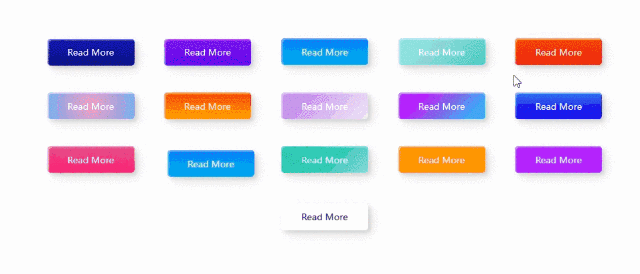
 本文展示了16种不同风格的按钮设计,包括渐变背景、动画效果、3D转换等,适用于前端开发中的各种场景。这些设计通过CSS实现,可自定义颜色、大小,为网页增添视觉吸引力和交互体验。


 扫一扫
扫一扫


 932
932

 被折叠的 条评论
为什么被折叠?
被折叠的 条评论
为什么被折叠?
 到【灌水乐园】发言


