


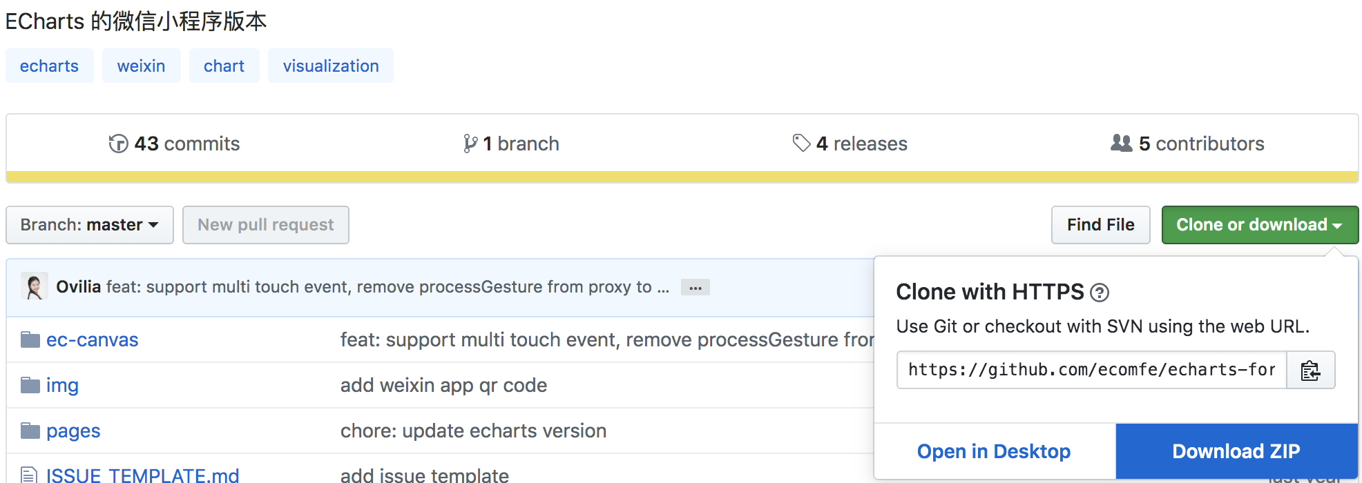
下载
- 下载地址:
- 引入项目中
第一步:
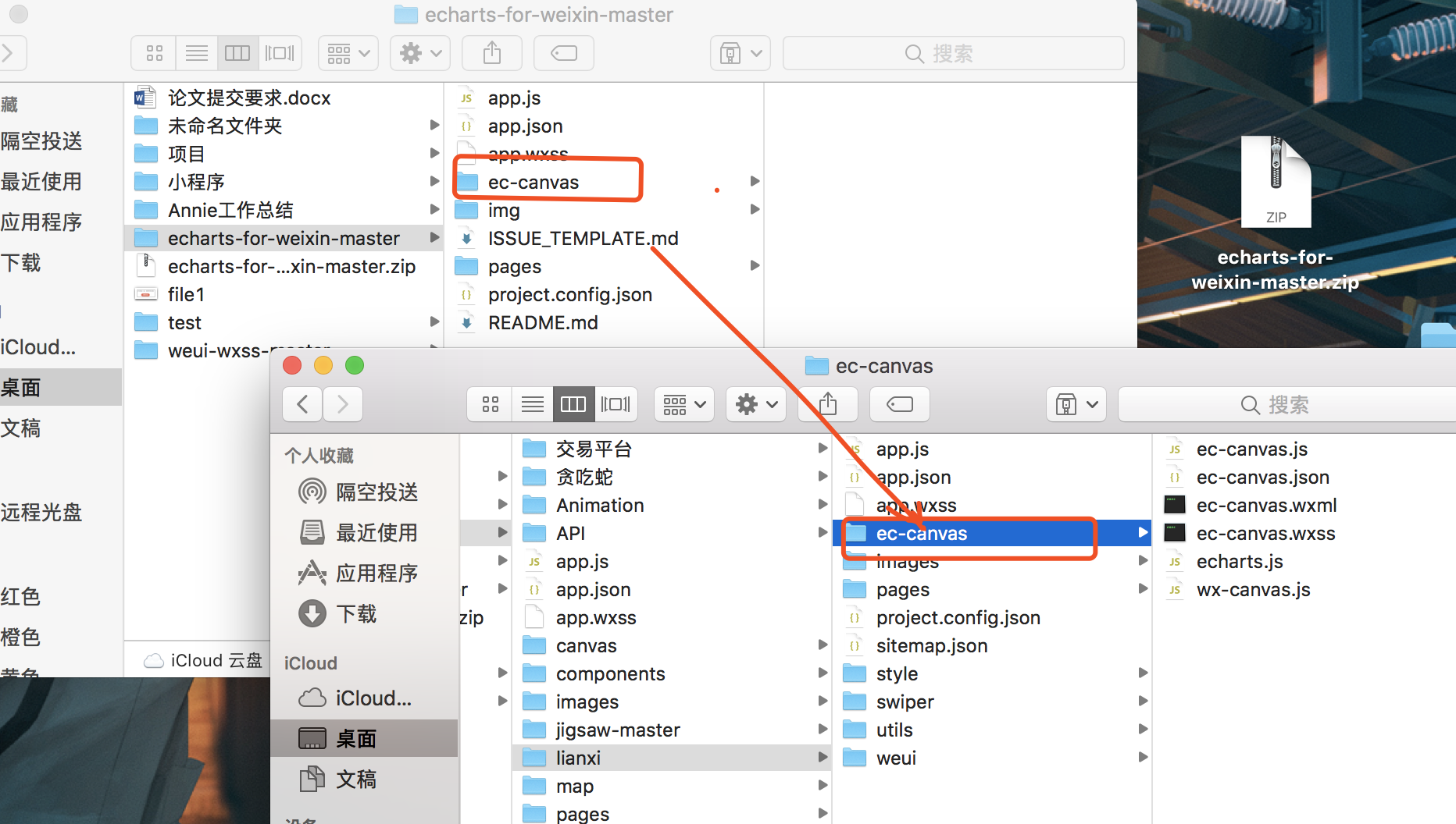
拷贝文件,将 echarts-for-weixin-master 项目里面的 ec-canvas 文件夹拷贝到项目目录中,
第二步:
在需要显示页面配置文件中配置组件及引入。
.json 配置组件
{
  "usingComponents": {
    "ec-canvas": "../../ec-canvas/ec-canvas"
  }
}
.wxml 使用组件
<!--index.wxml-->
<view class="box">
  <ec-canvas id="mychart-dom-bar" canvas-id="mychart-bar" ec="{{ ec }}"></ec-canvas>
</view>
.wcss 必须得样式
.box {
	width:100%;
	height:100%;
	position: absolute;
	top: 0;
	bottom: 0;
	left: 0;
	right: 0;
}
.js 脚本
// 1、引入依赖脚本
import * as echarts from '../../ec-canvas/echarts';
let chart = null;
// 2、进行初始化数据
function initChart(canvas, width, height) {
  chart = echarts.init(canvas, null, {
    width: width,
    height: height
  });
  canvas.setChart(chart);
  var option = {
    color: ['#37a2da', '#32c5e9', '#67e0e3'],
    tooltip: {
      trigger: 'axis',
      axisPointer: {            // 坐标轴指示器,坐标轴触发有效
        type: 'shadow'        // 默认为直线,可选为:'line' | 'shadow'
      }
    },
    legend: {
      data: ['热度', '正面', '负面']
    },
    grid: {
      left: 20,
      right: 20,
      bottom: 15,
      top: 40,
      containLabel: true
    },
    xAxis: [
      {
        type: 'value',
        axisLine: {
          lineStyle: {
            color: '#999'
          }
        },
        axisLabel: {
          color: '#666'
        }
      }
    ],
    yAxis: [
      {
        type: 'category',
        axisTick: { show: false },
        data: ['北京百星', '成都溧阳', '百度贴吧', '一点资讯', '微信', '微博', '知乎'],
        axisLine: {
          lineStyle: {
            color: '#999'
          }
        },
        axisLabel: {
          color: '#666'
        }
      }
    ],
    series: [
      {
        name: '热度',
        type: 'bar',
        label: {
          normal: {
            show: true,
            position: 'inside'
          }
        },
        data: [300, 270, 340, 344, 300, 320, 310],
        itemStyle: {
          // emphasis: {
          //   color: '#37a2da'
          // }
        }
      },
      {
        name: '正面',
        type: 'bar',
        stack: '总量',
        label: {
          normal: {
            show: true
          }
        },
        data: [120, 102, 141, 174, 190, 250, 220],
        itemStyle: {
          // emphasis: {
          //   color: '#32c5e9'
          // }
        }
      },
      {
        name: '负面',
        type: 'bar',
        stack: '总量',
        label: {
          normal: {
            show: true,
            position: 'left'
          }
        },
        data: [-20, -32, -21, -34, -90, -130, -110],
        itemStyle: {
          // emphasis: {
          //   color: '#67e0e3'
          // }
        }
      }
    ]
  };
  chart.setOption(option);
  return chart;
}
Page({
  onShareAppMessage: function (res) {
    return {
      title: 'ECharts',
      path: '/pages/index/index',
      success: function () { },
      fail: function () { }
    }
  },
  data: {
    ec: {
      onInit: initChart // 3、将数据放入到里面
    }
  },
  onReady() {
    setTimeout(function () {
      // 获取 chart 实例的方式
      console.log(chart)
    }, 2000);
  }
});
最后结果为下图,E charts图表是不是成功出来啦~~~


 422
422

 被折叠的 条评论
为什么被折叠?
被折叠的 条评论
为什么被折叠?
 到【灌水乐园】发言


