


问题?详解css3中webkit-animation
原理:这是一个不需要触发就可以执行的css3的类似伪类属性,与伪类属性不同的是,伪类需要鼠标悬浮才能执行,而该属性不需要任何触发条件即可执行
例子:
<!DOCTYPE html>
<html>
<head>
<meta charset="utf-8">
<meta http-equiv="X-UA-Compatible" content="IE=edge">
<title></title>
<link rel="stylesheet" href="">
<style type="text/css">
body{
background-color: black;
}
div{
width: 80px;
height: 80px;
border-radius: 50%;
background-color: rgba(255,255,255,0.6);
position: absolute;
top: 200px;
left: 600px;
text-align: center;
line-height: 80px;
color: white;
font-size: 30px;
/*animation:自动执行 第一个名字 过渡时间 方式 延迟时间 几次(这里是永久) 下一次动作(这里是网上走)*/
-webkit-animation: tiao 1s ease 0s infinite alternate;
}
/* 下面这个才是过渡的重要点儿 */
@-webkit-keyframes tiao{
from{
top:200px;
}
to{
top: 250px;
}
}
</style>
</head>
<body>
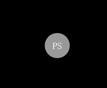
<div>PS</div>
</body>
</html>效果图:


 1145
1145

 被折叠的 条评论
为什么被折叠?
被折叠的 条评论
为什么被折叠?
 到【灌水乐园】发言


