


摘要:使用kaggle公开数据为数据源:员工离职数据,使用Pyecharts分析员工离职情况。针对优秀员工, 使用决策树、随机森林 探索影响员工离职的主要因素 ,结果显示,主要因素为工作年限、员工满意度、月平均工作时长、最近一次评估结果、参与项目数量;又分别使用朴素贝叶斯和SVM模型 预测员工是否离职,其中随机森林预测准确度最高,AUC值可以达到99.05%,SVM模型次之,AUC值为97.43%。 针对最低留存率工作年限的员工,使用逻辑回归模型 分析最低留存率工作年限(第五年)员工离职的主要驱动力 。结果显示,延长平均项目用时、发生事故、近5年获得晋升、加薪以及降低员工满意度能降低员工第五年离职概率。
一、导入数据及数据预处理
import pandas as pd
import numpy as np
import matplotlib.pyplot as plt
import seaborn as sns
plt.rc('font',family='FangSong') # 此语句确保绘图中的中文可以正常显示
import warnings
warnings.filterwarnings('ignore')
df = pd.read_csv('HR_comma_sep.csv')
pd.set_option('display.max_rows',4)
df
| satisfaction_level | last_evaluation | number_project | average_montly_hours | time_spend_company | Work_accident | left | promotion_last_5years | sales | salary | |
|---|---|---|---|---|---|---|---|---|---|---|
| 0 | 0.38 | 0.53 | 2 | 157 | 3 | 0 | 1 | 0 | sales | low |
| 1 | 0.80 | 0.86 | 5 | 262 | 6 | 0 | 1 | 0 | sales | medium |
| ... | ... | ... | ... | ... | ... | ... | ... | ... | ... | ... |
| 14997 | 0.11 | 0.96 | 6 | 280 | 4 | 0 | 1 | 0 | support | low |
| 14998 | 0.37 | 0.52 | 2 | 158 | 3 | 0 | 1 | 0 | support | low |
14999 rows × 10 columns
df.info()
<class 'pandas.core.frame.DataFrame'>
RangeIndex: 14999 entries, 0 to 14998
Data columns (total 10 columns):
 #   Column                 Non-Null Count  Dtype
---  ------                 --------------  -----
 0   satisfaction_level     14999 non-null  float64
 1   last_evaluation        14999 non-null  float64
 2   number_project         14999 non-null  int64
 3   average_montly_hours   14999 non-null  int64
 4   time_spend_company     14999 non-null  int64
 5   Work_accident          14999 non-null  int64
 6   left                   14999 non-null  int64
 7   promotion_last_5years  14999 non-null  int64
 8   sales                  14999 non-null  object
 9   salary                 14999 non-null  object
dtypes: float64(2), int64(6), object(2)
memory usage: 1.1+ MB
pd.set_option('display.max_rows',None) # 解决df看不全的问题
df.describe().T
| count | mean | std | min | 25% | 50% | 75% | max | |
|---|---|---|---|---|---|---|---|---|
| satisfaction_level | 14999.0 | 0.612834 | 0.248631 | 0.09 | 0.44 | 0.64 | 0.82 | 1.0 |
| last_evaluation | 14999.0 | 0.716102 | 0.171169 | 0.36 | 0.56 | 0.72 | 0.87 | 1.0 |
| number_project | 14999.0 | 3.803054 | 1.232592 | 2.00 | 3.00 | 4.00 | 5.00 | 7.0 |
| average_montly_hours | 14999.0 | 201.050337 | 49.943099 | 96.00 | 156.00 | 200.00 | 245.00 | 310.0 |
| time_spend_company | 14999.0 | 3.498233 | 1.460136 | 2.00 | 3.00 | 3.00 | 4.00 | 10.0 |
| Work_accident | 14999.0 | 0.144610 | 0.351719 | 0.00 | 0.00 | 0.00 | 0.00 | 1.0 |
| left | 14999.0 | 0.238083 | 0.425924 | 0.00 | 0.00 | 0.00 | 0.00 | 1.0 |
| promotion_last_5years | 14999.0 | 0.021268 | 0.144281 | 0.00 | 0.00 | 0.00 | 0.00 | 1.0 |
通过箱线图查看异常值
import seaborn as sns
fig, ax = plt.subplots(1,5, figsize=(12, 2))
sns.boxplot(x=df.columns[0], data=df, ax=ax[0])
sns.boxplot(x=df.columns[1], data=df, ax=ax[1])
sns.boxplot(x=df.columns[2], data=df, ax=ax[2])
sns.boxplot(x=df.columns[3], data=df, ax=ax[3])
sns.boxplot(x=df.columns[4], data=df, ax=ax[4])
plt.show()

结论: 除了工作年限外, 其他均无异常值。该异常值也反映了该公司员工中以年轻人为主
1. 人力资源总体情况
from pyecharts import options as opts
from pyecharts.charts import Pie

X = [(df.left.value_counts()[1])/(df.shape[0]),(df.left.value_counts()[0])/(df.shape[0])]
X = [round(i,2)  for i in X]
y = ['离职','在职']
c = (
    Pie()
    .add(
        "",
        [list(z) for z in zip(y, X)],
        radius=["30%", "75%"],
    )
    .set_global_opts(
        title_opts=opts.TitleOpts(title="Pie-Radius"),
        legend_opts=opts.LegendOpts(orient="vertical", pos_top="15%", pos_left="2%"),
    )
    .set_series_opts(label_opts=opts.LabelOpts(formatter="{b}: {c}"))
)
c.render_notebook()
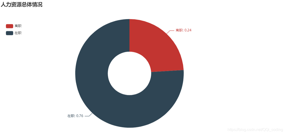
结论: 离职人员占比24%
2. Pyecharts分析是否离职与其余9个因素的关系
2.1 对公司满意度与是否离职的关系
from pyecharts import options as opts
from pyecharts.charts import Boxplot

v1 = [df[df['left']==1]['satisfaction_level'].values.tolist(),df[df['left']==0]['satisfaction_level'].values.tolist()]
c = Boxplot()
c.add_xaxis(['离职','在职'])
c.add_yaxis('对公司满意度',c.prepare_data(v1))
c.set_global_opts(title_opts=opts.TitleOpts(title="对公司满意度与是否离职的关系图"))
c.render_notebook()
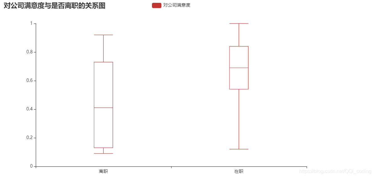
结论: 就中位数而言, 离职人员对公司满意度相对较低, 且离职人员对公司满意度整体波动较大. 另外离职人员中没有满意度为1的评价.
2.2 最新考核评估与是否离职的关系
# 查看具体分箱情况bins
# df4 = df[['last_evaluation','left']]
# pd.cut(df4['last_evaluation'],5,labels= ['低','中低','中','中高','高'],retbins=True)
import pyecharts.options as opts
from pyecharts.charts import Line

df4 = df[['last_evaluation','left']]
df4['last_evaluation'] = pd.cut(df4['last_evaluation'],5,labels= ['低','中低','中','中高','高'])
df4['count'] =1
df_groupby = df4.groupby(by = 'last_evaluation').sum()
df_groupby['left0'] = df_groupby['count'] - df_groupby['left']

c = (
    Line()
    .add_xaxis(df_groupby.index.tolist())
    .add_yaxis("在总体离职员工中的占比", df_groupby['left']/ df_groupby['left'].sum(), is_smooth=True)
    .add_yaxis("在总体在职员工中的占比", df_groupby['left0']/ df_groupby['left0'].sum(), is_smooth=True)
    .set_series_opts(
        areastyle_opts=opts.AreaStyleOpts(opacity=0.5),
        label_opts=opts.LabelOpts(is_show=False),
    )
    .set_global_opts(
        title_opts=opts.TitleOpts(title="最新考核评价与是否离职的关系"),
        xaxis_opts=opts.AxisOpts(
            axistick_opts=opts.AxisTickOpts(is_align_with_label=True),
            is_scale=False,
            boundary_gap=False,
            name="最新考核评价",
        ),
#         yaxis_opts=opts.AxisOpts(name="占比"),
    )
)
c.render_notebook()
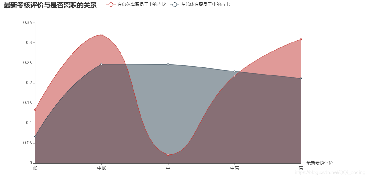
结论:考核评价偏低或偏高的员工更容易离职。在职人员的最新考核评价较为平均,大多数分布在中低-高之间。离职员工的最新考核评价集中在中低和高两个段。
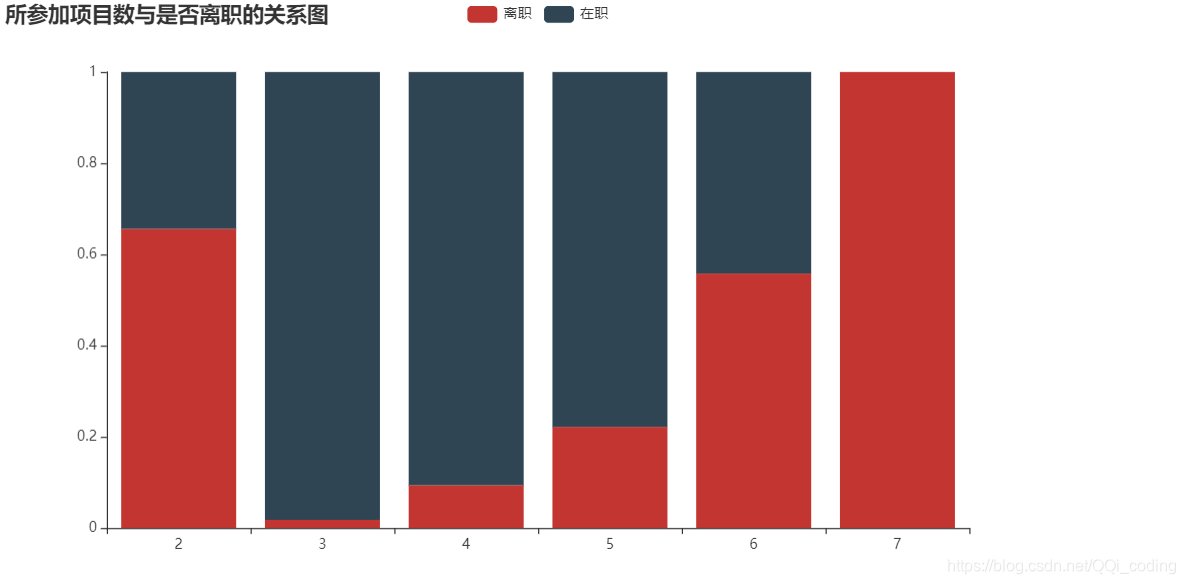
2.3 所参加项目数与是否离职的关系
不同参与项目数的员工离职与在职人员占比分布
from pyecharts import options as opts
from pyecharts.charts import Bar,Pie, Grid

project_left_1 = df[df.left==1].groupby('number_project')['left'].count()
project_all = df.groupby('number_project')['left'].count()
# 分别计算离职人数和在职人数所占比例
project_left1_rate = project_left_1/project_all
project_left0_rate = 1-project_left1_rate


bar = (
    Bar()
    .add_xaxis(project_all.index.tolist())
    .add_yaxis('离职', project_left1_rate.values.reshape(6,).tolist(), stack="stack1")
    .add_yaxis('在职', project_left0_rate.values.reshape(6,).tolist(), stack="stack1")
    .set_series_opts(label_opts=opts.LabelOpts(is_show=False))
    .set_global_opts(title_opts=opts.TitleOpts(title="所参加项目数与是否离职的关系图"))
)

bar.render_notebook()
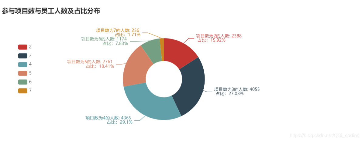
参与项目数与员工人数及占比分布
c = (
    Pie()
    .add(
        "",
        [list(z) for z in zip(project_all.index.tolist(), project_all.values.reshape(6,).tolist())],
        radius=["20%", "45%"],
    )
    .set_global_opts(
        title_opts=opts.TitleOpts(title="参与项目数与员工人数及占比分布" ,pos_top="10%"),
        legend_opts=opts.LegendOpts(orient="vertical", pos_top="30%", pos_left="5%"),

    )
    .set_series_opts(label_opts=opts.LabelOpts(formatter="项目数为{b}的人数: {c} \n 占比:{d}%"))
)

c.render_notebook()
2.4 平均每月工作时长与是否离职的关系
# 平均每月工作时长分段处理,分别统计离职人员和在职人员数量
df_count = df[['average_montly_hours','left']]
df_count['left1'] = [1 if i==1 else 0 for i in df_count['left']]
df_count['left0'] = [1 if i==0 else 0 for i in df_count['left']]

# 分段
bins =[i for i in range(95,315,10)]
df_cut = pd.cut(df_count['average_montly_hours'],bins =bins)
df_count['df_cut'] = df_cut
# 计数
df_cut_count = df_count.groupby(by = 'df_cut').sum()
df_cut_left1_count = df_cut_count['left1'].values.tolist() # 离职人员数量
df_cut_left0_count = df_cut_count['left0'].values.tolist() # 在职人员数量

df_cut_count = df_cut_count.reset_index()
X = [str(i) for i in df_cut_count['df_cut'].values]
from pyecharts import options as opts
from pyecharts.charts import Bar
from pyecharts.faker import Faker
df_average_montly_hours = pd.cut(df[df.left ==1]['average_montly_hours'],bins = 20)
df[df.left ==1]['average_montly_hours'].values.tolist()
c = (
    Bar()
    .add_xaxis(X)
    .add_yaxis("离职",df_cut_left1_count, color=Faker.rand_color())
    .add_yaxis("在职",df_cut_left0_count)
    .set_global_opts(
        title_opts=opts.TitleOpts(title="平均每月工作时长与是否离职的关系"),
        datazoom_opts=[opts.DataZoomOpts(), opts.DataZoomOpts(type_="inside")],
    )
)
c.render_notebook()
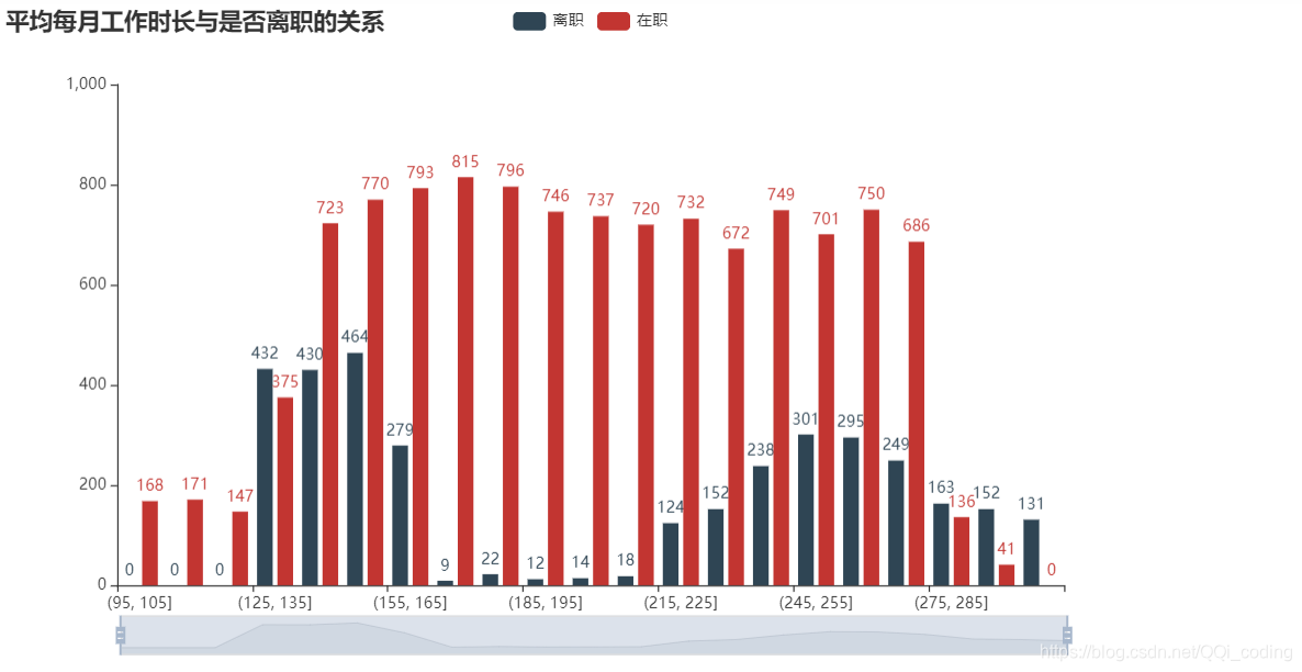
结论: 离职员工的平均每月工作时长集中在(125,165]小时和(215,285]小时之间,而在职员工平均每月工作时长分布均匀,说明平均每月工作时长太短(日均6-7.5h)或太长(日均10h以上),都可能导致员工离职。将员工月平均工作时长调整在(155,235]之间,
2.5 意外事故和是否离职的关系
accident_df= df[['Work_accident','left','satisfaction_level','last_evaluation','number_project','average_montly_hours'
                ,'salary','time_spend_company']]
accident_df['count']=1
# accident_df.head()
def f(x):
    d = {
   }
    d['count_sum'] = x['count'].sum()
    d['left_sum'] = x['left'].sum()
    d
最低0.47元/天 解锁文章


 8118
8118

 被折叠的 条评论
为什么被折叠?
被折叠的 条评论
为什么被折叠?
 到【灌水乐园】发言


