


css的三栏布局主要是左右宽度固定,中间自适应
下面就来介绍一下实现三栏布局的几种方式
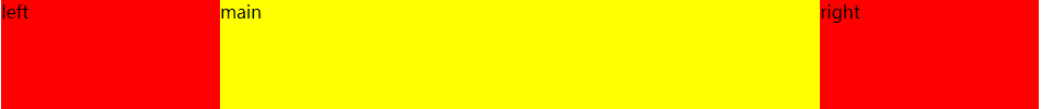
1.Flex布局
利用flex布局可以实现
给父级设置:display: flex;,给中间元素设置flex: 1;
html结构
 <div class="box">
        <div class="left">left</div>
        <div class="main">main</div>
        <div class="right">right</div>
 </div>
css样式
.box {
    height: 100px;
    display: flex;
}
.left,
.right {
    width: 200px;
    height: 100px;
    background-color: red;
}
.main {
    height: 100px;
    flex: 1;
    background-color: yellow;
}
2.Float浮动
利用 float + margin实现三栏布局
main写在left和right的下面,最后渲染
给main 设置 margin: 0 200px; 给左右盒子留出宽度,中间盒子的内容才能不被覆盖
html结构
<div class="box">
    <div class="left">left</div>
    <div class="right">right</div>
    <!-- mian写在left和right的下面,最后渲染 -->
    <div class="main">main</div>
</div>
css样式
.box {
    height: 100px;

}
.left,
.right {
    width: 200px;
    height: 100px;
    background-color: red;
}
.left {
    float: left;
}
.right {
    float: right;
}
.main {
    height: 100px;
    /* 给左右盒子留出宽度,中间盒子的内容才能不被覆盖 */
    margin: 0 200px;
    background-color: yellow;
}
3.利用绝对定位
外部盒子相对定位,左侧和右侧盒子绝对定位
给main 设置 margin: 0 200px; 给左右盒子留出宽度,中间盒子的内容才能不被覆盖
html结构
<div class="box">
    <div class="left">left</div>
    <div class="main">main</div>
    <div class="right">right</div>
</div>
css样式
.box {
    width: 100%;
    height: 100px;
    position: relative;

}
.left,
.right {
    width: 200px;
    height: 100px;
    position: absolute;
    background-color: red;
}
/*改变左侧盒子的位置*/
.left {
    left: 0;
    top: 0;
}
/*改变右侧盒子的位置*/
.right {
    right: 0;
    top: 0;
}
.main {
    height: 100px;
    margin: 0 200px;
    background-color: yellow;
}
4.圣杯布局
特点:
- 1.两边固定,中间自适应
- 2.给外面盒子设置padding:0 xx px(左右盒子的宽度)
- 给三个盒子都设置浮动
- 左侧盒子的margin-left负值是百分比单位(实际距离是中间盒子的宽度)
- 右侧盒子的margin-left负值是px单位,百分比实现不了
- 给左右盒子设置相对定位,值为左右盒子的宽度x`
main 要在left 和 right的上面,最先渲染
html结构
<div class="box">
    <div class="main">main</div>
    <div class="left">left</div>
    <div class="right">right</div>
</div>
css样式
.box {
    height: 400px;
    padding: 0 200px;
}
.main {
    float: left;
    width: 100%;
    height: 400px;
    background-color: yellow;
}
.left,
.right {
    float: left;
    position: relative;
    width: 200px;
    height: 400px;
    background-color: red;
}
.left {
	/*单位是百分比*/
    margin-left: -100%;
    left: -200px;
}
.right {
	/*单位是px, 值为盒子宽度*/
    margin-left: -200px;
    right: -200px;
}
5.双飞翼布局
特点:
- 1.为了中间的
div内容不被遮挡,直接在中间div内部创建一个子div用于放置内容 - 中间的
div设置margin,为左右盒子留出位置
其他内容基本上和圣杯布局一样
html结构
<div class="box">
        <div class="main">
            <div class="main-wrap">
                #main
            </div>
        </div>
        <div class="left">left</div>
        <div class="right">right</div>
    </div>
css样式
.box {
    height: 400px;
}
.main {
    width: 100%;
    height: 400px;
    float: left;
    background-color: yellow;
}
.main .main-wrap {
    margin: 0 200px;
}
.left,
.right {
    float: left;
    width: 200px;
    height: 400px;
    background-color: red;
}
.left {
    margin-left: -100%;
    left: -200px;
}
.right {
    margin-left: -200px;
    right: -200px;
}


 593
593


 被折叠的 条评论
为什么被折叠?
被折叠的 条评论
为什么被折叠?
 到【灌水乐园】发言


