


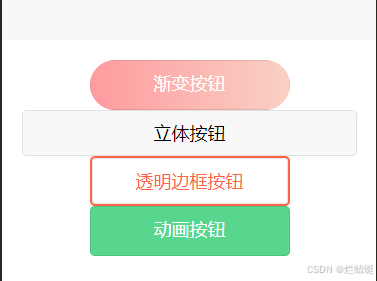
在 uniapp 开发过程中,按钮作为用户交互的关键元素,其样式设计直接影响着用户体验。今天就来给大家分享 uniapp 中四种独具特色的按钮样式,包含渐变按钮、立体按钮、透明边框按钮和动画按钮,并且附上完整代码,让大家轻松上手。老规矩,先上效果图!
一、渐变按钮
渐变按钮通过线性渐变的背景色,营造出独特的视觉效果,在不同状态下背景色的变化,增强了交互的趣味性。
<button class="gradient-button">渐变按钮</button>
.gradient-button {
    width: 200px;
    height: 50px;
    border: none;
    border-radius: 25px;
    color: #fff;
    font-size: 18px;
    background: linear-gradient(to right, #ff9a9e 0%, #fad0c4 99%, #fad0c4 100%);
    cursor: pointer;
    outline: none;
}
.gradient-button:hover {
    background: linear-gradient(to right, #ff6b6b 0%, #ffa07a 99%, #ffa07a 100%);
}
二、立体按钮
立体按钮借助box-shadow属性模拟出立体感,按下时通过改变box-shadow和transform属性实现按下效果,让按钮仿佛真实可触。
<button class="3d-button">立体按钮</button>
.3d-button {
    width: 200px;
    height: 50px;
    border: none;
    border-radius: 5px;
    color: #fff;
    font-size: 18px;
    background-color: #007aff;
    box-shadow: 0 5px 0 #0056b3;
    cursor: pointer;
    outline: none;
}
.3d-button:active {
    box-shadow: none;
    transform: translateY(5px);
}
三、透明边框按钮
透明边框按钮以透明背景和彩色边框为特色,悬停时背景和文字颜色的变化,简洁而富有现代感。
<button class="transparent-button">透明边框按钮</button>
.transparent-button {
    width: 200px;
    height: 50px;
    border: 2px solid #ff6347;
    border-radius: 5px;
    color: #ff6347;
    font-size: 18px;
    background-color: transparent;
    cursor: pointer;
    outline: none;
    transition: all 0.3s ease;
}
.transparent-button:hover {
    background-color: #ff6347;
    color: #fff;
}
四、动画按钮
动画按钮利用伪元素和绝对定位,在悬停时实现从左到右的渐变动画,为按钮增添动态美感。
<button class="animated-button">动画按钮</button>
.animated-button {
    width: 200px;
    height: 50px;
    border: none;
    border-radius: 5px;
    color: #fff;
    font-size: 18px;
    background-color: #2ecc71;
    position: relative;
    overflow: hidden;
    cursor: pointer;
    outline: none;
}
.animated-button::before {
    content: "";
    position: absolute;
    top: 0;
    left: -100%;
    width: 100%;
    height: 100%;
    background: rgba(255, 255, 255, 0.2);
    transition: all 0.3s ease;
}
.animated-button:hover::before {
    left: 0;
}
以上就是 uniapp 中四款特色按钮样式及代码分享,大家可以根据项目需求灵活运用这些样式,提升应用的视觉效果和交互体验。如果在使用过程中有任何问题,欢迎在评论区留言交流。


 扫一扫
扫一扫


 4076
4076

 被折叠的 条评论
为什么被折叠?
被折叠的 条评论
为什么被折叠?
 到【灌水乐园】发言


