


目录
CSS三大特性
1.层叠性

<!DOCTYPE html>
<html lang="en">

<head>
    <meta charset="UTF-8">
    <meta http-equiv="X-UA-Compatible" content="IE=edge">
    <meta name="viewport" content="width=device-width, initial-scale=1.0">
    <title>Document</title>
    <style>
        .div {
            color: blue;
        }

        #pp {
            color: rgb(226, 43, 43);
        }

        body {
            font-size: 50px;
        }
    </style>
</head>

<body>
    <div id="pp">春风不度玉门关</div>
</body>

</html>
2.继承性

<!DOCTYPE html>
<html lang="en">

<head>
    <meta charset="UTF-8">
    <meta http-equiv="X-UA-Compatible" content="IE=edge">
    <meta name="viewport" content="width=device-width, initial-scale=1.0">
    <title>Document</title>
    <style>
        div {
            color: rgb(17, 184, 226);
            font-size: 50px;
        }
    </style>
</head>

<body>
    <div>
        <p>龙生龙,凤生风,老鼠生的儿子会打洞</p>
    </div>
</body>

</html> 
行高的继承

<!DOCTYPE html>
<html lang="en">
<head>
<meta charset="UTF-8">
<meta http-equiv="X-UA-Compatible" content="IE=edge">
<meta name="viewport" content="width=device-width, initial-scale=1.0">
<title>Document</title>
<style>
body {
color: rgb(17, 184, 226);
/* 原来行高的1.5倍 */
font: 20px/1.5 'Microsoft YaHei';
}
div {
font-size: 14px;
}
p {
font-size: 40px;
}
</style>
</head>
<body>
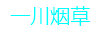
<div>一川烟草</div>
<p>一川烟草</p>
</body>
</html>

3.优先级


运行结果:

但是style 权重更高
<body>
<div class="p" id="qwq" style="color: darkorchid;">一川烟草</div>
</body>
运行结果:
!important 最重要 ,权重最高

运行结果:
优先级注意事项


运行结果:

权重的叠加

盒子模型 边框border

<!DOCTYPE html>
<html lang="en">

<head>
    <meta charset="UTF-8">
    <meta http-equiv="X-UA-Compatible" content="IE=edge">
    <meta name="viewport" content="width=device-width, initial-scale=1.0">
    <title>Document</title>
    <style>
        div {
            width: 200px;
            height: 200px;
            /* 边框颜色 */
            border-color: pink;
            /* 边框样式 */
            border-style: solid;
            /* 边框粗细 */
            border-width: 1px;
        }
    </style>
</head>

<body>
    <div></div>
</body>

</html>
border复合写法
<!DOCTYPE html>
<html lang="en">

<head>
    <meta charset="UTF-8">
    <meta http-equiv="X-UA-Compatible" content="IE=edge">
    <meta name="viewport" content="width=device-width, initial-scale=1.0">
    <title>Document</title>
    <style>
        div {
            width: 200px;
            height: 200px;
            /* border-color: pink;
            border-style: solid;
            border-width: 1px; */
            /* 复合写法 */
            border: pink 1px solid;
        }
    </style>
</head>

<body>
    <div></div>
</body>

</html>
上下左右边框可以分开写
而且具有层叠性
例如:
<!DOCTYPE html>
<html lang="en">

<head>
    <meta charset="UTF-8">
    <meta http-equiv="X-UA-Compatible" content="IE=edge">
    <meta name="viewport" content="width=device-width, initial-scale=1.0">
    <title>Document</title>
    <style>
        div {
            width: 200px;
            height: 200px;
            /* 其余边框 */
            border: dashed 10px purple;
            /* 上边框 */
            border-top: solid 5px pink;

        }
    </style>
</head>

<body>
    <div></div>
</body>

</html>
表格细线边框
<style>
        table {
            width: 600px;
            height: 249px;
        }

        table,
        td {
            border: purple 1px solid;
            /* 合并相邻的边框 */
            border-collapse: collapse;
            font-size: 14px;
            text-align: center;
        }
    </style>
原来:

加了style之后:

边框会影响盒子大小
盒子模型内边距padding

<!DOCTYPE html>
<html lang="en">

<head>
    <meta charset="UTF-8">
    <meta http-equiv="X-UA-Compatible" content="IE=edge">
    <meta name="viewport" content="width=device-width, initial-scale=1.0">
    <title>Document</title>
    <style>
        div {
            width: 200px;
            height: 200px;
            background-color: rgb(255, 167, 167);
            padding-left: 50px;
            padding-right: 50px;
            padding-top: 50px;

        }
    </style>
</head>

<body>
    <div>愿你去往之地皆为热土,愿你将遇之人皆为挚友。万千祈福皆如愿,逐梦长路化坦途。万物更新,旧疾当愈,长安常安。</div>
</body>

</html>
padding复合写法


新浪导航栏
<!DOCTYPE html>
<html lang="en">

<head>
    <meta charset="UTF-8">
    <meta http-equiv="X-UA-Compatible" content="IE=edge">
    <meta name="viewport" content="width=device-width, initial-scale=1.0">
    <title>Document</title>
    <style>
        .nav {
            height: 41px;
            line-height: 41px;
            border-color: #fcfcfc;
            color: #4c4c4c;
            border-top: 3px solid #ff8500;
            border-bottom: 1px solid #edeef0;
        }

        .nav a {
            height: 41px;
            font-size: 12px;
            color: #4c4c4c;
            text-decoration: none;
            display: inline-block;
            padding: 0 20px;

        }

        .nav a:hover {
            background-color: rgb(228, 228, 228);
            color: #ff8500;
        }
    </style>
</head>

<body>
    <div class="nav">
        <a href="#">设为首页</a>
        <a href="#">手机新浪网</a>
        <a href="#">移动客户端</a>
        <a href="#">博客</a>
        <a href="#">微博</a>
        <a href="#">关注我</a>
    </div>
</body>

</html>
小米侧栏修改
缩进用padding
<!DOCTYPE html>
<html lang="en">

<head>
    <meta charset="UTF-8">
    <meta http-equiv="X-UA-Compatible" content="IE=edge">
    <meta name="viewport" content="width=device-width, initial-scale=1.0">
    <title>Document</title>
    <style>
        a {
            display: block;
            width: 234px;
            height: 42px;
            text-decoration: none;
            color: rgb(255, 255, 255);
            background-color: rgb(156, 155, 163);
            padding-left: 40px;
            line-height: 42px;
        }

        a:hover {
            background-color: rgb(255, 103, 0);
        }
    </style>
</head>

<body>
    <a href="#">手机</a>
    <a href="#">电视</a>
    <a href="#">笔记本 平板</a>
    <a href="#">家电</a>
    <a href="#">出行 穿戴</a>
    <a href="#">智能 路由器</a>
    <a href="#">电源 配件</a>
    <a href="#">健康 儿童</a>
    <a href="#">耳机 音箱</a>
    <a href="#">生活 箱包</a>
</body>

</html>
padding不会撑开盒子的情况
<!DOCTYPE html>
<html lang="en">

<head>
    <meta charset="UTF-8">
    <meta http-equiv="X-UA-Compatible" content="IE=edge">
    <meta name="viewport" content="width=device-width, initial-scale=1.0">
    <title>Document</title>
    <style>
        h1 {
            width: 100%;
            height: 200px;
            background-color: pink;
            padding: 30px;
        }

        div {
            width: 300px;
            height: 200px;
            background-color: rgb(154, 241, 103);
        }

        div p {
            width: 100%;
            padding: 30px;
            background-color: rgb(139, 0, 0);
        }
    </style>
</head>

<body>
    <h1></h1>
    <div>
        <p></p>
    </div>
</body>

</html>
没给盒子width,盒子就不会变宽
给盒子 width:100%; 盒子就会变宽
给盒子里面的p加 width:100%; padding,会超出盒子宽度

盒子模型外边距margin

<!DOCTYPE html>
<html lang="en">

<head>
    <meta charset="UTF-8">
    <meta http-equiv="X-UA-Compatible" content="IE=edge">
    <meta name="viewport" content="width=device-width, initial-scale=1.0">
    <title>Document</title>
    <style>
        div {
            height: 200px;
            width: 200px;
            background-color: rgb(255, 124, 124);
        }

        /* .one {
            margin-bottom: 20px;
        } */
        .two {
            margin-top: 20px;
        }
    </style>
</head>

<body>
    <div class="one">1</div>
    <div class="two">2</div>
</body>

</html>
外边距典型应用
行内元素和行内块元素水平居中

外边距合并

父元素和子元素的塌陷问题,加一个外边框就能解决
<!DOCTYPE html>
<html lang="en">

<head>
    <meta charset="UTF-8">
    <meta http-equiv="X-UA-Compatible" content="IE=edge">
    <meta name="viewport" content="width=device-width, initial-scale=1.0">
    <title>Document</title>
    <style>
        .father {
            width: 400px;
            height: 400px;
            background-color: rgb(255, 168, 168);
            margin-top: 50px;
            /* border: 1px blue solid; */
            /* border: 1px transparent solid; */
            /* padding: 1px; */
            overflow: hidden;
        }

        .son {
            width: 200px;
            height: 200px;
            background-color: rgb(91, 236, 205);
            margin-top: 100px;
        }
    </style>
</head>

<body>
    <div class="father">
        <div class="son"></div>
    </div>
</body>

</html>
也可以将边框改为透明
transparent

加内边距也能解决塌陷问题
padding:1px;
清除内外边距

<!DOCTYPE html>
<html lang="en">

<head>
    <meta charset="UTF-8">
    <meta http-equiv="X-UA-Compatible" content="IE=edge">
    <meta name="viewport" content="width=device-width, initial-scale=1.0">
    <title>Document</title>
    <style>
        * {
            padding: 0;
            margin: 0;
        }

        span {
            margin: 20px;
        }
    </style>
</head>

<body>
    <div>456789</div>
    <ul>
        <li>asd</li>
    </ul>
    <span>行内元素尽量只设置左右边距,不设置上下边距</span>
</body>

</html>
综合案例1
产品模块布局
使用ps
<!DOCTYPE html>
<html lang="en">

<head>
    <meta charset="UTF-8">
    <meta http-equiv="X-UA-Compatible" content="IE=edge">
    <meta name="viewport" content="width=device-width, initial-scale=1.0">
    <title>Document</title>
    <style>
        * {
            padding: 0;
            margin: 0;
        }

        body {
            background-color: #f5f5f5;
        }

        .box {
            width: 351px;
            height: 452px;
            background-color: #fff;
            /* 让块级盒子水平居中 */
            margin: 100px auto;
        }

        .name {
            /* padding: 0; */
            font-size: 17px;
        }

        a {
            text-decoration: none;
            color: black;
        }

        .review {
            padding-top: 5px;
            color: #b0b0b0;
            font-size: 10px;
        }

        .v {
            padding-top: 27px;
        }

        .v span {
            color: #ff7f00;
            font-size: 14px;
        }

        .v h4 {
            display: inline-block;
            color: #b0b0b0;
            font-weight: 400;
            font-size: 14px;
        }

        em {
            font-style: normal;
            color: #ebe4e0;
            margin-left: 20px;
            margin-right: 7px;
        }
    </style>
</head>

<body>
    <a href="#">
        <div class="box" align="center">
            <img src="images/手机.jpg" alt="">
            <p class="name">Xiaomi MIX 4</p>
            <div class="review">CPU全面屏</div>
            <div class="v">
                <h4>小米手机...</h4>
                <em>|</em>
                <span>4999元起</span>
            </div>
        </div>
    </a>
</body>

</html> 
综合案例2
快报模块列表制作
<!DOCTYPE html>
<html lang="en">

<head>
    <meta charset="UTF-8">
    <meta http-equiv="X-UA-Compatible" content="IE=edge">
    <meta name="viewport" content="width=device-width, initial-scale=1.0">
    <title>Document</title>
    <style>
        * {
            margin: 0;
            padding: 0;
        }

        .box {
            width: 248px;
            height: 163px;
            border: 1px solid #ccc;
            margin: 100px auto;
        }

        .box h3 {
            height: 32px;
            border-bottom: 1px dotted #ccc;
            font-size: 14px;
            font-weight: 400;
            height: 32px;
            padding-left: 15px;
        }

        .box ul li a {
            font-size: 12px;
            color: #666;
            text-decoration: none;
        }

        .box ul li a:hover {
            text-decoration: underline;
        }

        li {
            /* 去掉li前面的小圆点 */
            list-style: none;
        }

        .box ul li {
            height: 23px;
        }

        ul {
            padding: 17px 0 0 18px;
        }
    </style>
</head>

<body>
    <div class="box">
        <h3>品优购快报</h3>
        <ul>
            <li><a href="#">【特惠】爆款耳机5折秒!</a></li>
            <li><a href="#">【特惠】母亲节,健康好礼低至5折!</a></li>
            <li><a href="#">【特惠】爆款耳机5折秒!</a></li>
            <li><a href="#">【特惠】9.9元洗100张照片!</a></li>
            <li><a href="#">【特惠】长虹智能空调立省1000</a></li>
        </ul>
    </div>
</body>

</html>


 7174
7174


 被折叠的 条评论
为什么被折叠?
被折叠的 条评论
为什么被折叠?
 到【灌水乐园】发言


