


一、元素的显示和隐藏
默认情况下元素是正常显示的,但也可根据需要将其隐藏。
display:none;
将原本的元素隐藏.
下面是应用元素的显示和隐藏的实例:
<!DOCTYPE html>
<html lang="en">

<head>
    <meta charset="UTF-8">
    <meta name="viewport" content="width=device-width, initial-scale=1.0">
    <title>Document</title>
    <style>
        .father {
            width: 300px;
            height: 300px;
            margin: 0 auto;
            border: 1px solid rebeccapurple;
        }

        .son {
            width: 100px;
            height: 100px;
            background-color: aqua;
            display: none;
        }
        /* 本来son元素是隐藏的,当鼠标悬停到father元素上时,使元素重新显示  */

        .father:hover .son {
            display: block;
        }
    </style>
</head>

<body>
    <div class="father">
        <div class="son">son</div>
    </div>
</body>

</html>
二、结构性伪类选择器
- :nth-child(n) 对指定序号的子元素设置样式(从前往后数)。参数可以使数字(1、2、3)、关键字(odd、even)、公式(2n、2n+3 :使用公式时,n从0开始),参数的索引起始值时1,而不是0。
- :nth-last-child(n) 对指定序号的子元素设置样式(从后往前数)。参数同上。
- :nth-of-type(n) 匹配指定序号的同一种类型的子元素(从前往后数)。参数同上。
- :nth-last-of-type(n) 匹配 指定序号的同一种类型的子元素(从后往前数)。参数同上。
<!DOCTYPE html>
<html lang="en">

<head>
    <meta charset="UTF-8">
    <meta name="viewport" content="width=device-width, initial-scale=1.0">
    <title>Document</title>
    <style>
        .nav li:nth-child(3) {
            color: aquamarine;
        }

        .nav li:nth-child(odd) {
            color: red;
        }

        .nav li:nth-child(even) {
            color: blue;
        }

        .nav li:nth-child(2n+1) {
            color: green;
        }
        /* .main {
            color: yellowgreen;
        } */

        .main p:nth-child(4) {
            color: red
        }

        .main p:nth-of-type(3) {
            color: blueviolet;
        }
    </style>
</head>

<body>
    <ul class="nav">
        <li>li元素1</li>
        <li>li元素2</li>
        <li>li元素3</li>
        <li>li元素4</li>
        <li>li元素5</li>
    </ul>

    <div class="main">
        <span>hello world</span>
        <p>partone</p>
        <p>partone</p>
        <!-- 目标元素 -->
        <p>partone</p>
        <p>partone</p>
        <p>partone</p>
    </div>
</body>

</html> 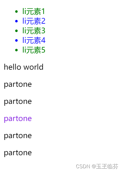
三、过渡
过渡(transition)是CSS3中具有颠覆性的特征之一,我们可以在不使用 Flash 动画或 JavaScript 的情况下,当元素从一种样式变换为另一种样式时为元素添加效果。
语法格式:
transition: 要过渡的属性 花费时间 运动曲线 何时开始;
如果有多组属性变化,还是用逗号隔开。
<style>
        .box {
            width: 200px;
            height: 100px;
            background-color: red;
            /* 过渡 */
            /* transition: 要过渡的属性 花费的时间   */
            transition: width 1s, height 1s;
        }

        .box:hover {
            width: 1000px;
            height: 200px;
        }
    </style>
</head>

<body>
    <div class="box"></div>
</body>
四、 2D变形(CSS3) transform
transform是CSS3中具有颠覆性的特征之一,可以实现元素的位移、旋转、倾斜、缩放,甚至支持矩阵方式,配合过渡和即将学习的动画知识,可以取代大量之前只能靠Flash才可以实现的效果。
4.1.移动 translate(x, y)
translate 移动平移的意思
使用translate方法来将文字或图像在水平方向和垂直方向上分别移动。
translate(x,y)水平方向和垂直方向同时移动(也就是X轴和Y轴同时移动)
<style>
        .box {
            width: 200px;
            height: 100px;
            background-color: aqua;
            /* 过渡 */
            margin: 300px auto;
            transition: transform 0.6s;
        }
        /* 鼠标悬浮触发效果 */

        .box:hover {
            /* Y轴方向上的移动 */
            transform: translateY(-10px);
            /* 给盒子加上阴影 */
            box-shadow: 3px 3px 5px #a03e3e;
        }
    </style>
</head>

<body>
    <div class="box"></div>
</body>
4.2.缩放scale(x,y)
scale(X,Y)使元素水平方向和垂直方向同时缩放(也就是X轴和Y轴同时缩放)
scaleX(x)元素仅水平方向缩放(X轴缩放)
scaleY(y)元素仅垂直方向缩放(Y轴缩放)
scale()的取值默认的值为1,当值设置为0.01到0.99之间的任何值,作用使一个元素缩小;而 任何大于1的值,作用是让元素放大。
<style>
        .box {
            width: 200px;
            height: 100px;
            background-color: aqua;
            /* 过渡 */
            transition: all 1s;
            margin: 100px auto;
        }

        .box:hover {
            /* 缩小:[0,1] 1不变大也不缩小 扩大:大于1 */
            transform: scale(1.1, 1.1);
            /* 如果 */
            /* transform: scale(1, 1); */
        }
    </style>
</head>

<body>
    <div class="box"></div>
</body>
4.3.旋转 rotate(deg)
可以对元素进行旋转,正值为顺时针,负值为逆时针;
 <style>
        .box {
            width: 200px;
            height: 100px;
            background-color: aqua;
            /* 过渡 */
            transition: all 1s;
            margin: 100px auto;
        }

        .box:hover {
            /* 括号中的是旋转的度数 */
            transform: rotate(360deg);
        }
    </style>
</head>

<body>
    <div class="box"></div>
</body>
五、动画(CSS3) animation
5.1.定义动画
@keyframes 动画名称 {
from{ 开始位置 }
to{ 结束 }
}@keyframes 动画名称 {
0%
55%
....
100%
}
/* 关于几个值,除了名字,动画时间,延时有严格顺序要求其它随意*/
5.2.调用动画
animation:动画名称 动画时间 运动曲线 何时开始 播放次数 是否反方向;
常用属性写法 :
animation-iteration-count:infinite; 无限循环播放
animation-play-state:paused; 暂停动画animation-direction:alternate;(动画交替反向运行)alternate-reverse;(动画反向交替运行)reverse(动画反向);
animation-fill-mode: forwards(动画完成后,保持最后状态);
animation-fill-mode: backwards;(动画将应用在 animation-delay 定义期间启动动画的第一次迭代的关键帧中定义的属性值。)
animation-fill-mode: both;(动画遵循 forwards 和 backwards 的规则。)
<!DOCTYPE html>
<html lang="en">

<head>
    <meta charset="UTF-8">
    <meta name="viewport" content="width=device-width, initial-scale=1.0">
    <title>Document</title>
    <style>
        @keyframes move {
            from {
                left: 0px;
            }
            to {
                left: 600px;
            }
        }

        .fly {
            /* 调用动画 */
            /* animation:动画名称 动画时间 运动曲线 */
            animation: move 2s linear;
            /* 规定动画之外的的状态 */
            /* fforwards动画完成后,保持最后的状态 */
            position: absolute;
            left: 0;
            top: 0;
        }
    </style>
</head>

<body>
    <img src="../my-summary/img/汽车.gif" alt="" class="fly">
</body>

</html>


 765
765


 被折叠的 条评论
为什么被折叠?
被折叠的 条评论
为什么被折叠?
 到【灌水乐园】发言


