


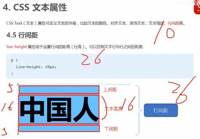
改变行高只是改变上下间距的大小,
目标:
- 知道移动WEB的开发现状
- 写出标准的viewport
- 使用移动WEB的调试方法
- 说出移动端常见的布局方案
- 描述流式分布
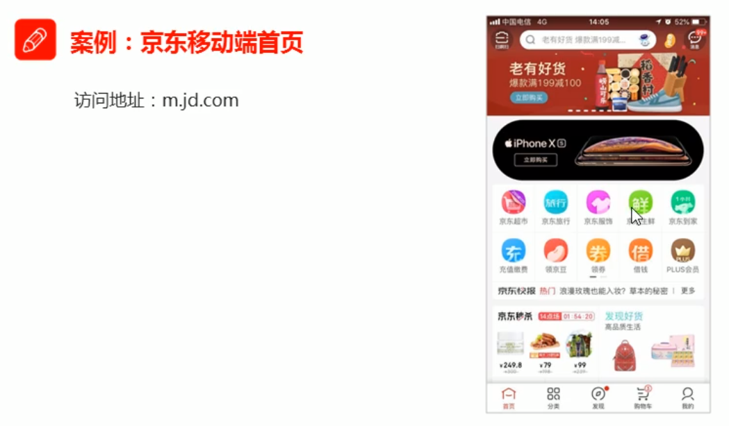
- 独立完成京东移动端首页
1. 移动端基础

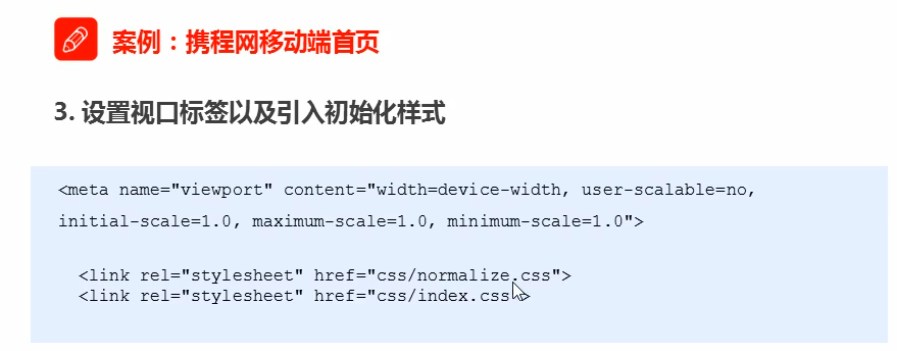
2. 视口
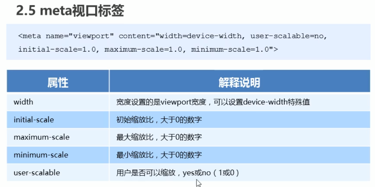
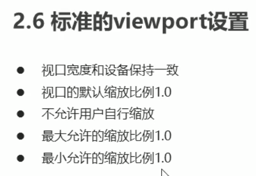
<meta name="viewport" content="width=device-width, initial-scale=1.0, maximum-scale=1.0, user-scalable=0" />
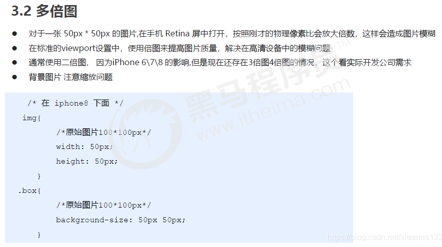
3. 二倍图
二倍精灵图做法
- 先缩小一倍精灵图
- 量logo尺寸和坐标
- css中background-size缩小一倍 :114px auto ; (原来宽度是228)
- 设置background-position为量出来的坐标点


2014以上版本ps才能安装
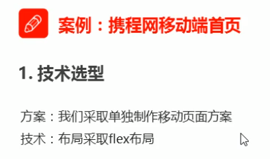
4. 移动端开发选择
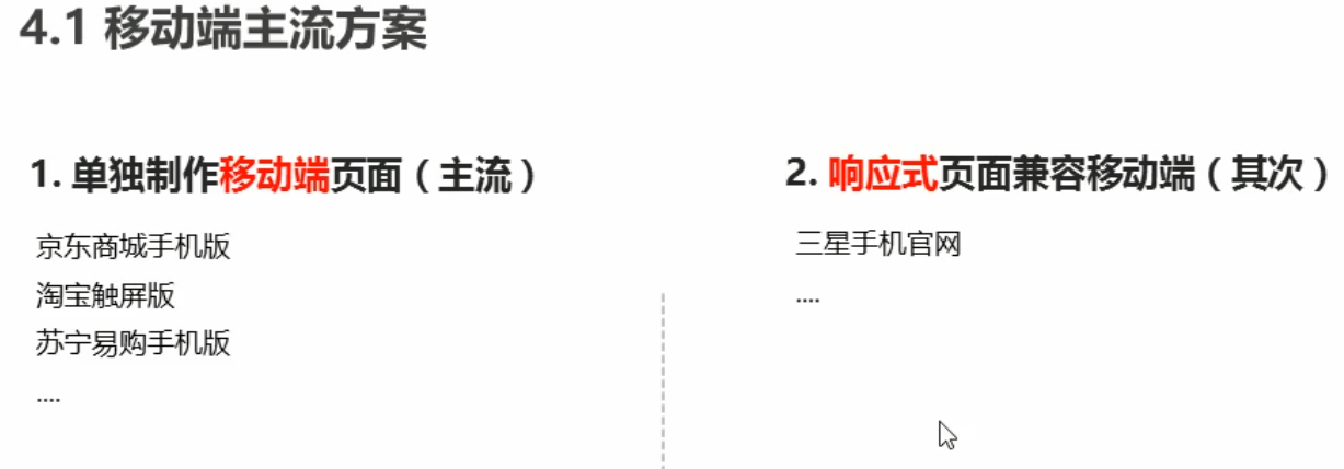


5. 移动端技术解决方案


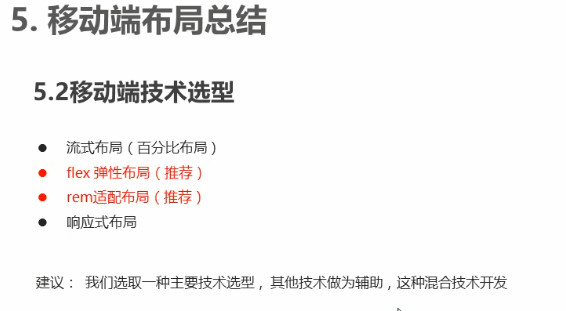
6. 移动端常见布局

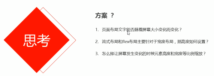
流式布局


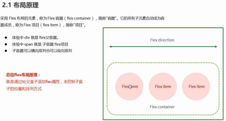
flex布局
使用flex 布局后容器和item都会变成块级元素
<style>
a {
display: flex;
text-decoration: none;
width: 100px;
height: 100px;
background-color: aqua;
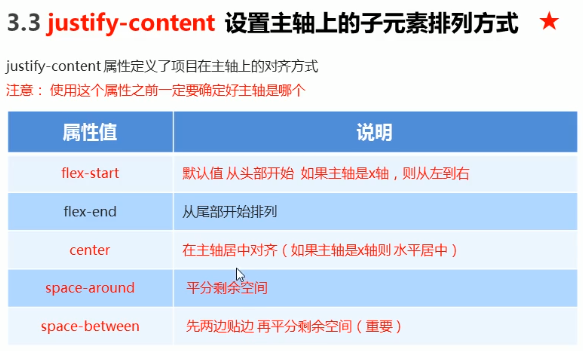
justify-content: space-around;
align-items: center;
}
span {
width: 20px;
height: 20px;
background-color: blueviolet;
}
</style>
</head>
<body>
<a href="">
<span>1</span>
<span>1</span>
</a>
</body>


可以用百分比20%
案例
//二倍图
.search::before {
    content: '';
    position: absolute;
    top: 5px;
    left: 5px;
    width: 15px;
    height: 15px;
    background: url(../images/sprite.png) no-repeat -59px -279px;
    background-size: 104px auto;
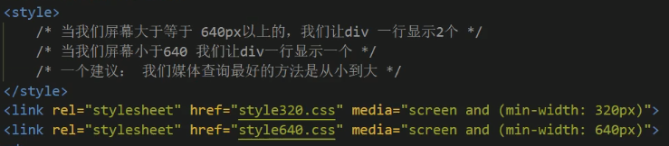
rem+媒体查询适配布局


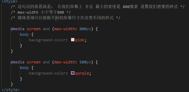
 @media screen and (max-width: 539px)  {
            body {
                background-color: blue;
            }
        }
        @media screen and (min-width: 540px) and (max-width: 969px ) {//可以省略(max-width:969px)效果一样
            body {
                background-color: pink;
            }
        }
        @media screen and (min-width: 970px) {
            body {
                background-color: saddlebrown;
            }
        }

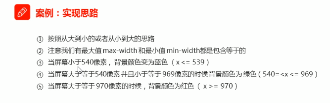
小于用max-width,大于用min-width
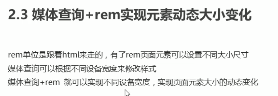


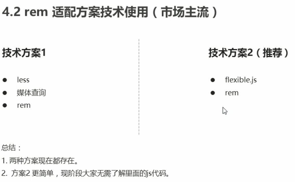
1.rem+less+媒体查询
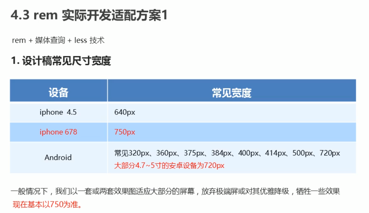
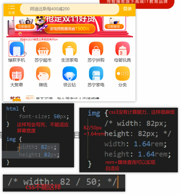
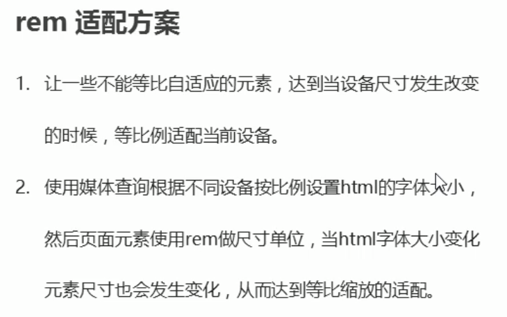
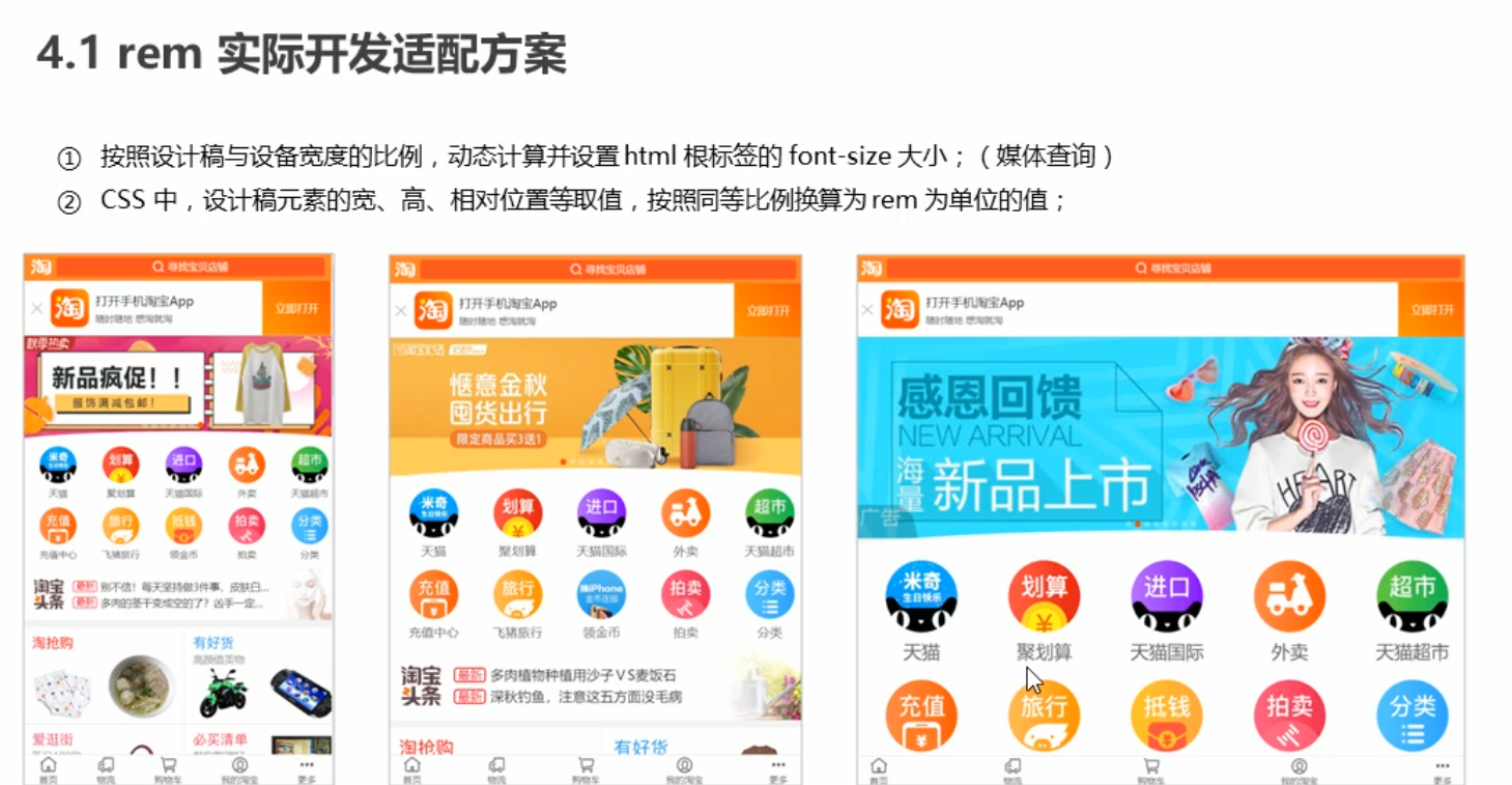
我们要做的效果是,在大分辨率的设备下,图片文字显示大一点,小分辨率的设备图片文字显示小一点
- 页面中的图片、文字不能用绝对单位px写死!,rem是相对单位,相对于根元素html的font-size大小,我们可以在不同的分辨率下改变html的font-size大小就可以实现、文字图片根设备适配的效果了。
- 那么根元素的font-size要去如何根据分辨率去改变呢?这就要用到媒体查询@media了,
- 要实现从320分辨率的设备到750px的设备图片文字等比例缩放大小,根元素的font-size不能乱写,要按比例!
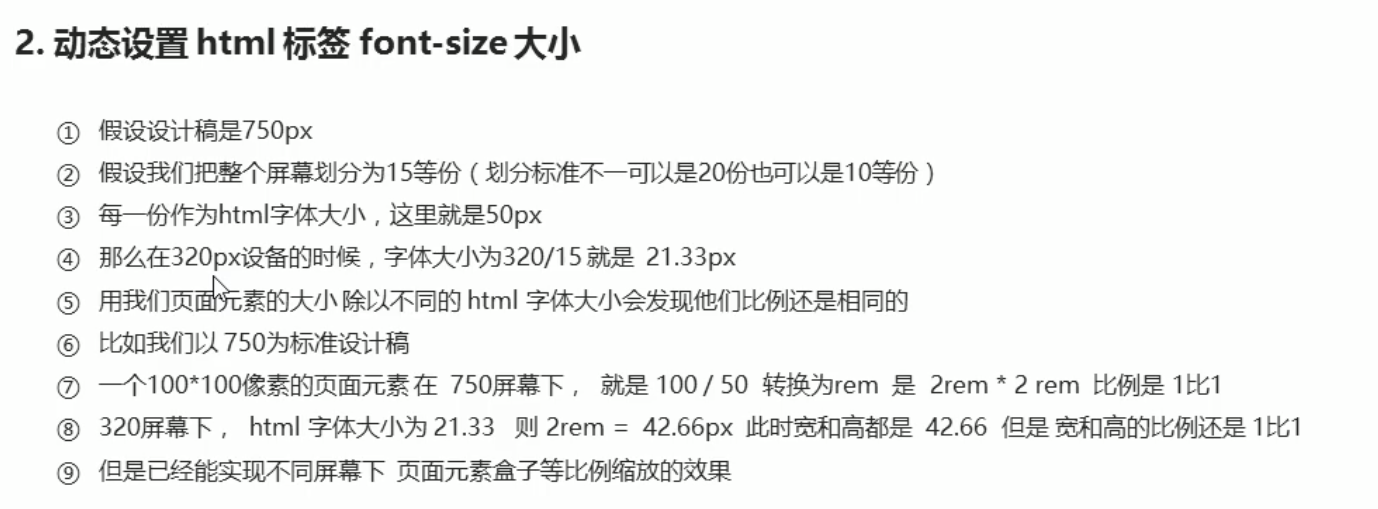
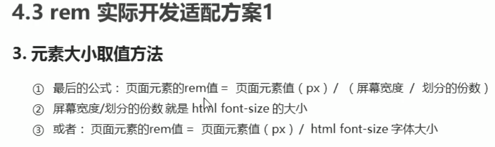
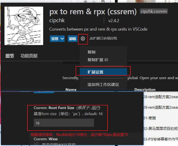
- 例如2px的设备的font-size我们设为1,那么4px的设备的font-size我们就要设为2,320像素的设备/15份=21.33 750像素的设备就也要 / 15 = 50px,所以750px的设备font-size为50px,这样就可以实现等比例! 当然这个除的分数随便你!
- 在一张750px的设计稿下量的div的宽度为100px,那我们应该怎么去写呢
- 首先,等比例的不同分辨率320px和750px的font-size我们已经设好了 分别为 21.33px和50px
- 根据设计稿,要在750像素的情况下,div要宽高为100px,
- div的宽高要用rem做单位为了适配
- 那么在750px的分辨率下 div的宽高要多少rem才能等于100px呢?
- 就用750分辨率下的html的font-size来运算 100px / 50px = 2 所以div的宽高可以是 2rem
- 在不同分辨率下,媒体查询改变对应font-size, div的宽高也等比例缩放了
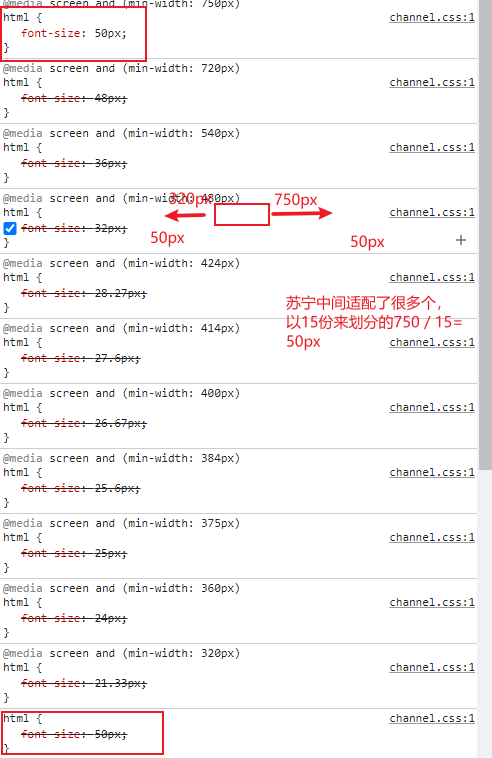
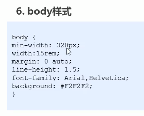
注意html {font-size:50px}要写在最前面,写后面会被层叠掉
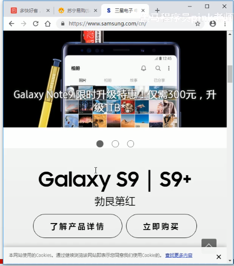
pc端也可以访问移动端的网站
// 搜索模块
.search-content {
    position: fixed;
    left: 50%;
    top: 0;
    transform: translateX(-50%);
    height: (88rem / @baseFont);
    width: 15rem;
    background-color: #FFC001;
}
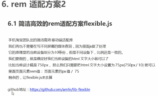
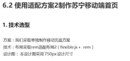
2.flexible.js +rem


使用时,当屏幕大于750px,font-size还是会跟随屏幕来放大
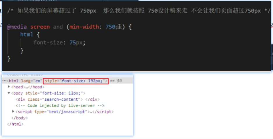
现在还是不行,还是超过750px
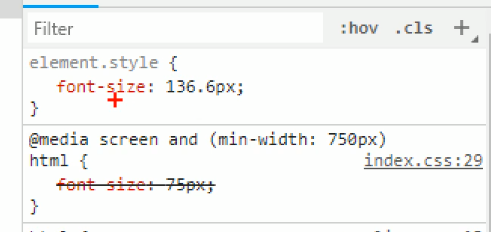
样式被覆盖了
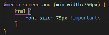
解决方法:提高权重
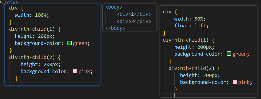
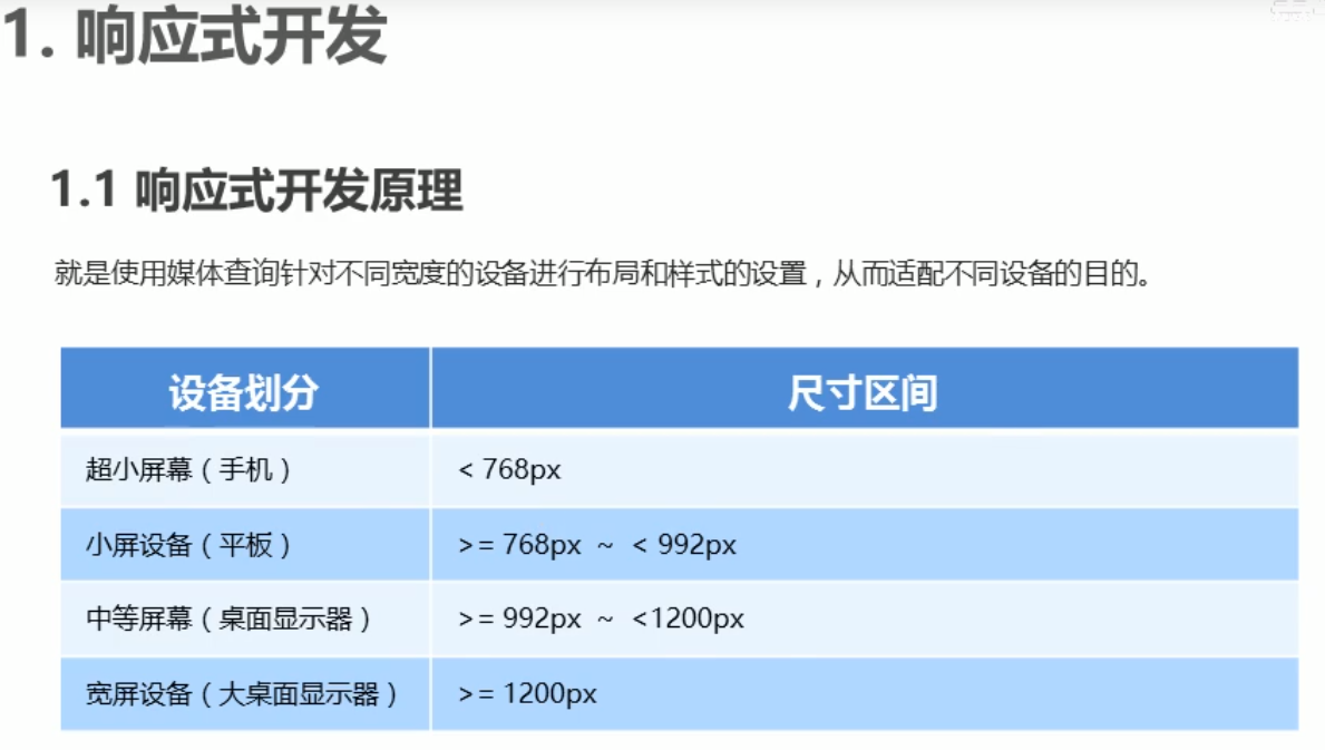
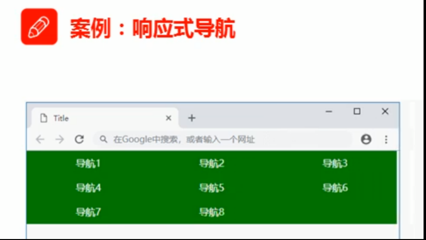
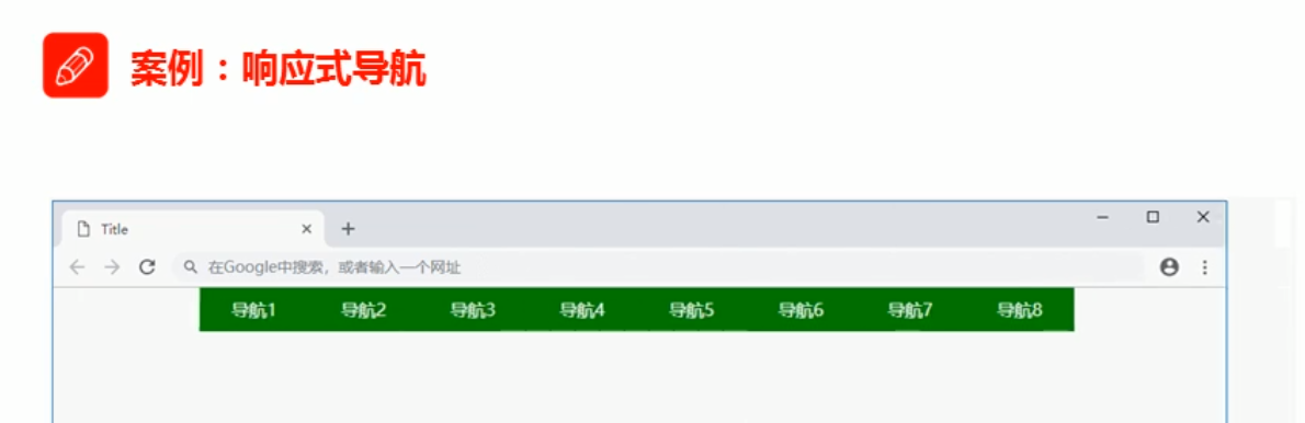
响应式布局
一套页面可以适配三种设备手机、PC、ipad


<style>
        * {
            margin: 0;
            padding: 0;
        }
        .container {
            height: 150px;
            background-color: pink;
            margin: 0 auto;
        }
        /* 超小屏幕下 小于 768 布局容器的宽度为 100% */
        @media screen and (max-width:767px ){
            .container {
                width: 100%;
            }
        }
        /* 小屏幕下 大于等于768 布局容器改为 750 px */
        @media screen and (min-width:768px) {
            .container {
                width: 750px;
            }
        }
        /* 中等屏幕 大于992px 布局容器设置为 970px */
        @media screen and (min-width:992px) {
            .container {
                width: 970px;
            }
        }
        /* 大屏幕 大于1200px 布局容器宽度设置为1170px */
        @media screen and (min-width:1200px) {
            .container {
                width: 1170px;
            }
        }
        .container ul li {
            float: left;
            width: 11.11%;
            height: 30px;
            list-style: none;
            text-align: center;
            background-color: green;
        }
        @media screen and (max-width:767px) {
            .container ul li {
                width: 33.33%;
            }
        }
    </style>
</head>
<body>
    <div class="container">
        <ul>
            <li>导航栏</li>
            <li>导航栏</li>
            <li>导航栏</li>
            <li>导航栏</li>
            <li>导航栏</li>
            <li>导航栏</li>
            <li>导航栏</li>
            <li>导航栏</li>
            <li>导航栏</li>
        </ul>
    </div>

移动端布局总结
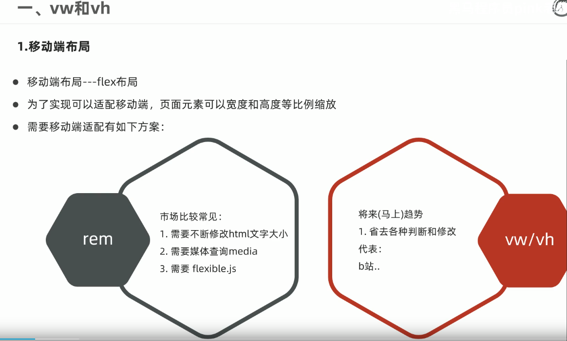
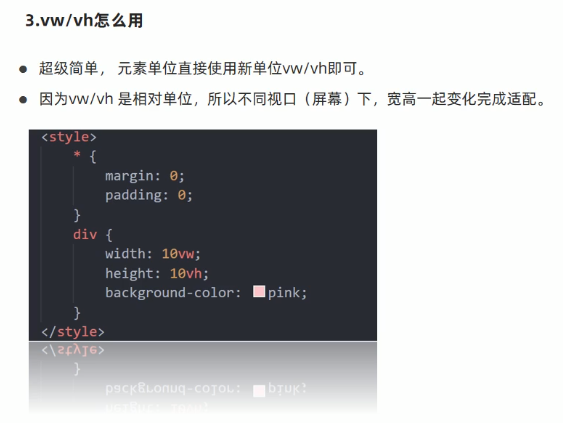
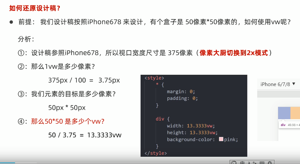
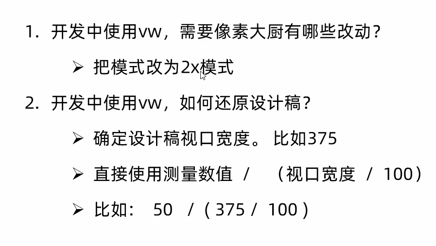
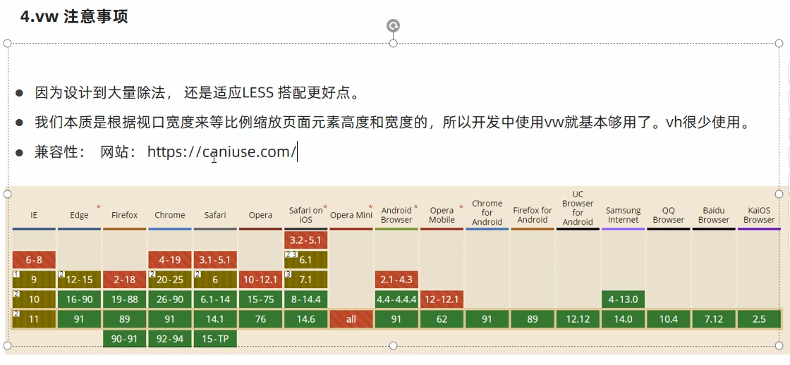
vw vh移动端布局
[外链图片转存失败,源站可能有防盗链机制,建议将图片保存下来直接上传(img-s4u5KZUC-1628409911062)(C:\Users\KAN\AppData\Roaming\Typora\typora-user-images\image-20210701211031565.png)]


 321
321


 被折叠的 条评论
为什么被折叠?
被折叠的 条评论
为什么被折叠?
 到【灌水乐园】发言


