


本网页为html+css完成的页面,仅为学习交流之用。页面非常粗糙,有不足之处请谅解。
另:页面为一个,不可跳转。
目录
2、在文件夹里新建一个HTML文档,名字随意。例如:料理次元官网-伪.html
3、在 料理次元官网-伪 这个文件夹里新建一个文件夹,命名为css(小写)。
4、将网页所用图片资源下载到刚才新建的文件夹:料理次元官网-伪
代码部分:
1、HTML页面
料理次元官网-伪.html
<!DOCTYPE html>
<html lang="en">

<head>
    <meta charset="UTF-8">
    <meta http-equiv="X-UA-Compatible" content="IE=edge">
    <meta name="viewport" content="width=device-width, initial-scale=1.0">
    <title>料理次元官网-伪</title>
    <link rel="stylesheet" href="./css/料理次元官网-伪.css">
    <link rel="stylesheet" href="./css/料理次元动画效果.css">
</head>

<body>
    <!-- 左侧小人 -->
    <div class="side-character"></div>
    <!-- 第一部分 -->
    <div class="box-one">
        <!-- 1-5 -->
        <div class="character character1"></div>
        <div class="character character2"></div>
        <div class="character character3"></div>
        <div class="character character4"></div>
        <div class="character character5"></div>
        <!-- 6-10 -->
        <div class="character character6"></div>
        <div class="character character7"></div>
        <div class="character character8"></div>
        <div class="character character9"></div>
        <div class="character character10"></div>
        <!-- 11 -->
        <div class="character character11"></div>
        <header></header>
        <!-- 导航栏 -->
        <nav>
            <a href="" class="logo">料理次元官网</a>
            <div class="nav-list-wrap">
                <ul class="nav-list">
                    <li><a href="">首页</a></li>
                    <li><a href="">人设站</a></li>
                    <li><a href="">同人作品</a></li>
                    <li><a href="">世界观</a></li>
                </ul>
            </div>
        </nav>
        <!-- 一二部分分隔 -->
        <div class="divide">
            <div class="box-one-divide cloud1"></div>
            <div class="box-one-divide cloud2"></div>
            <div class="box-one-divide cloud3"></div>
        </div>
    </div>
    <!-- 第二部分 -->
    <div class="box-two">
        <div class="news-animation">
            <div class="animation animation1"></div>
            <div class="animation animation2"></div>
            <div class="animation animation3"></div>
            <div class="animation animation4"></div>
            <div class="pay">
                <div class="pay-picture"></div>
                <div class="pay-border"></div>
            </div>
        </div>
    </div>
    <!-- 第三部分 -->
    <div class="box-three">
        <div class="box-three-title"></div>
        <div class="characters-introduction-bg1"></div>
        <div class="characters-introduction-bg2"></div>
        <div class="characters-introduction-decorate"></div>
        <!-- 人物具体介绍 -->
        <div class="characters-introduction1">
            <div class="characters-introduction1-title"></div>
            <div class="characters-introduction1-contrnt">
                相当的笨手笨脚,性格也比较软弱给人一种软绵绵的感觉。兴趣是呆在花丛发呆,无论多平坦的地面都能施展特技平地摔。散发出一种“让人想保护(想欺负)”的气场,主要是焦急或者被欺负时候那种想哭的表情非常可爱。
            </div>
            <div class="characters-introduction1-picture"></div>
            <div class="characters-introduction1-button"></div>
        </div>
        <div class="characters-introduction2">
            <div class="characters-introduction2-title"></div>
            <div class="characters-introduction2-contrnt">
                相当的傲娇,高冷的时候和害羞的时候有很大的反差,一旦撒起娇格外的甜。最喜欢的事情是洗过澡之后香喷喷的躲在被窝里调戏头顶的小白鸭,也是她最好的朋友。
            </div>
            <div class="characters-introduction2-picture"></div>
            <div class="characters-introduction2-button"></div>
        </div>
        <div class="characters-introduction3">
            <div class="characters-introduction3-title"></div>
            <div class="characters-introduction3-contrnt">
                是个喜欢自由自在,不受约束的少女。一派江户人的气质,讲话有些江户腔。性格稍微有点狂妄,每天背着很多食材但是行动又很灵巧,出乎意料地容易上当。
            </div>
            <div class="characters-introduction3-picture"></div>
            <div class="characters-introduction3-button"></div>
        </div>
        <div class="characters-introduction4">
            <div class="characters-introduction4-title"></div>
            <div class="characters-introduction4-contrnt">
                起床的时候没什么精神。即使发困也会做好工作,但是在中途睡着也是经常的事。可一旦睡起觉,叫醒她是非常难的。最喜欢早上的光芒,感觉在清晨的太阳光下睡觉,是人生最大的幸福。
            </div>
            <div class="characters-introduction4-picture"></div>
            <div class="characters-introduction4-button"></div>
        </div>
        <div class="characters-introduction5">
            <div class="characters-introduction5-title"></div>
            <div class="characters-introduction5-contrnt">
                非常好的人,温柔、博爱、非常天然。在她不知道的地方,“简单教”正在建立起来,而白米饭被作为教祖供奉着。养活了几十亿的人的她,对于朴素的信徒来说,的确是神一般的存在。
            </div>
            <div class="characters-introduction5-picture"></div>
            <div class="characters-introduction5-button"></div>
        </div>
        <div class="characters-introduction6">
            <div class="characters-introduction6-title"></div>
            <div class="characters-introduction6-contrnt">
                沉默的小萝莉,胆子很小,说话经常犹豫,偶尔装大人神气。对味道很敏感,喜欢甜食,特别是五颜六色的食物。带着一只名为小绿的熊猫,语气意外的很凶,以保护香菜戚风蛋糕为己任。
            </div>
            <div class="characters-introduction6-picture"></div>
            <div class="characters-introduction6-button"></div>
        </div>
        <div class="characters-introduction-button">
            <ul>
                <li></li>
                <li></li>
                <li></li>
                <li></li>
                <li></li>
                <li></li>
            </ul>
        </div>
    </div>
    <!-- 第四部分 -->
    <div class="box-four">
        <div class="box-four-title"></div>
        <div class="box-four-video"></div>
        <div class="box-four-cosplay"></div>
        <div class="box-four-ramification"></div>
        <div class="playgame-call"></div>
    </div>
    <!-- 第五部分 -->
    <div class="box-five">
        <div class="weibo">
            <div class="weibo-picture"></div>
            <div class="weibo-content">官方微博</div>
        </div>
        <div class="game-download">
            <div class="game-download-picture"></div>
            <div class="game-download-line"></div>
            <div class="game-download-content">扫码下载</div>
        </div>
        <div class="weixin">
            <div class="weixin-picture"></div>
            <div class="weixin-content">官方微信</div>
        </div>
    </div>
    <!-- 第六部分 -->
    <div class="box-six">
        <div class="company-logo">4</div>
        <ul class="box-six-content1">
            <li><a href="">zhaolugame@163.com</a></li>
            <li><a href="">754655350</a></li>
        </ul>
        <ul class="box-six-content2">
            <li>
                Copyright © 2013-2020 COCO ALL RIGHTS RESERVED.杭州朝露科技有限公司版权所有
            </li>
            <li>
                <a href=""></a>
                <a href="">浙公网安备33010802009275号</a>
            </li>
        </ul>
    </div>
    <!-- 旋转置顶六面体 -->
    <div class="box-seven">
        <ul>
            <li></li>
            <li></li>
            <li></li>
            <li></li>
            <li></li>
            <li></li>
        </ul>
    </div>
</body>

</html>
2、CSS页面布局部分
料理次元官网-伪.css
*{
    margin: 0;
    padding: 0;
}
html, body, div, ul, li, h1, h2, h3, h4, h5, h6, p, dl, dt, dd, ol, form, input, textarea, th, td, select, img {
    margin: 0;
    padding: 0;
}
a {
	text-decoration:none;
}
a:hover, a:visited {
    text-decoration: none;
}

/* 整体宽高 */
body{
    width: 1000px;
    height: auto;
    margin: 0px auto;
    background: url(../img/bg.png) no-repeat;
    background-repeat: round;
}

/* 第一部分 */
.box-one{
    width: 100%;
    height: 563px;
    background: url(../img/1602317806_3.jpg) no-repeat;
    background-repeat: round;
    position: relative;
}
.character1{
    width: 200px;
    height: 290px;
    background: url(../img/料理砵仔糕1.png) no-repeat;
    background-repeat: round;
    position: absolute;
    margin-top: 251px;
    margin-left: 817px;
    transform: scale(1);
    opacity: 0;
}
.character2{
    width: 251px;
    height: 301px;
    background: url(../img/料理玉子烧1.png) no-repeat;
    background-repeat: round;
    position: absolute;
    margin-top: 158px;
    margin-left: 632px;
    transform: scale(.8);
    opacity: 0;
}
.character3{
    width: 200px;
    height: 356px;
    background: url(../img/料理白米饭1.png) no-repeat;
    background-repeat: round;
    position: absolute;
    margin-top: 238px;
    margin-left: 717px;
    transform: scale(1.3);
    opacity: 0;
}
.character4{
    width: 200px;
    height: 259px;
    background: url(../img/料理西芹百合1a.png) no-repeat;
    background-repeat: round;
    position: absolute;
    margin-top: 211px;
    margin-left: 90px;
    transform: scale(1.45);
    opacity: 0;
}
.character5{
    width: 200px;
    height: 309px;
    background: url(../img/料理馄饨1.png) no-repeat;
    background-repeat: round;
    position: absolute;
    margin-top: 151px;
    margin-left: 449px;
    transform: scale(1.6);
    opacity: 0;
}
.character6{
    width: 270px;
    height: 327.5px;
    background: url(../img/料理小笼包1新.png) no-repeat;
    background-repeat: round;
    position: absolute;
    margin-top: 248px;
    margin-left: 589px;
    transform: scale(1);
    opacity: 0;
}
.character7{
    width: 200px;
    height: 236.4px;
    background: url(../img/料理可丽饼1.png) no-repeat;
    background-repeat: round;
    position: absolute;
    margin-top: 250px;
    margin-left: 498px;
    transform: scale(1.8);
    opacity: 0;
}
.character8{
    width: 159.25px;
    height: 227px;
    background: url(../img/料理艾果1.png) no-repeat;
    background-repeat: round;
    position: absolute;
    margin-top: 206px;
    margin-left: 382px;
    transform: scale(1.7);
    opacity: 0;
}
.character9{
    width: 302px;
    height: 302.7px;
    background: url(../img/料理马赛鱼汤1.png) no-repeat;
    background-repeat: round;
    position: absolute;
    margin-top: 225px;
    margin-left: 170px;
    transform: scale(1.1);
    opacity: 0;
}
.character10{
    width: 322px;
    height: 360.5px;
    background: url(../img/料理次元馒头1.png) no-repeat;
    background-repeat: round;
    position: absolute;
    margin-top: 219px;
    margin-left: -37px;
    transform: scale(.95);
    opacity: 0;
}
.character11{
    width: 848px;
    height: 530px;
    background: url(../img/料理叉烧1.png) no-repeat 0px -48px;
    background-repeat: repeat;
    position: absolute;
    margin-top: 165px;
    margin-left: -19px;
    transform: scale(.5);
    opacity: 0;
}
/* 导航栏 */
nav{
    width: 1818px;
    height: 111px;
    background: url(../img/bg_nav.png) no-repeat 0px 0px;
    background-repeat: repeat;
    transform: scale(.55);
    margin-top: -30px;
    margin-left: -410px;
    z-index: 5;
    position: fixed;
}
.logo{
    width: 340px;
    height: 160px;
    background: url(../img/cd9faa3495cea0d0c97c63457f903f489dc5012c.png) no-repeat;
    background-repeat: repeat;
    transform: scale(.7);
    z-index: 6;
    position: absolute;
    margin: -13px 259px;
    text-indent: -999em;
}
.nav-list-wrap{
    width: 700px;
    height: 60px;
    z-index: 6;
    position: absolute;
    margin: 41px 624px;
}
.nav-list-wrap>ul{
    list-style: none;
}
.nav-list-wrap>ul>li{
    display: inline-block;
    padding: 0px 40px;
}
.nav-list-wrap>ul>li>a{
    font-size: 24px;
    color: rgb(119, 70, 22);
}
/* 第一部分 分隔 */
.cloud1{
    width: 800px;
    height: 120px;
    position: absolute;
    margin-top: 470px;
    margin-left: -92px;
    background: url(../img/header_cloud.png) no-repeat -1343px 0px;
    background-repeat: repeat;
    transform: scale(.77);
    opacity: .9;
}
.cloud2{
    width: 1300px;
    height: 120px;
    position: absolute;
    margin-top: 470px;
    margin-left: -150px;
    background: url(../img/header_cloud.png) no-repeat -1147px 0px;
    background-repeat: repeat;
    transform: scale(.77);
}

/* 第二部分 */
.news-animation{
    width: 600px;
    height: 400px;
    margin: 40px auto;
    /* background-color: rgb(228, 151, 151); */
    position: relative;
}
.animation1{
    width: 100%;
    height: 368px;
    background: url(../img/料理次元登陆界面_切图.jpg) no-repeat 0px 0px;
    background-repeat: round;
    position: absolute;
    margin-top: 16px;
    opacity: 0;
}
.animation2{
    width: 100%;
    height: 296px;
    background: url(../img/动画2.jpg) no-repeat 0px 0px;
    background-repeat: round;
    position: absolute;
    margin-top: 52px;
    opacity: 0;
}
.animation3{
    width: 100%;
    height: 296px;
    background: url(../img/动画3.jpg) no-repeat 0px 0px;
    background-repeat: round;
    position: absolute;
    margin-top: 52px;
    opacity: 0;
}
.animation4{
    width: 100%;
    height: 329px;
    background: url(../img/香槟写真图.png) no-repeat 0px 0px;
    background-repeat: round;
    position: absolute;
    margin-top: 35.5px;
    opacity: 0;
}
.pay-picture{
    width: 128px;
    height: 128px;
    background: url(../img/video_btn_bg.png) no-repeat 0px 0px;
    background-repeat: round;
    position: absolute;
    margin-top: -64px;
    margin-left: 236px;
    transform: scale(.8);
    z-index: 2;
}
.pay-border{
    width: 171px;
    height: 171px;
    background: url(../img/video_round_bg.png) no-repeat 0px 0px;
    background-repeat: round;
    position: absolute;
    margin-top: -85.5px;
    margin-left: 214.5px;
    transform: scale(.8);
    z-index: 2;
}
/* 侧边人 */
.side-character{
    width: 650px;
    height: 908px;
    z-index: 18;
    background: url(../img/料理马卡龙1.png) no-repeat;
    background-repeat: round;
    opacity: .85;
    position: fixed;
    margin-top: 50px;
    margin-left: -209px;
}
/* 第三部分 */
.box-three{
    width: 100%;
    height: 710px;
    background-color: #f0f1e02e;
    position: relative;
}
.box-three-title{
    width: 380px;
    height: 88px;
    background: url(../img/juese_title_bg.png) no-repeat;
    background-repeat: round;
    transform: scale(.6);
    position: absolute;
    margin-top: 0px;
    margin-left: 130px;
}
.characters-introduction-bg1{
    width: 658px;
    height: 469px;
    background: url(../img/juese_bg.png) no-repeat;
    background-repeat: round;
    transform: scale(1.25);
    position: absolute;
    margin-top: 120px;
    margin-left: 185px;
}
.characters-introduction-bg2{
    width: 467px;
    height: 630px;
    background: url(../img/juese_page_bg.png) no-repeat;
    background-repeat: round;
    transform: scale(.8);
    position: absolute;
    margin-top: 60px;
    margin-left: 75px;
}
.characters-introduction-decorate{
    width: 339px;
    height: 215px;
    background: url(../img/chazi_bg.png) no-repeat;
    background-repeat: round;
    transform: scale(.8);
    position: absolute;
    margin-top: 49px;
    margin-left: -5px;
    z-index: 1;
}
/* 玉子烧 */
.characters-introduction1{
    opacity: 0;
}
.characters-introduction1-title{
    width: 365px;
    height: 142px;
    background: url(../img/yzs_title.png) no-repeat;
    background-repeat: round;
    transform: scale(.8);
    position: absolute;
    margin-top: 178px;
    margin-left: 130px;
}
.characters-introduction1-contrnt{
    width: 298px;
    height: auto;
    margin-left: 170px;
    font-size: 12px;
    color: #676767;
    position: absolute;
    line-height: 34px;
    margin-top: 320px;
}
.characters-introduction1-picture{
    width: 638px;
    height: 750px;
    background: url(../img/p8.png) no-repeat;
    background-repeat: round;
    transform: scale(.7);
    position: absolute;
    margin-top: -40px;
    margin-left: 390px;
}
.characters-introduction1-button{
    width: 65px;
    height: 65px;
    background: url(../img/b8.png) no-repeat;
    background-repeat: round;
    position: absolute;
    margin-top: 630px;
    margin-left: 792px;
    z-index: 1;
}
/* 北京烤鸭 */
.characters-introduction2{
    opacity: 0;
}
.characters-introduction2-title{
    width: 365px;
    height: 142px;
    background: url(../img/bjky_title.png) no-repeat;
    background-repeat: round;
    transform: scale(.8);
    position: absolute;
    margin-top: 178px;
    margin-left: 130px;
}
.characters-introduction2-contrnt{
    width: 298px;
    height: auto;
    margin-left: 170px;
    font-size: 12px;
    color: #676767;
    position: absolute;
    line-height: 34px;
    margin-top: 320px;
}
.characters-introduction2-picture{
    width: 614px;
    height: 828px;
    background: url(../img/p7.png) no-repeat;
    background-repeat: round;
    transform: scale(.7);
    position: absolute;
    margin-top: -80px;
    margin-left: 390px;
}
.characters-introduction2-button{
    width: 65px;
    height: 65px;
    background: url(../img/b7.png) no-repeat;
    background-repeat: round;
    position: absolute;
    margin-top: 630px;
    margin-left: 747px;
    z-index: 1;
}
/* 关东煮 */
.characters-introduction3{
    opacity: 0;
}
.characters-introduction3-title{
    width: 365px;
    height: 142px;
    background: url(../img/gdz_title.png) no-repeat;
    background-repeat: round;
    transform: scale(.8);
    position: absolute;
    margin-top: 178px;
    margin-left: 130px;
}
.characters-introduction3-contrnt{
    width: 298px;
    height: auto;
    margin-left: 170px;
    font-size: 12px;
    color: #676767;
    position: absolute;
    line-height: 34px;
    margin-top: 320px;
}
.characters-introduction3-picture{
    width: 506px;
    height: 734px;
    background: url(../img/p6.png) no-repeat;
    background-repeat: round;
    transform: scale(.7);
    position: absolute;
    margin-top: -22px;
    margin-left: 436px;
}
.characters-introduction3-button{
    width: 65px;
    height: 65px;
    background: url(../img/b6.png) no-repeat;
    background-repeat: round;
    position: absolute;
    margin-top: 630px;
    margin-left: 701px;
    z-index: 1;
}
/* 龙虾意面 */
.characters-introduction4{
    opacity: 0;
}
.characters-introduction4-title{
    width: 365px;
    height: 142px;
    background: url(../img/lxym_title.png) no-repeat;
    background-repeat: round;
    transform: scale(.8);
    position: absolute;
    margin-top: 178px;
    margin-left: 130px;
}
.characters-introduction4-contrnt{
    width: 298px;
    height: auto;
    margin-left: 170px;
    font-size: 12px;
    color: #676767;
    position: absolute;
    line-height: 34px;
    margin-top: 320px;
}
.characters-introduction4-picture{
    width: 706px;
    height: 689px;
    background: url(../img/p5.png) no-repeat;
    background-repeat: round;
    transform: scale(.7);
    position: absolute;
    margin-top: 1px;
    margin-left: 375px;
}
.characters-introduction4-button{
    width: 65px;
    height: 65px;
    background: url(../img/b5.png) no-repeat;
    background-repeat: round;
    position: absolute;
    margin-top: 630px;
    margin-left: 657px;
    z-index: 1;
}
/* 白米饭 */
.characters-introduction5{
    opacity: 0;
}
.characters-introduction5-title{
    width: 365px;
    height: 142px;
    background: url(../img/bmf_title.png) no-repeat;
    background-repeat: round;
    transform: scale(.8);
    position: absolute;
    margin-top: 178px;
    margin-left: 130px;
}
.characters-introduction5-contrnt{
    width: 298px;
    height: auto;
    margin-left: 170px;
    font-size: 12px;
    color: #676767;
    position: absolute;
    line-height: 34px;
    margin-top: 320px;
}
.characters-introduction5-picture{
    width: 521px;
    height: 743px;
    background: url(../img/p3.png) no-repeat;
    background-repeat: round;
    transform: scale(.7);
    position: absolute;
    margin-top: -27px;
    margin-left: 427px;
}
.characters-introduction5-button{
    width: 65px;
    height: 65px;
    background: url(../img/b3.png) no-repeat;
    background-repeat: round;
    position: absolute;
    margin-top: 630px;
    margin-left: 613px;
    z-index: 1;
}
/* 香菜蛋糕 */
.characters-introduction6{
    opacity: 0;
}
.characters-introduction6-title{
    width: 365px;
    height: 142px;
    background: url(../img/xcdg_title.png) no-repeat;
    background-repeat: round;
    transform: scale(.8);
    position: absolute;
    margin-top: 178px;
    margin-left: 130px;
}
.characters-introduction6-contrnt{
    width: 298px;
    height: auto;
    margin-left: 170px;
    font-size: 12px;
    color: #676767;
    position: absolute;
    line-height: 34px;
    margin-top: 320px;
}
.characters-introduction6-picture{
    width: 617px;
    height: 705px;
    background: url(../img/p2.png) no-repeat;
    background-repeat: round;
    transform: scale(.7);
    position: absolute;
    margin-top: -2px;
    margin-left: 400px;
}
.characters-introduction6-button{
    width: 65px;
    height: 65px;
    background: url(../img/b2.png) no-repeat;
    background-repeat: round;
    position: absolute;
    margin-top: 630px;
    margin-left: 567px;
    z-index: 1;
}
/* 原始按钮 */
.characters-introduction-button>ul{
    list-style: none;
    position: absolute;
    margin-top: 650px;
    margin-left: 570px;
}
.characters-introduction-button>ul>li{
    display: inline-block;
    list-style: none;
    width: 18px;
    height: 17px;
    background: url(../img/li_bg.png) no-repeat;
    background-repeat: round;
    box-sizing: border-box;
    margin-left: 20px;
    padding: 10px;
}

/* 第四部分 */
.box-four{
    width: 100%;
    height: 530px;
    background-color: rgba(252, 230, 172, 0.116);
    position: relative;
}
.box-four-title{
    width: 380px;
    height: 88px;
    background: url(../img/tongren_title_bg.png) no-repeat;
    background-repeat: round;
    transform: scale(.6);
    position: absolute;
    margin-top: 0px;
    margin-left: 130px;
}
.box-four-video{
    width: 641px;
    height: 547px;
    background: url(../img/tongren_girl_1.png) no-repeat;
    background-repeat: round;
    transform: scale(.6);
    position: absolute;
    margin-top: 0px;
    margin-left: -110px;
}
.box-four-cosplay{
    width: 413px;
    height: 540px;
    background: url(../img/tongren_girl_2.png) no-repeat;
    background-repeat: round;
    transform: scale(.6);
    position: absolute;
    margin-top: 0px;
    margin-left: 330px;
}
.box-four-ramification{
    width: 533px;
    height: 558px;
    background: url(../img/tongren_girl_3.png) no-repeat;
    background-repeat: round;
    transform: scale(.6);
    position: absolute;
    margin-top: -2px;
    margin-left: 570px;
}
.playgame-call{
    width: 660px;
    height: 23px;
    background: url(../img/t3.png) no-repeat;
    background-repeat: round;
    transform: scale(.7);
    position: absolute;
    margin-top: 500px;
    margin-left: 176px;
}

/* 第五部分 */
.box-five{
    width: 100%;
    height: 300px;
    background-color: rgba(165, 244, 247, .05);
    position: relative;
}
.weibo-picture{
    width: 150px;
    height: 150px;
    background: url(../img/e2.png) no-repeat;
    background-repeat: round;
    position: absolute;
    margin-top: 50px;
    margin-left: 200px;
}
.weibo-content{
    width: 150px;
    height: 150px;
    font-size: 18px;
    position: absolute;
    margin-top: 210px;
    margin-left: 238px;
}
.game-download-picture{
    width: 150px;
    height: 150px;
    background: url(../img/e.png) no-repeat;
    background-repeat: round;
    position: absolute;
    margin-top: 50px;
    margin-left: 450px;
}
.game-download-content{
    width: 150px;
    height: 150px;
    font-size: 18px;
    position: absolute;
    margin-top: 210px;
    margin-left: 488px;
}
.game-download-line{
    width: 150px;
    height: 10px;
    background: url(../img/line.png) no-repeat;
    background-repeat: round;
    position: absolute;
    margin-top: 50px;
    margin-left: 450px;
}
.weixin-picture{
    width: 150px;
    height: 150px;
    background: url(../img/e3.png) no-repeat;
    background-repeat: round;
    position: absolute;
    margin-top: 50px;
    margin-left: 700px;
}
.weixin-content{
    width: 150px;
    height: 150px;
    font-size: 18px;
    position: absolute;
    margin-top: 210px;
    margin-left: 738px;
}
/* 第六部分 */
.box-six{
    width: 100%;
    height: 150px;
    background: url(../img/footerbg.jpg) no-repeat;
    position: relative;
}
.company-logo{
    width: 200px;
    height: 118px;
    background: url(../img/footerlogo.png) no-repeat;
    background-repeat: round;
    position: absolute;
    transform: scale(.6);
    margin-top: 3px;
    margin-left: 125px;
}
.box-six-content1{
    list-style: none;
    width: 200px;
    height: 100px;
    position: absolute;
    margin-top: 24px;
    margin-left: 600px;
}
.box-six-content1 li:nth-of-type(2){
    margin-top: 9px;
}
.box-six-content1 a{
    font-size: 14px;
    color: #828287;
}
.box-six-content2{
    list-style: none;
    width: 600px;
    height: 100px;
    position: absolute;
    margin-top: 105px;
    margin-left: 385px;
}
.box-six-content2 li:nth-of-type(2){
    margin-top: 5px;
}
.box-six-content2 li,.box-six-content2 a{
    font-size: 12px;
    color: #8b8b8b;
}
.box-six-content2 li:nth-of-type(2) a:nth-of-type(1){
    display: inline-block;
    width: 20px;
    height: 20px;
    background: url(../img/sp_003.png) no-repeat;
    background-repeat: round;
}
/* 旋转置顶立方体 */
.box-seven{
    perspective: 1000px;
    position: fixed;
    margin-top: -2250px;
    margin-left: 900px;
    z-index: 8;
}
.box-seven>ul{
    width: 100px;
    height: 100px;
    line-height: 100px;
    position: relative;
    list-style: none;
    text-align: center;
    transform-style: preserve-3d;
}
.box-seven>ul>li{
    width: 100%;
    height: 100%;
    position: absolute;
    border: 1px solid rgb(151, 151, 151, .2);
}
.box-seven>ul>li:nth-of-type(1){
    background: url(../img/香槟食物图.png);
    background-repeat: round;
    transform: rotateY(180deg) translateZ(50px);
}
.box-seven>ul>li:nth-of-type(6){
    background: url(../img/四喜丸子食物图.png);
    background-repeat: round;
    transform: translateZ(50px);
}
.box-seven>ul>li:nth-of-type(2){
    background: url(../img/汤圆食物图.png);
    background-repeat: round;
    transform: rotateX(90deg) translateZ(50px);
}
.box-seven>ul>li:nth-of-type(4){
    background: url(../img/马卡龙食物图.png);
    background-repeat: round;
    transform: rotateX(-90deg) translateZ(50px);
}
.box-seven>ul>li:nth-of-type(3){
    background: url(../img/焦糖布丁食物图.png);
    background-repeat: round;
    transform: rotateY(90deg) translateZ(50px);
}
.box-seven>ul>li:nth-of-type(5){
    background: url(../img/烟熏三文鱼食物图.png);
    background-repeat: round;
    transform: rotateY(-90deg) translateZ(50px);
}
3、CSS动画效果部分
料理次元动画效果.css
/* 左侧小人 */
.side-character{
    animation: side-character 20s linear infinite alternate forwards;
}
.side-character:hover{
    animation-play-state: paused;
    opacity: 1;
}
@keyframes side-character{
    0%{
        transform: translate(0px, 0px) scale(.4);
    }
    12.5%{
        transform: translate(0px, -5px) scale(.4);
    }
    25%{
        transform: translate(0px, 0px) scale(.4);
    }
    37.5%{
        transform: translate(5px, 0px) scale(.4);
    }
    50%{
        transform: translate(0px, 0px) scale(.4);
    }
    62.5%{
        transform: translate(0px, 5px) scale(.4);
    }
    75%{
        transform: translate(0px, 0px) scale(.4);
    }
    87.5%{
        transform: translate(-5px, 0px) scale(.4);
    }
    100%{
        transform: translate(0px, 0px) scale(.4);
    }
}
/* 第一部分 */
.character1{
     animation: character 2s linear forwards;
 }
 .character4{
    animation: character 2s linear 1s forwards;
}
.character3{
    animation: character 2s linear 2s forwards;
}
.character10{
    animation: character 2s linear 3s forwards;
}
.character6{
    animation: character 2s linear 4s forwards;
}
.character9{
    animation: character 2s linear 5s forwards;
}
.character8{
    animation: character 2s linear 6s forwards;
}
.character5{
    animation: character 2s linear 7s forwards;
}
.character7{
    animation: character 2s linear 8s forwards;
}
.character11{
    animation: character 2s linear 9s forwards;
}
.character2{
    animation: character 2s linear 10s forwards;
}
 @keyframes character{
     0%{
         opacity: 0;
     }
     100%{
        opacity: 1;
    }
 }
/* 一二部分分隔 */
.cloud1{
    animation: cloud1 10s linear infinite alternate forwards;
}
@keyframes cloud1{
    0%{
        transform: translate(0px, 0px) scale(.77);
    }
    25%{
        transform: translate(25px, 0px) scale(.77);
    }
    50%{
        transform: translate(50px, 0px) scale(.77);
    }
    75%{
        transform: translate(75px, 0px) scale(.77);
    }
    100%{
        transform: translate(100px, 0px) scale(.77);
    }
}
/* 第二部分 */
.pay-border{
    animation: pay-border 4s linear infinite;
}
@keyframes pay-border{
    0%{
        transform: rotateZ(0deg) scale(.8);
    }
    25%{
        transform: rotateZ(90deg) scale(.8);
    }
    50%{
        transform: rotateZ(180deg) scale(.8);
    }
    75%{
        transform: rotateZ(270deg) scale(.8);
    }
    100%{
        transform: rotateZ(360deg) scale(.8);
    }
}
.animation1{
    animation: animation1 30s linear infinite;
}
.animation2{
    animation: animation2 30s linear infinite;
}
.animation3{
    animation: animation3 30s linear infinite;
}
.animation4{
    animation: animation4 30s linear infinite;
}
@keyframes animation1{
    0%{
        z-index: 0;
        opacity: 0;
    }
    0.5%{
        z-index: 1;
        opacity: 1;
    }
    24.5%{
        z-index: 2;
        opacity: 1;
    }
    25%{
        z-index: 0;
        opacity: 0;
    }
    100%{
        z-index: 0;
        opacity: 0;
    }
}
@keyframes animation2{
    0%{
        z-index: 0;
        opacity: 0;
    }
    25%{
        z-index: 0;
        opacity: 0;
    }
    25.5%{
        z-index: 2;
        opacity: 1;
    }
    49.5%{
        z-index: 2;
        opacity: 1;
    }
    50%{
        z-index: 0;
        opacity: 0;
    }
    100%{
        z-index: 0;
        opacity: 0;
    }
}
@keyframes animation3{
    0%{
        z-index: 0;
        opacity: 0;
    }
    50%{
        z-index: 0;
        opacity: 0;
    }
    50.5%{
        z-index: 2;
        opacity: 1;
    }
    74.5%{
        z-index: 2;
        opacity: 1;
    }
    75%{
        z-index: 0;
        opacity: 0;
    }
    100%{
        z-index: 0;
        opacity: 0;
    }
}
@keyframes animation4{
    0%{
        z-index: 0;
        opacity: 0;
    }
    75%{
        z-index: 0;
        opacity: 0;
    }
    75.5%{
        z-index: 2;
        opacity: 1;
    }
    99.5%{
        z-index: 2;
        opacity: 1;
    }
    100%{
        z-index: 0;
        opacity: 0;
    }
}

/* 第三部分 */
/* 第三部分 主体内容 */
.characters-introduction1{
    animation: characters-introduction1 50s linear infinite;
}
.characters-introduction2{
    animation: characters-introduction2 50s linear infinite;
}
.characters-introduction3{
    animation: characters-introduction3 50s linear infinite;
}
.characters-introduction4{
    animation: characters-introduction4 50s linear infinite;
}
.characters-introduction5{
    animation: characters-introduction5 50s linear infinite;
}
.characters-introduction6{
    animation: characters-introduction6 50s linear infinite;
}
@keyframes characters-introduction1{
    0%{
        z-index: 0;
        opacity: 0;
    }
    1%{
        z-index: 4;
        opacity: 1;
    }
    16%{
        z-index: 4;
        opacity: 1;
    }
    16.7%{
        z-index: 0;
        opacity: 0;
    }
    100%{
        z-index: 0;
        opacity: 0;
    }
}
@keyframes characters-introduction2{
    0%{
        z-index: 0;
        opacity: 0;
    }
    16.7%{
        z-index: 0;
        opacity: 0;
    }
    17%{
        z-index: 4;
        opacity: 1;
    }
    32.5%{
        z-index: 4;
        opacity: 1;
    }
    33.3%{
        z-index: 0;
        opacity: 0;
    }
    100%{
        z-index: 0;
        opacity: 0;
    }
}
@keyframes characters-introduction3{
    0%{
        z-index: 0;
        opacity: 0;
    }
    33.3%{
        z-index: 0;
        opacity: 0;
    }
    34%{
        z-index: 4;
        opacity: 1;
    }
    45.5%{
        z-index: 4;
        opacity: 1;
    }
    50%{
        z-index: 0;
        opacity: 0;
    }
    100%{
        z-index: 0;
        opacity: 0;
    }
}
@keyframes characters-introduction4{
    0%{
        z-index: 0;
        opacity: 0;
    }
    50%{
        z-index: 0;
        opacity: 0;
    }
    50.5%{
        z-index: 4;
        opacity: 1;
    }
    66.5%{
        z-index: 4;
        opacity: 1;
    }
    66.8%{
        z-index: 0;
        opacity: 0;
    }
    100%{
        z-index: 0;
        opacity: 0;
    }
}
@keyframes characters-introduction5{
    0%{
        z-index: 0;
        opacity: 0;
    }
    66.8%{
        z-index: 0;
        opacity: 0;
    }
    67.1%{
        z-index: 4;
        opacity: 1;
    }
    83%{
        z-index: 4;
        opacity: 1;
    }
    83.5%{
        z-index: 0;
        opacity: 0;
    }
    100%{
        z-index: 0;
        opacity: 0;
    }
}
@keyframes characters-introduction6{
    0%{
        z-index: 0;
        opacity: 0;
    }
    83.5%{
        z-index: 0;
        opacity: 0;
    }
    84%{
        z-index: 4;
        opacity: 1;
    }
    99%{
        z-index: 4;
        opacity: 1;
    }
    99.5%{
        z-index: 0;
        opacity: 0;
    }
    100%{
        z-index: 0;
        opacity: 0;
    }
}
/* 第三部分 人物图片 */
.characters-introduction1-picture{
    animation: characters-introduction1-picture 50s linear infinite;
}
.characters-introduction2-picture{
    animation: characters-introduction2-picture 50s linear infinite;
}
.characters-introduction3-picture{
    animation: characters-introduction3-picture 50s linear infinite;
}
.characters-introduction4-picture{
    animation: characters-introduction4-picture 50s linear infinite;
}
.characters-introduction5-picture{
    animation: characters-introduction5-picture 50s linear infinite;
}
.characters-introduction6-picture{
    animation: characters-introduction6-picture 50s linear infinite;
}
@keyframes characters-introduction1-picture{
    0%{
        transform: translateX(50px) scale(.7);
    }
    1%{
        transform: translateX(0px) scale(.7);
    }
    16%{
        transform: translateX(0) scale(.7);
    }
    16.7%{
        transform: translateX(50px) scale(.7);
    }
    100%{
        transform: translateX(50px) scale(.7);
    }
}
@keyframes characters-introduction2-picture{
    0%{
        transform: translateX(50px) scale(.7);
    }
    16.7%{
        transform: translateX(50px) scale(.7);
    }
    17%{
        transform: translateX(0) scale(.7);
    }
    32.5%{
        transform: translateX(0) scale(.7);
    }
    33.3%{
        transform: translateX(50px) scale(.7);
    }
    100%{
        transform: translateX(50px) scale(.7);
    }
}
@keyframes characters-introduction3-picture{
    0%{
        transform: translateX(50px) scale(.7);
    }
    33.3%{
        transform: translateX(50px) scale(.7);
    }
    34%{
        transform: translateX(0) scale(.7);
    }
    45.5%{
        transform: translateX(0) scale(.7);
    }
    50%{
        transform: translateX(50px) scale(.7);
    }
    100%{
        transform: translateX(50px) scale(.7);
    }
}
@keyframes characters-introduction4-picture{
    0%{
        transform: translateX(50px) scale(.7);
    }
    50%{
        transform: translateX(50px) scale(.7);
    }
    50.5%{
        transform: translateX(0) scale(.7);
    }
    66.5%{
        transform: translateX(0) scale(.7);
    }
    66.8%{
        transform: translateX(50px) scale(.7);
    }
    100%{
        transform: translateX(50px) scale(.7);
    }
}
@keyframes characters-introduction5-picture{
    0%{
        transform: translateX(50px) scale(.7);
    }
    66.8%{
        transform: translateX(50px) scale(.7);
    }
    67.1%{
        transform: translateX(0px) scale(.7);
    }
    83%{
        transform: translateX(0px) scale(.7);
    }
    83.5%{
        transform: translateX(50px) scale(.7);
    }
    100%{
        transform: translateX(50px) scale(.7);
    }
}
@keyframes characters-introduction6-picture{
    0%{
        transform: translateX(50px) scale(.7);
    }
    83.5%{
        transform: translateX(50px) scale(.7);
    }
    84%{
        transform: translateX(00px) scale(.7);
    }
    99%{
        transform: translateX(00px) scale(.7);
    }
    99.5%{
        transform: translateX(50px) scale(.7);
    }
    100%{
        transform: translateX(50px) scale(.7);
    }
}
/* 第三部分 按钮 */
.characters-introduction-button li:nth-of-type(6){
    animation: characters-introduction-button1 50s linear infinite;
}
.characters-introduction-button li:nth-of-type(5){
    animation: characters-introduction-button2 50s linear infinite;
}
.characters-introduction-button li:nth-of-type(4){
    animation: characters-introduction-button3 50s linear infinite;
}
.characters-introduction-button li:nth-of-type(3){
    animation: characters-introduction-button4 50s linear infinite;
}
.characters-introduction-button li:nth-of-type(2){
    animation: characters-introduction-button5 50s linear infinite;
}
.characters-introduction-button li:nth-of-type(1){
    animation: characters-introduction-button6 50s linear infinite;
}
@keyframes characters-introduction-button1{
    0%{
        opacity: 1;
    }
    1%{
        opacity: 0;
    }
    16%{
        opacity: 0;
    }
    16.7%{
        opacity: 1;
    }
    100%{
        opacity: 1;
    }
}
@keyframes characters-introduction-button2{
    0%{
        opacity: 1;
    }
    16.7%{
        opacity: 1;
    }
    17%{
        opacity: 0;
    }
    32.5%{
        opacity: 0;
    }
    33.3%{
        opacity: 1;
    }
    100%{
        opacity: 1;
    }
}
@keyframes characters-introduction-button3{
    0%{
        opacity: 1;
    }
    33.3%{
        opacity: 1;
    }
    34%{
        opacity: 0;
    }
    45.5%{
        opacity: 0;
    }
    50%{
        opacity: 1;
    }
    100%{
        opacity: 1;
    }
}
@keyframes characters-introduction-button4{
    0%{
        opacity: 1;
    }
    50%{
        opacity: 1;
    }
    50.5%{
        opacity: 0;
    }
    66.5%{
        opacity: 0;
    }
    66.8%{
        opacity: 1;
    }
    100%{
        opacity: 1;
    }
}
@keyframes characters-introduction-button5{
    0%{
        opacity: 1;
    }
    66.8%{
        opacity: 1;
    }
    67.1%{
        opacity: 0;
    }
    83%{
        opacity: 0;
    }
    83.5%{
        opacity: 1;
    }
    100%{
        opacity: 1;
    }
}
@keyframes characters-introduction-button6{
    0%{
        opacity: 1;
    }
    83.5%{
        opacity: 1;
    }
    84%{
        opacity: 0;
    }
    99%{
        opacity: 0;
    }
    99.5%{
        opacity: 1;
    }
    100%{
        opacity: 1;
    }
}

/* 第四部分 */
.box-four-video,
.box-four-cosplay,
.box-four-ramification{
    transition: all 1s;
}
.box-four-video:hover,
.box-four-cosplay:hover,
.box-four-ramification:hover{
    transform: scale(.7);
}
/* 第五部分 */
.game-download-line{
    animation: game-download-line 3s linear infinite alternate forwards;
}
@keyframes game-download-line{
    0%{
        transform: translateY(0px);
    }
    100%{
        transform: translateY(140px);
    }
}
/* 旋转置顶六面体 */
.box-seven>ul{
    animation: show 12s linear infinite;
}
.box-seven>ul:hover{
    animation-play-state: paused;
}
@keyframes show{
    25%{
        transform: rotate3d(0, 1, 0, 180deg);
    }
    50%{
        transform: rotate3d(0, 1, 0, 360deg);
    }
    75%{
        transform: rotate3d(1, 0, 0, 180deg);
    }
    100%{
        transform: rotate3d(1, 0, 0, 0deg);
    }
}
页面展示:
网页效果静图: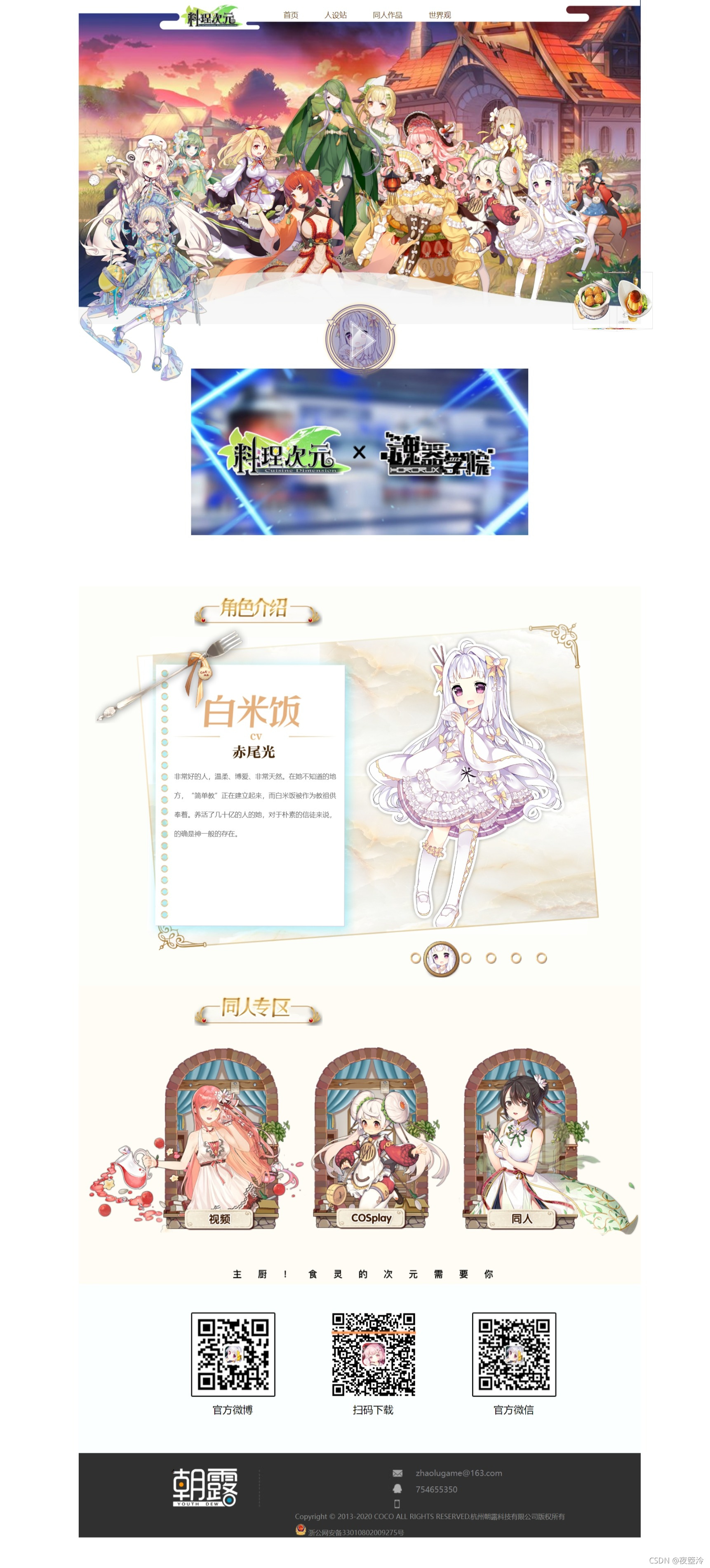
页面效果视频:
网页制作借鉴&图片来源:
借鉴网页:
大部分图片来源:
小部分图片来源:
网页所用图片资源:
img.7z伪——料理次元官网所用图片-网页制作文档类资源-CSDN下载
网页拿取步骤:
如需拿取网页自己演示请按以下步骤进行:
1、新建一个文件夹,名字随意,例如:料理次元官网-伪
2、在文件夹里新建一个HTML文档,名字随意。例如:料理次元官网-伪.html
将HTML代码复制这个HTML文档
如不会创建HTML文档,可以先创建一个文本文档,即后缀名为.txt的文档;
名字随意,例如:料理次元官网-伪.txt
查看文件后缀名的方法:https://jingyan.baidu.com/article/5bbb5a1b2f390652eba179bb.html
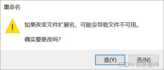
然后将HTML代码复制进这个文本文档,然后更改后缀名为.html
跳出的提示框不用管,直接点是即可
3、在 料理次元官网-伪 这个文件夹里新建一个文件夹,命名为css(小写)。
在里面新建两个CSS文件,分别命名为
料理次元官网-伪.css (这个里面复制第一个css代码)
料理次元动画效果.css (这个里面复制第二个css代码)
如不会创建CSS文档,可以先创建一个文本文档,即后缀名为.txt的文档;
然后将CSS代码复制进这个文本文档,然后更改后缀名为.css
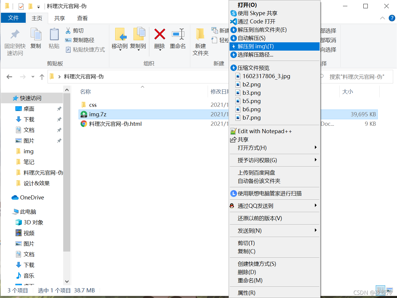
4、将网页所用图片资源下载到刚才新建的文件夹:料理次元官网-伪
鼠标点击选中,然后点击右键选择 解压到img\


 8604
8604


 被折叠的 条评论
为什么被折叠?
被折叠的 条评论
为什么被折叠?
 到【灌水乐园】发言


