


Matplotlib has support for several kinds of bar charts. In the most general case we plot a bar chart by sending in a parameter of the x components, and a parameter of the height of the bar. Let's do this with some linear data.
# Bring in our libraries and create the linear data
import matplotlib.pyplot as plt
import numpy as np

linear_data = np.array([1,2,3,4,5,6,7,8])

# Then, I'll generate a list of X labels
xvals = range(len(linear_data))
# And send this along with the linear data's bar heights, to the bar function.
# We pass in the width of the bar as 0.3.
plt.bar(xvals, linear_data, width = 0.3)
To add a second bar, we simply call the bar plot again with new data, keeping in mind that we need to adjust the x component to make up for the first bar we plotted.
# Lets compare some exponential data here
new_xvals = []
exponential_data = linear_data**2

# Now we want to adjust the x axis values to make up
# for the first set of bars plotted
for item in xvals:
    new_xvals.append(item+0.3)

# And we just plot both items
plt.bar(xvals, linear_data, width = 0.3)
plt.bar(new_xvals, exponential_data, width = 0.3 ,color='red')
So the plot looks okay, but not great. All of the x labels are to the far left of the items being described, and not centered. Now, we can center them with a given bar, using the align parameter, but it's a bit frustrating when you have to make multiple bars, and you have to calculate it yourself. And it's a pain to go through and add a new data series manually. And this gets worse, we actually have to manually iterate through and add in dates if we want them. Because otherwise we couldn't set the bar left location appropriately.
I'll be honest, bar charts are one of my least favorite things to create in matplotlib. I feel like the foundation is there, but some of the ways I would want to use the API, such as plotting several series of data in groups across time, are sadly missing.
There are some other nice features of bar charts, though. For instance, you can add error bars to each bar as well, using the y-error parameter. For example, each of our pieces of data in the linear data might actually be a mean value, computed from many different observations. So we could just create a list of error values we want to render as well and show them.
# I'll import from a random function which can generate some random integers, and then I'll use a
# list comprehension to generate this new list.
from random import randint
linear_err = [randint(1,4) for x in range(len(linear_data))]

# This will plot a new set of bars with errorbars using the list of random error values
plt.bar(xvals, linear_data, width = 0.3, yerr=linear_err)
We can also do stacked bar charts as well. For instance, if we wanted to show cumulative values while also keeping the series independent, we could do this by setting the bottom parameter and our second plot to be equal to first set of data to plot.
# All wee need to do here is to set the bottom parameter of the second barchart
# to be the linear data heights
xvals = range(len(linear_data))
plt.bar(xvals, linear_data, width = 0.3, color='b')
plt.bar(xvals, exponential_data, width = 0.3, bottom=linear_data, color='r')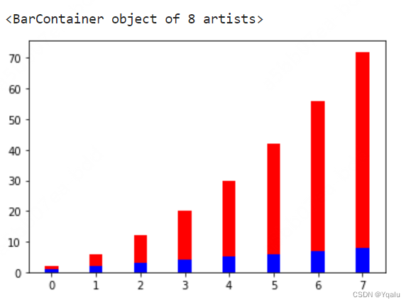
Finally, we can pivot this bar graph into a horizontal bar graph by calling the barh function instead. But note that we have to change the bottom to a left and the width to a height.
# To switch to horizontal bar charts we just use barh as the function, and then
# changer the width parameter to a height
xvals = range(len(linear_data))
plt.barh(xvals, linear_data, height = 0.3, color='b')
plt.barh(xvals, exponential_data, height = 0.3, left=linear_data, color='r')
So those are the basics of charting and plotting in Matplotlib. I think it's important to realize that there really isn't any magic -- the scripting layer is really a set of convenience functions on top of the object layer.
Some people have a preference for one or the other, but at the core, they manipulate the same data elements. And I don't think you should think of them as being opposed to one another or duplicative. They work together, and being able to move back and forth is really important.
We've talked about some fundamental charts in this module. Scatter plots, line graphs, and bar charts. There are more, which we'll dig into in the next module. But these are a good base for consideration.
The assignment for this module is a tough one. It's meant to show you real world data visualization problems. You're going to have to lever your knowledge of the Pandas Library from the first course and couple this with your new knowledge of Matplotlib to come to an elegant solution.
But the final result should be a portfolio ready piece. So I'll see you in the forums for discussions and for help.


 被折叠的 条评论
为什么被折叠?
被折叠的 条评论
为什么被折叠?
 到【灌水乐园】发言


