


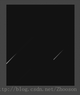
查看效果
<!DOCTYPE html>
<html>
    <head>
        <meta charset="UTF-8">
        <title></title>
        <style>
            html,body {
                width: 100%;
                height: 100%;
                margin: 0;
                background:#444444;
            }
            .space {
                width: 235px;
                height: 280px;
                margin:150px;
                background: #121212;
                float:left;
                overflow: hidden;
            }
            .space .star {
                display: block;
                width: 0px;
                height: 0px;
                border-radius: 50%;
                background: #fff;
                top: -50px;
                left:200px;
                position: relative;
                transform-origin: 100% 0;
                animation: star-ani 6s infinite ease-out;
                box-shadow: 0 0 0px 0px rgba(255, 255, 255, .3);
                opacity: 0;
                z-index: 2;
            }
            .space .star:after {
                content: '';
                display: block;
                top: -10px;
                left: 200px;
                border: 0px solid #fff;
                border-width: 0px 90px 3px 90px;
                border-color: transparent transparent transparent #fff;
                transform: rotate(-45deg) translate3d(1px, 3px, 0);
                box-shadow: 0 0 1px 0 rgba(255, 255, 255, .1);
                transform-origin: 0% 100%;
                animation: shooting-ani 1s infinite ease-out;
            }


            .space .star1 {
                top: -10px;
                left: 300px;
                background: #fff;
                animation-delay: 0.5s;
                -webkit-animation-delay:0.5s;
                -moz-animation-delay: 0.5s;
            }
            .space .star1:after {
                border-color: transparent transparent transparent #fff;
                animation-delay: 0.5s;
                -webkit-animation-delay:0.5s;
                -moz-animation-delay: 0.5s;
            }
            .space .star2 {
                top: 100px;
                left: 200px;
                background: #fff;
                animation-delay: 0s;
                -webkit-animation-delay:0s;
                -moz-animation-delay: 0s;
            }
            .space .star2:after {
                border-color: transparent transparent transparent #fff;
                animation-delay: 0;
                -webkit-animation-delay:0s;
                -moz-animation-delay: 0s;
            }
            .space .star3 {
                top: -10px;
                left: 100px;
                background: #fff;
                animation-delay: 1.5s;
                -webkit-animation-delay: 1.5s;
                -moz-animation-delay: 1.5s;
            }
            .space .star3:after {
                border-color: transparent transparent transparent #fff;
               animation-delay: 1.5s;
                -webkit-animation-delay: 1.5s;
                -moz-animation-delay:1.5s;
            }
            .space .star4 {
                top: 100px;
                left: 250px;
                background: #fff;
                animation-delay: 1.5s;
                -webkit-animation-delay: 1.5s;
                -moz-animation-delay: 1.5s;
            }
            .space .star4:after {
                border-color: transparent transparent transparent #fff;
               animation-delay: 1.5s;
                -webkit-animation-delay: 1.5s;
                -moz-animation-delay:1.5s;
            }
            .space .star5 {
                top: 200px;
                left: 250px;
                background: #fff;
                animation-delay: 1.5s;
                -webkit-animation-delay: 1.5s;
                -moz-animation-delay: 1.5s;
            }
            .space .star5:after {
               border-color: transparent transparent transparent #fff;
               animation-delay: 1.5s;
               -webkit-animation-delay: 1.5s;
               -moz-animation-delay: 1.5s;
            }
            .space .star6 {
                top: -10px;
                left: 100px;
                background: #fff;
                animation-delay: 1.5s;
                -webkit-animation-delay: 1.5s;
                -moz-animation-delay: 1.5s;
            }
            .space .star6:after {
                border-color: transparent transparent transparent #fff;
               animation-delay: 1.5s;
                -webkit-animation-delay: 1.5s;
                -moz-animation-delay: 1.5s;
            }


            .space .star7 {
                top: 100px;
                left: 200px;
                background: #fff;
                animation-delay: 3s;
                -webkit-animation-delay:3s;
                -moz-animation-delay: 3s;
            }
            .space .star7:after {
                border-color: transparent transparent transparent #fff;
                animation-delay: 3s;
                -webkit-animation-delay:3s;
                -moz-animation-delay: 3s;
            }
            .space .star13 {
                top: -10px;
                left: 210px;
                background: #fff;
                animation-delay: 3s;
                -webkit-animation-delay:3s;
                -moz-animation-delay: 3s;
            }
            .space .star13:after {
                border-color: transparent transparent transparent #fff;
                animation-delay: 3s;
                -webkit-animation-delay:3s;
                -moz-animation-delay: 3s;
            }
            .space .star14 {
                top: -100px;
                left: 150px;
                background: #fff;
                animation-delay: 2s;
                -webkit-animation-delay:2s;
                -moz-animation-delay: 2s;
            }
            .space .star14:after {
                border-color: transparent transparent transparent #fff;
                animation-delay: 2s;
                -webkit-animation-delay:2s;
                -moz-animation-delay: 2s;
            }


            .space .star15 {
                top: 200px;
                left: 250px;
                background: #fff;
                animation-delay: 2.5s;
                -webkit-animation-delay:2.5s;
                -moz-animation-delay: 2.5s;
            }
            .space .star15:after {
                border-color: transparent transparent transparent #fff;
                animation-delay: 2.5s;
                -webkit-animation-delay:2.5s;
                -moz-animation-delay: 2.5s;
            }
            .space .star8 {
                top: -10px;
                left: 100px;
                background: #fff;
                animation-delay: 3s;
                -webkit-animation-delay: 3s;
                -moz-animation-delay: 3s;
            }
            .space .star8:after {
                border-color: transparent transparent transparent #fff;
               animation-delay: 3s;
                -webkit-animation-delay: 3s;
                -moz-animation-delay:3s;
            }
            .space .star9 {
                top: 100px;
                left: 250px;
                background: #fff;
                animation-delay: 4s;
                -webkit-animation-delay: 4s;
                -moz-animation-delay: 4s;
            }
            .space .star9:after {
                border-color: transparent transparent transparent #fff;
               animation-delay: 4s;
                -webkit-animation-delay: 4s;
                -moz-animation-delay:4s;
            }
            .space .star10 {
                top: 200px;
                left: 250px;
                background: #fff;
                animation-delay: 5s;
                -webkit-animation-delay: 5s;
                -moz-animation-delay: 5s;
            }
            .space .star10:after {
                border-color: transparent transparent transparent #fff;
               animation-delay: 5s;
                -webkit-animation-delay: 5s;
                -moz-animation-delay: 5s;
            }
            .space .star11 {
                top: -10px;
                left: 100px;
                background: #fff;
                animation-delay: 5s;
                -webkit-animation-delay: 5s;
                -moz-animation-delay: 5s;
            }
            .space .star11:after {
                border-color: transparent transparent transparent #fff;
               animation-delay: 5s;
                -webkit-animation-delay: 5s;
                -moz-animation-delay: 5s;
            }
            .space .star12 {
                top: -10px;
                left: 100px;
                background: #fff;
                animation-delay: 6s;
                -webkit-animation-delay: 6s;
                -moz-animation-delay: 6s;
            }
            .space .star12:after {
                border-color: transparent transparent transparent #fff;
               animation-delay: 6s;
                -webkit-animation-delay: 6s;
                -moz-animation-delay: 6s;
            }
            @keyframes star-ani {
                0% {
                    opacity: 0;
                    transform: scale(0) rotate(0) translate3d(0, 0, 0);
                    -webkit-transform: scale(0) rotate(0) translate3d(0, 0, 0);
                    -moz-transform: scale(0) rotate(0) translate3d(0, 0, 0);
                }
                50% {
                    opacity: 1;
                    transform: scale(1) rotate(0) translate3d(-300px, 300px, 0);
                    -webkit-transform: scale(1) rotate(0) translate3d(-300px, 300px, 0);
                    -moz-transform: scale(1) rotate(0) translate3d(-300px, 300px, 0);
                }
                100% {
                    opacity: 0;
                    transform: scale(1) rotate(0) translate3d(-400px, 300px, 0);
                    -webkit-transform: scale(1) rotate(0) translate3d(-400px, 400px, 0);
                    -moz-transform: scale(1) rotate(0) translate3d(-400px, 400px, 0);
                }
            }
        </style>
    </head>
    <body>
        <div class="space">
            <div class="star"></div>
            <div class="star star1"></div>
            <div class="star star2"></div>
            <div class="star star3"></div>
            <div class="star star4"></div>
            <div class="star star5"></div>
            <div class="star star6"></div>
            <div class="star star7"></div>
            <div class="star star8"></div>
            <div class="star star9"></div>
            <div class="star star10"></div>
            <div class="star star11"></div>
            <div class="star star12"></div>
            <div class="star star13"></div>
            <div class="star star14"></div>
            <div class="star star15"></div>
        </div>
    </body>
</html>
纯css写的流星效果,有这几个缺点,节点应该循环出来,每个流星出来的时间,位置,大小等元素应该随机分配的,这几点后期慢慢优化
备注: 如您有更好的建议和效果展示,请留言,谢谢!!


 扫一扫
扫一扫
 2911
2911

 被折叠的 条评论
为什么被折叠?
被折叠的 条评论
为什么被折叠?
 到【灌水乐园】发言


