


首先是折线图
color:表示线的颜色
eg:r:红色 k:黑色 w:白色 y:黄色 b:蓝色
#首先先导入模板

import matplotlib. pyplot as plt
import numpy as np


#将x,y赋子数据且定义一个范围

x = np. arange(1, 9)
y_ max = np. array([32, 32, 38, 38, 32, 34, 32, 38])
y_ min = np. array([10, 12, 12, 14, 12, 18,16, 10])

#取其中的平均值

y_ maen = y_ max/2 +y min/2

#绘制折线图,并设置粗细形状和颜色

plt. plot(x,y_ max, color=' r', label=' max’, linewidth=3, linestyle=' - )
plt. plot(x,y_ min, color=' k', label=' min',linewidth=2, linestyle=' :’ )
plt. plot (x, y_ maen, color=' b', label=' maen',linewidth=5, linestyle='-' )
#将值设定完成后用下列两数将图表达出来

plt. legend()

plt. show()
将代码完成后可得到如下的图形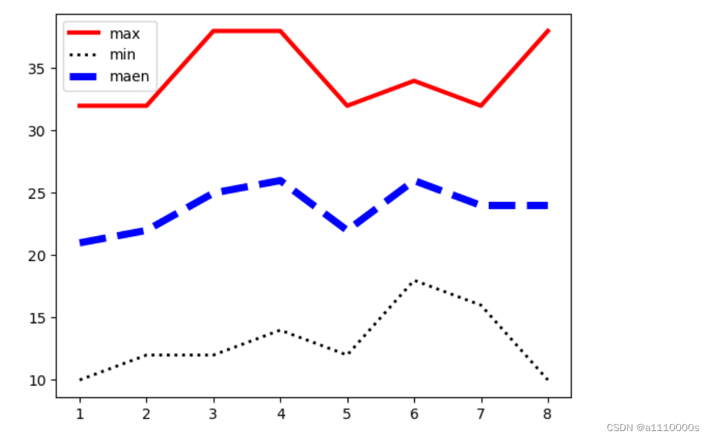
第二个是柱形图
bar:柱形图
add_subplot:增加绘图区域
#导入模板
import numpy as np
import matplotlib.pyplot as plt
#准备数据,下面的y代表生成15列的浮点数,浮点数的范围在(0,1),是随机生成的
x = np.arange(4,19)
y = np.random.random([15])
创建画布
fig = plt.figure()
在画布上添加绘图区域
ax = fig.add_subplot(111)
使用bar()绘制柱形图,展示
ax.bar(x,y)
plt.show()运行结果如下
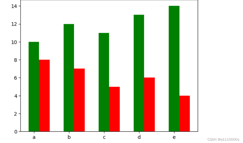
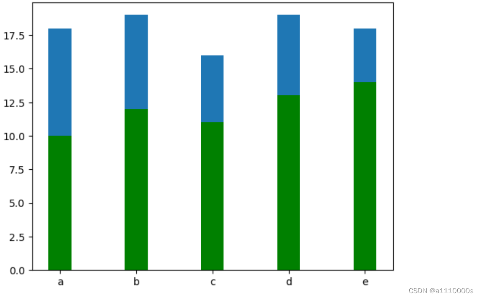
第三个为堆积图
bottom:将两个图叠加一起
import matplotlib. pyplot as plt
import numpy as np
#将x,y数据
X = np. arange (5)
y1 = np. array ([10, 12,11, 13, 14])
y2 = np. array ([8, 7, 5, 6, 4])
#设置柱形的高度
bar_width =0. 3
#月bottom数将yl,y2图型推积在一起
plt. bar (z, y1, color=g', tick label-['a','b','c','d,eJ,wiath=bar_widtb)
plt. bar (x, y2, bottom=y1, width=bar_width)
plt. show
展示图如下
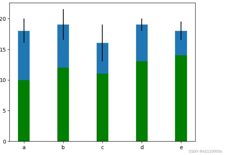
第四在堆积图的基础下增加一些错误的数值结果会如和
import matplotlib. pyplot as plt
import numpy as np
#将x,y数据
X = np. arange (5)
y1 = np. array ([10, 12,11, 13, 14])
y2 = np. array ([8, 7, 5, 6, 4])

增加偏差值
error = [2,2.5,3,1,1.5]

#设置柱形的高度
bar_width =0. 3
#月bottom数将yl,y2图型推积在一起
plt. bar (z, y1, color=g', tick label-['a','b','c','d,eJ,wiath=bar_widtb)
plt. bar (x, y2, bottom=y1, width=bar_width, yerr=error)
plt. show
在运行完后可得到如下图型
第五个堆积面积图
stackplot:将两图堆积一起
#绘制一个堆积面积图

#首先导入模板

import matplotlib. pyplot as
plt import numpy as np

#赋予x y轴的值

х = np. arange (6)
y1 = np. array([3.5,3, 4, 5,3,4.5])
y2 =np. array([3, 4,4.5,2,4,3])
y3 =np. array([5,2,3, 4,5,4])

#绘制堆积面积图,并增加颜色

plt. stackplot(x, y1, y2, y3, colors['black','red,' yellow'])
plt. show()
运行效果如下图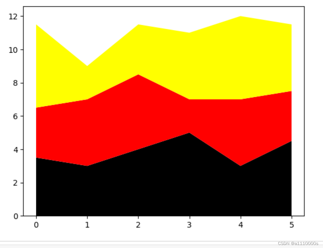


 3万+
3万+


 被折叠的 条评论
为什么被折叠?
被折叠的 条评论
为什么被折叠?
 到【灌水乐园】发言


