


官网的选项卡没有左右滑动的效果,本身的样式也不太好看,所以封装了个简易的组件达到相同的效果,可自行修改css部分修改样式~
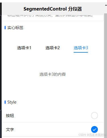
封装组件效果如下

custom-segmented-control.vue
<template>
  <view class="container">
    <view
      class="custom-segmented-control"
      @touchstart="onTouchStart"
      @touchend="onTouchEnd"
    >
      <view
        v-for="(value, index) in values"
        :key="index"
        :class="{ active: index === current }"
        class="title"
        @click="handleClick(index)"
      >
        {{ value }}
      </view>
      <view
        class="indicator"
        :style="{
          left: `${current * (100 / values.length) + 100 / values.length / 3}%`,
          width: `${100 / values.length / 3}%`,
        }"
      ></view>
    </view>
  </view>
</template>

<script>
export default {
  props: {
    current: {
      type: Number,
      default: 0,
    },
    values: {
      type: Array,
      default: () => [],
    },
  },
  data() {
    return {
      touchStartX: 0,
    };
  },
  methods: {
    handleClick(index) {
      this.$emit("clickItem", { index });
    },
    onTouchStart(e) {
      this.touchStartX = e.changedTouches[0].clientX;
    },
    onTouchEnd(e) {
      const touchEndX = e.changedTouches[0].clientX;
      const deltaX = touchEndX - this.touchStartX;
      const threshold = 50;

      if (deltaX > threshold) {
        if (this.current > 0) {
          this.$emit("clickItem", { index: this.current - 1 });
        }
      } else if (deltaX < -threshold) {
        if (this.current < this.values.length - 1) {
          this.$emit("clickItem", { index: this.current + 1 });
        }
      }
    },
  },
};
</script>

<style scoped>
.container {
  height: 36px;
  overflow: hidden;
  cursor: pointer;
}

.custom-segmented-control {
  display: flex;
  /* 平均分配子元素空间 */
  justify-content: space-between;
  align-items: center;
  position: relative;
}

.custom-segmented-control > view {
  /* 平均分配宽度 */
  flex: 1;
  cursor: pointer;
  text-align: center;
}
.title {
  font-size: 14px;
  line-height: 20px;
  text-align: center;
}

.active {
  color: #333333;
  font-weight: bold;
  padding: 4px 0;
}

.indicator {
  position: absolute; /* 绝对定位 */
  bottom: -4px; /* 与内容底部对齐 */
  height: 4px; /* 下划线的高度 */
  background-color: #0574ff;
  border-radius: 4px; /* 设置圆角 */
  will-change: left; /* 告知浏览器 left 属性即将变化 */
  transition: left 0.1s ease;
}
</style>
外部引用
<template>
  <div id="app">
    <CustomSegmentedControl
      :current="currentStatus"
      :values="statusItems"
      @clickItem="onClickStatus"
    />
  </div>
</template>

<script>
import CustomSegmentedControl from "./components/CustomSegmentedControl.vue";

export default {
  components: {
    CustomSegmentedControl,
  },
  data() {
    return {
      currentStatus: 0,
      statusItems: ["草稿", "已下发", "生产中", "已完工", "已结案"],
    };
  },
  methods: {
    onClickStatus(e) {
      this.currentStatus = e.index;
    },
  },
};
</script>

<style>
#app {
  font-family: Avenir, Helvetica, Arial, sans-serif;
  -webkit-font-smoothing: antialiased;
  -moz-osx-font-smoothing: grayscale;
  text-align: center;
  color: #2c3e50;
  margin-top: 60px;
}
</style>


 扫一扫
扫一扫


 911
911

 被折叠的 条评论
为什么被折叠?
被折叠的 条评论
为什么被折叠?
 到【灌水乐园】发言


