


 本文介绍了如何使用Python的matplotlib库进行数据可视化,包括绘制趋势图、多张子图、条形图、散点图、直方图和箱型图。还特别探讨了动态图的绘制,提供了多个示例代码,帮助读者掌握Python的数据可视化技巧。
Python数据可视化
代码已放到GitHub
1.使用matplotlib绘制最简单的趋势图
先查看一下数据
import pandas as pd
unrate = pd.read_csv('unrate.csv')  # 使用pandas读取数据
unrate['DATE'] = pd.to_datetime(unrate['DATE'])
print(unrate.head(12)) # 查看前12条数据
         DATE  VALUE
0  1948-01-01    3.4
1  1948-02-01    3.8
2  1948-03-01    4.0
3  1948-04-01    3.9
4  1948-05-01    3.5
5  1948-06-01    3.6
6  1948-07-01    3.6
7  1948-08-01    3.9
8  1948-09-01    3.8
9  1948-10-01    3.7
10 1948-11-01    3.8
11 1948-12-01    4.0
绘图
import matplotlib.pyplot as plt
#%matplotlib inline
#Using the different pyplot functions, we can create, customize, and display a plot. For example, we can use 2 functions to :
first_twelve = unrate[0:12]
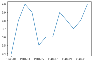
plt.plot(first_twelve['DATE'], first_twelve['VALUE'])
plt.show()
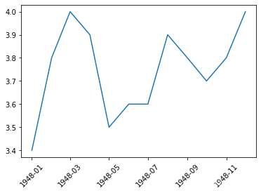
# 我们可以设置x轴的标签旋转
plt.plot(first_twelve['DATE'], first_twelve['VALUE'])
plt.xticks(rotation=45)
#print help(plt.xticks)
plt.show()
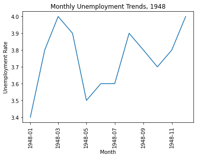
#xlabel(): 给x轴标签命名
#ylabel(): 给y轴标签命名
#title(): 绘图标题

plt.plot(first_twelve['DATE'], first_twelve['VALUE'])
plt.xticks(rotation=90)
plt.xlabel('Month')
plt.ylabel('Unemployment Rate')
plt.title('Monthly Unemployment Trends, 1948')
plt.show()
2.绘制多张图
2.1绘制子图
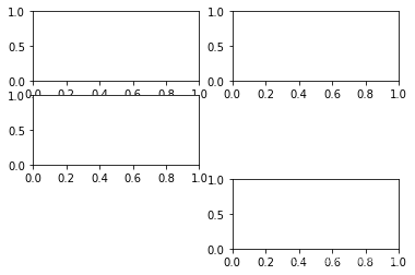
例子1
#add_subplot(first,second,index) first:第几行,second:第几列,index:第几个图.
import pandas as pd
import matplotlib.pyplot as plt
import matplotlib.pyplot as plt
fig = plt.figure()
ax1 = fig.add_subplot(3,2,1)
ax2 = fig.add_subplot(3,2,2)
ax3 = fig.add_subplot(3,2,3)
ax4 = fig.add_subplot(3,2,6)
plt.show()
例子2.例如绘制两个子图
import numpy as np
fig = plt.figure()
#fig = plt.figure(figsize=(3, 3))
ax1 = fig.add_subplot(2,1,1)
ax2 = fig.add_subplot(2,1,2)

ax1.plot(np.random.randint(1,5,5), np.arange(5))
ax2.plot(
最低0.47元/天 解锁文章


 被折叠的 条评论
为什么被折叠?
被折叠的 条评论
为什么被折叠?
 到【灌水乐园】发言


