


The Imagine Style
Imagine风格
One of the goals with Qt Quick Controls is to separate the logic of a control from its appearance. For most of the styles, the implementation of the appearance consists of a mix of QML code and graphical assets. However, using the Imagine style, it is possible to customize the appearance of a Qt Quick Controls based application using only graphical assets.
Qt Quick Controls的目标之一是将控件的逻辑与其外观分离。对于大多数样式,外观的实现由QML代码和图形资源的混合组成。但是,使用Imagine样式,可以仅使用图形资源,自定义基于Qt Quick Control的应用程序外观。
The imagine style is based on 9-patch images. This allows the images to carry information on how they are stretched and what parts are to be considered as a part of the element and what is outside; e.g. a shadow. For each control, the style supports several elements, and for each element a large number of states are available. By providing assets for certain combinations of these elements and states, you can control the appearance of each control in detail.
imagine样式基于9-patch图像。这允许图像携带有关如何拉伸以及哪些部分被视为元素的一部分以及哪些部分在外部的信息;如阴影属于外部。对于每个控件,样式支持多个元素类型,对于每个元素类型,有大量状态可用。通过为这些元素和状态的特定组合提供资源,可以详细控制每个控件的外观。
The details of 9-patch images, and how each control can be styled is covered in great detail in the Imagine style documentation. Here, we will create a custom style for an imaginary device interface to demonstrate how the style is used.
Imagine style文档中详细介绍了9-patch图像的细节以及每个控件的样式。在这里,我们将为虚拟设备接口创建一个自定义样式,以演示如何使用该样式。
The application's style customizes the ApplicationWindow and Button controls. For the buttons, the normal state, as well as the pressed and checked states are handled. The demonstration application is shown below.
应用程序的样式自定义ApplicationWindow和Button控件。对于按钮,处理正常状态以及按下pressed 和选中checked 状态。演示应用程序如下所示。
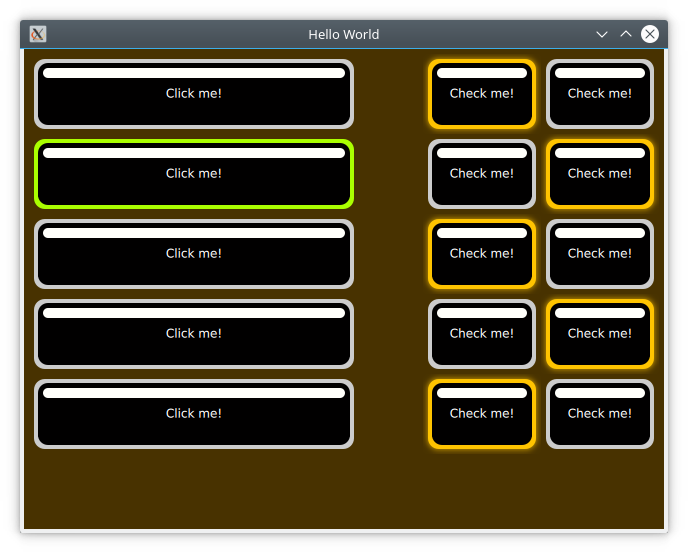
The code for this uses a Column for the clickable buttons, and a Grid for the checkable ones. The clickable buttons also stretch with the window width.
此代码使用Column元素类型排列可单击按钮,Grid元素类型排列可检查按钮。可单击的按钮也会随着窗口的宽度而拉伸。
import QtQuick
import QtQuick.Controls

ApplicationWindow {

    // ...

    visible: true
    width: 640
    height: 480
    title: qsTr("Hello World")

    Column {
        anchors.top: parent.top
        anchors.left: parent.left
        anchors.margins: 10

        width: parent.width/2

        spacing: 10

        // ...

        Repeater {
            model: 5
            delegate: Button {
                width: parent.width
                height: 70
                text: qsTr("Click me!")
            }
        }
    }

    Grid {
        anchors.top: parent.top
        anchors.right: parent.right
        anchors.margins: 10

        columns: 2

        spacing: 10

        // ...

        Repeater {
            model: 10

            delegate: Button {
                height: 70
                text: qsTr("Check me!")
                checkable: true
            }
        }
    }
}
As we are using the Imagine style, all controls that we want to use need to be styled using a graphical asset. The easiest is the background for the ApplicationWindow. This is a single pixel texture defining the background colour. By naming the file applicationwindow-background.png and then pointing the style to it using the qtquickcontrols2.conf file, the file is picked up.
当我们使用Imagine样式时,我们想要使用的所有控件都需要使用图形资源进行样式设置。最简单的是ApplicationWindow的背景。这里定义背景颜色为单像素纹理。通过将文件命名为applicationwindow-background.png,然后在qtquickcontrols2.conf文件中,设置样式。,该背景文件就会被使用。
In the qtquickcontrols2.conf file shown below, you can see how we set the Style to Imagine, and then setup a Path for the style where it can look for the assets. Finally we set some palette properties as well. The available palette properties can be found on the palette QML Basic Typepage.qtquickcontrols2.conf文件显示如下,您可以看到我们如何将样式Style设置为Imagine,然后为样式设置一个路径Path,在该路径中可以查找到资源文件。最后,我们还设置了一些调色板属性。可用的调色板属性可以在调色板QML基本类型页面上找到。
[Controls]
Style=Imagine

[Imagine]
Path=:images/imagine

[Imagine\Palette]
Text=#ffffff
ButtonText=#ffffff
BrightText=#ffffff
The assets for the Button control are button-background.9.png, button-background-pressed.9.png and button-background-checked.9.png. These follow the control-element-state pattern. The stateless file, button-background.9.png is used for all states without a specific asset. According to the Imagine style element reference table, a button can have the following states:
按钮控件Button的资源文件是button-background.9.png,button-background-pressed.9.png和button-background-checked.9.png。它们遵循控制元素状态模式。无状态文件button-background.9.png适用于没有指定资源文件的所有状态。根据Imagine样式元素参考表,按钮可以具有以下状态:
disabled 是否启用状态pressed 是否按下状态checked 是否已检查状态checkable 是否可检查状态focused 是否有焦点状态highlighted 是否高亮状态flat 是否是平坦状态mirrored 是否是镜像状态hovered 是否是鼠标悬停状态
The states that are needed depend on your user interface. For instance, the hovered style is never used for touch-based interfaces.
所需的状态取决于用户界面。例如,悬停样式从不用于基于触摸的界面。
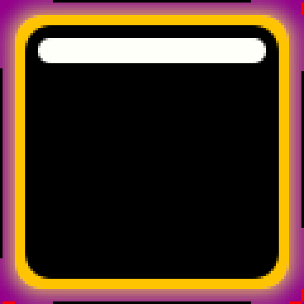
Looking at an enlarged version of button-background-checked.9.png above, you can see the 9-patch guide lines along the sides. The purple background has been added for visibility reasons. This area is actually transparent in the asset used in the example.
看下上方的按钮背景 button-background-checked.9.png放大图。可以看到沿侧面的9片引导线。由于可见性原因,添加了紫色背景。在示例使用的资源文件中,此区域实际上是透明的。
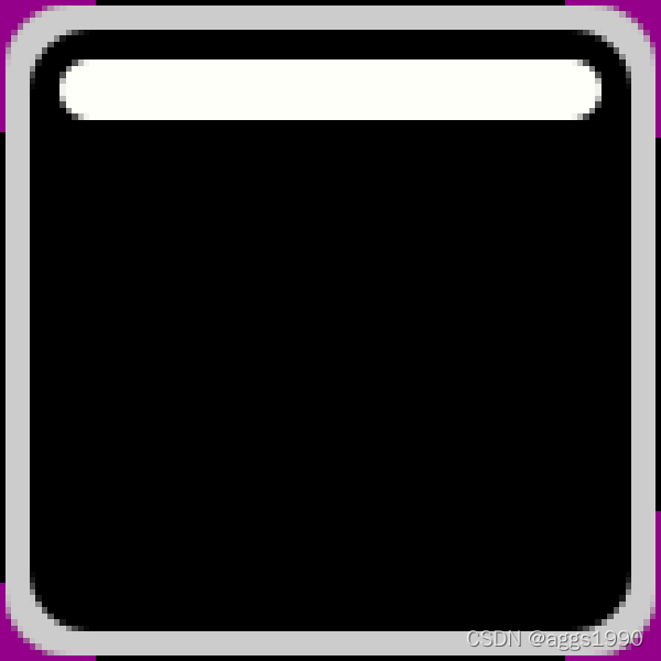
The pixes along the edges of the image can be either white/transparent, black, or red. These have different meanings that we will go through one by one.
沿图像边缘的像素可以是白色/透明、黑色或红色。这些都有不同的含义,我们将逐一讨论。
-
Black lines along the left and top sides of the asset mark the stretchable parts of the image. This means that the rounded corners and the white marker in the example are not affected when the button is stretched.
-
沿资源文件左侧和顶部的黑线标记图像的可拉伸部分。这意味着拉伸按钮时,示例中的圆角和白色标记不受影响。
-
Black lines along the right and bottom sides of the asset mark the area used for the control’s contents. That means the part of the button that is used for text in the example.
-
沿资源文件右侧和底部的黑线标记用于控件内容的区域。这表示示例中用于文本的按钮部分。
-
Red lines along the right and bottom sides of the asset mark inset areas. These areas are a part of the image, but not considered a part of the control. For the checked image above, this is used for a soft halo extending outside the button.
-
沿资源文件标记插入区域右侧和底部的红线。这些区域是图像的一部分,但不被视为控件的一部分。对于上面选中的图像,这用于延伸到按钮外部的软光晕。
A demonstration of the usage of an inset area is shown in button-background.9.png (below) and button-background-checked.9.png (above): the image seems to light up, but not move.
示例中,按钮背景内区域使用button-background.9.png(下图)和button-background-checked.9.png(上图):图像看起来亮了,但没有移动。
示例源码下载


 扫一扫
扫一扫


 被折叠的 条评论
为什么被折叠?
被折叠的 条评论
为什么被折叠?
 到【灌水乐园】发言


