


Text是文本组件,通常用于展示用户视图,如显示文章的文字。
创建文本
Text可通过以下两种方式来创建:
-
string字符串
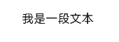
Text('我是一段文本')
-
引用Resource资源
资源引用类型可以通过$r创建Resource类型对象,文件位置为/resources/base/element/string.json。
Text($r('app.string.module_desc'))
  .baselineOffset(0)
  .fontSize(30)
  .border({ width: 1 })
  .padding(10)
  .width(300)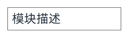
添加子组件
Span只能作为Text和RichEditor组件的子组件显示文本内容。可以在一个Text内添加多个Span来显示一段信息,例如产品说明书、承诺书等。
-
创建Span。
Span组件需要写到Text组件内,单独写Span组件不会显示信息,Text与Span同时配置文本内容时,Span内容覆盖Text内容。
Text('我是Text') {
  Span('我是Span')
}
.padding(10)
.borderWidth(1)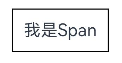
-
设置文本装饰线及颜色。
通过decoration设置文本装饰线及颜色。
Text() {
  Span('我是Span1,').fontSize(16).fontColor(Color.Grey)
    .decoration({ type: TextDecorationType.LineThrough, color: Color.Red })
  Span('我是Span2').fontColor(Color.Blue).fontSize(16)
    .fontStyle(FontStyle.Italic)
    .decoration({ type: TextDecorationType.Underline, color: Color.Black })
  Span(',我是Span3').fontSize(16).fontColor(Color.Grey)
    .decoration({ type: TextDecorationType.Overline, color: Color.Green })
}
.borderWidth(1)
.padding(10)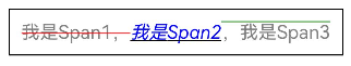
-
通过textCase设置文字一直保持大写或者小写状态。
Text() {
  Span('I am Upper-span').fontSize(12)
    .textCase(TextCase.UpperCase)
}
.borderWidth(1)
.padding(10)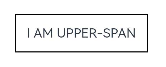
-
添加事件。
由于Span组件无尺寸信息,事件仅支持添加点击事件onClick。
Text() {
  Span('I am Upper-span').fontSize(12)
    .textCase(TextCase.UpperCase)
    .onClick(()=>{
      console.info('我是Span——onClick')
    })
}
自定义文本样式
-
通过textAlign属性设置文本对齐样式。
Text('左对齐')
  .width(300)
  .textAlign(TextAlign.Start)
  .border({ width: 1 })
  .padding(10)
Text('中间对齐')
  .width(300)
  .textAlign(TextAlign.Center)
  .border({ width: 1 })
  .padding(10)
Text('右对齐')
  .width(300)
  .textAlign(TextAlign.End)
  .border({ width: 1 })
  .padding(10)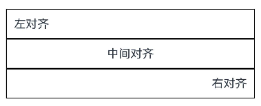
-
通过textOverflow属性控制文本超长处理,textOverflow需配合maxLines一起使用(默认情况下文本自动折行)。
Text('This is the setting of textOverflow to Clip text content This is the setting of textOverflow to None text content. This is the setting of textOverflow to Clip text content This is the setting of textOverflow to None text content.')
  .width(250)
  .textOverflow({ overflow: TextOverflow.None })
  .maxLines(1)
  .fontSize(12)
  .border({ width: 1 })
  .padding(10)
Text('我是超长文本,超出的部分显示省略号。I am an extra long text, with ellipses displayed for any excess。')
  .width(250)
  .textOverflow({ overflow: TextOverflow.Ellipsis })
  .maxLines(1)
  .fontSize(12)
  .border({ width: 1 })
  .padding(10)
Text('当文本溢出其尺寸时,文本将滚动显示。When the text overflows its dimensions, the text will scroll for displaying.')
  .width(250)
  .textOverflow({ overflow: TextOverflow.MARQUEE })
  .maxLines(1)
  .fontSize(12)
  .border({ width: 1 })
  .padding(10)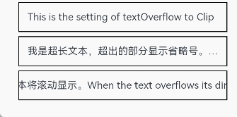
-
通过lineHeight属性设置文本行高。
Text('This is the text with the line height set. This is the text with the line height set.')
  .width(300).fontSize(12).border({ width: 1 }).padding(10)
Text('This is the text with the line height set. This is the text with the line height set.')
  .width(300).fontSize(12).border({ width: 1 }).padding(10)
  .lineHeight(20)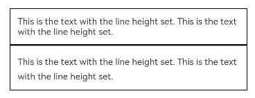
-
通过decoration属性设置文本装饰线样式及其颜色。
Text('This is the text')
  .decoration({
    type: TextDecorationType.LineThrough,
    color: Color.Red
  })
  .borderWidth(1).padding(10).margin(5)
Text('This is the text')
  .decoration({
    type: TextDecorationType.Overline,
    color: Color.Red
  })
  .borderWidth(1).padding(10).margin(5)
Text('This is the text')
  .decoration({
    type: TextDecorationType.Underline,
    color: Color.Red
  })
  .borderWidth(1).padding(10).margin(5)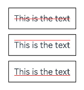
-
通过baselineOffset属性设置文本基线的偏移量。
Text('This is the text content with baselineOffset 0.')
  .baselineOffset(0)
  .fontSize(12)
  .border({ width: 1 })
  .padding(10)
  .width('100%')
  .margin(5)
Text('This is the text content with baselineOffset 30.')
  .baselineOffset(30)
  .fontSize(12)
  .border({ width: 1 })
  .padding(10)
  .width('100%')
  .margin(5)

Text('This is the text content with baselineOffset -20.')
  .baselineOffset(-20)
  .fontSize(12)
  .border({ width: 1 })
  .padding(10)
  .width('100%')
  .margin(5)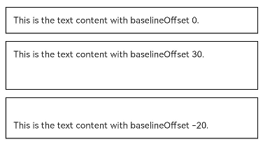
-
通过letterSpacing属性设置文本字符间距。
Text('This is the text content with letterSpacing 0.')
  .letterSpacing(0)
  .fontSize(12)
  .border({ width: 1 })
  .padding(10)
  .width('100%')
  .margin(5)
Text('This is the text content with letterSpacing 3.')
  .letterSpacing(3)
  .fontSize(12)
  .border({ width: 1 })
  .padding(10)
  .width('100%')
  .margin(5)
Text('This is the text content with letterSpacing -1.')
  .letterSpacing(-1)
  .fontSize(12)
  .border({ width: 1 })
  .padding(10)
  .width('100%')
  .margin(5)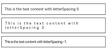
-
通过minFontSize与maxFontSize自适应字体大小,minFontSize设置文本最小显示字号,maxFontSize设置文本最大显示字号,minFontSize与maxFontSize必须搭配同时使用,以及需配合maxline或布局大小限制一起使用,单独设置不生效。
Text('我的最大字号为30,最小字号为5,宽度为250,maxLines为1')
  .width(250)
  .maxLines(1)
  .maxFontSize(30)
  .minFontSize(5)
  .border({ width: 1 })
  .padding(10)
  .margin(5)
Text('我的最大字号为30,最小字号为5,宽度为250,maxLines为2')
  .width(250)
  .maxLines(2)
  .maxFontSize(30)
  .minFontSize(5)
  .border({ width: 1 })
  .padding(10)
  .margin(5)
Text('我的最大字号为30,最小字号为15,宽度为250,高度为50')
  .width(250)
  .height(50)
  .maxFontSize(30)
  .minFontSize(15)
  .border({ width: 1 })
  .padding(10)
  .margin(5)
Text('我的最大字号为30,最小字号为15,宽度为250,高度为100')
  .width(250)
  .height(100)
  .maxFontSize(30)
  .minFontSize(15)
  .border({ width: 1 })
  .padding(10)
  .margin(5)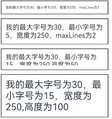
-
通过textCase属性设置文本大小写。
Text('This is the text content with textCase set to Normal.')
  .textCase(TextCase.Normal)
  .padding(10)
  .border({ width: 1 })
  .padding(10)
  .margin(5)

// 文本全小写展示
Text('This is the text content with textCase set to LowerCase.')
  .textCase(TextCase.LowerCase)
  .border({ width: 1 })
  .padding(10)
  .margin(5)

// 文本全大写展示
Text('This is the text content with textCase set to UpperCase.')
  .textCase(TextCase.UpperCase)
  .border({ width: 1 })
  .padding(10)
  .margin(5)
-
通过copyOption属性设置文本是否可复制粘贴。
Text("这是一段可复制文本")
  .fontSize(30)
  .copyOption(CopyOptions.InApp)
添加事件
Text组件可以添加通用事件,可以绑定onClick、onTouch等事件来响应操作。
Text('点我')
  .onClick(()=>{
      console.info('我是Text的点击响应事件');
   })
场景示例
// xxx.ets
@Entry
@Component
struct TextExample {
build() {
Column() {
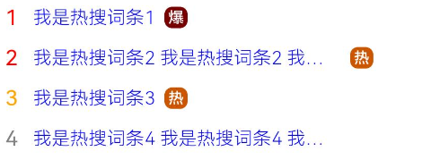
Row() {
Text("1").fontSize(14).fontColor(Color.Red).margin({ left: 10, right: 10 })
Text("我是热搜词条1")
.fontSize(12)
.fontColor(Color.Blue)
.maxLines(1)
.textOverflow({ overflow: TextOverflow.Ellipsis })
.fontWeight(300)
Text("爆")
.margin({ left: 6 })
.textAlign(TextAlign.Center)
.fontSize(10)
.fontColor(Color.White)
.fontWeight(600)
.backgroundColor(0x770100)
.borderRadius(5)
.width(15)
.height(14)
}.width('100%').margin(5)
Row() {
Text("2").fontSize(14).fontColor(Color.Red).margin({ left: 10, right: 10 })
Text("我是热搜词条2 我是热搜词条2 我是热搜词条2 我是热搜词条2 我是热搜词条2")
.fontSize(12)
.fontColor(Color.Blue)
.fontWeight(300)
.constraintSize({ maxWidth: 200 })
.maxLines(1)
.textOverflow({ overflow: TextOverflow.Ellipsis })
Text("热")
.margin({ left: 6 })
.textAlign(TextAlign.Center)
.fontSize(10)
.fontColor(Color.White)
.fontWeight(600)
.backgroundColor(0xCC5500)
.borderRadius(5)
.width(15)
.height(14)
}.width('100%').margin(5)
Row() {
Text("3").fontSize(14).fontColor(Color.Orange).margin({ left: 10, right: 10 })
Text("我是热搜词条3")
.fontSize(12)
.fontColor(Color.Blue)
.fontWeight(300)
.maxLines(1)
.constraintSize({ maxWidth: 200 })
.textOverflow({ overflow: TextOverflow.Ellipsis })
Text("热")
.margin({ left: 6 })
.textAlign(TextAlign.Center)
.fontSize(10)
.fontColor(Color.White)
.fontWeight(600)
.backgroundColor(0xCC5500)
.borderRadius(5)
.width(15)
.height(14)
}.width('100%').margin(5)
Row() {
Text("4").fontSize(14).fontColor(Color.Grey).margin({ left: 10, right: 10 })
Text("我是热搜词条4 我是热搜词条4 我是热搜词条4 我是热搜词条4 我是热搜词条4")
.fontSize(12)
.fontColor(Color.Blue)
.fontWeight(300)
.constraintSize({ maxWidth: 200 })
.maxLines(1)
.textOverflow({ overflow: TextOverflow.Ellipsis })
}.width('100%').margin(5)
}.width('100%')
}
}
文本输入
TextInput、TextArea是输入框组件,通常用于响应用户的输入操作,比如评论区的输入、聊天框的输入、表格的输入等,也可以结合其它组件构建功能页面,例如登录注册页面。
创建输入框
TextInput为单行输入框、TextArea为多行输入框。通过以下接口来创建。
TextInput(value?:{placeholder?: ResourceStr, text?: ResourceStr, controller?: TextInputController})TextArea(value?:{placeholder?: ResourceStr, text?: ResourceStr, controller?: TextAreaController})-
单行输入框
TextInput()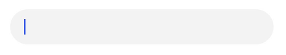
-
多行输入框
TextArea()
多行输入框文字超出一行时会自动折行。
TextArea({text:"我是TextArea我是TextArea我是TextArea我是TextArea"}).width(300)
设置输入框类型
TextInput有9种可选类型,分别为Normal基本输入模式、Password密码输入模式、Email邮箱地址输入模式、Number纯数字输入模式、PhoneNumber电话号码输入模式、USER_NAME用户名输入模式、NEW_PASSWORD新密码输入模式、NUMBER_PASSWORD纯数字密码输入模式、NUMBER_DECIMAL带小数点的数字输入模式。通过type属性进行设置:
-
基本输入模式(默认类型)
TextInput()
  .type(InputType.Normal)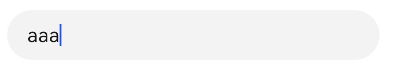
-
密码输入模式
TextInput()
  .type(InputType.Password)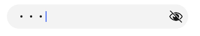
自定义样式
-
设置无输入时的提示文本。
TextInput({placeholder:'我是提示文本'})
TextInput({placeholder:'我是提示文本'})
-
设置输入框当前的文本内容。
TextInput({placeholder:'我是提示文本',text:'我是当前文本内容'})
-
添加backgroundColor改变输入框的背景颜色。
TextInput({placeholder:'我是提示文本',text:'我是当前文本内容'})
  .backgroundColor(Color.Pink)
更丰富的样式可以结合通用属性实现。
添加事件
文本框主要用于获取用户输入的信息,把信息处理成数据进行上传,绑定onChange事件可以获取输入框内改变的内容。用户也可以使用通用事件来进行相应的交互操作。
TextInput()
  .onChange((value: string) => {
    console.info(value);
  })
  .onFocus(() => {
    console.info('获取焦点');
  })
场景示例
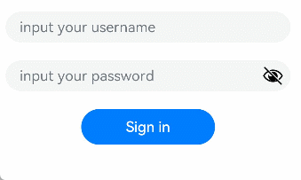
在登录/注册页面,用户进行登录或注册。
@Entry
@Component
struct TextInputSample {
  build() {
    Column() {
      TextInput({ placeholder: 'input your username' }).margin({ top: 20 })
        .onSubmit((EnterKeyType)=>{
          console.info(EnterKeyType+'输入法回车键的类型值')
        })
      TextInput({ placeholder: 'input your password' }).type(InputType.Password).margin({ top: 20 })
        .onSubmit((EnterKeyType)=>{
          console.info(EnterKeyType+'输入法回车键的类型值')
        })
      Button('Sign in').width(150).margin({ top: 20 })
    }.padding(20)
  }
}
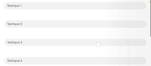
键盘避让
键盘抬起后,具有滚动能力的容器组件在横竖屏切换时,才会生效键盘避让,若希望无滚动能力的容器组件也生效键盘避让,建议在组件外嵌套一层具有滚动能力的容器组件,比如Scroll、List、Grid。
// xxx.ets
@Entry
@Component
struct Index {
  placeHolderArr: string[] = ['1', '2', '3', '4', '5', '6', '7']

  build() {
    Scroll() {
      Column() {
        ForEach(this.placeHolderArr, (placeholder: string) => {
          TextInput({ placeholder: 'TextInput ' + placeholder })
            .margin(30)
        })
      }
    }
    .height('100%')
    .width('100%')
  }
}
最后
有很多小伙伴不知道学习哪些鸿蒙开发技术?不知道需要重点掌握哪些鸿蒙应用开发知识点?而且学习时频繁踩坑,最终浪费大量时间。所以有一份实用的鸿蒙(HarmonyOS NEXT)资料用来跟着学习是非常有必要的。
点击领取→【纯血版鸿蒙全套最新学习资料】希望这一份鸿蒙学习资料能够给大家带来帮助
鸿蒙(HarmonyOS NEXT)最新学习路线
有了路线图,怎么能没有学习资料呢,小编也准备了一份联合鸿蒙官方发布笔记整理收纳的一套系统性的鸿蒙(OpenHarmony )学习手册(共计1236页)与鸿蒙(OpenHarmony )开发入门教学视频,内容包含:ArkTS、ArkUI、Web开发、应用模型、资源分类…等知识点。
获取以上完整版高清学习路线,请点击→纯血版全套鸿蒙HarmonyOS学习资料
这份鸿蒙(HarmonyOS NEXT)资料包含了鸿蒙开发必掌握的核心知识要点,内容包含了(ArkTS、ArkUI开发组件、Stage模型、多端部署、分布式应用开发、音频、视频、WebGL、OpenHarmony多媒体技术、Napi组件、OpenHarmony内核、(南向驱动、嵌入式等)鸿蒙项目实战等等)鸿蒙(HarmonyOS NEXT)技术知识点。
HarmonyOS Next 最新全套视频教程
《鸿蒙 (OpenHarmony)开发基础到实战手册》
OpenHarmony北向、南向开发环境搭建
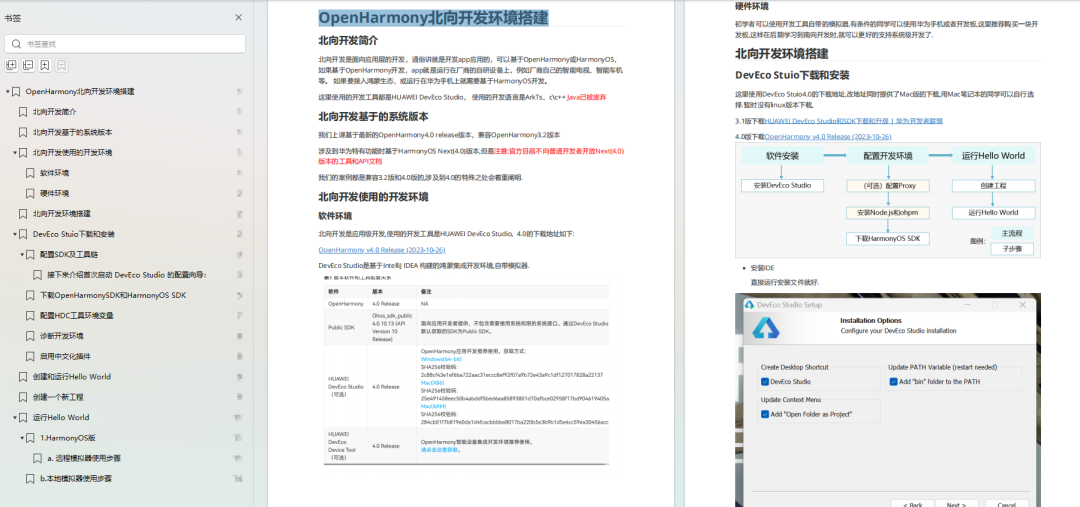
《鸿蒙开发基础》
- ArkTS语言
- 安装DevEco Studio
- 运用你的第一个ArkTS应用
- ArkUI声明式UI开发
- .……

《鸿蒙开发进阶》
- Stage模型入门
- 网络管理
- 数据管理
- 电话服务
- 分布式应用开发
- 通知与窗口管理
- 多媒体技术
- 安全技能
- 任务管理
- WebGL
- 国际化开发
- 应用测试
- DFX面向未来设计
- 鸿蒙系统移植和裁剪定制
- ……
《鸿蒙进阶实战》
- ArkTS实践
- UIAbility应用
- 网络案例
- ……
大厂面试必问面试题
鸿蒙南向开发技术
鸿蒙APP开发必备
请点击→纯血版全套鸿蒙HarmonyOS学习资料
总结
总的来说,华为鸿蒙不再兼容安卓,对程序员来说是一个挑战,也是一个机会。只有积极应对变化,不断学习和提升自己,才能在这个变革的时代中立于不败之地。


 1万+
1万+

 被折叠的 条评论
为什么被折叠?
被折叠的 条评论
为什么被折叠?
 到【灌水乐园】发言


