


Button是按钮组件,通常用于响应用户的点击操作,其类型包括胶囊按钮、圆形按钮、普通按钮。Button做为容器使用时可以通过添加子组件实现包含文字、图片等元素的按钮。
创建按钮
Button通过调用接口来创建,接口调用有以下两种形式:
-
创建不包含子组件的按钮。
Button(label?: ResourceStr, options?: { type?: ButtonType, stateEffect?: boolean })其中,label用来设置按钮文字,type用于设置Button类型,stateEffect属性设置Button是否开启点击效果。
Button('Ok', { type: ButtonType.Normal, stateEffect: true })
  .borderRadius(8)
  .backgroundColor(0x317aff)
  .width(90)
  .height(40)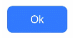
-
创建包含子组件的按钮。
Button(options?: {type?: ButtonType, stateEffect?: boolean})Button({ type: ButtonType.Normal, stateEffect: true }) { Row() { Image($r('app.media.loading')).width(20).height(40).margin({ left: 12 }) Text('loading').fontSize(12).fontColor(0xffffff).margin({ left: 5, right: 12 }) }.alignItems(VerticalAlign.Center) }.borderRadius(8).backgroundColor(0x317aff).width(90).height(40)
设置按钮类型
Button有三种可选类型,分别为胶囊类型(Capsule)、圆形按钮(Circle)和普通按钮(Normal),通过type进行设置。
-
胶囊按钮(默认类型)
此类型按钮的圆角自动设置为高度的一半,不支持通过borderRadius属性重新设置圆角。
Button('Disable', { type: ButtonType.Capsule, stateEffect: false })
  .backgroundColor(0x317aff)
  .width(90)
  .height(40)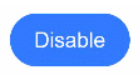
-
圆形按钮
此类型按钮为圆形,不支持通过borderRadius属性重新设置圆角。
Button('Circle', { type: ButtonType.Circle, stateEffect: false })
  .backgroundColor(0x317aff)
  .width(90)
  .height(90)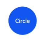
-
普通按钮
此类型的按钮默认圆角为0,支持通过borderRadius属性重新设置圆角。
Button('Ok', { type: ButtonType.Normal, stateEffect: true })
  .borderRadius(8)
  .backgroundColor(0x317aff)
  .width(90)
  .height(40)
自定义样式
-
设置边框弧度。
使用通用属性来自定义按钮样式。例如通过borderRadius属性设置按钮的边框弧度。
Button('circle border', { type: ButtonType.Normal })
  .borderRadius(20)
  .height(40)
-
设置文本样式。
通过添加文本样式设置按钮文本的展示样式。
Button('font style', { type: ButtonType.Normal })
  .fontSize(20)
  .fontColor(Color.Pink)
  .fontWeight(800)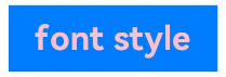
-
设置背景颜色。
添加backgroundColor属性设置按钮的背景颜色。
Button('background color').backgroundColor(0xF55A42)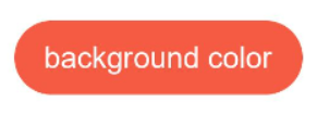
-
创建功能型按钮。
为删除操作创建一个按钮。
let MarLeft: Record<string, number> = { 'left': 20 }
Button({ type: ButtonType.Circle, stateEffect: true }) {
  Image($r('app.media.ic_public_delete_filled')).width(30).height(30)
}.width(55).height(55).margin(MarLeft).backgroundColor(0xF55A42)
添加事件
Button组件通常用于触发某些操作,可以绑定onClick事件来响应点击操作后的自定义行为。
Button('Ok', { type: ButtonType.Normal, stateEffect: true })
  .onClick(()=>{
    console.info('Button onClick')
  })
场景示例
-
用于启动操作。
可以用按钮启动任何用户界面元素,按钮会根据用户的操作触发相应的事件。例如,在List容器里通过点击按钮进行页面跳转。
// xxx.ets
import { router } from '@kit.ArkUI';

@Entry
@Component
struct ButtonCase1 {
  @State FurL:router.RouterOptions = {'url':'pages/first_page'}
  @State SurL:router.RouterOptions = {'url':'pages/second_page'}
  @State TurL:router.RouterOptions = {'url':'pages/third_page'}
  build() {
    List({ space: 4 }) {
      ListItem() {
        Button("First").onClick(() => {
          router.pushUrl(this.FurL)
        })
          .width('100%')
      }
      ListItem() {
        Button("Second").onClick(() => {
          router.pushUrl(this.SurL)
        })
          .width('100%')
      }
      ListItem() {
        Button("Third").onClick(() => {
          router.pushUrl(this.TurL)
        })
          .width('100%')
      }
    }
    .listDirection(Axis.Vertical)
    .backgroundColor(0xDCDCDC).padding(20)
  }
}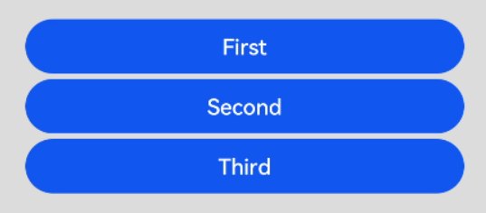
-
用于提交表单。
在用户登录/注册页面,使用按钮进行登录或注册操作。
// xxx.ets
@Entry
@Component
struct ButtonCase2 {
  build() {
    Column() {
      TextInput({ placeholder: 'input your username' }).margin({ top: 20 })
      TextInput({ placeholder: 'input your password' }).type(InputType.Password).margin({ top: 20 })
      Button('Register').width(300).margin({ top: 20 })
        .onClick(() => {
          // 需要执行的操作
        })
    }.padding(20)
  }
}
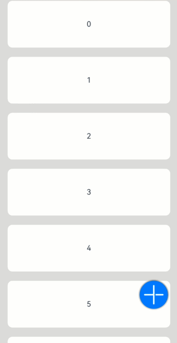
- 悬浮按钮
- 在可以滑动的界面,滑动时按钮始终保持悬浮状态。
// xxx.ets
@Entry
@Component
struct HoverButtonExample {
  private arr: number[] = [0, 1, 2, 3, 4, 5, 6, 7, 8, 9]
  build() {
    Stack() {
      List({ space: 20, initialIndex: 0 }) {
        ForEach(this.arr, (item:number) => {
          ListItem() {
            Text('' + item)
              .width('100%').height(100).fontSize(16)
              .textAlign(TextAlign.Center).borderRadius(10).backgroundColor(0xFFFFFF)
          }
        }, (item:number) => item.toString())
      }.width('90%')
      Button() {
        Image($r('app.media.ic_public_add'))
          .width(50)
          .height(50)
      }
      .width(60)
      .height(60)
      .position({x: '80%', y: 600})
      .shadow({radius: 10})
      .onClick(() => {
        // 需要执行的操作
      })
    }
    .width('100%')
    .height('100%')
    .backgroundColor(0xDCDCDC)
    .padding({ top: 5 })
  }
}
单选框
Radio是单选框组件,通常用于提供相应的用户交互选择项,同一组的Radio中只有一个可以被选中。
创建单选框
Radio通过调用接口来创建,接口调用形式如下:
Radio(options: {value: string, group: string})其中,value是单选框的名称,group是单选框的所属群组名称。checked属性可以设置单选框的状态,状态分别为false和true,设置为true时表示单选框被选中。
Radio支持设置选中状态和非选中状态的样式,不支持自定义形状。
Radio({ value: 'Radio1', group: 'radioGroup' })
  .checked(false)
Radio({ value: 'Radio2', group: 'radioGroup' })
  .checked(true)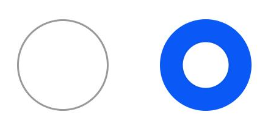
添加事件
除支持通用事件外,Radio还用于选中后触发某些操作,可以绑定onChange事件来响应选中操作后的自定义行为。
  Radio({ value: 'Radio1', group: 'radioGroup' })
    .onChange((isChecked: boolean) => {
      if(isChecked) {
        //需要执行的操作
      }
    })
  Radio({ value: 'Radio2', group: 'radioGroup' })
    .onChange((isChecked: boolean) => {
      if(isChecked) {
        //需要执行的操作
      }
    })
场景示例
通过点击Radio切换声音模式。
// xxx.ets
import { promptAction } from '@kit.ArkUI';

@Entry
@Component
struct RadioExample {
  @State Rst:promptAction.ShowToastOptions = {'message': 'Ringing mode.'}
  @State Vst:promptAction.ShowToastOptions = {'message': 'Vibration mode.'}
  @State Sst:promptAction.ShowToastOptions = {'message': 'Silent mode.'}
  build() {
    Row() {
      Column() {
        Radio({ value: 'Radio1', group: 'radioGroup' }).checked(true)
          .height(50)
          .width(50)
          .onChange((isChecked: boolean) => {
            if(isChecked) {
              // 切换为响铃模式
              promptAction.showToast(this.Rst)
            }
          })
        Text('Ringing')
      }
      Column() {
        Radio({ value: 'Radio2', group: 'radioGroup' })
          .height(50)
          .width(50)
          .onChange((isChecked: boolean) => {
            if(isChecked) {
              // 切换为振动模式
              promptAction.showToast(this.Vst)
            }
          })
        Text('Vibration')
      }
      Column() {
        Radio({ value: 'Radio3', group: 'radioGroup' })
          .height(50)
          .width(50)
          .onChange((isChecked: boolean) => {
            if(isChecked) {
              // 切换为静音模式
              promptAction.showToast(this.Sst)
            }
          })
        Text('Silent')
      }
    }.height('100%').width('100%').justifyContent(FlexAlign.Center)
  }
}
最后
有很多小伙伴不知道学习哪些鸿蒙开发技术?不知道需要重点掌握哪些鸿蒙应用开发知识点?而且学习时频繁踩坑,最终浪费大量时间。所以有一份实用的鸿蒙(HarmonyOS NEXT)资料用来跟着学习是非常有必要的。
点击→【纯血版鸿蒙全套最新学习资料】希望这一份鸿蒙学习资料能够给大家带来帮助
鸿蒙(HarmonyOS NEXT)最新学习路线
有了路线图,怎么能没有学习资料呢,小编也准备了一份联合鸿蒙官方发布笔记整理收纳的一套系统性的鸿蒙(OpenHarmony )学习手册(共计1236页)与鸿蒙(OpenHarmony )开发入门教学视频,内容包含:ArkTS、ArkUI、Web开发、应用模型、资源分类…等知识点。
获取以上完整版高清学习路线,请点击→纯血版全套鸿蒙HarmonyOS学习资料
这份鸿蒙(HarmonyOS NEXT)资料包含了鸿蒙开发必掌握的核心知识要点,内容包含了(ArkTS、ArkUI开发组件、Stage模型、多端部署、分布式应用开发、音频、视频、WebGL、OpenHarmony多媒体技术、Napi组件、OpenHarmony内核、(南向驱动、嵌入式等)鸿蒙项目实战等等)鸿蒙(HarmonyOS NEXT)技术知识点。
HarmonyOS Next 最新全套视频教程
《鸿蒙 (OpenHarmony)开发基础到实战手册》
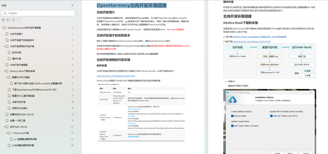
OpenHarmony北向、南向开发环境搭建
《鸿蒙开发基础》
- ArkTS语言
- 安装DevEco Studio
- 运用你的第一个ArkTS应用
- ArkUI声明式UI开发
- .……

《鸿蒙开发进阶》
- Stage模型入门
- 网络管理
- 数据管理
- 电话服务
- 分布式应用开发
- 通知与窗口管理
- 多媒体技术
- 安全技能
- 任务管理
- WebGL
- 国际化开发
- 应用测试
- DFX面向未来设计
- 鸿蒙系统移植和裁剪定制
- ……
《鸿蒙进阶实战》
- ArkTS实践
- UIAbility应用
- 网络案例
- ……
大厂面试必问面试题
鸿蒙南向开发技术
鸿蒙APP开发必备
请点击→纯血版全套鸿蒙HarmonyOS学习资料
总结
总的来说,华为鸿蒙不再兼容安卓,对程序员来说是一个挑战,也是一个机会。只有积极应对变化,不断学习和提升自己,才能在这个变革的时代中立于不败之地。


 3761
3761

 被折叠的 条评论
为什么被折叠?
被折叠的 条评论
为什么被折叠?
 到【灌水乐园】发言


