


知识点:热力图和子图的绘制
- 介绍了热力图的绘制方法
- 介绍了子图的绘制方法
- 介绍了enumerate()函数
import pandas as pd
dt = pd.read_csv('data.csv')
将 Years in current job 和 Home Ownership 列映射为数字,绘制箱线图,数据至少要是数值,否则报错
查看 Years in current job 下的值:
dt['Years in current job'].value_counts()输出:
Years in current job
10+ years    2332
2 years       705
3 years       620
< 1 year      563
5 years       516
1 year        504
4 years       469
6 years       426
7 years       396
8 years       339
9 years       259
Name: count, dtype: int64
# 创建映射字典
mapping = {
"Home Ownership": {
'Home Mortgage': 3,
'Rent': 1,
'Own Home': 0,
'Have Mortgage': 2
},
"Years in current job":{
'< 1 year':0,
'1 year':1,
'2 years':2,
'3 years':3,
'4 years':4,
'5 years':5,
'6 years':6,
'7 years':7,
'8 years':8,
'9 years':9,
'10+ years':10
}
}
# map()映射
dt['Home Ownership'] = dt['Home Ownership'].map(mapping['Home Ownership'])
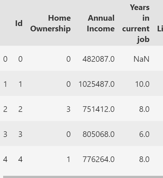
dt['Years in current job'] = dt['Years in current job'].map(mapping['Years in current job'])查看映射后的效果:
# 查看映射后的效果
dt.head(10)
输出:
一、绘制热力图
热力图本质上只能对连续值进行处理,不适合处理数值型的离散值
import pandas as pd
import seaborn as sns
import matplotlib.pyplot as plt

# 连续特征 continuous_features
continuous_features=[
 'Annual Income',
 'Years in current job',
 'Number of Open Accounts',
 'Years of Credit History',
 'Maximum Open Credit',
 'Months since last delinquent',
 'Current Loan Amount',
 'Current Credit Balance',
 'Monthly Debt',
 'Credit Score',
 ]

# 计算相关系数矩阵 corr()
correlation_matrix = dt[continuous_features].corr()

# 设置图片清晰度
plt.rcParams['figure.dpi'] = 300

# 绘制热力图
plt.figure(figsize=(12, 10))
sns.heatmap(correlation_matrix, annot=True, cmap='coolwarm', vmin=-1, vmax=1)
plt.title('Correlation Heatmap of Continuous Features')
plt.show()
输出:
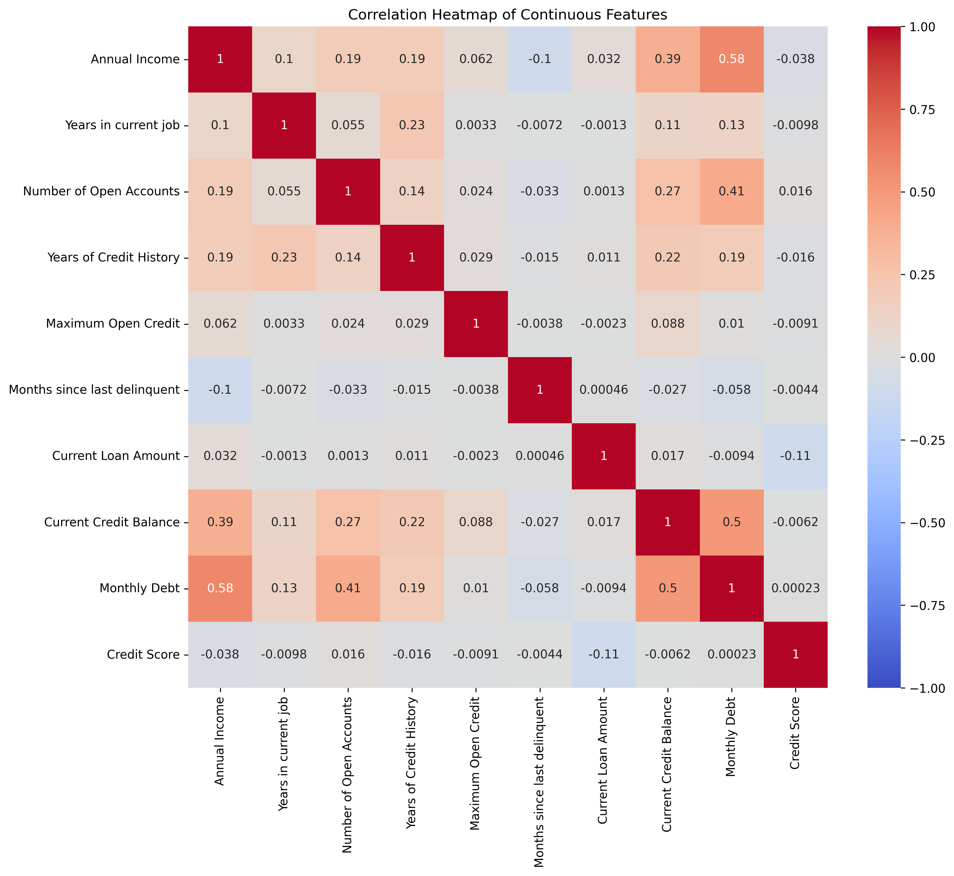
注:correlation_matrix = dt[continuous_features].corr()
调用pandas中的corr()方法,计算列表continuous_features中连续特征的皮尔逊系数矩阵,并将结果存储在correlation_matrix 中
- correlation_matrix:输入的相关系数矩阵数据
- annot=True:(annotate注释)在热力图的每个单元格中显示具体的相关系数数值
- cmap='coolwarm':(colormap颜色映射表)使用「冷-暖」色调的颜色映射(蓝到红)表示相关系数大小
- vmin=-1, vmax=1:(value minimum值的最小值)设置颜色映射的最小值(-1)和最大值(1),与相关系数的理论范围一致
二、子图的绘制
1、手动指引下标绘图
import pandas as pd
import matplotlib.pyplot as plt

# 定义要绘制的特征列
features = ['Annual Income', 'Years in current job', 'Tax Liens', 'Number of Open Accounts']

# 1.创建一个2*2的子图,fig, axes[x, y]:子图数组
fig, axes = plt.subplots(2, 2, figsize=(12, 10))

# # figsize设在subplots内或单独设置,意义相同,但结果不一样(留存)
# # 2.创建一个2*2的子图
# fig, axes = plt.subplots(2, 2)
# # 图片大小
# plt.figure(figsize=(12, 10))

# 清晰度
plt.rcParams['figure.dpi'] = 500

# 手动指引下标索引进行绘图
# 注:dropna()删除数据集中的空值 避免报错,不能漏,"drop not available"
i =0
feature = features[i]
axes[0, 0].boxplot(dt[feature].dropna())
axes[0, 0].set_title(f'Boxplot of {feature}')
axes[0, 0].set_ylabel(feature)

i = 1
feature = features[i]
# 注:seaborn 里边才有kde和element = 'step',直方图叫histplot
axes[0, 1].boxplot(dt[feature].dropna())
axes[0, 1].set_title(f'Boxplot of {feature}')
axes[0, 1].set_ylabel(feature)

i =2
feature = features[i]
axes[1, 0].boxplot(dt[feature].dropna())
axes[1, 0].set_title(f'Boxplot of {feature}')
axes[1, 0].set_ylabel(feature)

i =3
feature = features[i]
axes[1, 1].boxplot(dt[feature].dropna())
axes[1, 1].set_title(f'Boxplot of {feature}')
axes[1, 1].set_ylabel(feature)

# 调整子图间距
plt.tight_layout()

plt.show()
2、借助循环实现绘图:
# 这里借助循环实现

import pandas as pd
import matplotlib.pyplot as plt

# 定义要绘制的特征列
features = ['Annual Income', 'Years in current job', 'Current Loan Amount', 'Current Credit Balance']

# 设置图片清晰度
plt.rcParams['figure.dpi'] = 500

# 创建一个包含2行2列的子图
fig, axes = plt.subplots(2, 2, figsize=(12, 10))

# 遍历特征绘制箱线图
for i in range(len(features)):  # i: 0、1、2、3
  feature = features[i]
  row = i // 2  # 计算当前子图的行索引
  col = i % 2   # 计算当前子图的列索引
  axes[row, col].boxplot(dt[feature].dropna())
  axes[row, col].set_title(f'Boxplot of {feature}')  # 每个子图的标题
  axes[row, col].set_ylabel(feature)  # 每个子图的y轴标签

# 调整子图间的距离
plt.tight_layout()

plt.show()
输出同上
注:subplot()和subplots()的区别
- subplot() :适合动态、逐个添加子图的场景(例如需要根据条件决定是否添加子图)。 但代码可能更冗长(需多次调用 subplot() 并逐个操作子图)。
- subplots() :适合预先规划好子图布局的场景(例如固定2行3列的子图),通过 axes 数组统一管理子图,代码更简洁。
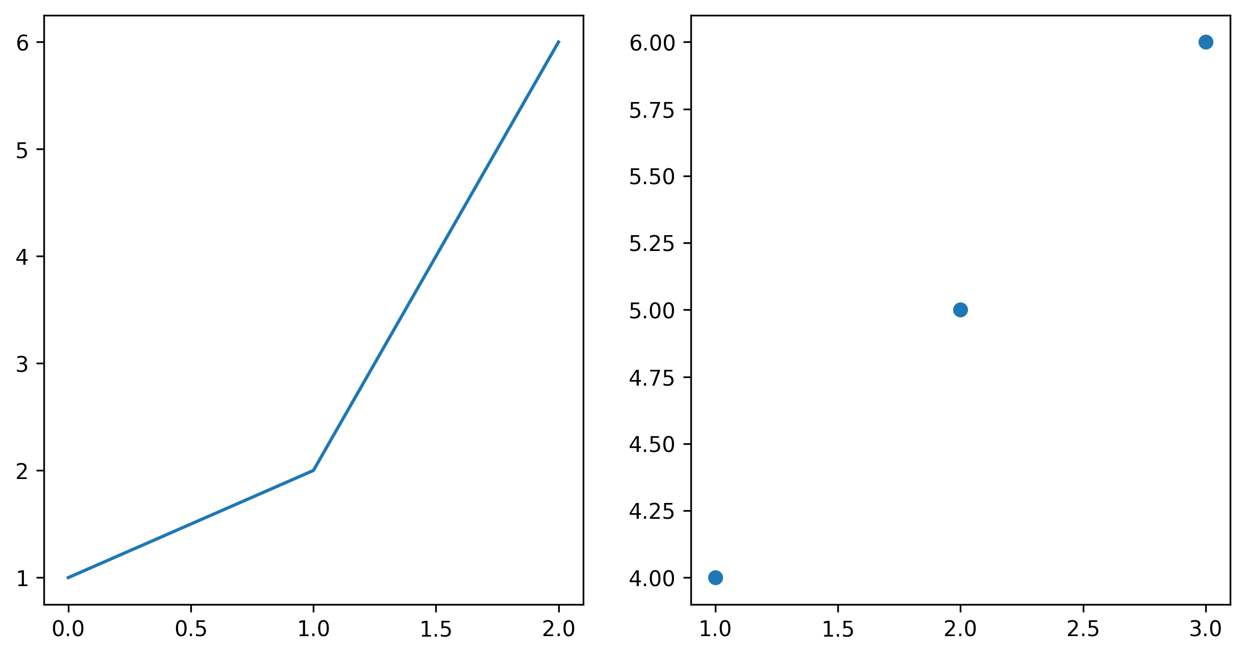
举例:
# 使用 subplot() 逐个创建
plt.subplot(1, 2, 1)  # 第1个子图
plt.plot([1, 2, 6])
plt.subplot(1, 2, 2)  # 第2个子图
plt.scatter([1, 2, 3], [4, 5, 6])

# 使用 subplots() 批量创建
fig, axes = plt.subplots(1, 2, figsize=(10, 5))
axes[0].plot([1, 2, 6])  # 操作第1个子图
axes[1].scatter([1, 2, 3], [4, 5, 6])  # 操作第2个子图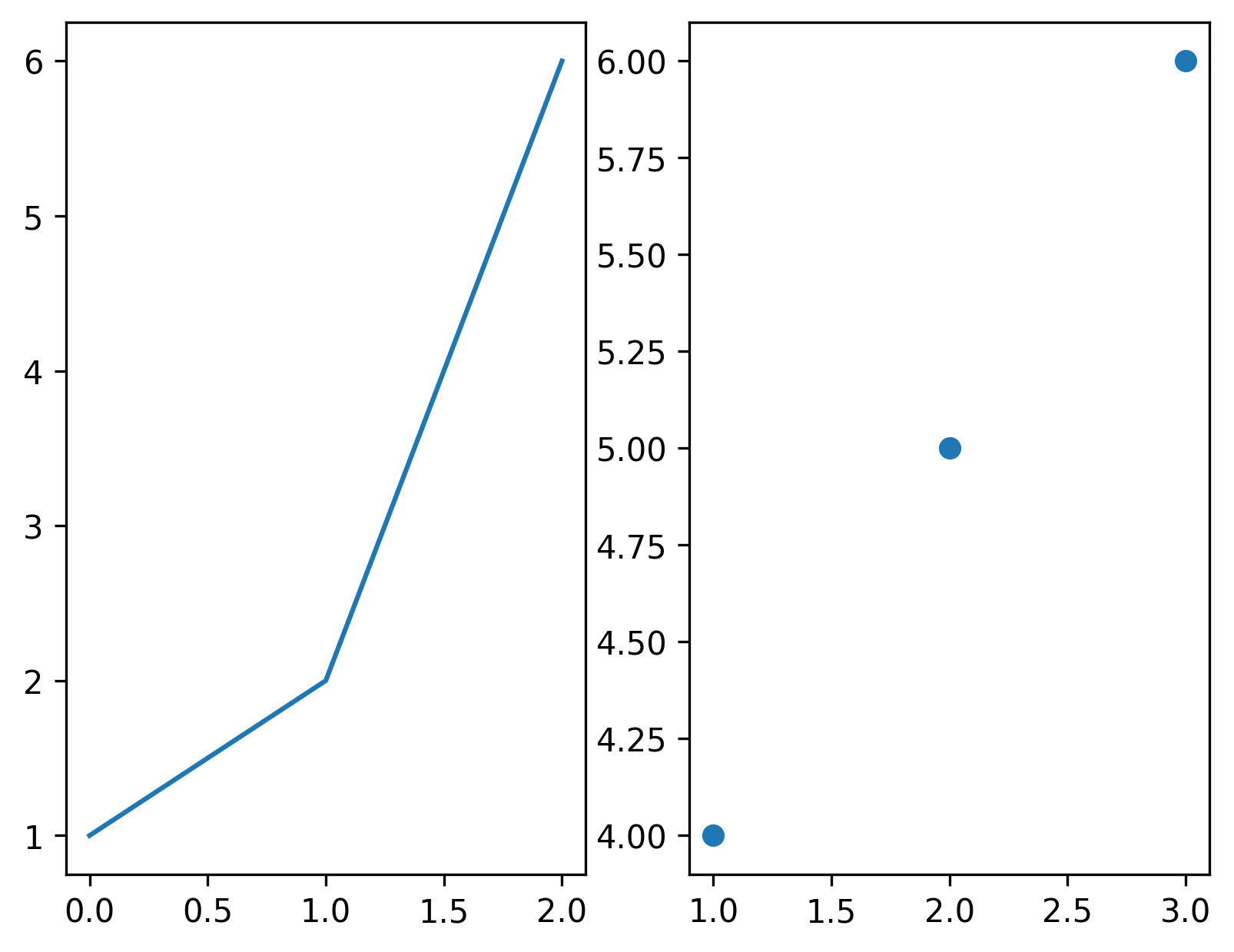
三、非常实用的函数:enumerate( )
enumerate()函数返回一个迭代对象,该对象包含索引和值
语法:
enumerate(iterable, start=0)
参数:
- iterable--迭代对象,可以是列表、元组、字典、字符串等。
- start--索引的开始值
返回值:
返回一个迭代对象,该对象包含索引和值
之所以这个函数很有用,是因为它允许我们同时迭代一个序列,并获取每个元素的索引和值
1、enumerate()举例
features = ['Annual Income', 'Years in current job', 'Current Loan Amount', 'Current Credit Balance']
# 遍历特征并输出索引和值,enumerate:枚举
for i, feature in enumerate(features):
  print(f'索引{i}对应的值是:{feature}\n')
输出:
索引0对应的值是:Annual Income

索引1对应的值是:Years in current job

索引2对应的值是:Current Loan Amount

索引3对应的值是:Current Credit Balance
2、借助 循环 和 enumerate() 函数画子图
import matplotlib.pyplot as plt
import pandas as pd


# 定义要绘制的特征
features = ['Annual Income', 'Years in current job', 'Current Loan Amount', 'Current Credit Balance']

"""
创建一个2*2的子图
fig:代表整个2*2的大画布
axes:是一个2*2数组,通过axes[i, j]访问每个子图
"""
fig, axes = plt.subplots(2, 2, figsize=(12, 8))

# 设置分辨率
plt.rcParams['figure.dpi'] = 300

# 遍历特征并绘制箱线图
for i, feature in enumerate(features):
  # 计算每个子图的行、列索引
  x = i // 2
  y = i % 2
  # 绘图
  axes[x, y].boxplot(dt[feature].dropna())
  axes[x, y].set_title(f'Boxplot of {feature}')
  axes[x, y].set_ylabel(feature)

plt.tight_layout()
plt.show()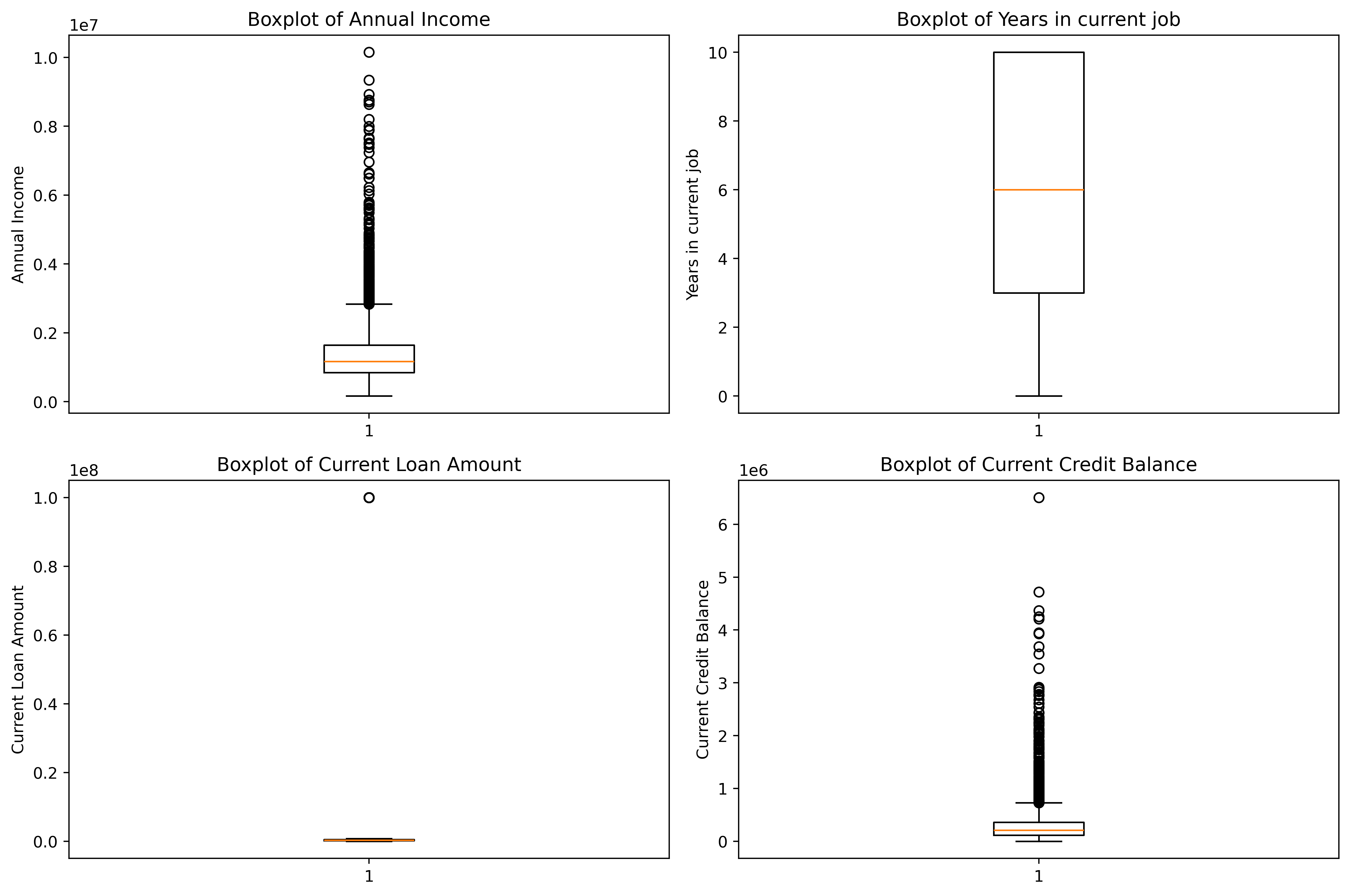
3、与seaborn画图的区别
import seaborn as sns
import matplotlib.pyplot as plt
import pandas as pd
# 读取数据
dt = pd.read_csv('data.csv')
# 画图
sns.boxplot(dt['Annual Income'])#画箱线图
plt.title('Boxplot of Annual Income')#设置标题
plt.ylabel('Annual Income')#设置y轴标签
plt.show()#显示图形- 需要导包seaborn
- 创建画布使用sns.boxplot、sns.histplot、sns.sountplot
- 设置标题时的方法名:seaborn中用title、xlabel、ylabel;axes[x, y]中用set_title、set_xlabel、set_ylabel
- kde核密度曲线和element=' step '阶梯状直方图是seaborn独有的
四、绘制心脏病诊断数据集的热力图和子图
1、读取数据
import pandas as pd
import matplotlib.pyplot as plt
dt = pd.read_csv('heart.csv')
dt.head(10)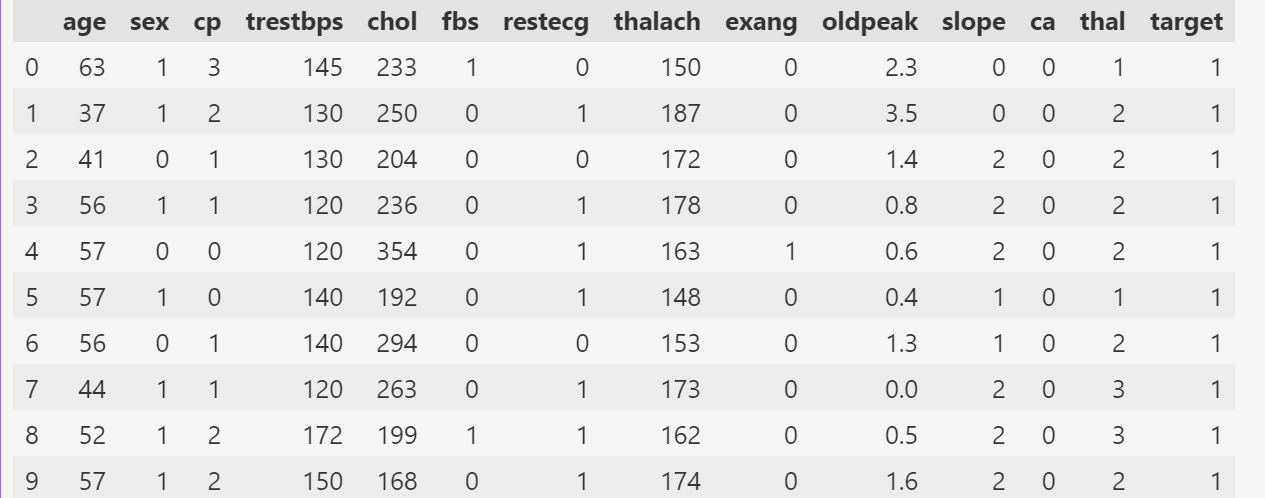
2、心脏病数据集热力图
找哪些是连续特征
dt.columns.to_list()['age',
'sex',
'cp',
'trestbps',
'chol',
'fbs',
'restecg',
'thalach',
'exang',
'oldpeak',
'slope',
'ca',
'thal',
'target']绘制热力图:
# 连续特征 continuous_features
continuous_features=[
 'age',
 'trestbps',
 'chol',
 'thalach',
 'oldpeak'
]

# 计算相关系数矩阵 corr()
correlation_martix = dt[continuous_features].corr()

# 设置图片清晰度
plt.rcParams['figure.dpi'] = 300

# 绘制热力图
# 设置画布大小
plt.figure(figsize=(12, 10))
# 热力图设置
sns.heatmap(correlation_martix, annot=True, cmap='coolwarm', vmin=-1, vmax=1)
# 标题
plt.title('Correlation Heatmap of Continuous Features')
# 展示热力图
plt.show()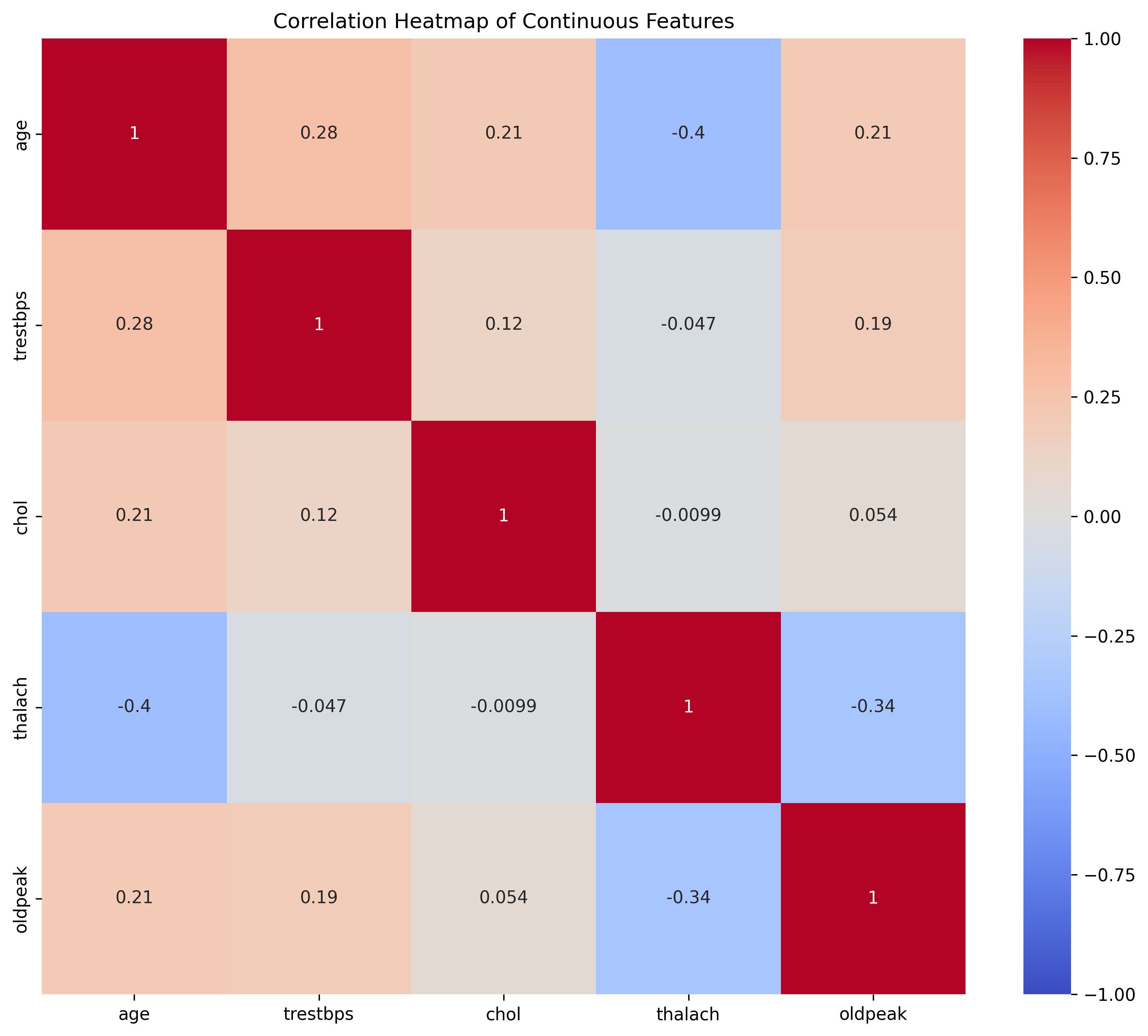
3、心脏病数据集子图
import matplotlib.pyplot as plt
import pandas as pd

# 定义要绘制的特征
features = [ 'trestbps','chol','thalach','oldpeak']

"""
创建一个2*2的子图
fig:代表整个2*2的大画布
axes:是一个2*2数组,通过axes[i, j]访问每个子图
"""
fig, axes = plt.subplots(2, 2, figsize=(12, 8))

# 设置分辨率
plt.rcParams['figure.dpi'] = 300

# 遍历特征并绘制箱线图 enumerate()
for i, feature in enumerate(features):
  # 计算每个子图的行、列索引
  row = i // 2
  col = i % 2
  # 绘图
  # 传入数据
  axes[row, col].boxplot(dt[feature].dropna())
  # 设置标题
  axes[row, col].set_title(f'Boxplot of {feature}')
  # 设置y标签
  axes[row, col].set_ylabel(feature)
# 调整布局
plt.tight_layout()
# 展示子图
plt.show()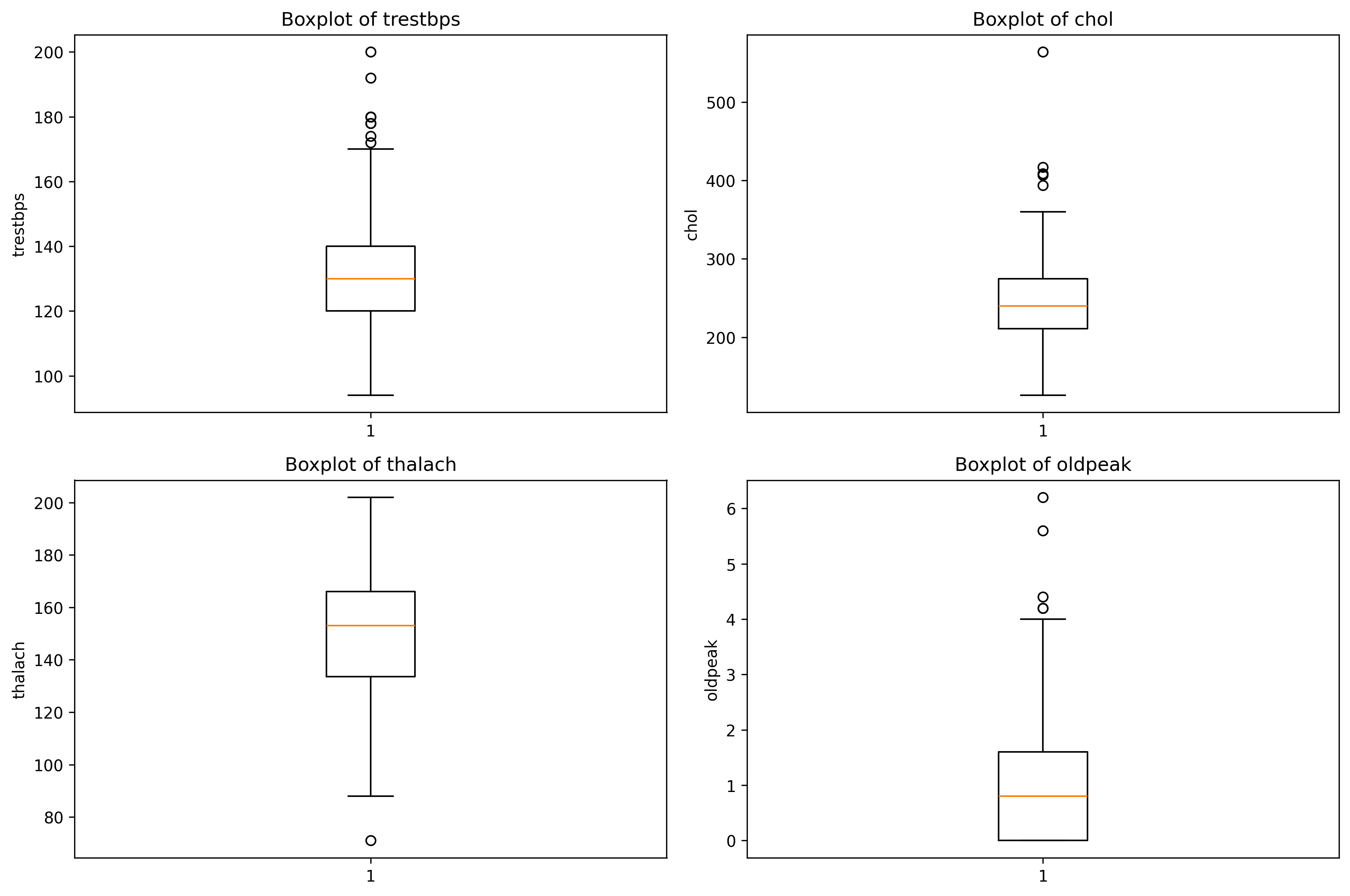


 被折叠的 条评论
为什么被折叠?
被折叠的 条评论
为什么被折叠?
 到【灌水乐园】发言


