


WPF之按钮渲染篇
1.在XAML中添加按钮
    <StackPanel HorizontalAlignment="Left">
        <Button>按钮1</Button>
        <Button>按钮2</Button>
    </StackPanel>
2.使用Application资源来设置属性,类似于网页中的层叠样式表(CSS)
设置宽度与边缘距离
<Application.Resources >
        <Style TargetType=“Button”>
          <Setter Property=“Width” Value=“90”/>
          <Setter Property=“Margin” Value=“10”/>
        </Style>
</Application.Resources >
添加渐变颜色
<Application.Resources >
  <LinearGradientBrush x:Key=“GrayBlueGardientBrush”  StartPoint=“0,0” EndPoint=“1,1” >
           <GradientStop Color=“DarkCyan” Offset=“0” />
           <GradientStop Color=“#CCCCFF” Offset=“0.5” />
           <GradientStop Color=“DarkCyan” Offset=“1” />
  </LinearGradientBrush >
</Application.Resources >
设置按钮模板属性,需要在样式标记内使用模板
  <Style TargetType=“{x:Type Button}” >
       <Setter Property=“Background” Value=“{StaticResource GrayBlueGardientBrush}” />
       <Setter Property=“Width” Value=“80” />
        <Setter Property=“Margin” Value=“10” />
        <Setter Property=“Template” >
           <Setter.Value >

            </Setter.Value >
        </Setter >
  </Style >
创建圆角边缘
 <Setter.Value>
       <!-- The button template is defined here. -->
       <ControlTemplate TargetType="Button">
          <Grid Width="{TemplateBinding Width}" Height="{TemplateBinding Height}" ClipToBounds="True">
              <Rectangle x:Name="outerRectangle" HorizontalAlignment="Stretch" VerticalAlignment="Stretch" Stroke="{TemplateBinding Background}" RadiusX="20" RadiusY="20" StrokeThickness="5" Fill="Transparent" />
              <Rectangle x:Name="innerRectangle" HorizontalAlignment="Stretch" VerticalAlignment="Stretch" Stroke="Transparent" StrokeThickness="20" Fill="{TemplateBinding Background}" RadiusX="20" RadiusY="20" />
              <DockPanel Name="myContentPresenterDockPanel">
                  <ContentPresenter x:Name="myContentPresenter" Margin="20" Content="{TemplateBinding  Content}" TextBlock.Foreground="Black" />
              </DockPanel>
           </Grid>
       </ControlTemplate>
   </Setter.Value>
3.创建按钮响应。设置按钮交互性,使用属性触发器和事件触发器,要设置触发属性为true。
添加模板触发器
  <ControlTemplate.Triggers>

  </ControlTemplate.Triggers>
添加焦点触发器
   <Trigger Property="IsMouseOver"  Value="True">
     <Setter Property="Rectangle.Stroke" TargetName="outerRectangle"   Value="{DynamicResource {x:Static SystemColors.HighlightBrushKey}}" />
     <Setter Property="Rectangle.Opacity" Value="1" TargetName="glassCube" />
     <Setter Property="ContentPresenter.BitmapEffect"  TargetName="myContentPresenter">
       <Setter.Value>
         <BlurBitmapEffect Radius="1" />
       </Setter.Value>
    </Setter>
    </Trigger>
添加动画效果
 <EventTrigger RoutedEvent="Mouse.MouseEnter">
   <EventTrigger.Actions>
      <BeginStoryboard Name="mouseEnterBeginStoryboard">
          <Storyboard>
               <DoubleAnimation Storyboard.TargetName="glassCube"   Storyboard.TargetProperty=   "(Rectangle.RenderTransform).(TransformGroup.Children)[0].(ScaleTransform.ScaleX)"    By="-0.1" Duration="0:0:0.5" />
               <DoubleAnimation Storyboard.TargetName="glassCube" Storyboard.TargetProperty=    "(Rectangle.RenderTransform).(TransformGroup.Children)[0].(ScaleTransform.ScaleY)"    By="-0.1" Duration="0:0:0.5" />
            </Storyboard>
      </BeginStoryboard>
   </EventTrigger.Actions>
  </EventTrigger>

 <EventTrigger RoutedEvent="Mouse.MouseLeave">
    <EventTrigger.Actions>
      <StopStoryboard BeginStoryboardName="mouseEnterBeginStoryboard" />
    </EventTrigger.Actions>
</EventTrigger>

<EventTrigger RoutedEvent="Button.Click">
   <EventTrigger.Actions>
      <BeginStoryboard>
          <Storyboard>
             <DoubleAnimation Storyboard.TargetName="glassCube"  Storyboard.TargetProperty=   "(Rectangle.RenderTransform).(TransformGroup.Children)[1].(RotateTransform.Angle)"  By="360" Duration="0:0:0.5" />
          </Storyboard>
       </BeginStoryboard>
    </EventTrigger.Actions>
</EventTrigger>
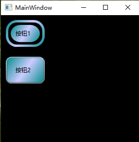
4.显示效果
参考文章:《Walkthrough: Create a Button by Using XAML》 https://docs.microsoft.com/en-us/dotnet/framework/wpf/controls/walkthrough-create-a-button-by-using-xaml


 554
554


 被折叠的 条评论
为什么被折叠?
被折叠的 条评论
为什么被折叠?
 到【灌水乐园】发言


