


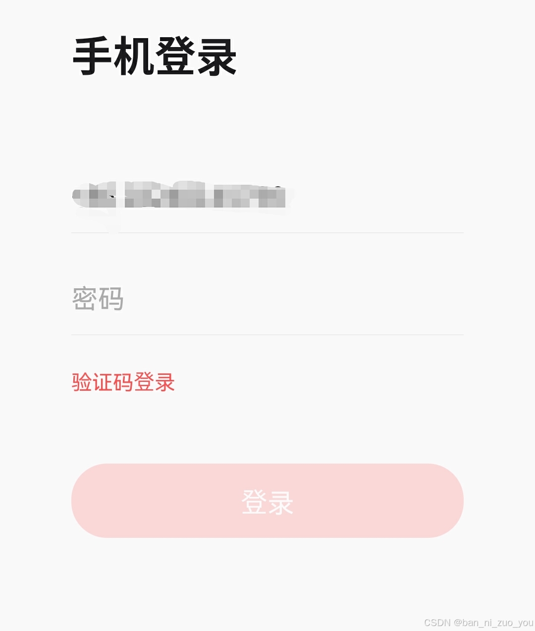
EditText的作用是用来生成一个输入框,比如一些常见的登录界面
EditText继承了TextView的所有属性,学习之前建议学习TextView控件(可以看我往期文章)
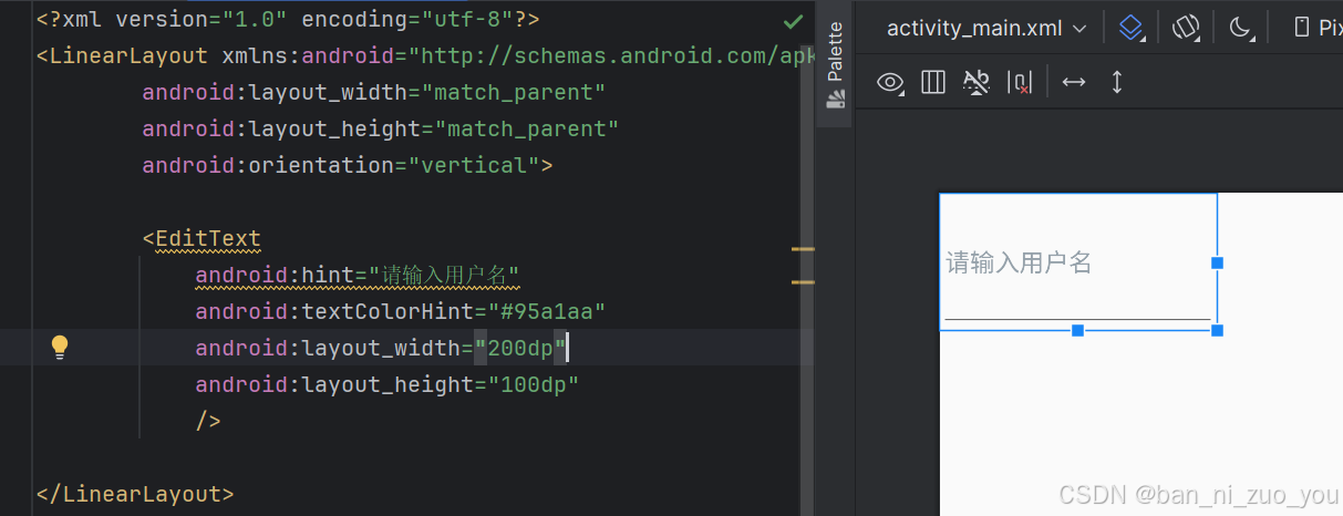
hint输入提示
输入框内一些默认的提示用户输入的文字
textColorTint输入提示文字的颜色
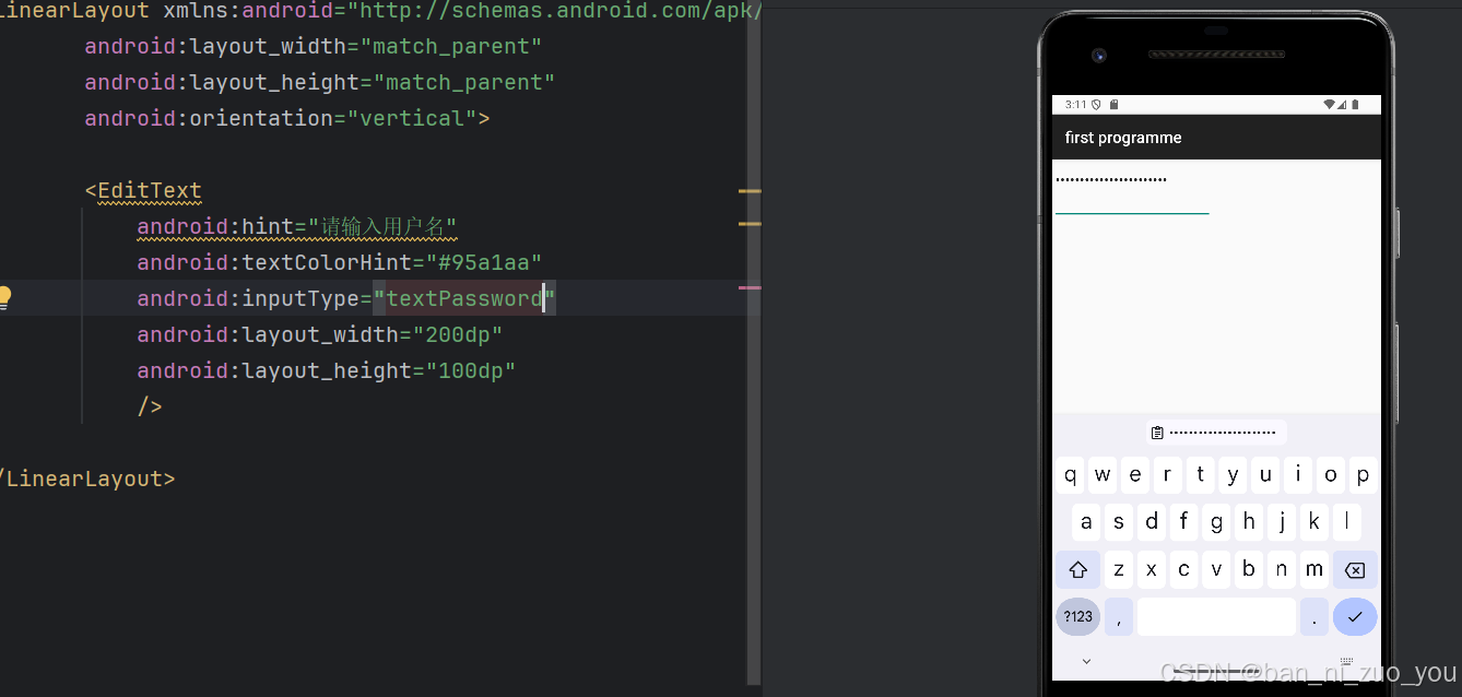
inputType设置输入内容的类型
textPassword:输入密码,且输入的内容可以包含字母,数字,符号等等文本内容
 number:输入框输入的内容只能为数字。
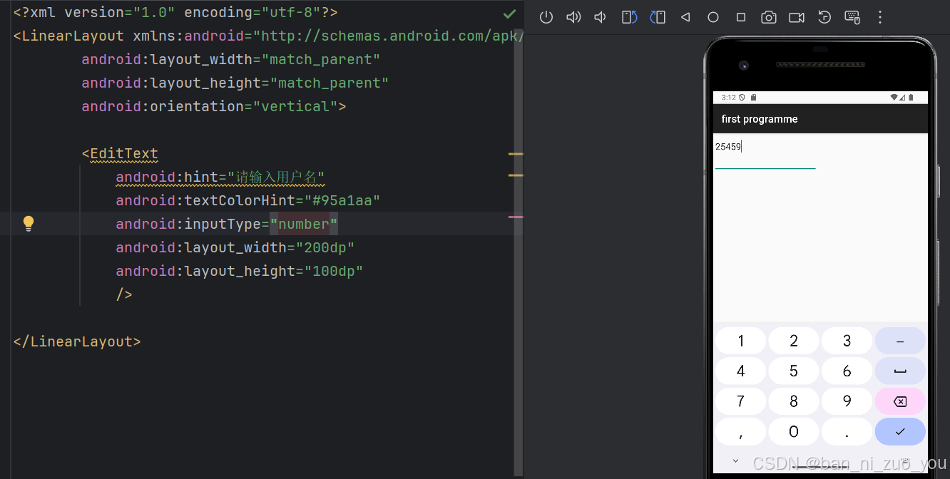
inputType的所以属性值如下:
<attr name="inputType">
<!-- There is no content type. The text is not editable. -->
<flag name="none" value="0x00000000" />
<!-- Just plain old text. Corresponds to
{@link android.text.InputType#TYPE_CLASS_TEXT} |
{@link android.text.InputType#TYPE_TEXT_VARIATION_NORMAL}. -->
<flag name="text" value="0x00000001" />
<!-- Can be combined with <var>text</var> and its variations to
request capitalization of all characters. Corresponds to
{@link android.text.InputType#TYPE_TEXT_FLAG_CAP_CHARACTERS}. -->
<flag name="textCapCharacters" value="0x00001001" />
<!-- Can be combined with <var>text</var> and its variations to
request capitalization of the first character of every word. Corresponds to
{@link android.text.InputType#TYPE_TEXT_FLAG_CAP_WORDS}. -->
<flag name="textCapWords" value="0x00002001" />
<!-- Can be combined with <var>text</var> and its variations to
request capitalization of the first character of every sentence. Corresponds to
{@link android.text.InputType#TYPE_TEXT_FLAG_CAP_SENTENCES}. -->
<flag name="textCapSentences" value="0x00004001" />
<!-- Can be combined with <var>text</var> and its variations to
request auto-correction of text being input. Corresponds to
{@link android.text.InputType#TYPE_TEXT_FLAG_AUTO_CORRECT}. -->
<flag name="textAutoCorrect" value="0x00008001" />
<!-- Can be combined with <var>text</var> and its variations to
specify that this field will be doing its own auto-completion and
talking with the input method appropriately. Corresponds to
{@link android.text.InputType#TYPE_TEXT_FLAG_AUTO_COMPLETE}. -->
<flag name="textAutoComplete" value="0x00010001" />
<!-- Can be combined with <var>text</var> and its variations to
allow multiple lines of text in the field. If this flag is not set,
the text field will be constrained to a single line. Corresponds to
{@link android.text.InputType#TYPE_TEXT_FLAG_MULTI_LINE}.
Note: If this flag is not set and the text field doesn't have max length limit, the
framework automatically set maximum length of the characters to 5000 for the
performance reasons.
-->
<flag name="textMultiLine" value="0x00020001" />
<!-- Can be combined with <var>text</var> and its variations to
indicate that though the regular text view should not be multiple
lines, the IME should provide multiple lines if it can. Corresponds to
{@link android.text.InputType#TYPE_TEXT_FLAG_IME_MULTI_LINE}. -->
<flag name="textImeMultiLine" value="0x00040001" />
<!-- Can be combined with <var>text</var> and its variations to
indicate that the IME should not show any
dictionary-based word suggestions. Corresponds to
{@link android.text.InputType#TYPE_TEXT_FLAG_NO_SUGGESTIONS}. -->
<flag name="textNoSuggestions" value="0x00080001" />
<!-- Can be combined with <var>text</var> and its variations to
indicate that if there is extra information, the IME should provide
{@link android.view.inputmethod.TextAttribute}. Corresponds to
{@link android.text.InputType#TYPE_TEXT_FLAG_ENABLE_TEXT_CONVERSION_SUGGESTIONS}. -->
<flag name="textEnableTextConversionSuggestions" value="0x00100001" />
<!-- Text that will be used as a URI. Corresponds to
{@link android.text.InputType#TYPE_CLASS_TEXT} |
{@link android.text.InputType#TYPE_TEXT_VARIATION_URI}. -->
<flag name="textUri" value="0x00000011" />
<!-- Text that will be used as an e-mail address. Corresponds to
{@link android.text.InputType#TYPE_CLASS_TEXT} |
{@link android.text.InputType#TYPE_TEXT_VARIATION_EMAIL_ADDRESS}. -->
<flag name="textEmailAddress" value="0x00000021" />
<!-- Text that is being supplied as the subject of an e-mail. Corresponds to
{@link android.text.InputType#TYPE_CLASS_TEXT} |
{@link android.text.InputType#TYPE_TEXT_VARIATION_EMAIL_SUBJECT}. -->
<flag name="textEmailSubject" value="0x00000031" />
<!-- Text that is the content of a short message. Corresponds to
{@link android.text.InputType#TYPE_CLASS_TEXT} |
{@link android.text.InputType#TYPE_TEXT_VARIATION_SHORT_MESSAGE}. -->
<flag name="textShortMessage" value="0x00000041" />
<!-- Text that is the content of a long message. Corresponds to
{@link android.text.InputType#TYPE_CLASS_TEXT} |
{@link android.text.InputType#TYPE_TEXT_VARIATION_LONG_MESSAGE}. -->
<flag name="textLongMessage" value="0x00000051" />
<!-- Text that is the name of a person. Corresponds to
{@link android.text.InputType#TYPE_CLASS_TEXT} |
{@link android.text.InputType#TYPE_TEXT_VARIATION_PERSON_NAME}. -->
<flag name="textPersonName" value="0x00000061" />
<!-- Text that is being supplied as a postal mailing address. Corresponds to
{@link android.text.InputType#TYPE_CLASS_TEXT} |
{@link android.text.InputType#TYPE_TEXT_VARIATION_POSTAL_ADDRESS}. -->
<flag name="textPostalAddress" value="0x00000071" />
<!-- Text that is a password. Corresponds to
{@link android.text.InputType#TYPE_CLASS_TEXT} |
{@link android.text.InputType#TYPE_TEXT_VARIATION_PASSWORD}. -->
<flag name="textPassword" value="0x00000081" />
<!-- Text that is a password that should be visible. Corresponds to
{@link android.text.InputType#TYPE_CLASS_TEXT} |
{@link android.text.InputType#TYPE_TEXT_VARIATION_VISIBLE_PASSWORD}. -->
<flag name="textVisiblePassword" value="0x00000091" />
<!-- Text that is being supplied as text in a web form. Corresponds to
{@link android.text.InputType#TYPE_CLASS_TEXT} |
{@link android.text.InputType#TYPE_TEXT_VARIATION_WEB_EDIT_TEXT}. -->
<flag name="textWebEditText" value="0x000000a1" />
<!-- Text that is filtering some other data. Corresponds to
{@link android.text.InputType#TYPE_CLASS_TEXT} |
{@link android.text.InputType#TYPE_TEXT_VARIATION_FILTER}. -->
<flag name="textFilter" value="0x000000b1" />
<!-- Text that is for phonetic pronunciation, such as a phonetic name
field in a contact entry. Corresponds to
{@link android.text.InputType#TYPE_CLASS_TEXT} |
{@link android.text.InputType#TYPE_TEXT_VARIATION_PHONETIC}. -->
<flag name="textPhonetic" value="0x000000c1" />
<!-- Text that will be used as an e-mail address on a web form. Corresponds to
{@link android.text.InputType#TYPE_CLASS_TEXT} |
{@link android.text.InputType#TYPE_TEXT_VARIATION_WEB_EMAIL_ADDRESS}. -->
<flag name="textWebEmailAddress" value="0x000000d1" />
<!-- Text that will be used as a password on a web form. Corresponds to
{@link android.text.InputType#TYPE_CLASS_TEXT} |
{@link android.text.InputType#TYPE_TEXT_VARIATION_WEB_PASSWORD}. -->
<flag name="textWebPassword" value="0x000000e1" />
<!-- A numeric only field. Corresponds to
{@link android.text.InputType#TYPE_CLASS_NUMBER} |
{@link android.text.InputType#TYPE_NUMBER_VARIATION_NORMAL}. -->
<flag name="number" value="0x00000002" />
<!-- Can be combined with <var>number</var> and its other options to
allow a signed number. Corresponds to
{@link android.text.InputType#TYPE_CLASS_NUMBER} |
{@link android.text.InputType#TYPE_NUMBER_FLAG_SIGNED}. -->
<flag name="numberSigned" value="0x00001002" />
<!-- Can be combined with <var>number</var> and its other options to
allow a decimal (fractional) number. Corresponds to
{@link android.text.InputType#TYPE_CLASS_NUMBER} |
{@link android.text.InputType#TYPE_NUMBER_FLAG_DECIMAL}. -->
<flag name="numberDecimal" value="0x00002002" />
<!-- A numeric password field. Corresponds to
{@link android.text.InputType#TYPE_CLASS_NUMBER} |
{@link android.text.InputType#TYPE_NUMBER_VARIATION_PASSWORD}. -->
<flag name="numberPassword" value="0x00000012" />
<!-- For entering a phone number. Corresponds to
{@link android.text.InputType#TYPE_CLASS_PHONE}. -->
<flag name="phone" value="0x00000003" />
<!-- For entering a date and time. Corresponds to
{@link android.text.InputType#TYPE_CLASS_DATETIME} |
{@link android.text.InputType#TYPE_DATETIME_VARIATION_NORMAL}. -->
<flag name="datetime" value="0x00000004" />
<!-- For entering a date. Corresponds to
{@link android.text.InputType#TYPE_CLASS_DATETIME} |
{@link android.text.InputType#TYPE_DATETIME_VARIATION_DATE}. -->
<flag name="date" value="0x00000014" />
<!-- For entering a time. Corresponds to
{@link android.text.InputType#TYPE_CLASS_DATETIME} |
{@link android.text.InputType#TYPE_DATETIME_VARIATION_TIME}. -->
<flag name="time" value="0x00000024" />
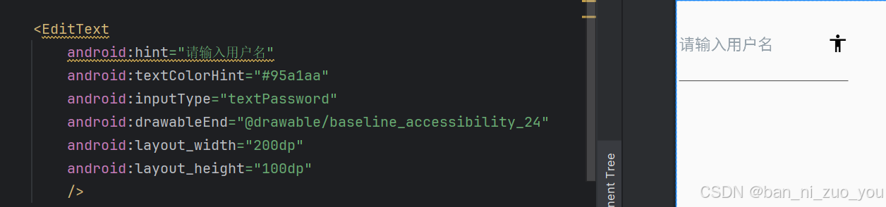
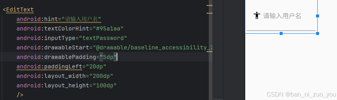
</attr>drawableXxxx添加图片
drawableStart:代表在最前面(最左侧)添加图片,和drawableLeft效果一样
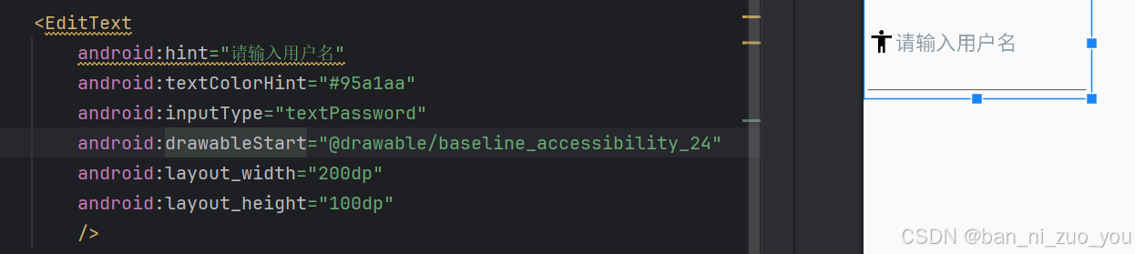
drawableEnd:在输入框的最末尾(最右侧)添加图片,和drawableRight效果一样
其他可用属性值如下:
<!-- The drawable to be drawn above the text. -->
<attr name="drawableTop" format="reference|color" />
<!-- The drawable to be drawn below the text. -->
<attr name="drawableBottom" format="reference|color" />
<!-- The drawable to be drawn to the left of the text. -->
<attr name="drawableLeft" format="reference|color" />
<!-- The drawable to be drawn to the right of the text. -->
<attr name="drawableRight" format="reference|color" />
<!-- The drawable to be drawn to the start of the text. -->
<attr name="drawableStart" format="reference|color" />
<!-- The drawable to be drawn to the end of the text. -->
<attr name="drawableEnd" format="reference|color" />
<!-- The padding between the drawables and the text. -->
<attr name="drawablePadding" format="dimension" />
<!-- Tint to apply to the compound (left, top, etc.) drawables. -->
<attr name="drawableTint" format="color" />
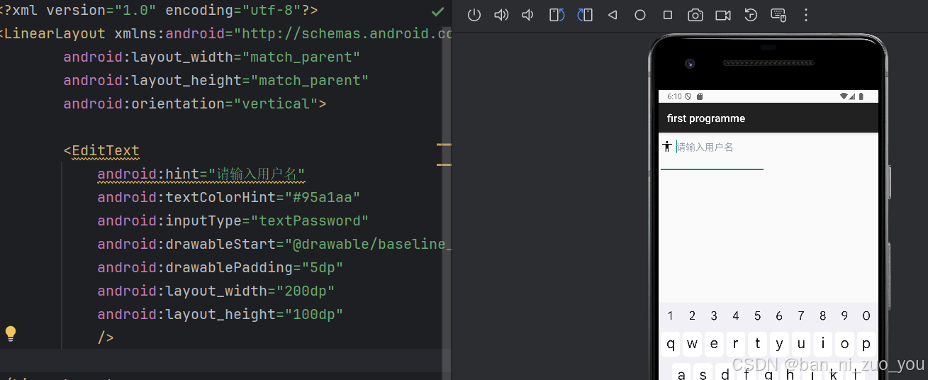
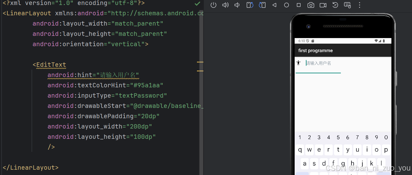
<!-- Blending mode used to apply the compound (left, top, etc.) drawables tint. -->drawablePadding设置图片与输入内容的间距
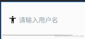
距离为5dp时:
距离为20dp时:
paddingXxxx 设置内容与输入框的间距
paddingXxxx的所有属性
<!-- Sets the padding, in pixels, of all four edges. Padding is defined as
             space between the edges of the view and the view's content. This value will take
             precedence over any of the edge-specific values (paddingLeft, paddingTop,
             paddingRight, paddingBottom, paddingHorizontal and paddingVertical), but will
             not override paddingStart or paddingEnd, if set. A view's size
             will include its padding. If a {@link android.R.attr#background}
             is provided, the padding will initially be set to that (0 if the
             drawable does not have padding). Explicitly setting a padding value
             will override the corresponding padding found in the background. -->
        <attr name="padding" format="dimension" />
        <!-- Sets the padding, in pixels, of the left and right edges; see
             {@link android.R.attr#padding}. This value will take precedence over
             paddingLeft and paddingRight, but not paddingStart or paddingEnd (if set). -->
        <attr name="paddingHorizontal" format="dimension" />
        <!-- Sets the padding, in pixels, of the top and bottom edges; see
             {@link android.R.attr#padding}. This value will take precedence over
             paddingTop and paddingBottom, if set. -->
        <attr name="paddingVertical" format="dimension" />
        <!-- Sets the padding, in pixels, of the left edge; see {@link android.R.attr#padding}. -->
        <attr name="paddingLeft" format="dimension" />
        <!-- Sets the padding, in pixels, of the top edge; see {@link android.R.attr#padding}. -->
        <attr name="paddingTop" format="dimension" />
        <!-- Sets the padding, in pixels, of the right edge; see {@link android.R.attr#padding}. -->
        <attr name="paddingRight" format="dimension" />
        <!-- Sets the padding, in pixels, of the bottom edge; see {@link android.R.attr#padding}. -->
        <attr name="paddingBottom" format="dimension" />
        <!-- Sets the padding, in pixels, of the start edge; see {@link android.R.attr#padding}. -->
        <attr name="paddingStart" format="dimension" />
        <!-- Sets the padding, in pixels, of the end edge; see {@link android.R.attr#padding}. -->
        <attr name="paddingEnd" format="dimension" />
drawablePadding和paddingXxxx的区别
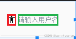
如上图,drawablePadding指的是图片(红色框)与输入内容(绿色框)的间距
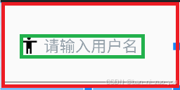
而paddingXxxx指的时输入框内的所有内容(绿色部分)与整个输入框(红色框)的间距
background背景色
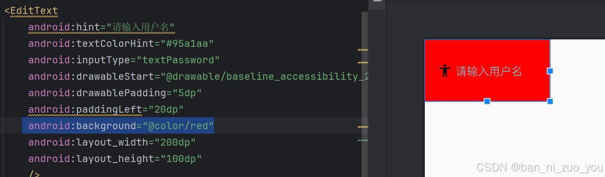
正常情况下,输入框的下面都会有一条边框显得很难看(如下图)
我们可以通过将background设置成white来隐藏边框
实际开发时
实际开发时,EditText一般配合着Button控件来使用。通过使用Button来获取输入框里的内容,进行登录等等操作。
activity_main.xml
<?xml version="1.0" encoding="utf-8"?>
<LinearLayout xmlns:android="http://schemas.android.com/apk/res/android"
android:layout_width="match_parent"
android:layout_height="match_parent"
android:orientation="vertical">
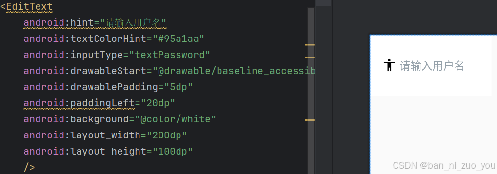
<EditText
android:id="@+id/ET"
android:hint="请输入用户名"
android:textColorHint="#95a1aa"
android:inputType="textPassword"
android:drawableStart="@drawable/baseline_accessibility_24"
android:drawablePadding="5dp"
android:paddingLeft="20dp"
android:background="@color/white"
android:layout_width="200dp"
android:layout_height="100dp"
/>
<Button
android:id="@+id/btn"
android:text="获取用户名"
android:layout_width="wrap_content"
android:layout_height="wrap_content"/>
</LinearLayout>
MainActivity.java
package com.example.firstprogramme;


import android.nfc.Tag;
import android.os.Bundle;
import android.util.Log;
import android.view.MotionEvent;
import android.view.View;
import android.widget.Button;
import android.widget.EditText;
import android.widget.TextView;

import androidx.activity.EdgeToEdge;
import androidx.appcompat.app.AppCompatActivity;
import androidx.core.graphics.Insets;
import androidx.core.view.ViewCompat;
import androidx.core.view.WindowInsetsCompat;

public class MainActivity extends AppCompatActivity {

    private  EditText ET;
    @Override
    protected void onCreate(Bundle savedInstanceState) {
        super.onCreate(savedInstanceState);
        EdgeToEdge.enable(this);
        setContentView(R.layout.activity_main);

        Button btn = findViewById(R.id.btn);
        ET = findViewById(R.id.ET);
//当点击按钮时,获取输入框的内容
        btn.setOnClickListener(new View.OnClickListener() {
            @Override
            public void onClick(View view) {
//getText()获取输入框的内容 toString()将其转化成字符串
                String text = ET.getText().toString();
                Log.e("TAG", "输入的内容:"+text);
            }
        });
    }
}


 扫一扫
扫一扫


 1615
1615

 被折叠的 条评论
为什么被折叠?
被折叠的 条评论
为什么被折叠?
 到【灌水乐园】发言


