


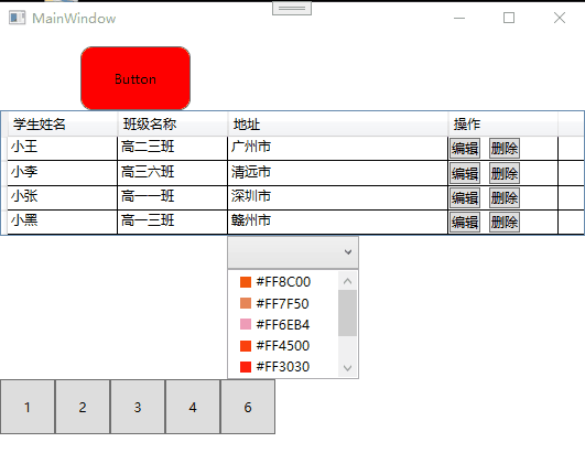
运行效果
界面代码
<Window x:Class="Template.MainWindow"
        xmlns="http://schemas.microsoft.com/winfx/2006/xaml/presentation"
        xmlns:x="http://schemas.microsoft.com/winfx/2006/xaml"
        xmlns:d="http://schemas.microsoft.com/expression/blend/2008"
        xmlns:mc="http://schemas.openxmlformats.org/markup-compatibility/2006"
        xmlns:local="clr-namespace:Template"
        mc:Ignorable="d"
        Title="MainWindow" Height="697" Width="800">
    <Window.Resources>

        <ControlTemplate x:Key="sdf" TargetType="{x:Type Button}">
            <Border x:Name="border"  Width="100"
                                CornerRadius="10" Background="Red"
                                BorderBrush="{TemplateBinding BorderBrush}"
                                BorderThickness="{TemplateBinding BorderThickness}"
                                SnapsToDevicePixels="true">
                <ContentPresenter x:Name="contentPresenter" Focusable="False" HorizontalAlignment="{TemplateBinding HorizontalContentAlignment}"
                                              Margin="{TemplateBinding Padding}" RecognizesAccessKey="True" SnapsToDevicePixels="{TemplateBinding SnapsToDevicePixels}"
                                              VerticalAlignment="{TemplateBinding VerticalContentAlignment}"/>
            </Border>
            <ControlTemplate.Triggers>
                <Trigger Property="IsDefaulted" Value="true">
                    <Setter Property="BorderBrush" TargetName="border" Value="{DynamicResource {x:Static SystemColors.HighlightBrushKey}}"/>
                </Trigger>
                <Trigger Property="IsMouseOver" Value="true">
                    <Setter Property="Background" TargetName="border" Value="Blue"/>
                    <Setter Property="BorderBrush" TargetName="border" Value="Blue"/>
                </Trigger>
                <EventTrigger RoutedEvent="MouseEnter">
                    <BeginStoryboard>
                        <Storyboard>
                            <ColorAnimation Storyboard.TargetName="border"
                                                        Storyboard.TargetProperty="Background.Color" To="Pink"
                                                        Duration="0:0:0:2"/>
                        </Storyboard>
                    </BeginStoryboard>
                </EventTrigger>
                <EventTrigger RoutedEvent="MouseLeave">
                    <BeginStoryboard>
                        <Storyboard>
                            <ColorAnimation Storyboard.TargetName="border"
                                                        Storyboard.TargetProperty="Background.Color" To="Green"
                                                        Duration="0:0:0:2"/>
                        </Storyboard>
                    </BeginStoryboard>
                </EventTrigger>

            </ControlTemplate.Triggers>
        </ControlTemplate>

        <Style x:Key="FocusVisual">
            <Setter Property="Control.Template">
                <Setter.Value>
                    <ControlTemplate>
                        <Rectangle Margin="2" StrokeDashArray="1 2" Stroke="{DynamicResource {x:Static SystemColors.ControlTextBrushKey}}" SnapsToDevicePixels="true" StrokeThickness="1"/>
                    </ControlTemplate>
                </Setter.Value>
            </Setter>
        </Style>
        <SolidColorBrush x:Key="Button.Static.Background" Color="#FFDDDDDD"/>
        <SolidColorBrush x:Key="Button.Static.Border" Color="#FF707070"/>
        <SolidColorBrush x:Key="Button.MouseOver.Background" Color="#FFBEE6FD"/>
        <SolidColorBrush x:Key="Button.MouseOver.Border" Color="#FF3C7FB1"/>
        <SolidColorBrush x:Key="Button.Pressed.Background" Color="#FFC4E5F6"/>
        <SolidColorBrush x:Key="Button.Pressed.Border" Color="#FF2C628B"/>
        <SolidColorBrush x:Key="Button.Disabled.Background" Color="#FFF4F4F4"/>
        <SolidColorBrush x:Key="Button.Disabled.Border" Color="#FFADB2B5"/>
        <SolidColorBrush x:Key="Button.Disabled.Foreground" Color="#FF838383"/>

        <Style x:Key="ButtonStyle1" TargetType="{x:Type Button}">
            <Setter Property="FocusVisualStyle" Value="{StaticResource FocusVisual}"/>
            <Setter Property="Background" Value="{StaticResource Button.Static.Background}"/>
            <Setter Property="BorderBrush" Value="{StaticResource Button.Static.Border}"/>
            <Setter Property="Foreground" Value="{DynamicResource {x:Static SystemColors.ControlTextBrushKey}}"/>
            <Setter Property="BorderThickness" Value="1"/>
            <Setter Property="HorizontalContentAlignment" Value="Center"/>
            <Setter Property="VerticalContentAlignment" Value="Center"/>
            <Setter Property="Padding" Value="1"/>
            <Setter Property="Template">
                <Setter.Value>
                    <ControlTemplate TargetType="{x:Type Button}">
                        <Border x:Name="border"  Width="100"
                                CornerRadius="10" Background="Red"
                                BorderBrush="{TemplateBinding BorderBrush}"
                                BorderThickness="{TemplateBinding BorderThickness}"
                                SnapsToDevicePixels="true">
                            <ContentPresenter x:Name="contentPresenter" Focusable="False" HorizontalAlignment="{TemplateBinding HorizontalContentAlignment}"
                                              Margin="{TemplateBinding Padding}" RecognizesAccessKey="True" SnapsToDevicePixels="{TemplateBinding SnapsToDevicePixels}"
                                              VerticalAlignment="{TemplateBinding VerticalContentAlignment}"/>
                        </Border>
                        <ControlTemplate.Triggers>
                            <Trigger Property="IsDefaulted" Value="true">
                                <Setter Property="BorderBrush" TargetName="border" Value="{DynamicResource {x:Static SystemColors.HighlightBrushKey}}"/>
                            </Trigger>
                            <Trigger Property="IsMouseOver" Value="true">
                                <Setter Property="Background" TargetName="border" Value="Blue"/>
                                <Setter Property="BorderBrush" TargetName="border" Value="Blue"/>
                            </Trigger>
                            <Trigger Property="IsPressed" Value="true">
                                <Setter Property="Background" TargetName="border" Value="{StaticResource Button.Pressed.Background}"/>
                                <Setter Property="BorderBrush" TargetName="border" Value="{StaticResource Button.Pressed.Border}"/>
                            </Trigger>
                            <Trigger Property="IsEnabled" Value="false">
                                <Setter Property="Background" TargetName="border" Value="{StaticResource Button.Disabled.Background}"/>
                                <Setter Property="BorderBrush" TargetName="border" Value="{StaticResource Button.Disabled.Border}"/>
                                <Setter Property="TextElement.Foreground" TargetName="contentPresenter" Value="{StaticResource Button.Disabled.Foreground}"/>
                            </Trigger>
                            <EventTrigger RoutedEvent="MouseEnter">
                                <BeginStoryboard>
                                    <Storyboard>
                                        <ColorAnimation Storyboard.TargetName="border"
                                                        Storyboard.TargetProperty="Background.Color" To="Pink"
                                                        Duration="0:0:0:2"/>
                                    </Storyboard>
                                </BeginStoryboard>
                            </EventTrigger>
                            <EventTrigger RoutedEvent="MouseLeave">
                                <BeginStoryboard>
                                    <Storyboard>
                                        <!--<DoubleAnimation Storyboard.TargetName="border"
                                                       Storyboard.TargetProperty="FrameworkElement.Width" To="1000"
                                                       Duration="0:0:0:2"/>-->
                                        <ColorAnimation Storyboard.TargetName="border"
                                                        Storyboard.TargetProperty="Background.Color" To="Green"
                                                        Duration="0:0:0:2"/>
                                    </Storyboard>
                                </BeginStoryboard>
                            </EventTrigger>

                        </ControlTemplate.Triggers>
                    </ControlTemplate>
                </Setter.Value>
            </Setter>
        </Style>


        <DataTemplate x:Key="comTemplate">
            <StackPanel Orientation="Horizontal" Margin="5,0">
                <Border Width="10" Height="10" Background="{Binding Code}"/>
                <TextBlock Text="{Binding Code}" Margin="5,0"/>
            </StackPanel>
        </DataTemplate>

    </Window.Resources>
    <StackPanel>
        <Button Template="{StaticResource sdf}" Content="Button" HorizontalAlignment="Left" Margin="10,10,0,0" VerticalAlignment="Top" Height="58" Width="225"/>
        <DataGrid Name="gd" AutoGenerateColumns="False" CanUserSortColumns="True"  CanUserAddRows="False">
            <DataGrid.Columns>
                <DataGridTextColumn Binding="{Binding UserName}" Width="100" Header="学生姓名"/>
                <DataGridTextColumn Binding="{Binding ClassName}" Width="100" Header="班级名称"/>
                <DataGridTextColumn Binding="{Binding Address}" Width="200" Header="地址"/>
                <DataGridTemplateColumn Header="操作" Width="100" >
                    <DataGridTemplateColumn.CellTemplate>
                        <DataTemplate>
                            <StackPanel Orientation="Horizontal" VerticalAlignment="Center" HorizontalAlignment="Left">
                                <Button Content="编辑"/>
                                <Button Margin="8 0 0 0" Content="删除" />
                            </StackPanel>
                        </DataTemplate>
                    </DataGridTemplateColumn.CellTemplate>
                </DataGridTemplateColumn>
            </DataGrid.Columns>
        </DataGrid>

        <ComboBox Name="cob" Width="120" Height="30" ItemTemplate="{StaticResource comTemplate}"/>
        <ListBox Name="lib" Width="120" Height="100" Margin="5,0"  ItemTemplate="{StaticResource comTemplate}"/>

        <ItemsControl Name="ic">
            <ItemsControl.ItemsPanel>
                <ItemsPanelTemplate>
                    <WrapPanel Orientation="Horizontal"/>
                </ItemsPanelTemplate>
            </ItemsControl.ItemsPanel>

            <ItemsControl.ItemTemplate>
                <DataTemplate>
                    <Button Width="50" Height="50" Content="{Binding Code}"/>
                </DataTemplate>
            </ItemsControl.ItemTemplate>
        </ItemsControl>

    </StackPanel>
</Window>
后台代码
using System;
using System.Collections.Generic;
using System.Linq;
using System.Text;
using System.Threading.Tasks;
using System.Windows;
using System.Windows.Controls;
using System.Windows.Data;
using System.Windows.Documents;
using System.Windows.Input;
using System.Windows.Media;
using System.Windows.Media.Imaging;
using System.Windows.Navigation;
using System.Windows.Shapes;

namespace Template
{
    /// <summary>
    /// Interaction logic for MainWindow.xaml
    /// </summary>
    public partial class MainWindow : Window
    {


        public MainWindow()
        {
            InitializeComponent();
            List<Student> students = new List<Student>();
            students.Add(new Student() { UserName = "小王", ClassName = "高二三班", Address = "广州市" });
            students.Add(new Student() { UserName = "小李", ClassName = "高三六班", Address = "清远市" });
            students.Add(new Student() { UserName = "小张", ClassName = "高一一班", Address = "深圳市" });
            students.Add(new Student() { UserName = "小黑", ClassName = "高一三班", Address = "赣州市" });

            List<UseColor> ColorList = new List<UseColor>();
            ColorList.Add(new UseColor() { Code = "#FF8C00" });
            ColorList.Add(new UseColor() { Code = "#FF7F50" });
            ColorList.Add(new UseColor() { Code = "#FF6EB4" });
            ColorList.Add(new UseColor() { Code = "#FF4500" });
            ColorList.Add(new UseColor() { Code = "#FF3030" });
            ColorList.Add(new UseColor() { Code = "#CD5B45" });

            cob.ItemsSource = ColorList;
            lib.ItemsSource = ColorList;
            gd.ItemsSource = students;

            List<UseColor> tests = new List<UseColor>();
            tests.Add(new UseColor() { Code = "1" });
            tests.Add(new UseColor() { Code = "2" });
            tests.Add(new UseColor() { Code = "3" });
            tests.Add(new UseColor() { Code = "4" });
            tests.Add(new UseColor() { Code = "6" });
            ic.ItemsSource = tests;
        }
    }
}
using Prism.Mvvm;


namespace Template
{
    public class Student :  BindableBase
    {
        private string userName=string.Empty;
        public string UserName { get => userName; set => SetProperty(ref userName, value); }

        private string className = string.Empty;
        public string ClassName { get => className; set => SetProperty(ref className, value); }

        private string address = string.Empty;
        public string Address { get => address; set => SetProperty(ref address, value); }

    }
}
using Prism.Mvvm;

namespace Template
{
    public class UseColor : BindableBase
    {
        private string code = string.Empty;

        public string Code { get => code; set => SetProperty(ref code, value); }
    }
}
备注
上述代码引入了Primer框架,主要作用是实现可观察对象。
觉得有用就请关注赞收藏吧!!!
工控之路,不迷茫


 661
661


 被折叠的 条评论
为什么被折叠?
被折叠的 条评论
为什么被折叠?
 到【灌水乐园】发言


