


CSS3 3d转换的属性与方法
W3CSchool标准CSS使用语法*transform:rotatex(deg)-针对不同浏览器兼容
div
{
transform: rotateX(120deg);
-webkit-transform: rotateX(120deg);	/* Safari 和 Chrome */
-moz-transform: rotateX(120deg);	/* Firefox */
}
注意:IE 10 和 Firefox 支持 3D 转换;Chrome 和 Safari 需要前缀 -webkit-;Opera 仍然不支持 3D 转换(它只支持2D 转换)。
html与css代码
<!DOCTYPE html>
<html lang="en">
<head>
<meta charset="utf-8">
<!-- Always force latest IE rendering engine (even in intranet) & Chrome Frame
Remove this if you use the .htaccess -->
<meta http-equiv="X-UA-Compatible" content="IE=edge,chrome=1">
<title>index</title>
<meta name="description" content="">
<meta name="author" content="boonya">
<meta name="viewport" content="width=device-width; initial-scale=1.0">
<!-- Replace favicon.ico & apple-touch-icon.png in the root of your domain and delete these references -->
<link rel="shortcut icon" href="/favicon.ico">
<link rel="apple-touch-icon" href="/apple-touch-icon.png">
<style>
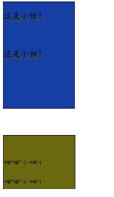
div {
width: 200px;
height: 300px;
color: #0A0A0A;
font-family: '楷体';
size: 12px;
text-shadow: 10px 10px 5px #90120A;
border: 2px solid #0D0505;
background-color: #153EA5;
}
div#header2 {
-moz-transform:rotatex(120deg);
background-color: red;
}
</style>
</head>
<body>
<div>
<p>
这是小妞!
</p>
<br />
<p>
这是小妞!
</p>
<br />
</div>
<div id="header2">
<p>
这是小妞!
</p>
<br />
<p>
这是小妞!
</p>
<br />
</div>
</body>
</html>


 376
376

 被折叠的 条评论
为什么被折叠?
被折叠的 条评论
为什么被折叠?
 到【灌水乐园】发言


