


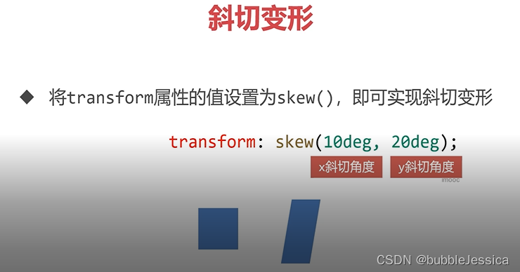
斜切变形
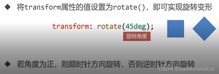
旋转变形
transform-origin: 0 0 表示以左上角为中心点进行旋转
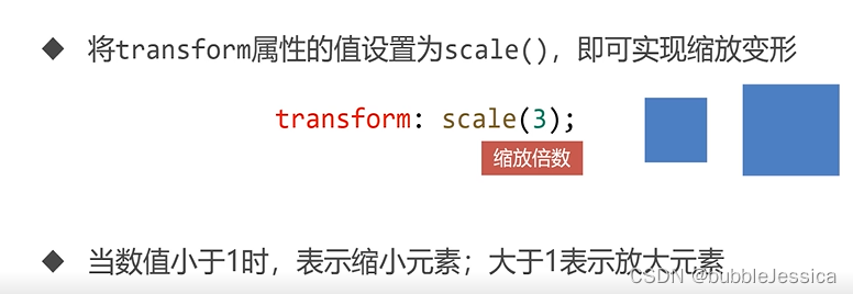
缩放变形
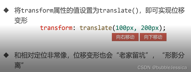
位移变形
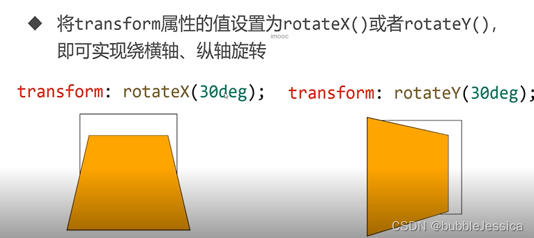
3D旋转
rotateZ平面旋转
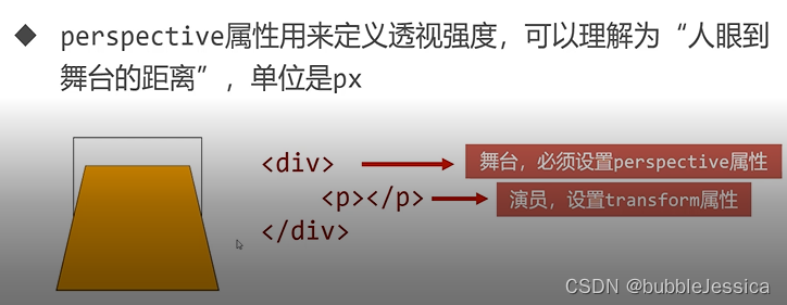
perspective属性
透视强度大则设置小点px,反之即强度小则设置大点px
空间移动
<!DOCTYPE html>
<html lang="en">
<head>
    <meta charset="UTF-8">
    <title>空间移动</title>
    <style>
        *{
            margin: 0;
            padding: 0;
        }
        .box{
            width: 202px;
            height: 202px;
            border: 1px solid #000;
            margin: 50px auto;
            perspective: 300px;
        }
        p{
            width: 200px;
            height: 200px;
            border: 1px solid #000;
            background-color: orange;
        }
        .box p{
            transform: rotateX(30deg) translateX(100px) translateY(100px);
        }

    </style>
</head>
<body>
<div class="box">
    <p></p>
</div>
</body>
</html>
<!DOCTYPE html>
<html lang="en">
<head>
    <meta charset="UTF-8">
    <title>正方体</title>
    <style>
        *{
            margin: 0;
            padding: 0;
        }
        .box{
            width: 200px;
            height: 200px;
            border: 1px solid #000;
            margin: 100px auto;
            perspective: 300px;
            position: relative;
        }
        .box p{
            position: absolute;
            top: 0;
            left: 0;
            width: 200px;
            height: 200px;
        }
        .box p:nth-child(1){
            background-color: rgba(219,56,211,0.486);
            /*前面*/
            transform: translateZ(100px);
        }
        .box p:nth-child(2){
            background-color: rgba(42,128,199,0.486);
            /*顶面 后仰*/
            transform: rotateX(90deg) translateZ(100px);
        }
        .box p:nth-child(3){
            background-color: rgba(56,219,83,0.486);
            /*背面 后仰*/
            transform: rotateX(180deg) translateZ(100px);
        }
        .box p:nth-child(4){
            background-color: rgba(213,216,32,0.486);
            /*底面 前倾*/
            transform: rotateX(-90deg) translateZ(100px);
        }
        .box p:nth-child(5){
            background-color: rgba(236,82,102,0.486);
            /*侧面*/
            transform: rotateY(90deg) translateZ(100px);
        }
        .box p:nth-child(6){
            background-color: rgba(119,17,236,0.486);
            /*侧面*/
            transform: rotateY(-90deg) translateZ(100px);
        }
    </style>
</head>
<body>
    <div class="box">
        <p></p>
        <p></p>
        <p></p>
        <p></p>
        <p></p>
        <p></p>
    </div>
</body>
</html>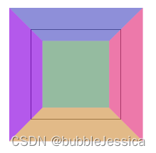
box-shadow属性
box-shadow: inset 10px 20px 30px 40px rgba(0,0,0,.2)
表示内阴影 x偏移 y偏移 模糊量 阴影延展 颜色(透明度)


 203
203


 被折叠的 条评论
为什么被折叠?
被折叠的 条评论
为什么被折叠?
 到【灌水乐园】发言


