


在知乎上总共采集到了5947分数据,对每个用户抓取到它的ID,location,college,gender,agree,thanks,ask,answer,posts,collections,log.总计11个变量
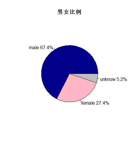
数据中的男女比例大约在2.5:1的情况
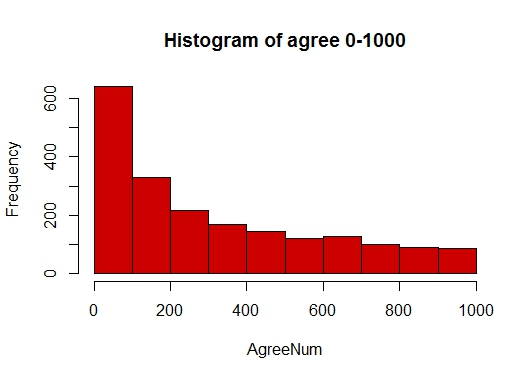
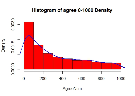
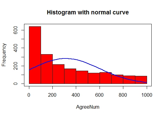
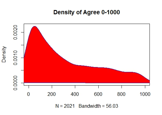
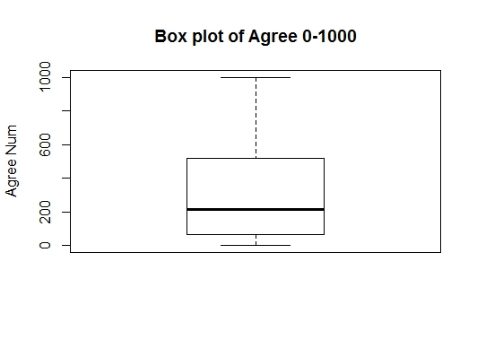
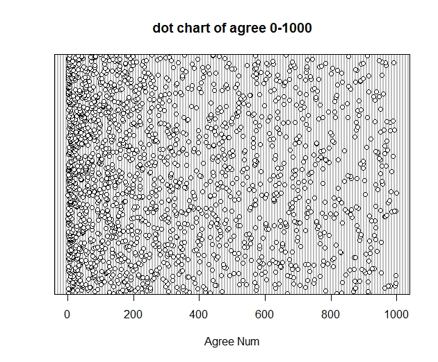
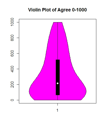
接着因为对个人获得的agree数进行统计,因为数值差异太大,获得最多的赞同数有250多万,对图形展示有很大的影响,所以我选取了获得的赞同数在1000以内的用户
得到了他的一系列分析图,由总体可以看出在0-1000以内的获得的赞数中,大部分还是处在获得0-100的赞数,并随着获得赞数越来越多人数也越来越少。并不是随着正态分布
其中第三个图表示以选取数据的平均值和方差所做出的正态分布图。
这里先只列出了获得的赞数的一下分布图形,同理与获得的感谢数。下一步可以看看怎么画出这些群体在地图上的分布,以及各个大学
附上R中的代码:
info <- read.csv("zuizhongfile.csv", header=TRUE,sep=",",quote="")
info[info=="未知"] <- NA
genderlist <- info$gender
genderlist <- as.numeric(levels(genderlist))[genderlist]
N <- length(genderlist)
male <- sum(genderlist,na.rm=TRUE)
nogender <- sum(is.na(genderlist))
female <- N-male-nogender
gender1 <- c(male,female,nogender)
pct <- round(gender1/N*100, digits=1)
lbls <- c("male","female","unknow")
lbls1 <- paste(lbls," ",pct,"%",sep="")
pie(gender1,labels=lbls1,col=c("blue4","pink1","grey"),main="男女比例")
agree_0_10000 <- info$agree[info$agree >= 0 & info$agree < 10000]
agree_10000_100000 <- info$agree[info$agree >= 10000 & info$agree < 100000]
agree_100000_500000 <- info$agree[info$agree >= 100000 & info$agree < 500000]
agree_500000 <- info$agree[info$agree >= 500000]
agree_0_1000 <- info$agree[info$agree >= 0 & info$agree < 1000]
agree_0_200 <- info$agree[info$agree >= 0 & info$agree < 200]
agree_0_100 <- info$agree[info$agree >= 0 & info$agree < 100]
hist(agree_0_1000,col="red3",xlab="AgreeNum",main="Histogram of agree 0-1000")
hist(agree_0_1000,col="red",freq=FALSE,xlab="AgreeNum",main="Histogram of agree 0-1000 Density")
lines(density(agree_0_1000),col="blue",lwd=2)
h <- hist(agree_0_1000,col="red",xlab="AgreeNum",main="Histogram with normal curve")
xfit <- seq(min(agree_0_1000),max(agree_0_1000),length=40)
yfit <- dnorm(xfit,mean=mean(agree_0_1000),sd=sd(agree_0_1000))
yfit <- yfit*diff(h$mids[1:2])*length(agree_0_1000)
lines(xfit,yfit,col="blue",lwd=2)
box()
d <- density(agree_0_1000)
plot(d,main="Density of Agree 0-1000",xlim=c(0,1000))
polygon(d,col="red",border="blue")
boxplot(agree_0_1000,main="Box plot of Agree 0-1000",ylab="Agree Num")
dotchart(agree_0_1000,main="dot chart of agree 0-1000",xlab="Agree Num",xlim=c(0,1000))
library(vioplot)
vioplot(agree_0_1000)
title("Volin Plots of agree 0-1000")
thank_0_1000 <- info$thank[info$thank >= 0 & info$thank < 1000]
hist(thank_0_1000,col="red3",xlab="ThankNum",main="Histogram of thank 0-1000")
hist(thank_0_1000,col="red",freq=FALSE,xlab="ThankNum",main="Histogram of thank 0-1000 Density")
lines(density(thank_0_1000),col="blue",lwd=2)
h <- hist(thank_0_1000,col="red",xlab="ThankNum",main="Histogram with normal curve")
xfit <- seq(min(thank_0_1000),max(thank_0_1000),length=40)
yfit <- dnorm(xfit,mean=mean(thank_0_1000),sd=sd(thank_0_1000))
yfit <- yfit*diff(h$mids[1:2])*length(thank_0_1000)
lines(xfit,yfit,col="blue",lwd=2)
box()
d <- density(thank_0_1000)
plot(d,main="Density of Thank 0-1000",xlim=c(0,1000))
polygon(d,col="red",border="blue")
boxplot(thank_0_1000,main="Box plot of Thank 0-1000",ylab="Thank Num")
dotchart(thank_0_1000,main="dot chart of thank 0-1000",xlab="Thank Num",xlim=c(0,1000))
library(vioplot)
vioplot(thank_0_1000,col="gold")
title("Volin Plots of thank 0-1000")


 439
439

 被折叠的 条评论
为什么被折叠?
被折叠的 条评论
为什么被折叠?
 到【灌水乐园】发言


