Python添加graphic是

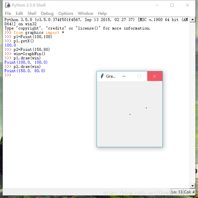
将下面链接中的 graphics.py放入与python.exe同个文件夹下即可运行。下面是一个测试程序。

http://download.csdn.net/download/chowyoungyoung/10171476

  • 0
    点赞
  • 0
    收藏
    觉得还不错? 一键收藏
  • 0
    评论
要实现设定阈值并添加警戒线,可以按照以下步骤操作: 1. 从 MySQL 数据库中获取数据,可以使用 Python 的 MySQLdb 或者 PyMySQL 模块进行操作。 2. 使用 echarts 绘制图表,可以使用 Python 的 pyecharts 或者 echarts 的 JavaScript 库。 3. 在图表中添加警戒线,可以使用 echarts 的 markLine 组件,然后将警戒线的位置和样式进行配置。 4. 设定阈值,可以在代码中手动设定或者从数据库中获取。 5. 将阈值和警戒线添加到图表中,可以使用 echarts 的 setOption 方法,将阈值和警戒线的配置信息加入到图表的 option 中。 以下是一个示例代码,其中使用 PyMySQL 获取数据,使用 pyecharts 绘制折线图,并添加了阈值和警戒线: ```python import pymysql from pyecharts.charts import Line from pyecharts import options as opts # 连接 MySQL 数据库 conn = pymysql.connect(host='localhost', port=3306, user='root', passwd='password', db='testdb') cur = conn.cursor() # 查询数据 cur.execute("SELECT date, value FROM data") data = cur.fetchall() # 绘制折线图 line = Line() x_data = [row[0] for row in data] y_data = [row[1] for row in data] line.add_xaxis(x_data) line.add_yaxis('', y_data) # 设定阈值 threshold = 80 # 添加警戒线 line.set_global_opts( title_opts=opts.TitleOpts(title="数据分析"), yaxis_opts=opts.AxisOpts( name='value', min_=0, max_=100, splitline_opts=opts.SplitLineOpts(is_show=True), axislabel_opts=opts.LabelOpts(formatter="{value} %") ), tooltip_opts=opts.TooltipOpts(trigger='axis', axis_pointer_type='cross'), visualmap_opts=opts.VisualMapOpts(is_show=False, dimension=0, series_index=0, min_=0, max_=100), graphic_opts=[ opts.GraphicGroup( graphic_item=opts.GraphicItem( left='center', top='center', z=100 ), children=[ opts.GraphicRect( graphic_item=opts.GraphicItem( z=100 ), x=20, y=20, width=360, height=80, brush_opts=opts.BrushOpts(color='rgba(0,0,0,0)'), edge_shape_opts=opts.EdgeShapeOpts( border_type='dashed', stroke='#999', line_width=2 ) ), opts.GraphicText( graphic_item=opts.GraphicItem( left='center', top='middle', z=100 ), style_opts=opts.StyleOpts(text=f"阈值: {threshold} %", font_size=18) ) ] ) ] ) line.add_yaxis( series_name='', y_axis=y_data, markline_opts=opts.MarkLineOpts( data=[ opts.MarkLineItem( name='警戒线', y=threshold, label_opts=opts.LabelOpts( formatter='{b}: {c} %', position='end' ) ) ], linestyle_opts=opts.LineStyleOpts(type_='dashed', color='#FF4500'), symbol='none', silent=True ) ) # 展示图表 line.render() ``` 该示例代码中,首先使用 PyMySQL 模块从 MySQL 数据库中获取数据,然后使用 pyecharts 绘制折线图。在图表中添加了阈值和警戒线,其中阈值手动设定为 80,警戒线的位置和样式使用 markLine 组件进行配置。最后使用 render 方法展示图表。

“相关推荐”对你有帮助么?

  • 非常没帮助
  • 没帮助
  • 一般
  • 有帮助
  • 非常有帮助
提交
评论
添加红包

请填写红包祝福语或标题

红包个数最小为10个

红包金额最低5元

当前余额3.43前往充值 >
需支付:10.00
成就一亿技术人!
领取后你会自动成为博主和红包主的粉丝 规则
hope_wisdom
发出的红包
实付
使用余额支付
点击重新获取
扫码支付
钱包余额 0

抵扣说明:

1.余额是钱包充值的虚拟货币,按照1:1的比例进行支付金额的抵扣。
2.余额无法直接购买下载,可以购买VIP、付费专栏及课程。

余额充值