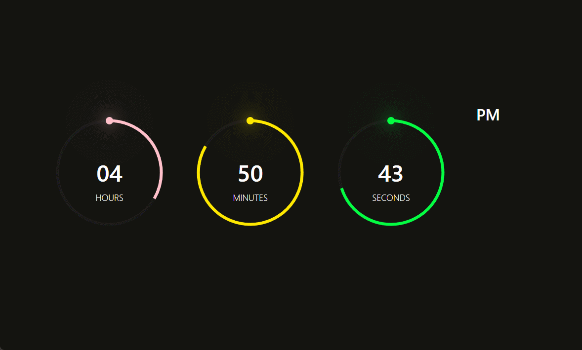
效果图
JS
import { useState, useEffect } from 'react';
import styles from './style.less'
const index = () =>
{
const [time, setTime] = useState({
hours: '00',
minutes: '00',
seconds: '00'
})
useEffect(() =>
{
countDown()
let timer = setInterval(countDown, 1000);
return () =>
{
clearInterval(timer)
}
}, [])
const countDown = () =>
{
let hours = `${new Date().getHours() % 12}`.padStart(2, 0);
let minutes = `${new Date().getMinutes()}`.padStart(2, 0);
let seconds = `${new Date().getSeconds()}`.padStart(2, 0);
setTime({ ...time, hours, minutes, seconds })
}
const { hours, minutes, seconds } = time
return (
<div className={styles.container}>
<div className={styles.time} >
<div className={styles.circle} style={{ '--color': 'pink' }}>
<div className={`${styles.dots} ${styles.hr_dot}`} ></div>
<svg>
<circle cx="70" cy="70" r="70"></circle>
<circle style={{ strokeDashoffset: `${440 - (440 * hours) / 12}` }} cx="70" cy="70" r="70" id="hh"></circle>
</svg>
<div>{hours}<div className={styles.tip}>HOURS</div></div>
</div>
<div className={styles.circle} style={{ '--color': '#fee800' }}>
<div className={`${styles.dots} ${styles.min_dot}`} ></div>
<svg>
<circle cx="70" cy="70" r="70"></circle>
<circle style={{ strokeDashoffset: `${440 - (440 * minutes) / 60}` }} cx="70" cy="70" r="70" id="mm"></circle>
</svg>
<div>{minutes}<div className={styles.tip}>MINUTES</div></div>
</div>
<div className={styles.circle} style={{ '--color': '#04fc43' }}>
<div className={`${styles.dots} ${styles.sec_dot}`} ></div>
<svg>
<circle cx="70" cy="70" r="70"></circle>
<circle style={{ strokeDashoffset: `${440 - (440 * seconds) / 60}` }} cx="70" cy="70" r="70" id="ss"></circle>
</svg>
<div>{seconds}<div className={styles.tip}>SECONDS</div></div>
</div>
<div className={styles.ap} >
<div>{hours > -12 ? 'PM' : 'AM'}</div>
</div>
</div>
</div>
);
};
export default index
CSS
.container {
  display: flex;
  justify-content: center;
  align-items: center;
  min-height: 100vh;
  background-color: #2f363e;

  .time {
    display: flex;
    gap: 40px;
    color: #fff;

    .circle {
      position: relative;
      width: 150px;
      height: 150px;
      display: flex;
      justify-content: center;
      align-items: center;

      svg {
        position: relative;
        width: 150px;
        height: 150px;
        transform: rotate(270deg);

        circle {
          width: 100%;
          height: 100%;
          fill: transparent;
          stroke: #191919;
          stroke-width: 4;
          transform: translate(5px, 5px);
          transition: 1s all;
        }

        circle:nth-child(2) {
          stroke: var(--color);
          stroke-dasharray: 440;
        }

      }
    }

    div {
      position: absolute;
      text-align: center;
      font-weight: 500;
      font-size: 1.5em;

      .tip {
        position: absolute;
        font-size: 0.35em;
        font-weight: lighter;
        left: 50%;
        transform: translateX(-50%);
      }
    }

    .ap {
      position: relative;
      font-size: 1em;
      transform: translateY(-20px);
    }


  }
}

.dots {
  position: absolute;
  width: 100%;
  height: 100%;
  z-index: 10;
  display: flex;
  justify-content: center;
  align-items: flex-start;
}

.dots::before {
  content: "";
  position: absolute;
  width: 10px;
  height: 10px;
  background: var(--color);
  border-radius: 50%;
  box-shadow: 0 0 20px var(--color), 0 0 60px var(--color);
}


 1万+
1万+


 被折叠的 条评论
为什么被折叠?
被折叠的 条评论
为什么被折叠?
 到【灌水乐园】发言


