


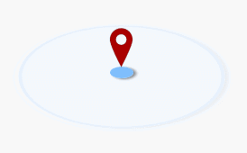
SVG的定位图标可以
- 使用 “在线SVG编辑器”并从常用图形中选取也可以从
- http://www.bootcss.com/p/font-awesome/design.html ,通过文字库的方式使用。
<html>
<head>
<style>
:root {
	--ripper-width: 3em;
	--ripper-height: 3em;
	--ripper-duration: 4.5s;
	font-size: 200%;
}
.ripper-container {
	width: var(--ripper-width);
	height: var(--ripper-height);
	display: flex;
	justify-content: center;
	align-items: center;
	position: relative;
	box-sizing: border-box;
}
.ripper-container::before {
	content: '';
	width: 10%;
	height: 10%;
	border-radius: 50%;
	background-color: #7abefd;
	position: absolute;
	box-shadow: 1px 1px 1px gray;
	transform: rotateX(60deg);
}
.location {
	width: calc(var(--ripper-width) / 9);
	height: calc(var(--ripper-width) / 6);
	top: calc(50% - var(--ripper-width) / 6);
	position: absolute;
	z-index: 1;
	animation: anim-location-spring1 var(--ripper-duration) linear infinite;
	/*animation: anim-location-spring2 .2s linear infinite alternate;*/
}
@keyframes anim-location-spring1 {
	0% {
		transform: translateY(-2px);
	}
	10% {
		transform: translateY(0);
	}
	20% {
		transform: translateY(-2px);
	}
	25% {
		transform: translateY(0);
	}
	30% {
		transform: translateY(-2px);
	}
	35% {
		transform: translateY(0);
	}
	40% {
		transform: translateY(-2px);
	}
	to {
		transform: translateY(-2px);
	}
}
@keyframes anim-location-spring2 {
	from {
		transform: translateY(-2px);
	}
	to {
		transform: translateY(0);
	}
}
.ripper {
	width: 100%;
	height: 100%;
	position: absolute;
	/* box-sizing的默认值是content-box,也就是说它默认并不会继承自父对象 */
	box-sizing: inherit;
	border: 2px solid #75abfa;
	border-radius: 50%;
	/* 十六进制的话,也是最后一个是透明度,也是RGBA的格式 */
	background-color: rgba(160, 195, 244, .5);
	opacity: 0;
	box-shadow: 1px 1px 1px gray;
}
.ripper-1 {
    animation: anim-ripper var(--ripper-duration) ease-out 225ms infinite;
}
.ripper-2 {
    animation: anim-ripper var(--ripper-duration) ease-out .9s infinite;
}
.ripper-3 {
    animation: anim-ripper var(--ripper-duration) ease-out 5.8s infinite;
}
@keyframes anim-ripper {
	from {
		opacity: 0;
		transform: scale(.1) rotateX(60deg);
	}
	5% {
		opacity: 1;
	}
	to {
		opacity: 0;
		transform: scale(1) rotateX(60deg) translateY(5px);
	}
}
</style>
</head>
<body>
<div class="ripper-container">
	<svg class="location" viewbox="100 0 40 400" xmlns="http://www.w3.org/2000/svg">
	 <!-- Created with Method Draw - http://github.com/duopixel/Method-Draw/ -->
	 <g>
	  <path id="svg_1" d="m119.131294,3.634801c-63.42067,0 -114.876956,51.408202 -114.876956,114.85097c0,63.442497 114.876956,277.512001 114.876956,277.512001s114.824944,-214.069504 114.824944,-277.512001c0,-63.442768 -51.409119,-114.85097 -114.824944,-114.85097zm0,169.740962c-30.333855,0 -54.916023,-24.559036 -54.916023,-54.889992s24.582169,-54.88982 54.916023,-54.88982s54.865288,24.582172 54.865288,54.88982s-24.582504,54.889992 -54.865288,54.889992z" stroke-width="1.5" stroke="#000" fill="#A00"/>
	 </g>
	</svg>
	<div class="ripper ripper-1"></div>
	<div class="ripper ripper-2"></div>
	<div class="ripper ripper-3"></div>
</div>
</body>
</html>


 2727
2727


 被折叠的 条评论
为什么被折叠?
被折叠的 条评论
为什么被折叠?
 到【灌水乐园】发言


