


渐进式web应用程序
The web is better than ever. You can now build fast, rich app-like experiences. As Googler Zach Coch said:
网络比以往更好。 您现在可以建立快速,丰富的类似应用程序的体验。 正如Googler Zach Coch所说:
The line between what is web and what is app is more blurry than it’s ever been.
网络和应用程序之间的界限比以往更加模糊。
And this is a great opportunity to get better at creating those incredible experiences.
这是一个很好的机会,可以更好地创造那些令人难以置信的体验。
But the web has its problems. Our mobile web experiences are not perfect. Why do we always tend to choose to download a native app instead of browsing its mobile website?
但是网络存在问题。 我们的移动网络体验并不完美。 为什么我们总是倾向于选择下载本机应用程序而不是浏览其移动网站?
There are many mobile web problems we are likely to encounter:
我们可能会遇到很多移动网络问题:
Slow performance – An average user can leave your website if it takes more than 3 seconds to load. The average load on mobile websites is around 19 seconds. That’s a huge gap.
速度慢 –加载时间超过3秒的普通用户可以离开您的网站。 移动网站的平均负载约为19秒。 差距很大。
Unresponsive experience – Have you ever noticed when scrolling on a mobile website, how laggy the scrolling is?
毫无React的体验 –在移动网站上滚动时,您是否注意到滚动的时间太长?
Frustrating UX – Sometimes you might tap on a page by mistake. You’d have to wait for the whole page to load (average of 19 seconds) to be able to get back to the previous one.
令人沮丧的UX –有时您可能会错误地点击页面。 您必须等待整个页面加载(平均19秒)才能返回上一页。
Google proposed Progressive Web Apps (PWAs) back in 2015 to solve some of these problems and make the web great again.
Google早在2015年就提出了渐进式Web应用程序(PWA) ,以解决其中的一些问题并使网络再次变得更好。
是什么使应用程序成为PWA? (What Makes an App a PWA?)
Progressive Web Apps are experiences that combine the best of the web and mobile apps to create powerful experiences. I like how Jad Joubran defines PWAs as “On going solutions to common mobile web problems”. It’s not one solution, it’s more like several best practices you can implement to create better web applications. So what are the qualifications for a website to be called a Progressive Web App?
渐进式Web应用程序是结合了最好的Web和移动应用程序以创建强大体验的体验。 我喜欢Jad Joubran如何将PWA定义为“针对常见移动Web问题的持续解决方案”。 这不是一个解决方案,它更像是您可以实施的几种最佳实践,以创建更好的Web应用程序。 那么,将网站称为渐进式Web应用程序的资格是什么?
Fast – A PWA loads quickly and performs smoothly using service workers and best practices for performance.
快速 – PWA使用服务人员和最佳实践来快速加载并顺利执行。
Progressive – PWAs work anywhere, no matter what the device is. And they are supercharged in modern browsers.
渐进式 –无论设备是什么,PWA均可在任何地方工作。 并且它们在现代浏览器中得到增强。
Connectivity-independent – PWAs work offline and with low-end connections. Even if a connection is weak or unstable, a PWA should lessen the impact of change in connectivity
独立于连接性 – PWA可以脱机工作并且具有低端连接。 即使连接弱或不稳定,PWA也应减轻连接变化的影响
Engaging – Users are more likely to reuse a PWA rather than a normal website, due to the ability of installing it to the homescreen and push notifications functionality
吸引力 –由于可以将PWA安装到主屏幕和推送通知功能,因此用户更有可能重用PWA而不是普通网站
创造类似应用的体验 (Creating App-Like Experiences)
The key of a PWA is to create a website built with web technologies that is capable of giving a native app experience. In order for a PWA to succeed, it should meet users’ expectations.
PWA的关键是创建一个使用Web技术构建的网站,该网站能够提供本机应用程序体验。 为了使PWA成功,它应该满足用户的期望。
Since users will eventually open the PWA from their homescreen, they expect it to work and behave like a normal app.
由于用户最终会从其主屏幕打开PWA,因此他们希望它可以正常工作并像普通应用一样运行。
#1从本机应用程序获得UX灵感 (#1 Take UX Inspiration from Native Apps)
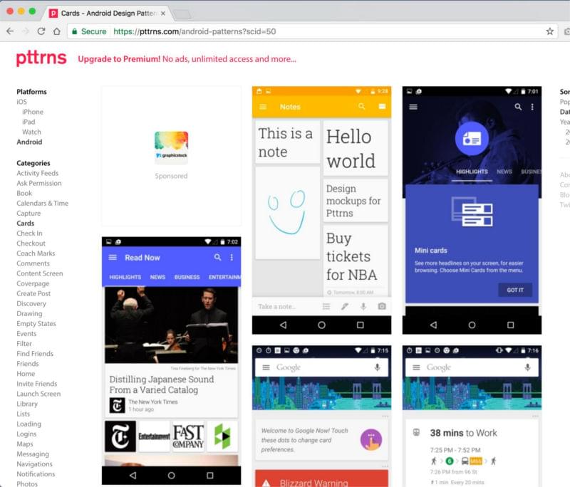
A common mistake for designers and developers is to create overly “web-like” designs, like double navbars, footers, and static components. But in order to match the user’s mental models, we need to use more app-like designs. For example, think big buttons instead of text links, or fixed bottom bars instead of end-of-page footers. To help create that mindset, start by browsing sites like pttrns.com for design inspiration. On Pttrns you can find common UI/UX patterns like onboarding, add to cart, etc.
对于设计人员和开发人员来说,常见的错误是创建过于“类似于网络”的设计,例如双导航栏,页脚和静态组件。 但是为了匹配用户的思维模型,我们需要使用更多类似于应用的设计。 例如,考虑使用大按钮而不是文本链接,或者使用固定的底部栏而不是页面尾的页脚。 为了帮助建立这种思维方式, 请先浏览pttrns.com等网站以获取设计灵感。 在Pttrns上,您可以找到常见的UI / UX模式,例如入职,添加到购物车等。
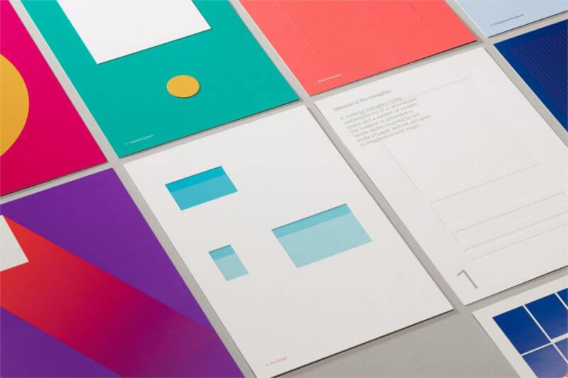
On another note, Google’s Material Design created a visual language that uses classic principles of good design in native apps. When you’re creating PWAs, it will benefit the end product if you level up your familiarity with Material Design to use these principles. There are tons of resources and guidelines to help you understand Material Design. Start by learning the principles behind what is Material like motion, style, patterns, and more.
另外,Google的Material Design创建了一种视觉语言,该语言在本机应用中使用了良好设计的经典原则。 当您创建PWA时,如果您熟悉Material Design以使用这些原理,它将使最终产品受益。 有大量资源和指南可帮助您了解材料设计。 首先学习“物质”背后的原理,例如运动,样式,图案等。
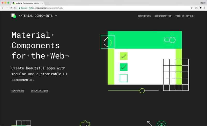
You can also create apps using Material Design Components (MDC). MDC is a modular and customizable UI components library. You can quickly code things like ripple animations, material cards, material theme colors, and more.
您还可以使用材料设计组件 (MDC)创建应用。 MDC是一个模块化且可自定义的UI组件库。 您可以快速编写诸如波纹动画,材质卡,材质主题颜色等的代码。
#2确保您的应用程序图标看起来不错 (#2 Make Sure Your App Icon Looks Good)
Remember, your app will sit in the user’s homescreen. This means your icon should visually match the native app icons. There are some visual standards you should consider carefully.
请记住,您的应用程序将位于用户的主屏幕中。 这意味着您的图标在视觉上应与本机应用程序图标匹配。 您应该仔细考虑一些视觉标准。
Your icon will be used in the splash screen, task switcher, notification banner, app install banner, among others. This means it should be responsive and work in different sizes. You can do that by making it a simple unique shape that looks good in small sizes. Having too many details in an icon can look bulky and weird.
您的图标将用于初始屏幕,任务切换器,通知标题,应用程序安装标题等。 这意味着它应该具有响应能力并以不同的大小工作。 您可以通过使它成为简单的独特形状(在小尺寸下看起来不错)来做到这一点。 图标中的详细信息过多可能显得庞大而怪异。
Also, make sure the app icon looks good on all platforms. For example, icons on iOS cannot be transparent, they require a background color which should be a solid square. If you upload icons with a transparent background, they will add a black background for you and it might not look good.
另外,请确保该应用程序图标在所有平台上均显示良好。 例如,iOS上的图标不能透明,它们需要背景颜色,该颜色应为实心正方形。 如果您上传的图标带有透明背景,则它们会为您添加黑色背景,看起来可能不太好。
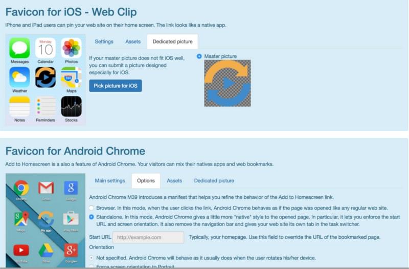
The best way to see the different platform requirements is to use an icon generator like realfavicongenerator.net. You can see all the variations in one go, and it lets you make adjustments for each platform. Then it generates a manifest.json file:
查看不同平台要求的最佳方法是使用图标生成器,例如realfavicongenerator.net 。 您可以一次性查看所有变化,并可以针对每个平台进行调整。 然后生成一个manifest.json文件 :
#3使用主题色为您的应用品牌 (#3 Brand Your App Using Theme Color)
The theme color is a great way to give your app a brand identity and the ability to stand out from the crowd. It’s one of the main features that make a PWA feel native.
主题颜色是使您的应用具有品牌知名度和脱颖而出的绝佳方法。 这是使PWA具有原生性的主要功能之一。
There are two types of theme color. I like to refer to them as the Browser color and the App color. Here’s the difference between them.
有两种类型的主题颜色。 我喜欢将它们称为浏览器颜色和应用程序颜色。 这是它们之间的区别。
Browser theme color – This is the background color you see on the browser’s header when you open the app from the browser.
浏览器主题颜色 –这是从浏览器打开应用程序时在浏览器标题上看到的背景颜色。
To specify the browser theme color, use the meta theme color in the <head>.
要指定浏览器主题颜色,请使用<head>的meta主题颜色。
<meta name="theme-color" content="#4285f4">App theme color – This one is the color you see on the app header when accessing the app via the homescreen. It’s also used in the header in task switcher mode (preview this animated GIF for a visual representation):
应用主题颜色 –这是您通过主屏幕访问应用时在应用标题上看到的颜色。 它还在任务切换器模式下的标头中使用(预览此动画GIF以获得可视化表示):

To specify the app theme color, add the theme color to the manifest.json file:
要指定应用程序主题颜色,请将主题颜色添加到manifest.json文件中:
{
  "theme_color": "#2196F3"
}
#4使用App Shell模型 (#4 Use the App Shell Model)
One of the most important features of a PWA is resilience. A PWA should perform smoothly and work offline. But most importantly, a PWA should load quickly, if not instantly.
PWA的最重要特征之一是弹性。 PWA应该运行平稳并且可以脱机工作。 但最重要的是,PWA应该立即加载,即使不是立即加载。
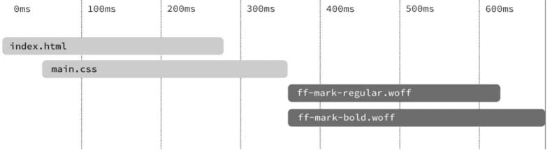
Having a fast first load improves a new user’s experience and will feel local. In regular websites, a first load would require users to wait on a white screen for a few seconds and then all components would load at the same time (check out this short video for a visual example).
拥有快速的第一负载可以改善新用户的使用体验,并且会感觉很本地。 在常规网站中,首次加载将要求用户在白屏上等待几秒钟,然后所有组件将同时加载(请查看此简短视频以获取可视示例 )。
A more progressive approach would be to immediately start loading components one after the other as soon as possible. This approach is more satisfying, as it reduces the user’s uncertainty and is proven to reduce the perception of time.
一种更先进的方法是立即尽快开始一个接一个地加载组件 。 这种方法更加令人满意,因为它减少了用户的不确定性,并被证明可以减少对时间的感知。
A great way to do this is by using the app shell model. An app shell is the minimal HTML, CSS & Javascript that powers a user interface. When you use an app shell, you start loading it first, as soon as possible, then you load your dynamic component.
一个很好的方法是使用应用程序外壳模型。 应用程序外壳是为用户界面提供动力的最小HTML,CSS和Javascript。 使用应用程序外壳程序时,请先尽快开始加载它,然后再加载动态组件。
The most common components of an app shell would be the navbar, tab bar (or sidebar), loader and main action button. To give priority to the app shell and load it first, you can inline the CSS related to the app shell:
应用程序外壳最常见的组件是导航栏,标签栏(或侧边栏),加载程序和主要操作按钮。 要优先考虑应用外壳并首先加载它,您可以内联与应用外壳相关CSS:
<style>
body{
  background-color: #ececec;
  margin: 0;
}
.shell-header{
  background-color: #2196F3;
  height: 56px;
}
.fab{
  position: fixed;
  bottom: 40px;
}
...
</style>
There are many other techniques you can use to create a progressive fast load in PWAs, like caching the app shell, preloading it, unblocking JS, and more.
您还可以使用许多其他技术在PWA中创建渐进式快速加载,例如缓存应用程序外壳,对其进行预加载,解除阻塞JS等。
#5限制字体 (#5 Limit Your Fonts)
One of the most common reasons for a slow first load is fonts. Even though typography is a crucial part of web design, unfortunately having a powerful performance can be a challenge. One way to ease this is to limit your fonts. Try to use only the fonts you need. Make sure you’re not loading any font weight you’re not using, and try to limit the font files to a maximum of 3 (that’s including the different weights).
首次加载缓慢的最常见原因之一是字体。 尽管排版是Web设计的关键部分,但不幸的是,要拥有强大的性能可能是一个挑战。 缓解这种情况的一种方法是限制字体。 尝试仅使用所需的字体。 确保您没有加载未使用的字体粗细,并尝试将字体文件限制为最多3个(包括不同的粗细)。
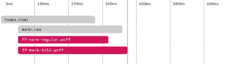
In most scenarios, here’s what happens: font files start rendering after the CSS files are fully downloaded. This creates a problem known as FOUT (Flash of Unstyled Text).
在大多数情况下,会发生以下情况:完全下载CSS文件后,字体文件开始呈现。 这会产生一个称为FOUT(无样式文本的闪烁)的问题。
To solve this problem, you can preload your font files by adding this snippet to the <head> section of your HTML document: link rel="preload". Make sure you specify the font type and add a crossorigin to avoid double requests:
要解决此问题,可以通过将以下代码段添加到HTML文档的<head>部分中来预加载字体文件: link rel="preload" 。 确保指定字体类型并添加跨域以避免重复请求:
<link rel="preload" href="roboto.woff2" as="font" type="font/woff2" crossorigin>By preloading the fonts, you’ll be able to start seeing the fonts immediately as the fonts start loading simultaneously with the CSS files, without blocking any content, which avoids FOUT.
通过预加载字体,当字体开始与CSS文件同时加载时,您将能够立即开始查看字体,而不会阻塞任何内容,从而避免了FOUT。
This is a great solution. But what if there’s a better way? Since you’re creating apps that feel native and local, what if there’s a way to tweak an app’s typography to match the user’s operating system? To use Roboto on Android, San Fransisco on iOS, etc.
这是一个很好的解决方案。 但是,如果有更好的方法呢? 由于您正在创建具有本地和本地感觉的应用程序,因此,如果有一种方法可以调整应用程序的版式以匹配用户的操作系统,该怎么办? 要在Android上使用Roboto,在iOS上使用San Fransisco,等等。
Well, there is! Just stack all the fonts for modern platforms possible. The user’s browser will use the appropriate font and will ignore the rest. It’s completely weightless. Also this way, your users will feel completely at home since they’re already used to these fonts:
好吧,有! 只需堆叠所有可能的现代平台字体即可。 用户的浏览器将使用适当的字体,并将忽略其余字体。 完全没有重量。 同样,由于您已经习惯了这些字体,因此您的用户将完全有宾至如归的感觉:
font-family: -apple-system, BlinkMacSystemFont, // Safari Mac/iOS, Chrome
”Segoe UI”, Roboto, Oxygen, // Windows, Android, KDE
Ubuntu, Cantarell, "Fira Sans”, // Ubuntu, Gnome, Firefox OS
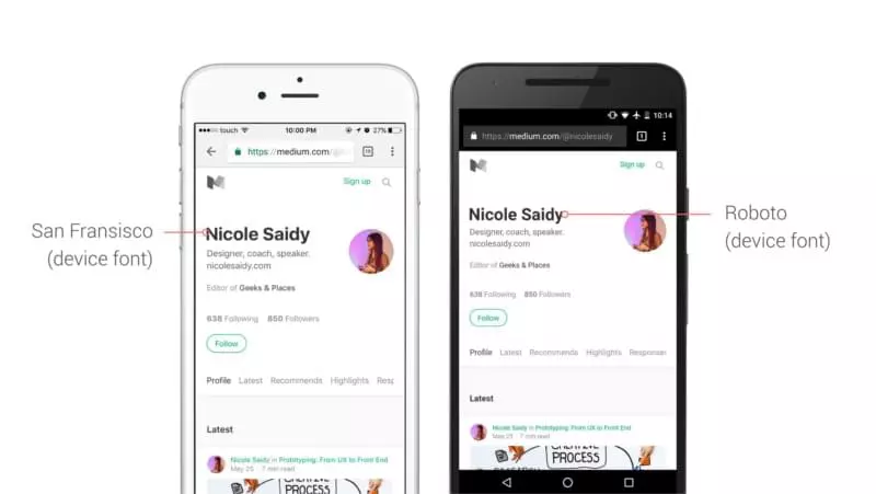
“Droid Sans”, ”Helvetica Neue”, sans-serif; // Old AndroidMedium is using this technique in their app. They’re stacking device fonts in their user interface.The Roboto typeface is displayed on Android while the San Fransisco typeface renders on iOS.
中号正在他们的应用程序中使用此技术。 他们在用户界面中堆叠设备字体.Roboto字体在Android上显示,而San Fransisco字体在iOS上呈现。
带走 (Take Away)
As Googler Owen Campbell-Moore said:
正如Google员工Owen Campbell-Moore所说:
Progressive Web Apps give us an opportunity to reset our expectations and to loudly declare that We Can Do Better when designing user experiences on the web.
渐进式Web应用程序使我们有机会重设期望,并大声宣称在设计网络用户体验时我们可以做得更好。
By taking these few steps, you can truly build amazing experiences on the web. You could do a lot more to create app-like experiences like push notifications, offline experiences, and more. The take away of this article is to:
通过采取这些步骤,您可以真正在网络上构建出色的体验。 您可以做更多的事情来创建类似应用程序的体验,例如推送通知,离线体验等等。 本文的主要目的是:
- Always take inspiration from native apps 始终从本地应用程序中汲取灵感
- Prep your PWA material by using checklists like this one 使用像这样的清单准备PWA材料
- Test with real devices and use throttling features in Chrome Dev Tools 使用真实设备进行测试并使用Chrome开发工具中的限制功能
Use Lighthouse to evaluate performance, metrics, accessibility and more.
使用Lighthouse评估性能,指标,可访问性等。
翻译自: https://www.sitepoint.com/putting-app-progressive-web-apps/
渐进式web应用程序


 519
519

 被折叠的 条评论
为什么被折叠?
被折叠的 条评论
为什么被折叠?
 到【灌水乐园】发言


