


交互ui
'Interaction design' is one of those newish buzzwords that has become strongly tied into the UX design process. In 2015 it's no longer enough for interface elements to instantly switch between two static states. Today words like 'slide' and 'bounce' and 'rebound' have come into the conversation on how good user interfaces work.
“交互设计”是与UX设计过程紧密相关的那些新流行术语之一。 在2015年,界面元素无法在两种静态状态之间即时切换已不再足够。 今天,诸如“幻灯片”,“反弹”和“反弹”之类的词已经成为人们谈论良好用户界面如何工作的话题。
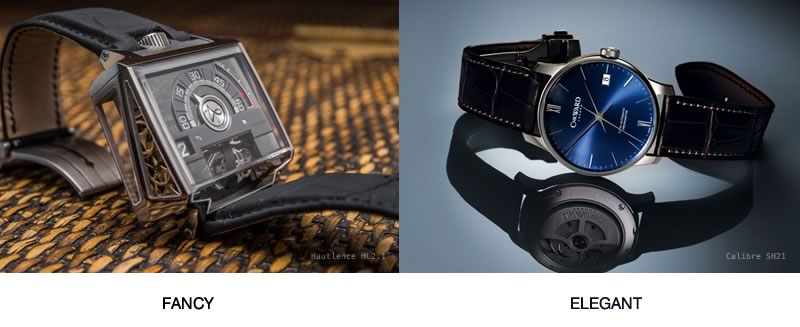
However in the world of interactions – as is the case with expensive watches – 'fancy' does not not necessarily mean 'elegant'. While we may be curious about the complexity of the fancy watch below, I suspect that very few of us would want to actually wear it. Natural elegance almost always triumphs over decoration in our interface design too.
但是,在互动世界中(例如昂贵的手表),“ 花哨 ”并不一定意味着“ 优雅 ”。 尽管我们可能对以下精美手表的复杂性感到好奇,但我怀疑我们当中很少有人会真正佩戴它。 自然的优雅几乎总是在我们界面设计中胜过装饰。
If you are creative like me, it's easy to be tempted to create fancy-flying interactions just to make your website feel more modern and engaging. Of course, in our hearts we know this approach can be one of the surest ways to screw up your entire user experience.
如果您像我一样有创造力,就很容易产生幻想式互动,以使您的网站更具现代感和吸引力。 当然,在我们心中,我们知道这种方法可能是改善整个用户体验的最可靠方法之一。
As such, I’ve found that it's important to focus on animations that are so smooth and easy on the eye that our users barely notices them. That's when our animations move out of the spotlight and instead support our what our user is trying to do.
因此,我发现将重点放在动画上非常重要,因为动画如此平滑易用,以至于我们的用户几乎看不到它们。 那是我们的动画移出聚光灯,而是支持我们的用户正在尝试做的事情。
那么,这为什么重要呢? (So, why does that matter?)
Why does Apple spend so much time and money on packaging that usually gets quickly thrown into the recycling bin? Why do luxury car companies tune the sound of their doors closing?
苹果为何在包装上花费大量时间和金钱,而通常又很快将它们扔进回收箱? 为什么豪华车公司会调整车门关闭的声音?
It’s because we find that minor, seemingly unimportant details can have an disproportionate impact on great design, and can lift a UX from "fine" to "awesome".
这是因为我们发现,细微的,看似无关紧要的细节可能会对出色的设计产生不成比例的影响,并使UX从“精美”提升为“出色” 。
Enriching your website with beautifully designed ‘micro-interactions’ not only makes it more usable, but can also trigger positive emotional feelings in your users (like opening that Apple box). Experiencing such emotions means more dopamine is consumed and this literally helps them to become more addicted to your website/application.
设计精美的“微交互”功能丰富了您的网站,不仅使它更有用,而且还可以在用户中引发积极的情感感受(例如打开Apple盒子)。 经历这种情绪意味着会消耗更多的多巴胺 ,这从字面上帮助他们变得更加沉迷于您的网站/应用程序。
那么,什么定义了“微交互”? (So, what defines a 'micro-interaction'?)
When a user makes an input (e.g. clicks, drags, types something) your website reacts – well, that's an interaction. This is a way for users to communicate with your website, so it's part of a dialogue. When designing a flow of how users behave on your website, you always have a few different types of interaction you can use:
当用户进行输入(例如单击,拖动,键入某些内容)时,您的网站就会做出React-就是交互。 这是用户与您的网站进行交流的一种方式,因此它是对话的一部分。 在设计用户在网站上的行为方式的流程时,您总是可以使用几种不同类型的交互方式:
Navigation interactions: This is when a user ends up in a totally new page/state.
导航互动 :这是用户最终进入全新页面/状态的时候。
Modal interactions: This is when the current state of website is frozen and some temporary state is displayed on top of it (e.g. "lightbox" gallery or confirmation dialog.)
方式互动 :这是网站的当前状态被冻结并且网站顶部显示某些临时状态(例如“灯箱”图片库或确认对话框)的情况。
Micro-interactions: This is when you want only a single element within a page to react to user input – for instance, to show a drop-down menu or reveal more details of a product.
微交互 :这是您只希望页面中的单个元素对用户输入做出React的情况-例如,显示下拉菜单或显示产品的更多详细信息。
我们如何使这些微交互变得优雅? (How do we make these micro-interaction elegant?)
A website should feel like a concert of interactive interface elements working together to impress you. Elegance is the key criteria to make such impression. Though it's very hard to define elegance in purely technical terms, we can use some logic hacks that helps us to create elegant interactions.
网站应该感觉像是一系列互动界面元素共同作用,给您留下深刻的印象。 优雅是给人以这种印象的关键标准。 尽管仅凭技术术语很难定义优雅,但是我们可以使用一些逻辑技巧来帮助我们创建优雅的交互。
关键规则#1 –禁止隐形传态 (Key Rule #1 – No teleportation)
The idea is simple – always use a transition when you are changing an element on page. That means there shouldn't be any instant snap-cuts on your GUI. Every appearing, disappearing or transforming element should be implemented with easing or/and animation.
这个想法很简单–更改页面上的元素时始终使用过渡。 这意味着GUI上不应有任何即时快照。 每个出现,消失或变换的元素都应使用缓动或动画来实现。
This helps users to focus their vision on the areas you want them to. And of course this creates a feeling of elegance and consistent flow.
这可以帮助用户将愿景集中在您想要的领域上。 当然,这会带来优雅和流畅的感觉。

规则2:切换比按钮更好 (Rule #2: Toggles are better than buttons)
At home you would usually use the same switch to turn lights both on and off. The same concept applies to toggle controls on your site. If a control toggle triggers a new state of a given element – that same control should rollback that state.
在家里,您通常会使用相同的开关来打开和关闭灯。 同样的概念适用于网站上的切换控件。 如果切换触发控制给定元素的一个新的国家-即相同的控制应该回滚状态。
Furthermore, according to Fitts' law such controls should require close to zero effort to rapidly switch between on and off states.
此外,根据菲茨定律,这种控制应需要几乎零的努力才能在打开和关闭状态之间快速切换。

规则3:触发器应在附近 (Rule #3: Triggers should be nearby)
Transitions always need some kind of trigger. At the time of the interaction, our user is usually focused on that trigger element. This means it's necessary that the transition begins on or very near the trigger. If you start a transition too far away from your trigger element, user could easily just miss it and the flow will break.
过渡总是需要某种触发器。 在进行交互时,我们的用户通常专注于该触发元素。 这意味着过渡必须在触发器上或非常接近触发器的地方开始。 如果您开始转换时离触发元素太远,则用户很容易错过它,流程会中断。
Furthermore a transition should generally propagate from the trigger to the position where you want to focus users' attention. The trick is simple – you lead users eye from trigger to the spot where he should make his next move. This way the user won't lose their focus and will be right on track where you want them.
此外,过渡通常应从触发器传播到您要引起用户注意的位置。 诀窍很简单–您可以使用户从触发器看向他应该采取的下一步行动。 这样,用户将不会失去他们的注意力,并且会正确地跟踪您想要他们的位置。

规则4:使用自然过渡时间 (Rule #4: Use natural transition timing)
Transition timings define how long our animation is playing. The major problem with timing is that there is no magic wand to get it right. If you make your transition too long, it will create a pain point for users repeating the same interaction often or rapidly.
过渡时间定义了动画播放的时间。 时间安排的主要问题是没有魔术棒可以正确调整时间。 如果过渡时间过长,将会给用户频繁或快速重复相同的交互带来痛苦。
On the other hand, if it is too short it will feel unnatural – or the user may miss it entirely. Unfortunately, all you can do is to evaluate the transition by your eagle eye and gut feel. The best advice I’ve found is not to give all your transitions the same timing. Just play around and find the right balance. Also note that even a difference of 0.05s matters.
另一方面,如果它太短,则会感觉不自然-否则用户可能会完全错过它。 不幸的是,您所能做的就是通过鹰眼和直觉来评估过渡。 我发现最好的建议是不要让所有转换都在同一时间进行。 只是玩耍,找到合适的平衡。 另请注意,即使相差0.05 秒也很重要。

规则5:过渡回滚绝不应破坏用户的控制感 (Rule #5: Transition rollbacks should never break the users’ sense of control)
Sometimes it happens that users change their mind quickly, in the middle of transition. In these cases, transition responsiveness is critical. If a user cancels the last interaction (e.g. clicks trigger button twice) the animation of transition should be instantly reversed. If it is not, our user instantly loses their feeling of control. Furthermore you are making your user think that they did something wrong.
有时,在过渡过程中,用户会Swift改变主意。 在这些情况下,过渡响应能力至关重要。 如果用户取消了最后一次交互(例如,两次单击触发按钮),则过渡动画应立即反转。 如果不是这样,我们的用户将立即失去控制感。 此外,您还使用户认为他们做错了什么。

规则6:始终自动关注系列中的下一个动作 (Rule #6: Always auto-focus on the next action in a series)
This tip is targeted at interactions where users perform a sequence of actions. When designing such a sequence, you should always avoid any unnecessary interactions and always set focus on the next control in the sequence. The most basic example of this kind of interaction is an [edit] button that opens a form and magically focuses on the first field so that user does not need to click it manually.
本技巧针对的是用户执行一系列操作的交互。 设计这样的序列时,应始终避免任何不必要的交互,并始终将重点放在该序列中的下一个控件上。 此类交互的最基本示例是[edit]按钮,该按钮可打开表单并神奇地聚焦于第一个字段,因此用户无需手动单击它。

规则7:完成后请务必告诉用户 (Rule #7: Always tell the user when you are done)
Users should always be able to recognize when an interaction is complete. If your interaction does not change on some obvious way on completion, you should always consider implementing some kind of visual feedback that tells users "Hey you, it's done!". In situations where you skip that, users tend to repeat the same action multiple times, thus making a mistake and possibly even corrupting something precious.
用户应始终能够识别交互完成的时间。 如果您的互动在完成时没有明显变化,则应始终考虑实施某种视觉反馈,告诉用户“嘿,这完成了!” 。 在您跳过该操作的情况下,用户倾向于多次重复相同的操作,从而犯错,甚至可能破坏一些珍贵的东西。

应用这些技巧 (Applying these tips)
In short, you can use these tips as cheat-sheet for implementing micro-interactions on your website. It should help you design the details of interaction before you implement them.
简而言之,您可以将这些技巧用作备忘单,以在您的网站上实现微交互。 它应有助于您在实施交互之前设计交互的详细信息。
However, there is a good chance that you won't make them perfect first time. In that case you will need to tweak them according to your own situation – so be prepared to play around a little.
但是,很有可能您不会第一次使它们完美。 在这种情况下,您将需要根据自己的情况对其进行调整-因此请准备好玩一些。
Aaaaand… there is just one final tip for you to take away. In general, the more your interactions surrender to the laws of real-world physics, the more they'll feel natural and elegant.
Aaaaand…最后一点建议供您参考。 通常,您的互动越服从现实世界的物理定律,他们越会感到自然而优雅。
Have animating fun!
玩得开心!
翻译自: https://www.sitepoint.com/7-rules-creating-elegant-ui-interactions/
交互ui


 357
357

 被折叠的 条评论
为什么被折叠?
被折叠的 条评论
为什么被折叠?
 到【灌水乐园】发言


