


css 网格布局
Grids are important when creating complex websites. The importance of grids in modern web design is clear from the number of frameworks that implement the grid system to speed up development.
在创建复杂的网站时,网格很重要。 从实现网格系统以加快开发速度的框架数量来看,网格在现代Web设计中的重要性显而易见。
With the introduction of the CSS Grid Layout spec, you will not need to include a separate stylesheet just to use the grid system. Another advantage is that you will not have to rely on properties like inline and float to lay out the elements on a web page. In this tutorial, we will cover the fundamentals of the grid system and create a basic blog layout.
随着CSS Grid Layout规范的引入,您将无需仅包含单独的样式表即可使用网格系统。 另一个优点是,您不必依靠inline和float类的属性来布置网页上的元素。 在本教程中,我们将介绍网格系统的基础知识并创建基本的博客布局。
浏览器支持 (Browser Support)
At present, only IE 10+ and Edge support Grid Layout — you cannot use it on a commercial website just yet.
目前,只有IE 10+和Edge支持Grid Layout-您还不能在商业网站上使用它。
It can be enabled in Chrome through the “Experimental Web Platform features” flag in chrome://flags. You can enable it in Firefox using the layout.css.grid.enabled flag.
可以通过chrome://flags的“实验性Web平台功能”标志在Chrome中启用该功能 。 您可以使用layout.css.grid.enabled标志在Firefox中启用它。
Another option is to use a polyfill. A CSS Grid Polyfill does exist! Using the various options above, you can start experimenting and learn as much about the Grid Layout as you can while it is still in its infancy.
另一种选择是使用polyfill。 CSS网格Polyfill确实存在! 使用上面的各种选项,您可以开始试验并尽可能多地了解Grid Layout,而它仍处于初期阶段。
Note: Internet Explorer has currently implemented the older version of the spec. Unfortunately, this means that it is not entirely compatible with the latest spec. When going through the examples in this tutorial I suggest you use Chrome or Firefox with appropriate flags enabled.
注意:Internet Explorer当前已实现该规范的旧版本。 不幸的是,这意味着它与最新规范不完全兼容。 在阅读本教程中的示例时,建议您使用启用了适当标志的Chrome或Firefox。
网格系统术语 (Grid System Terminology)
The CSS grid system is similar to tables when it comes to laying out elements. However, it is much more powerful and flexible. In this section, I will discuss a few terms that you will need to keep in mind when working with grids:
CSS网格系统在布局元素方面类似于表。 但是,它更加强大和灵活。 在本节中,我将讨论使用网格时需要记住的一些术语:
The fr unit: This unit is used to specify a fraction of available space. It is meant to be used with grid-rows and grid-columns. According to the spec —
fr单位 :此单位用于指定可用空间的一部分。 它旨在与grid-rows和grid-columns 。 根据规范-
The distribution of fractional space occurs after all ‘length’ or content-based row and column sizes have reached their maximum.
在所有“长度”或基于内容的行和列大小均达到最大值之后,才发生分数空间的分布。
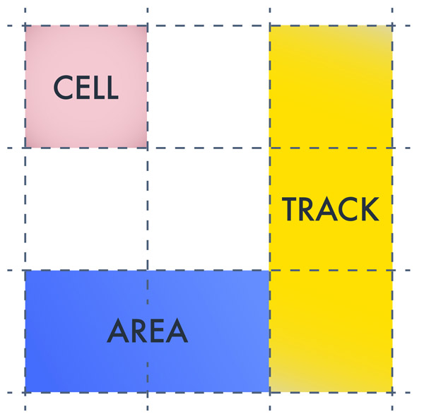
Lines: Lines define the boundaries of other elements. They run vertically as well as horizontally. In the figure below, there are four vertical and four horizontal lines.
线 :线定义其他元素的边界。 它们在垂直和水平方向上都运行。 在下图中,有四个垂直线和四个水平线。
Tracks: Tracks are the space between parallel lines. In the figure below, there are three vertical and three horizontal tracks.
轨道 :轨道是平行线之间的空间。 在下图中,有三个垂直轨道和三个水平轨道。
Cells: Cells are the building block of grids. In the figure below, there are nine cells in total.
单元 :单元是网格的组成部分。 在下图中,共有九个单元。
Areas: An area is a rectangular shape with an arbitrary number of cells. So, a track is an area and so is a cell.
区域 :区域是具有任意数量的单元格的矩形。 因此, 轨道是一个区域 , 单元也是 。
在网格中定位元素 (Positioning Elements in a Grid)
Let’s begin with the basics. In this section, I will teach you how to position elements at a certain location using grids. To use CSS Grid Layout, you need a parent element and one or more child elements. For the sake of demonstration, I will use the following markup for our grid system:
让我们从基础开始。 在本节中,我将教您如何使用网格将元素定位在特定位置。 要使用CSS网格布局,您需要一个父元素和一个或多个子元素。 为了演示,我将在我们的网格系统中使用以下标记:
<div class="grid-container">
  <div class="grid-element item-a">A</div>
  <div class="grid-element item-b">B</div>
  <div class="grid-element item-c">C</div>
  <div class="grid-element item-d">D</div>
  <div class="grid-element item-e">E</div>
  <div class="grid-element item-f">F</div>
</div>
After you are done with the markup you need to apply display:grid or display:inline-grid on the parent element along with other styling like this:
完成标记后,您需要在父元素上应用display:grid或display:inline-grid以及其他类似的样式:
.grid-container {
  display: grid;
  grid-template-columns: 200px 10px 0.3fr 10px 0.7fr;
  grid-template-rows: auto 20px auto;
}
The grid-template-columns and grid-template-rows properties are used to specify the width of various rows and columns. In the above example, I have defined five columns. The 10px columns act as gutters to provide required spacing between elements. The first column is 200px wide. The third column takes up 0.3 parts of the remaining space. Similarly, fifth column takes up 0.7 parts of the remaining space.
grid-template-columns和grid-template-rows属性用于指定各种行和列的宽度。 在上面的示例中,我定义了五列。 10px列用作装订线,以在元素之间提供所需的间距。 第一200px宽。 第三列占用剩余空间的0.3部分。 同样,第五列占用剩余空间的0.7部分。
Using auto for the first row in grid-template-rows allows the row to expand as necessary based on the content inside it. The 20px row acts as a gutter.
对grid-template-rows的第一行使用auto可以根据行中的内容根据需要扩展行。 20px行充当装订线。
At this point, the elements are packed closely together as evident from the following demo.
在这一点上,从下面的演示中可以看出,元素紧密地组合在一起。
See the Pen CSS Grid Layout Demo 1 by SitePoint (@SitePoint) on CodePen.
请参阅CodePen上SitePoint ( @SitePoint )的Pen CSS网格布局演示1 。
Observe that element B is in the second column that we were planning on using as a gutter. If you don’t specify the position of child elements inside the grid, the browser puts one element per cell until the first row is completely filled, the rest of the elements then go in the next row. This is the reason that we are left with four spare columns in the second row.
观察到元素B在我们计划用作装订线的第二列中。 如果未指定子元素在网格内的位置,则浏览器会在每个单元格中放置一个元素,直到第一行被完全填充,其余元素然后进入下一行。 这就是第二行剩下四个备用列的原因。
To move elements to a specific cell in the grid you need to specify their position in CSS. Before I explain how to move elements around using grid system, take a look at the following image.
要将元素移动到网格中的特定单元格,您需要指定它们在CSS中的位置。 在解释如何使用网格系统移动元素之前,请看一下下图。
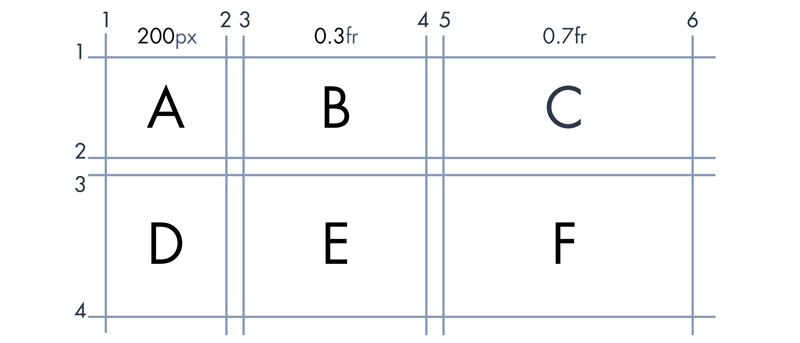
In this example, we will be using “line-based placements”. Line-based placement means that the lines in our grid system will act as guidelines to place and confine elements. Let’s take element B as an example. Horizontally, it starts at column line 3 and ends at column line 4. Along the vertical axis, it is located between the line at row 1 and the line at row 2.
在此示例中,我们将使用“基于行的展示位置”。 基于线的放置意味着我们网格系统中的线将作为放置和限制元素的准则。 让我们以元素B为例。 在水平方向上,它从列线3开始,在列线4处结束。沿着垂直轴,它位于行1的行和行2的行之间。
We use grid-column-start to specify the starting vertical line for an element. In this case, it would be set to 3. grid-column-end indicates the ending vertical line for an element. This property would be equal to 4 in this case. Corresponding row values will also be set similarly.
我们使用grid-column-start来指定元素的起始垂直线。 在这种情况下,它将设置为3 。 grid-column-end表示元素的垂直结束线。 在这种情况下,此属性等于4 。 相应的行值也将类似地设置。
With all of the above in mind, to move element B to the second cell you would use the following CSS:
考虑到以上所有内容,要将元素B移动到第二个单元格,可以使用以下CSS:
.element-b {
  grid-column-start: 3;
  grid-column-end: 4;
  grid-row-start: 1;
  grid-row-end: 2;
}
Similarly, to move element F to the sixth cell you would use the following CSS:
同样,要将元素F移动到第六个单元格,可以使用以下CSS:
.element-f {
  grid-column-start: 5;
  grid-column-end: 6;
  grid-row-start: 3;
  grid-row-end: 4;
}
After these changes in CSS, the elements should be spaced properly like they are in this demo:
在CSS中进行了这些更改之后,应像在此演示中一样正确地间隔元素:
See the Pen CSS Grid Layout Demo 2 by SitePoint (@SitePoint) on CodePen.
请参阅CodePen上的SitePoint ( @SitePoint )提供的Pen CSS网格布局演示2 。
创建基本布局 (Creating a Basic Layout)
Now it is time to create a basic blog layout. The blog will have a header, a footer, a sidebar and two sections for actual content. Let’s begin with the markup:
现在该创建基本的博客布局了。 该博客将包含一个页眉,页脚,侧边栏和两个实际内容部分。 让我们从标记开始:
<div class="grid-container">
  <div class="grid-element header">Header</div>
  <div class="grid-element sidebar">Sidebar</div>
  <div class="grid-element main">Main Content</div>
  <div class="grid-element extra">Extra Info</div>
  <div class="grid-element footer">Footer</div>
</div>
Keep in mind that the order of elements in markup does not make any difference as to where the elements are positioned on the web page. As long as you do not change the CSS, you can put the footer above the header in the markup and the position of elements on the web page will not change. Of course, I would not recommend it. The point is — your markup will no longer dictate the placement of your elements.
请记住,标记中元素的顺序对于元素在网页上的位置没有任何区别。 只要不更改CSS,就可以将页脚放在标记中标头的上方,并且网页上元素的位置也不会改变。 当然,我不会推荐它。 关键是-您的标记将不再决定元素的位置。
All we have to do now is figure out the value of properties like grid-row-end for various elements. Just like in the last example, we will use a grid diagram to determine the value of all grid properties.
我们现在要做的就是找出各种元素的属性值,例如grid-row-end 。 就像在上一个示例中一样,我们将使用网格图来确定所有网格属性的值。
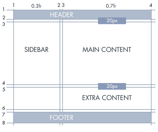
As the above image indicates, the header goes from column line 1 to column line 4 and row line 1 to row line 2. The CSS for this should be as follows:
如上图所示,标题从第1列到第4列,从行1到第2行。CSS如下所示:
.header {
  grid-column-start: 1;
  grid-column-end: 4;
  grid-row-start: 1;
  grid-row-end: 2;
}
Similarly, “extra content” goes from column line 3 to column line 4 and row line 5 to row line 6. Therefore, the CSS would be:
同样,“额外内容”从第3行到第4行,从第5行到第6行。因此,CSS为:
.extra {
  grid-column-start: 3;
  grid-column-end: 4;
  grid-row-start: 5;
  grid-row-end: 6;
}
Grid properties of all other elements can also be determined with ease now. Have a look at the CodePen demo and experiment with various grid values to get a better understanding of line-based placement:
现在也可以轻松确定所有其他元素的网格属性。 看看CodePen演示并尝试各种网格值,以更好地理解基于行的放置:
See the Pen CSS Grid Layout Demo 3 by SitePoint (@SitePoint) on CodePen.
请参阅CodePen上的SitePoint ( @SitePoint )的Pen CSS网格布局演示3 。
结论 (Conclusion)
The CSS grid layout spec allows us to create complex layouts with ease. The CSS we need to write is much simpler and more maintainable. We no longer have to use float or other such properties when creating complex layouts in our designs. Another great advantage is the complete separation of markup and layout. With CSS Grid Layout, the possibilities are endless.
CSS网格布局规范使我们能够轻松创建复杂的布局。 我们需要编写CSS更简单,更易于维护。 在设计中创建复杂布局时,我们不再需要使用float或其他此类属性。 另一个巨大的优势是标记和布局的完全分离。 使用CSS Grid Layout,可能性是无限的。
If you have any questions regarding this tutorial, let me know in the comments.
如果您对本教程有任何疑问,请在评论中告诉我。
翻译自: https://www.sitepoint.com/introducing-the-css-grid-layout/
css 网格布局


 2175
2175


 被折叠的 条评论
为什么被折叠?
被折叠的 条评论
为什么被折叠?
 到【灌水乐园】发言


