


excel瀑布图
We have a very famous waterfall here in Canada, and it creates gorgeous photos, like this one from my fall 2008 vacation.
在加拿大,我们有一个非常著名的瀑布,它创造了漂亮的照片,就像我2008年秋季度假时拍摄的那样。

You can create waterfalls in Excel too -- Waterfall Charts. They might not be as spectacular as Niagara Falls, but can be useful for showing how values change. There are details here for creating a simple waterfall chart, and a video that shows the steps.
您也可以在Excel中创建瀑布-瀑布图。 它们可能不如尼亚加拉瀑布(Niagara Falls)那样壮观,但是对于显示价值如何变化很有用。 这里有创建简单瀑布图的详细信息,以及显示步骤的视频。
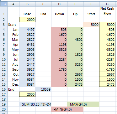
净现金流量 (Net Cash Flow)
For example, in a small business, the net cash flow might be a positive number one month, and a negative number the next. In the Waterfall Chart shown below, the red columns represent a negative number, that brings the cumulative cash total down. Green columns are shown for months with a positive cash flow.
例如,在一家小型企业中,一个月的净现金流量可能为正数,第二个月为负数。 在下面显示的瀑布图中,红色列表示负数,这使累计现金总额下降了。 绿色栏显示了几个月的现金流为正。
- The starting value for each red column (negative) is at its top, and the cumulative value for that month is the amount at the bottom of the red column. 每个红色列(负数)的起始值在其顶部,该月的累计值在红色列的底部。
- The starting value for each green column (positive) is at its bottom, and the cumulative value for that month is the amount at the top of the green column. 每个绿色列(正)的起始值在其底部,该月的累积值是绿色列顶部的量。
- The grey columns (Start and End) compare the original and final amounts, after all the monthly values have been included. 在包括所有月度值之后,灰色列(开始和结束)会比较原始和最终金额。
设置Excel数据 (Set Up the Excel Data)
Excel doesn't have a Waterfall Chart Type, but you can create one by arranging your data in columns, then adding and formatting a stacked column chart.
Excel没有瀑布图类型,但是您可以通过以下方式创建一个瀑布图类型:将数据按列排列,然后添加并格式化堆积的柱形图。
In the screenshot below, columns have been added after the dates, to create the series for the waterfall chart. The Base column is used as a foundation for the "floating" green and red columns.
在下面的屏幕截图中,在日期之后添加了列,以创建瀑布图的系列。 “基础”列用作“浮动”绿色和红色列的基础。
The formulas are shown below the table, so you can see how each column is calculated.
公式显示在表格下方,因此您可以查看每列的计算方式。
创建瀑布图 (Create the Waterfall Chart)
After you set up the data, follow these steps to create the chart:
设置数据后,请按照以下步骤创建图表:
- Select cells A1:F17, and insert a Stacked Column chart. 选择单元格A1:F17,然后插入堆积柱形图。
- Format the Base series to have no fill and no border, so it's invisible. 将基本系列的格式设置为无填充且无边框,因此它是不可见的。
- Reduce the gap width between the columns 减少列之间的间隙宽度
- Format the columns with the colours you'd prefer 用您喜欢的颜色设置列的格式
- Remove the Legend. 删除图例。
下载瀑布图示例文件 (Download the Waterfall Chart Sample File)
On the Contextures website, go to the Create an Excel Waterfall Chart page, and you'll see the formulas used in the waterfall chart data columns. You can also download the sample Excel Waterfall Chart file, to see how it works.
在Contextures网站上,转到“ 创建Excel瀑布图”页面,您将看到瀑布图数据列中使用的公式。 您还可以下载示例Excel Waterfall Chart文件,以查看其工作方式。
瀑布图实用程序 (Waterfall Chart Utility)
If you need to make more than a couple of waterfall charts, or other custom charts, take a look at Jon Peltier's time-saving Excel Chart Utility.
如果您需要制作多个瀑布图或其他自定义图表,请查看Jon Peltier的省时Excel图表实用程序 。
It's very reasonably priced, and will quickly pay for itself, in time saved, aggravation avoided, and possible prevention of hair loss. 😉
它的价格非常合理,可以Swift收回成本,节省时间,避免加重病情,并可能防止脱发。 😉
观看瀑布图视频 (Watch the Waterfall Chart Video)
To see the steps for setting up your data, and creating an Excel Waterfall Chart, you can watch this Excel video tutorial.
要查看设置数据和创建Excel瀑布图的步骤,您可以观看此Excel视频教程。
翻译自: https://contexturesblog.com/archives/2010/10/20/create-a-waterfall-chart-in-excel/
excel瀑布图


 970
970

 被折叠的 条评论
为什么被折叠?
被折叠的 条评论
为什么被折叠?
 到【灌水乐园】发言


