


 本文展示了如何仅使用CSS和复选框技术来创建各种风格的按钮开关,无需JavaScript。通过利用CSS3的新属性,如渐变、阴影和伪元素,可以实现从简单的圆形按钮到复杂的模拟开关的各种设计。文中提供了四个示例,从基本的圆形按钮到带有LED灯和模拟开关的复杂设计,以及使用图标字体和过渡效果的高级示例。
css 按钮隐藏复选框
Hello everyone! For a while now, I’m having fun with the new CSS properties (CSS3). It’s an incredible playground for creativity and cleverness. I particularly enjoy designing and creating UI elements like buttons, switches, toggles and such. That’s the focus of this tutorial, I’ll show you how to create button switches with CSS only, without a line of JavaScript. Ready for it? A few things before starting:
大家好! 现在有一段时间,我在玩新CSS属性(CSS3)。 这是创造力和智慧不可思议的游乐场。 我特别喜欢设计和创建UI元素,例如按钮,开关,切换键等。 这就是本教程的重点,我将向您展示如何仅使用CSS而不使用JavaScript来创建按钮开关。 准备好了吗? 开始之前的几件事:
- You won’t see any vendor prefixes in the CSS snippets, but you will of course find them in the files. 您不会在CSS片段中看到任何供应商前缀,但是您当然会在文件中找到它们。
- We won’t use much transitions between states because we often use pseudo-elements to reduce the number of elements to its minimum, and as of writing, only Firefox supports transitions/animations on pseudo-elements. 我们不会在状态之间使用过多的过渡,因为我们经常使用伪元素将元素的数量减少到最少,并且在撰写本文时,只有Firefox支持伪元素的过渡/动画。
- We’ll use the “checkbox hack” (see below). 我们将使用“复选框黑客”(如下所示)。
- I personally use the box-model where [width] = [element-width] + [padding] + [borders]. I activate it with the following snippet: 我个人使用[[width] = [element-width] + [padding] + [borders]的盒子模型。 我使用以下代码段激活它:
    *,
    *:after,
    *:before {
        box-sizing: border-box;
    }
关于“复选框黑客”(About the “Checkbox Hack”)
The checkbox hack allows us to have a toggle handler in pure CSS. It relies on a checkbox (which is either checked or unchecked), the :checked pseudo-selector, and a sibling selector (~ or +). Basically, you can say “if the checkbox is checked, then the following X element is behaving like this”. The old way consisted of having a checkbox with an ID, and a label tag with a “for” attribute calling the checkbox ID. This technique allowed to hide the checkbox and still toggle it by clicking on the label. The only problem with this approach it that mobile Safari doesn’t support it. So we have a workaround for that: turn the checkbox invisible with the opacity property, set it on top of whatever element you want (I still use label) and there you go, when clicking the element, you are actually clicking the checkbox! The code looks like this:
复选框hack允许我们在纯CSS中有一个切换处理程序。 它依赖于一个复选框(已选中或未选中)、: checked伪选择器和同级选择器(〜或+)。 基本上,您可以说“如果选中此复选框,则以下X元素的行为如下所示”。 以前的方法包括:拥有一个带有ID的复选框和一个带有“ for”属性的标签标签,以调用该复选框的ID。 这种技术允许隐藏复选框,并仍然可以通过单击标签来切换它。 这种方法的唯一问题是移动Safari不支持它。 因此,我们有一个解决方法:使用opacity属性使复选框不可见,将其设置在所需的任何元素之上(我仍在使用标签),然后单击该元素,实际上就是在单击该复选框! 代码如下:
.switch input {
    /* First, we make it as wide as the container */
    position: absolute;
    width: 100%;
    height: 100%;
    /* Then, we put it on top of everything else */
    z-index: 100;
    /* Last, we make it invisible */
    opacity: 0;
    /* This one is just for ergonomy */
    cursor: pointer;
}
Those 12 lines of CSS will be used in all the following demos, so feel free to copy paste it; it never changes. Note: for another awesome demo including the checkbox hack, you may want to have a look at this tutorial: Annotation overlay effect with CSS3.
这12行CSS将在以下所有演示中使用,因此随时可以复制粘贴。 它永远不会改变。 注意:对于另一个很棒的演示,包括复选框hack,您可能需要看一下本教程: CSS3的Annotation overlay effect 。
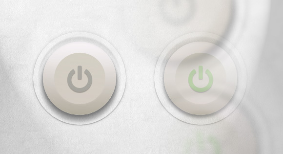
例子1 (Example 1)

Let’s start with a lovely little push button, with a small illuminated LED when it’s on.
让我们从一个可爱的小按钮开始,当它打开时,它带有一个小的发光LED。
标记 (The Markup)
<div class="switch">
	<input type="checkbox">
	<label></label>
</div>
The .switch element is our container. Within this very element the checkbox and the label will be positioned on top of each other to allow us to do the magic trick. The input doesn’t need anything more than the checkbox type (no ID, no name, nothing).
.switch元素是我们的容器。 在此元素内,复选框和标签将位于彼此的顶部,以使我们能够完成魔术。 输入仅需要复选框类型(没有ID,没有名称,什么也没有)。
And the last element could be anything (an anchor, a div, a span, a label, a bold/italic tag, whatever). I personally chose a label because I used to use the old checkbox hack, which required a label.
最后一个元素可以是任何内容(锚点,div,范围,标签,粗体/斜体标签等)。 我之所以选择一个标签,是因为我曾经使用过需要标签的旧复选框。
CSS (The CSS)
First, we give our button a size by setting the width and height to the container. Be sure the width and the height are the same, or your button won’t be round. Remember to hide the checkbox with the according CSS code at the top of this article.
首先,我们通过设置容器的宽度和高度来为按钮设置尺寸。 确保宽度和高度相同,否则按钮将不会变圆。 请记住,隐藏带有本文顶部相应CSS代码的复选框。
.switch {
    width: 100px;
    height: 100px;
    position: relative;
}
Then, the label, which is where we’ll add all the styling to. First of all, we set it to block and make it 100% of its parent size (the container). Then, we give it a relative position in order to add some pseudo-elements later.
然后,在标签上添加所有样式。 首先,我们将其设置为阻止并使其达到其父大小(容器)的100%。 然后,我们给它一个相对位置,以便以后添加一些伪元素。
Time for some real styles: a background color, a round shape, and some awesome box-shadows to make it look like it’s embossed.
是时候使用一些真实的风格:背景色,圆形和一些令人敬畏的盒子阴影,使其看起来像浮雕一样。
.switch label {
    display: block;
    width: 100%;
    height: 100%;
    position: relative;
    border-radius: 50%;
    background: #eaeaea;
    box-shadow:
        0 3px 5px rgba(0,0,0,0.25),
        inset 0 1px 0 rgba(255,255,255,0.3),
        inset 0 -5px 5px rgba(100,100,100,0.1),
        inset 0 5px 5px rgba(255,255,255,0.3);
}
It already looks acceptable, but we need to add some pseudo-elements to make it awesome, right? So let’s go. The first one is meant to improve the embossed look by adding a little recess around the button. So we set it to position absolute, behind the button and we don’t give it any size but we give it some top/right/bottom/left values instead.
它看起来已经可以接受了,但是我们需要添加一些伪元素使其变得很棒,对吗? 所以走吧第一个旨在通过在按钮周围添加一个小凹槽来改善浮雕外观。 因此,我们将其设置为绝对位置,并位于按钮后面,并且不给它任何大小,而是给它一些顶部/右侧/底部/左侧值。
And of course, some aesthetics: a soft gradient from top to bottom and some sexy box-shadows.
当然还有一些美感:从上到下的柔和渐变以及一些性感的盒子阴影。
.switch label:after {
    content: "";
    position: absolute;
    z-index: -1;
    top: -8%;
    right: -8%;
    bottom: -8%;
    left: -8%;
    border-radius: inherit;
    background: #ddd; /* Fallback */
    background: linear-gradient(#ccc, #fff);
    box-shadow:
        inset 0 2px 1px rgba(0,0,0,0.15),
        0 2px 5px rgba(200,200,200,0.1);
}
And now, the LED, which is the main indicator for the state of the button. Basically, it’s a small circle placed in the middle of the button. A little more fanciness than *just* box-shadows will be used here: a radial gradient. Let’s use a simple one though, just to make the whole thing a little nicer for browsers supporting radial gradients, and make a fallback for others.
现在,LED是按钮状态的主要指示器。 基本上,它是按钮中间的一个小圆圈。 这里将使用比*仅*框阴影稍大的奇特效果:径向渐变。 不过,让我们使用一个简单的示例,只是为了使整体功能对支持径向渐变的浏览器更好一些,并为其他浏览器提供一个替代。
.switch label:before {
    content: "";
    position: absolute;
    width: 20%;
    height: 20%;
    left: 40%;
    top: 40%;
    border-radius: inherit;
    background: #969696; /* Fallback */
    background: radial-gradient(40% 35%, #ccc, #969696 60%);
    box-shadow:
        inset 0 2px 4px 1px rgba(0,0,0,0.3),
        0 1px 0 rgba(255,255,255,1),
        inset 0 1px 0 white;
}
Okay, so now, we have a nice button. Let’s deal with the checked state. When you click on the container, you actually click on the invisible checkbox which sits on top of the label. From here, you have activated the checkbox, meaning you can use the :checked state and a sibling selector. The following is like saying “Hey, the input element is checked, so the following label in the .switch element has to be like this. So when the button is turned on, we change the background color of the LED (:before pseudo-element), as well as the background of the button. That’s basically it!
好的,现在,我们有了一个不错的按钮。 让我们处理检查状态。 当您单击容器时,实际上是单击标签顶部的不可见复选框。 从这里,您已经激活了复选框,这意味着您可以使用:checked状态和同级选择器。 以下内容就像说“嘿,检查输入元素,因此.switch元素中的以下标签必须像这样。 因此,当按钮打开时,我们将更改LED的背景颜色(在伪元素之前:)以及按钮的背景。 基本上就是这样!
.switch input:checked ~ label { /* Button */
	background: #e5e5e5; /* Fallback */
    background: linear-gradient(#dedede, #fdfdfd);
}

.switch input:checked ~ label:before { /* LED */
    background: #25d025; /* Fallback */
    background: radial-gradient(40% 35%, #5aef5a, #25d025 60%);
    box-shadow:
        inset 0 3px 5px 1px rgba(0,0,0,0.1),
        0 1px 0 rgba(255,255,255,0.4),
        0 0 10px 2px rgba(0, 210, 0, 0.5);
}
例子2(Example 2)

In this example we want to come close to an actual light button switch, so let’s see how far we can take it.
在此示例中,我们希望接近实际的灯光按钮开关,因此让我们看一下它能走多远。
标记 (The Markup)
The markup is the same as in the first example; a container, a checkbox and a label:
标记与第一个示例中的相同; 一个容器,一个复选框和一个标签:
<div class="switch">
	<input type="checkbox">
	<label></label>
</div>
CSS(The CSS)
We start by setting a size to our button and hiding the checkbox.
首先,为按钮设置大小并隐藏复选框。
.switch {
    width: 50px;
    height: 100px;
    position: relative;
}
This example requires many more box-shadows to look well. Let’s not forget to add a soft background color and rounded corners, to make the whole thing look even softer:
此示例需要更多的矩形阴影才能看起来不错。 我们不要忘记添加柔和的背景颜色和圆角,以使整个外观看起来更加柔和:
.switch label {
    display: block;
    width: 100%;
    height: 100%;
    position: relative;
    background: #cbc7bc;
    border-radius: 5px;
    box-shadow:
        inset 0 1px 0 white,
        0 0 0 1px #999,
        0 0 5px 1px rgba(0,0,0,0.2),
        0 2px 0 rgba(255,255,255,0.6),
        inset 0 10px 1px #e5e5e5,
        inset 0 11px 0 rgba(255,255,255,0.5),
        inset 0 -45px 3px #ddd;
}
And now, let’s add some pseudo-elements. The first one is meant to create the housing, the second one to simulate screws. Let’s start with the housing. It’s pretty much the same thing as in our previous example, plus a little border:
现在,让我们添加一些伪元素。 第一个用于创建外壳,第二个用于模拟螺钉。 让我们从外壳开始。 它与我们之前的示例几乎一样,只是带有一点边框:
.switch label:after {
    content: "";
    position: absolute;
    z-index: -1;
    top: -20px;
    left: -25px;
    bottom: -20px;
    right: -25px;
    background: #ccc; /* Fallback */
    background: linear-gradient(#ddd, #bbb);
    border-radius: inherit;
    border: 1px solid #bbb;
    box-shadow:
        0 0 5px 1px rgba(0,0,0,0.15),
        0 3px 3px rgba(0,0,0,0.3),
        inset 0 1px 0 rgba(255,255,255,0.5);
}
The second one is more interesting, since we only have one element to create two screws. This is one more job for box-shadows! Because we are using a plain color, we can easily make a shadow look like our main element. We could even make 4, 10 or 42 screw holes with this. But we just need two here:
第二个更有趣,因为我们只有一个元素可以创建两个螺钉。 对于盒子阴影来说,这是另一项工作! 因为我们使用的是纯色,所以我们可以轻松地使阴影看起来像我们的主要元素。 我们甚至可以用它制作4、10或42个螺Kong。 但是我们这里只需要两个:
.switch label:before {
    content: "";
    position: absolute;
    width: 8px;
    height: 8px;
    top: -13px;
    left: 20px;
    background: #666;
    border-radius: 50%;
    box-shadow:
        0 1px 0 white, /* Subtle reflection on the bottom of the hole */
        0 120px 0 #666, /* Faking a second screw hole... */
        0 121px 0 white; /* And its reflection */
}
Now the part of the checked state. In this example only the central part (which is the label) will change when we click it. And we created this material effect only with box-shadows, so easy peasy, let’s just revert them, adapt them, prettify them, and we’re done:
现在是检查状态的一部分。 在此示例中,单击时仅中心部分(即标签)会更改。 而且,我们仅用盒形阴影创建了这种物质效果,如此简单易用,让我们将它们还原,改编,美化它们,然后完成:
.switch input:checked ~ label { /* Button */
    background: #d2cbc3;
    box-shadow:
        inset 0 1px 0 white,
        0 0 0 1px #999,
        0 0 5px 1px rgba(0,0,0,0.2),
        inset 0 -10px 0 #aaa,
        0 2px 0 rgba(255,255,255,0.1),
        inset 0 45px 3px #e0e0E0,
        0 8px 6px rgba(0,0,0,0.18);
}
例子3(Example 3)

Let’s get on with something even cooler. This one is adapted from a lovely design by talented Piotr Kwiatkowski. It looks so smooth, doesn’t it?
让我们继续做一些更酷的事情。 这是根据才华横溢的Piotr Kwiatkowski的可爱设计改编而成。 看起来很光滑,不是吗?
标记 (The Markup)
For this switch, we will need an extra element. Let’s pick something quiet and discrete, like an <i>.
对于此开关,我们将需要一个额外的元素。 让我们选择一个安静且离散的东西,例如<i>。
<div class="switch">
	<input type="checkbox">
	<label><i></i></label>
</div>
CSS(The CSS)
So once again, we hide the checkbox, with the same little snippet of CSS. And, as always, we give a size to the container.
因此,我们再次隐藏具有相同CSS小片段的复选框。 而且,和往常一样,我们给容器一个尺寸。
.switch {
    width: 180px;
    height: 50px;
    position: relative;
}
So here we are going to do the following: the label will be the container of the toggle switch. The <i> tag will be the actual toggle element. So the label is only the dark grey background with shadows, nothing more. Pseudo-elements will do the rest.
因此,在这里我们将执行以下操作:标签将是拨动开关的容器。 <i>标签将是实际的切换元素。 因此,标签只是带有阴影的深灰色背景,仅此而已。 伪元素将完成其余的工作。
.switch label {
    display: block;
    width: 100%;
    height: 100%;
    position: relative;
    background: #a5a39d;
    border-radius: 40px;
    box-shadow:
        inset 0 3px 8px 1px rgba(0,0,0,0.2),
        0 1px 0 rgba(255,255,255,0.5);
}
This is the “frame of the container”, so we give it a nice gradient, and some sweet box-shadows.
这是“容器的框架”,因此我们给它提供了一个不错的渐变以及一些甜美的盒子阴影。
.switch label:after {
    content: "";
    position: absolute;
    z-index: -1;
    top: -8px; right: -8px; bottom: -8px; left: -8px;
    border-radius: inherit;
    background: #ccc; /* Fallback */
    background: linear-gradient(#f2f2f2, #ababab);
    box-shadow: 0 0 10px rgba(0,0,0,0.3),
        0 1px 1px rgba(0,0,0,0.25);
}
This pseudo-element is meant to create a soft hollow around the button, so as usual, we’ll use gradient and shadows. A little enhancement for Chrome with the use of a blur filter to make the effect even softer.
该伪元素旨在在按钮周围创建一个柔软的空心,因此,像往常一样,我们将使用渐变和阴影。 使用模糊滤镜使Chrome略有增强,使效果更加柔和。
.switch label:before {
    content: "";
    position: absolute;
    z-index: -1;
    top: -18px; right: -18px; bottom: -18px; left: -18px;
    border-radius: inherit;
    background: #eee; /* Fallback */
    background: linear-gradient(#e5e7e6, #eee);
    box-shadow: 0 1px 0 rgba(255,255,255,0.5);
    -webkit-filter: blur(1px); /* Smooth trick */
    filter: blur(1px); /* Future-proof */
}
So now, we have a really beautiful frame for our toggle switch. Let’s take care of the switch, shall we?
所以现在,我们的拨动开关有了一个非常漂亮的框架。 让我们照顾一下开关,好吗?
We turn it into a block element, give it the height of its parent and a little bit more than half of its width. We place it on the left of the container, and give it some nice styles (shadows and gradients, you get it):
我们将其变成一个块元素,为其指定其父对象的高度,并为其宽度的一半多一点。 我们将其放置在容器的左侧,并为其提供一些漂亮的样式(阴影和渐变,就可以了):
.switch label i {
    display: block;
    height: 100%;
    width: 60%;
    position: absolute;
    left: 0;
    top: 0;
    z-index: 2;
    border-radius: inherit;
    background: #b2ac9e; /* Fallback */
    background: linear-gradient(#f7f2f6, #b2ac9e);
    box-shadow:
        inset 0 1px 0 white,
        0 0 8px rgba(0,0,0,0.3),
        0 5px 5px rgba(0,0,0,0.2);
}
This first pseudo-element is used to enhance the aesthetics: it adds a curved effect to the toggle. We place it in the middle, and gave it a gradient from top to bottom, almost the same as the one of its parent but reverted.
第一个伪元素用于增强美观性:它为肘节添加了弯曲效果。 我们将其放置在中间,并给它一个从上到下的渐变,与它的父级几乎相同,但恢复原状。
.switch label i:after {
    content: "";
    position: absolute;
    left: 15%;
    top: 25%;
    width: 70%;
    height: 50%;
    background: #d2cbc3; /* Fallback */
    background: linear-gradient(#cbc7bc, #d2cbc3);
    border-radius: inherit;
}
The second pseudo-element is the word “ON” or “OFF”, depending on the state of the button. We use the content property to set the right word, and some font styles to make it look like it’s engraved in the background:
第二个伪元素是单词“ ON”或“ OFF”,具体取决于按钮的状态。 我们使用content属性设置正确的单词,并使用一些字体样式使其看起来像刻在背景中:
.switch label i:before {
    content: "off";
    position: absolute;
    top: 50%;
    right: -50%;
    margin-top: -12px;
    color: #666; /* Fallback */
    color: rgba(0,0,0,0.4);
    font-style: normal;
    font-weight: bold;
    font-family: Helvetica, Arial, sans-serif;
    font-size: 24px;
    text-transform: uppercase;
    text-shadow: 0 1px 0 #bcb8ae, 0 -1px 0 #97958e;
}
So now we have a toggle switch which looks like the one from Piotr, right? Let’s get into the checked state. Three things are changing when we click on the checkbox: the background color, the toggle’s position, and the word (“ON” or “OFF”):
所以现在我们有了一个拨动开关,看起来像是Piotr的那样,对吗? 让我们进入检查状态。 单击复选框时,三件事正在发生变化:背景颜色,切换开关的位置和单词(“ ON”或“ OFF”):
.switch input:checked ~ label { /* Background */
    background: #9abb82;
}

.switch input:checked ~ label i { /* Toggle */
    left: auto;
    right: -1%;
}

.switch input:checked ~ label i:before { /* On/off */
    content: "on";
    right: 115%;
    color: #82a06a;
    text-shadow: 0 1px 0 #afcb9b, 0 -1px 0 #6b8659;
}
例子4(Example 4)

Our last example is based on another work from Piotr Kwiatkowski, but slightly edited by myself in order to have the same color theme as the others.
我们的最后一个示例基于Piotr Kwiatkowski的另一作品,但我自己对其进行了少许编辑,以使其与其他主题具有相同的颜色主题。
Let’s do something really amazing on this one, with an icon font and transitions!
让我们通过图标字体和过渡功能在这一方面做些非常了不起的事情!
标记 (The Markup)
The markup will be pretty much the same as in the third example. The class on the <i> tag is required in order to make FontAwesome work.
标记将与第三个示例中的几乎相同。 <i>标记上的类是使FontAwesome起作用所必需的。
<div class="switch">
    <input type="checkbox">
    <label><i class="icon-off"></i></label>
</div>
CSS(The CSS)
I won’t cover here all the FontAwesome stuff because I’m pretty sure it has already been covered in another article, plus probably all of you have already done that before. Just make sure that
我不会在这里介绍所有FontAwesome东西,因为我很确定它已经在另一篇文章中介绍了,而且也许你们所有人以前都已经做过。 只要确保
- your @font-face stuff indicate the correct paths to the files,您的@ font-face内容指示文件的正确路径,
- one of your CSS files includes FontAwesome related styles. 您CSS文件之一包含FontAwesome相关样式。
So let’s start with the basics: checkbox hiding and container sizing:
因此,让我们从基础开始:复选框隐藏和容器大小调整:
.switch {
    width: 150px;
    height: 150px;
    position: relative;
}
Now, let’s take care of the label which is basically our big old button. Note that we include a few font style here. Since all of them are inherited, they will go straight to the <i> element (icon). So nothing new, a sweet gradient and some box-shadows for a beautiful effect:
现在,让我们来照顾标签,它基本上是我们的旧按钮。 请注意,此处包含一些字体样式。 由于它们都是继承的,因此它们将直接进入<i>元素(图标)。 因此,没有什么新鲜的东西了,甜美的渐变色和一些盒子阴影带来了美丽的效果:
.switch label {
    display: block;
    width: 100%;
    height: 100%;
    position: relative;
    color: #a5a39d;
    font-size: 70px;
    text-align: center;
    line-height: 115px;
    text-shadow: 0 2px 1px rgba(0,0,0,0.25);
    border-radius: 50%;
    background: #b25244; /* Fallback */
    background: linear-gradient(#f7f2f6, #b2ac9e);
    transition: all 0.3s ease-out;
    z-index: -1;
    box-shadow:
        inset 0 2px 3px rgba(255,255,255,0.13),
        0 5px 8px rgba(0,0,0,0.3),
        0 10px 10px 4px rgba(0,0,0,0.3);
}
Now, both label pseudo-elements are used to make the material effect around the button. We apply the blur filter to the closest one to make it a bit more subtle.
现在,两个标签伪元素都用于在按钮周围产生实物效果。 我们将模糊滤镜应用于最接近的滤镜,以使其更加微妙。
.switch label:before {
    content: "";
    position: absolute;
    left: -10px;
    right: -10px;
    top: -10px;
    bottom: -10px;
    z-index: -1;
    border-radius: inherit;
    box-shadow: inset 0 10px 10px rgba(0,0,0,0.13);
    -webkit-filter:blur(1px); /* Smooth trick */
    filter: blur(1px); /* Future-proof */
}

.switch label:after {
    content: "";
    position: absolute;
    left: -20px;
    right: -20px;
    top: -20px;
    bottom: -20px;
    z-index: -2;
    border-radius: inherit;
    box-shadow:
        inset 0 1px 0 rgba(255,255,255,0.1),
        0 1px 2px rgba(0,0,0,0.3),
        0 0 10px rgba(0,0,0,0.15);
}
Okay, let’s deal with our extra element: <i>. FontAwesome uses the :before pseudo-element to show the icon, so we can’t use it. But, we can use the :after one, and we will because we need something to make the upper part of our button. As usual, we give it a nice gradient, some subtle shadows, and a 1px blur to make it smoother.
好的,让我们处理一下额外的元素:<i>。 FontAwesome使用:before伪元素显示图标,因此我们不能使用它。 但是,我们可以使用:after,然后我们将因为需要一些东西来制作按钮的上部。 和往常一样,我们给它一个不错的渐变,一些细微的阴影以及1px的模糊以使其更平滑。
.switch .icon-off:after {
    content: "";
    display: block;
    position: absolute;
    width: 70%;
    height: 70%;
    left: 50%;
    top: 50%;
    z-index: -1;
    margin: -35% 0 0 -35%;
    border-radius: 50%;
    background: #d2cbc3; /* Fallback */
    background: linear-gradient(#cbc7bc, #d2cbc3);
    box-shadow:
        0 -2px 5px rgba(255,255,255,0.05),
        0 2px 5px rgba(255,255,255,0.1);
    -webkit-filter:blur(1px); /* Smooth trick */
    filter: blur(1px); /* Future-proof */
}
And now, the checked state; pretty simple: the icon turns green, and the button looks pressed:
现在,检查状态; 非常简单:图标变为绿色,并且按钮看上去已按下:
.switch input:checked ~ label { /* Button */
    color: #9abb82;
    box-shadow:
        inset 0 2px 3px rgba(255,255,255,0.13),
        0 5px 8px rgba(0,0,0,0.35),
        0 3px 10px 4px rgba(0,0,0,0.2);
}
最后的话(Final words)
So finally, what do we need to make beautiful buttons with pure CSS? Mostly shadows! But subtle gradients and rounded corners help a lot, too. To turn a simple button into a button switch, we just need one more thing: a checkbox.
那么,最后,我们需要用纯CSS制作漂亮的按钮吗? 主要是阴影! 但是细微的渐变和圆角也有很大帮助。 要将简单的按钮变成按钮开关,我们只需要再做一件事:一个复选框。
Please, keep in mind that this kind of stuff is pretty tricky, so not every browser will display it correctly. But, you can make the whole thing fall back to a simple checkbox very easily by using a filtering selector, for example:
请记住,这种东西非常棘手,因此并不是每个浏览器都能正确显示它。 但是,通过使用过滤选择器,您可以使整个事情很容易地回到一个简单的复选框,例如:
   .switch:not(:checked) label {
        /* Styles for label go here... */
    }

    .switch:not(:checked) input {
        /* Styles for input go here... */
    }
In this case, :not(:checked) is a filter so that browsers that don’t support :checked don’t follow these rules. Check out this article by Lea Verou to find out more about this technique: Accessible star rating widget with pure CSS
在这种情况下,:not(:checked)是一个过滤器,因此不支持:checked的浏览器不会遵循这些规则。 查看Lea Verou的这篇文章,以了解有关此技术的更多信息:具有纯CSS的可访问星级评分小部件
Anyway, with a little more time, we can make beautiful things like these:
无论如何,只要多一点时间,我们就可以制作出如下漂亮的东西:
A conceptual yes/no switch (Inspired by Nina Georgieva’s work)
Thank you for reading this tutorial, and if you have any question or related work to show, please do. 🙂
感谢您阅读本教程,如果您有任何疑问或需要展示的相关工作,请这样做。 🙂
翻译自: https://tympanus.net/codrops/2012/09/13/button-switches-with-checkboxes-and-css3-fanciness/
css 按钮隐藏复选框


 扫一扫
扫一扫
 304
304

 被折叠的 条评论
为什么被折叠?
被折叠的 条评论
为什么被折叠?
 到【灌水乐园】发言


