


css3手风琴菜单
Today we’ll experiment some more with the adjacent and general sibling combinator and the :checked pseudo-class. Using hidden inputs and labels, we will create an accordion that will animate the content areas on opening and closing.
今天,我们将使用相邻的通用同级组合器和:checked伪类进行更多实验。 使用隐藏的输入和标签,我们将创建一个手风琴,在打开和关闭时对内容区域进行动画处理。
There are many variations of CSS-only accordions around, most of which are implemented using the :target pseudo-class. The problem with using :target is that we can’t really close the content areas again or have multiple sections open at the same time. By using hidden checkboxes, we can control the opening and closing. Alternatively, we can also use radio buttons if only one section should be open at a time.
仅有CSS的手风琴有很多变体,其中大多数是使用:target伪类实现的。 使用:target的问题是我们不能真正地再次关闭内容区域或同时打开多个部分。 通过使用隐藏的复选框,我们可以控制打开和关闭。 另外,如果一次只能打开一个区域,我们也可以使用单选按钮。
So, let start!
所以,让我们开始吧!
Please note: the result of this tutorial will only work as intended in browsers that support the CSS3 properties in use.
请注意:本教程的结果只能在支持使用中CSS3属性的浏览器中按预期工作。
标记 (The Markup)
We will be going through an example that uses checkboxes where one content section is open by default (the input needs to be ‘checked’). Everything will be wrapped in a container with the class ac-container. For each item, we will have a checkbox, a label and an article which is the content section of that item:
我们将通过一个示例使用复选框,其中默认情况下一个内容部分处于打开状态(输入需要“选中”)。 一切都将与ac容器一起包装在一个容器中。 对于每个项目,我们将有一个复选框,一个标签和一个文章(该项目的内容部分):
<section class="ac-container">
<div>
<input id="ac-1" name="accordion-1" type="checkbox" />
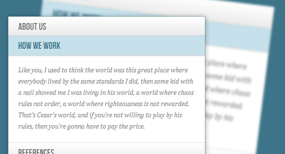
<label for="ac-1">About us</label>
<article class="ac-small">
<p>Some content... </p>
</article>
</div>
<div>
<input id="ac-2" name="accordion-1" type="checkbox" checked />
<label for="ac-2">How we work</label>
<article class="ac-medium">
<p>Some content... </p>
</article>
</div>
<div><!--...--></div>
</section>
Note that we need to give each input an ID which we will then use in the for attribute of the label. We need this in order to check the checkbox when clicking on the label.
请注意,我们需要给每个输入一个ID,然后将其用于标签的for属性。 我们需要它,以便在单击标签时选中复选框。
Each article will have a class that will help us determine to which height we it to expand to. (Optimally, we could use ‘auto’ as the expanded height value, but unfortunately it will not animate like that.)
每篇文章都有一个可帮助我们确定将其扩展到哪个高度的类。 (理想情况下,我们可以将“ auto”用作扩展的高度值,但不幸的是,它不会像这样设置动画。)
Let’s have a look at the style.
让我们来看看样式。
CSS (The CSS)
I will omit all the vendor prefixes, but you will, of course, find them in the files.
我将省略所有供应商前缀,但是您当然会在文件中找到它们。
Let’s define a width for the accordion and center it:
让我们为手风琴定义一个宽度并将其居中:
.ac-container{
	width: 400px;
	margin: 10px auto 30px auto;
}
Next, we’ll make the labels appear as clickable buttons by giving them some slick background gradient. With multiple box shadows, we’ll create a subtle border and an inset effect. We’ll also set the z-index to 20, to make sure it will be on top of the content section:
接下来,通过给它们一些平滑的背景渐变,使标签显示为可单击的按钮。 具有多个框阴影,我们将创建一个微妙的边框和一个嵌入效果。 我们还将z-index设置为20,以确保它位于内容部分的顶部:
.ac-container label{
	font-family: 'BebasNeueRegular', 'Arial Narrow', Arial, sans-serif;
	padding: 5px 20px;
	position: relative;
	z-index: 20;
	display: block;
	height: 30px;
	cursor: pointer;
	color: #777;
	text-shadow: 1px 1px 1px rgba(255,255,255,0.8);
	line-height: 33px;
	font-size: 19px;
	background: linear-gradient(top, #ffffff 1%,#eaeaea 100%);
	box-shadow:
		0px 0px 0px 1px rgba(155,155,155,0.3),
		1px 0px 0px 0px rgba(255,255,255,0.9) inset,
		0px 2px 2px rgba(0,0,0,0.1);
}
On hover, we’ll make the label white:
悬停时,我们将标签设置为白色:
.ac-container label:hover{
	background: #fff;
}
When we click on a label, the checkbox get’s checked and when that happens we want the respective label to have the following “selected” style:
当我们单击标签时,复选框会被选中,并且发生这种情况时,我们希望各个标签具有以下“选定”样式:
.ac-container input:checked + label,
.ac-container input:checked + label:hover{
	background: #c6e1ec;
	color: #3d7489;
	text-shadow: 0px 1px 1px rgba(255,255,255, 0.6);
	box-shadow:
		0px 0px 0px 1px rgba(155,155,155,0.3),
		0px 2px 2px rgba(0,0,0,0.1);
}
As you can see, we are using the adjacent sibling combinator to select the label since it is directly preceded by the checkbox input.
如您所见,我们正在使用相邻的同级组合器来选择标签,因为它直接在复选框输入之前。
Let’s add a little arrow icon on hover. For that we’ll simply use the pseudo-class “after” so that we don’t add unecessary markup:
让我们在悬停上添加一个小箭头图标。 为此,我们将仅使用伪类“ after”,以便我们不添加不必要的标记:
.ac-container label:hover:after,
.ac-container input:checked + label:hover:after{
	content: '';
	position: absolute;
	width: 24px;
	height: 24px;
	right: 13px;
	top: 7px;
	background: transparent url(../images/arrow_down.png) no-repeat center center;
}
For the “selected” item, we want to show the up-pointing arrow:
对于“选定”项目,我们要显示向上箭头:
.ac-container input:checked + label:hover:after{
	background-image: url(../images/arrow_up.png);
}
And since we don’t want the inputs to show, we’ll hide them:
由于我们不希望显示输入,因此我们将其隐藏:
.ac-container input{
	display: none;
}
The content area will have an initial height of 0px and any overflow will be hidden. We’ll add a transition for the height and for the box shadow. The transition that we are adding here will act upon “closing” the item. We define another transition for the selected item. So, we can basically control the two behaviors by doing this. As you can see, we will make the closing a bit faster than the opening.
内容区域的初始高度为0px,任何溢出都将被隐藏。 我们将为高度和框阴影添加过渡。 我们在此处添加的过渡将作用于“关闭”项目。 我们为所选项目定义另一个过渡。 因此,通过执行此操作,我们基本上可以控制这两种行为。 如您所见,我们将使闭合比打开快一点。
.ac-container article{
	background: rgba(255, 255, 255, 0.5);
	margin-top: -1px;
	overflow: hidden;
	height: 0px;
	position: relative;
	z-index: 10;
	transition:
		height 0.3s ease-in-out,
		box-shadow 0.6s linear;
}
.ac-container input:checked ~ article{
	transition:
		height 0.5s ease-in-out,
		box-shadow 0.1s linear;
	box-shadow: 0px 0px 0px 1px rgba(155,155,155,0.3);
}
Let’s style the content a bit:
让我们对内容进行一些样式设置:
.ac-container article p{
	font-style: italic;
	color: #777;
	line-height: 23px;
	font-size: 14px;
	padding: 20px;
	text-shadow: 1px 1px 1px rgba(255,255,255,0.8);
}
Now we define the three classes for the different heights. These are the heights that an item’s content will animate to:
现在我们为不同的高度定义三个类。 这些是项目内容可动画化的高度:
.ac-container input:checked ~ article.ac-small{
	height: 140px;
}
.ac-container input:checked ~ article.ac-medium{
	height: 180px;
}
.ac-container input:checked ~ article.ac-large{
	height: 230px;
}
As already mentioned, “auto” height would of course be the best option here, but since we can’t animate to that, we need to set some heights for the transition.
如前所述,“自动”高度当然是此处的最佳选择,但由于我们无法对此进行动画处理,因此我们需要为过渡设置一些高度。
Please note that in some mobile browsers, clicking on a label might not trigger the checking or focusing of the associated input.
请注意,在某些移动浏览器中,单击标签可能不会触发对相关输入的检查或集中。
演示版 (Demos)
And that’s it! I hope you enjoyed this tutorial and find it useful!
就是这样! 我希望您喜欢本教程并发现它有用!
翻译自: https://tympanus.net/codrops/2012/02/21/accordion-with-css3/
css3手风琴菜单


 1993
1993


 被折叠的 条评论
为什么被折叠?
被折叠的 条评论
为什么被折叠?
 到【灌水乐园】发言


