


行内块样式
Today we are going to create some fancy block quote styles. Using textures, circles, and pseudo-elements, we can put some life into quotations and testimonials.
今天,我们将创建一些漂亮的块引用样式。 通过使用纹理,圆和伪元素,我们可以在报价和证明书中花些时间。
We will omit vendor prefixes in this tutorial. But you’ll of course find them in the files.
在本教程中,我们将省略供应商前缀。 但是,您当然会在文件中找到它们。
标记 (The Markup)
The markup for the blockquotes will be as followed:
块引用的标记如下:
<div class="mb-wrap mb-style-1">
	<div class="mb-thumb"></div>
	<blockquote cite="http://www.gutenberg.org/ebooks/1257">
		<p>Never fear quarrels, but seek hazardous adventures.</p>
	</blockquote>
	<div class="mb-attribution">
		<p class="mb-author">Alexandre Dumas</p>
		<cite><a href="http://www.gutenberg.org/ebooks/1257">The Three Musketeers</a></cite>
	</div>
</div>
The division with the class mb-thumb will not be present in all the examples. In example 3 we will actually add it as a child to the division with the class mb-attribution.
在所有示例中都不会出现mb-thumb类的划分。 在示例3中,我们实际上将其作为子级添加到具有mb-attribution类的除法中。
CSS (The CSS)
Let’s first define some common styles:
让我们首先定义一些常见的样式:
@font-face {
	font-family: 'icons';
	src: url("font/icons.eot");
	src:
		url("font/icons.eot?#iefix") format('embedded-opentype'),
		url("font/icons.woff") format('woff'),
		url("font/icons.ttf") format('truetype'),
		url("font/icons.svg#icons") format('svg');
	font-weight: normal;
	font-style: normal;
}

/* Let's set and reset some common styles */
.mb-wrap {
	width: 300px;
	margin: 20px auto;
	padding: 20px;
	position: relative;
}

.mb-wrap p{
	margin: 0;
	padding: 0;
}

.mb-wrap blockquote {
	margin: 0;
	padding: 0;
	position: relative;
}

.mb-wrap cite {
	font-style: normal;
}
We are adding an icon font that we’ll use in some examples. We are also setting some default styles for the quote wrapper and the inner elements. Note, that there are some default styles for some of the elements, so we want to reset them.
我们添加了将在某些示例中使用的图标字体。 我们还为报价包装和内部元素设置了一些默认样式。 请注意,某些元素有一些默认样式,因此我们想重置它们。
例子1 (Example 1)
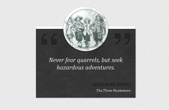
The first example will have a leather background and a round thumbnail for decoration. So, let’s style the whole wrapper first. We’ll give it the background texture and redefine the width:
第一个示例将具有皮革背景和圆形的缩略图装饰。 因此,让我们首先设置整个包装的样式。 我们将为其提供背景纹理并重新定义宽度:
.mb-style-1 {
	background: #363738 url(../images/dark_leather.jpg) repeat top left;
	margin-top: 100px;
	padding-top: 100px;
	width: 400px;
	color: #fff;
	box-shadow: 1px 1px 3px rgba(0,0,0,0.3);
	border-top: 10px solid #fff;
}
The round thumbnail will be pulled up by using a negative top value. With a semi-transparent border, we will add some flair:
圆形缩略图将使用负的上限值拉起。 使用半透明边框,我们将添加一些个性:
.mb-style-1 .mb-thumb {
	display: block;
	width: 180px;
	height: 180px;
	border: 10px solid rgba(255,255,255,0.5);
	border-radius: 50%;
	background: url(../images/Dartagnan-musketeers.jpg) no-repeat center center;
	position: absolute;
	left: 50%;
	top: -90px;
	margin: 0 0 0 -90px;
	box-shadow:
		inset 1px 1px 4px rgba(0,0,0,0.5),
		0 2px 3px rgba(0,0,0,0.6);
}
For adding the quotation marks, we will use the icon font that we have included before and the pseudo-classes :before and :after. The will have an engraved style since we are setting a dark color with a light text shadow:
为了添加引号,我们将使用之前包含的图标字体以及伪类:before和:after。 由于我们将深色设置为浅色文本阴影,因此将具有雕刻样式:
.mb-style-1 blockquote:before,
.mb-style-1 blockquote:after {
	font-family: 'icons';
	position: absolute;
	font-size: 70px;
	top: -95px;
	color: #242526;
	text-shadow: 0 1px 1px rgba(255,255,255,0.1);
}

.mb-style-1 blockquote:before{
	content: '275d';
}

.mb-style-1 blockquote:after{
	right: 0px;
	content: 'e800';
}
The styles for the text elements will be as follows:
文本元素的样式如下:
.mb-style-1 blockquote p {
	font-family: Cambria, Georgia, serif;
	font-style: italic;
	font-size: 25px;
	border-bottom: 1px solid rgba(0,0,0,0.5);
	box-shadow: 0 1px 0 rgba(255,255,255,0.1);
	padding: 10px 10px 20px 10px;
	text-align: center;
	margin: 0 0 20px 0;
	text-shadow: 1px 1px 2px rgba(0,0,0,0.6);
}

.mb-style-1 .mb-attribution {
	text-align: right;
}

.mb-style-1 .mb-author{
	text-transform: uppercase;
	font-size: 20px;
	font-weight: bold;
	color: #1b1c1d;
	text-shadow: 0 1px 1px rgba(255,255,255,0.1);
}

.mb-style-1 cite a{
	color: #f0f0f0;
	font-style: italic;
	font-family: Cambria, Georgia, serif;
	text-shadow: 1px 1px 1px rgba(0,0,0,0.7)
}

.mb-style-1 cite a:hover{
	text-shadow: 2px 2px 3px rgba(0,0,0,0.9)
}
And that was example one! Let’s check out the next one.
那就是例子之一! 让我们看看下一个。
例子2 (Example 2)
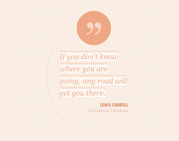
Example 2 will have a fancy asymmetrical style with a rounded element on its left side. On the top we want to show a circle with a quotation mark. So let’s first add some padding to the blockquote to push it down:
示例2将具有奇特的不对称样式,其左侧为圆形元素。 在顶部,我们想显示一个带引号的圆。 因此,让我们首先在blockquote中添加一些填充以将其压低:
.mb-style-2 blockquote{
	padding-top: 150px;
}
The circular pseudo-element has the following style:
圆形伪元素具有以下样式:
.mb-style-2 blockquote:after {
	font-family: 'icons';
	background: rgba(235,150,108,0.8);
	width: 130px;
	height: 130px;
	border-radius: 50%;
	content: '275e';
	position: absolute;
	font-size: 70px;
	line-height: 130px;
	text-align: center;
	top: 0px;
	left: 50%;
	margin-left: -65px;
	color: rgba(255,255,255,0.5);
	text-shadow: 0 1px 1px rgba(255,255,255,0.1);
}
We are centering it horizontally by setting the left to 50% and giving a negative left margin of half of its width.
我们将其水平居中,方法是将左侧设置为50%,并为左侧宽度的一半提供负的空白。
Now, let’s add that partial circle by using another pseud-element. We give it a width and height of 500px, a border radius of 50% and just a left border. This will create the shape:
现在,让我们通过使用另一个伪元素来添加该部分圆。 我们给它的宽度和高度为500px,边框半径为50%,仅左边框。 这将创建形状:
.mb-style-2 blockquote:before{
	content: '';
	width: 500px;
	height: 500px;
	border-radius: 50%;
	border-left: 5px solid rgba(235,150,108,0.1);
	position: absolute;
	top: 0px;
	left: -50px;
	z-index: -1;
}
The paragraph of the blockquote will be set to inline because we want to separate the lines:
块引用的段落将设置为内联,因为我们要分隔行:
.mb-style-2 blockquote p {
	font-family: Baskerville, Georgia, serif;
	font-size: 28px;
	font-style: italic;
	background: rgba(255,255,255,0.5);
	display: inline;
	color: rgba(235,150,108,0.8);
	text-shadow: 0 1px 1px rgba(255,255,255,0.5);
	line-height: 46px;
	box-shadow: 0 -6px 0 rgba(235,150,108,0.2);
}
And finally, let’s define the style for the resting text elements:
最后,让我们为其余文本元素定义样式:
.mb-style-2 .mb-attribution {
	text-align: right;
}

.mb-style-2 .mb-author{
	text-transform: uppercase;
	font-size: 18px;
	padding-top: 10px;
	font-weight: bold;
	color: #d48158;
	text-shadow: 0 1px 1px rgba(255,255,255,0.1);
}

.mb-style-2 cite a{
	color: #d7aa94;
	font-style: italic;
}

.mb-style-2 cite a:hover{
	color: #d48158;
}
例子3(Example 3)
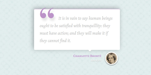
For the third style, we want to enlarge the wrapper and set a box shadow for the blockquote:
对于第三种样式,我们要扩大包装器并为blockquote设置一个框阴影:
.mb-style-3 {
	width: 500px;
}

.mb-style-3 blockquote{
	background: #fff;
	padding: 30px;
	border-radius: 5px;
	box-shadow:
		inset 0 2px 0 rgba(188, 147, 200, 0.7),
		-5px -4px 25px rgba(0, 0, 0, 0.3);
}
We will add a little arrow to point down using the technique offered at CSS Arrow Please!:
我们将使用CSS Arrow提供的技术添加一个小箭头指向下方,请! :
.mb-style-3 blockquote:after,
.mb-style-3 blockquote:before  {
	top: 100%;
	border: solid transparent;
	content: " ";
	height: 0;
	width: 0;
	position: absolute;
	pointer-events: none;
}

.mb-style-3 blockquote:after  {
	border-top-color: #ffffff;
	border-width: 10px;
	left: 65%;
	margin-left: -10px;
}

.mb-style-3 blockquote:before {
	border-top-color: rgba(0,0,0,0.01);
	border-width: 11px;
	left: 65%;
	margin-left: -11px;
}
The paragraph will have the following style:
该段将具有以下样式:
.mb-style-3 blockquote p {
	font-family: 'Alegreya', serif;
	font-size: 24px;
	color: #b4b4b4;
	font-weight: 400;
	line-height: 40px;
	font-style: italic;
	text-indent: 100px;
	position: relative;
}
Now, we will add a quotation mark to the left with the help of the pseudo-element :before:
现在,我们将在伪元素的帮助下在左侧添加一个引号:
.mb-style-3 blockquote p:before{
	content: '201C';
	font-family: serif;
	font-style: normal;
	font-weight: 700;
	position: absolute;
	font-size: 175px;
	top: 0px;
	left: -105px;
	color: rgba(188, 147, 200, 1);
	text-shadow: 7px 14px 10px rgba(0, 0, 0, 0.1);
}
The part with the link and the author will have a bigger right padding because of the thumb that we will add:
带有链接和作者的那部分将有较大的右填充,因为我们将添加一些经验:
.mb-style-3 .mb-attribution {
	text-align: right;
	padding: 20px 100px 20px 20px;
	position: relative;
}
The thumbnail division will be a little circle with the author’s picture as background:
缩略图部分将以作者的图片为背景的小圆圈:
.mb-style-3 .mb-thumb {
	display: block;
	width: 70px;
	height: 70px;
	border: 5px solid #fff;
	border-radius: 50%;
	background: url(../images/bronte.jpg) no-repeat center center;
	position: absolute;
	right: 10px;
	bottom: 5px;
	box-shadow:
		inset 1px 1px 4px rgba(0,0,0,0.5),
		0 2px 3px rgba(0,0,0,0.6);
}
And the resting text-styles are as followed:
其余的文本样式如下:
.mb-style-3 .mb-author{
	font-family: 'Alegreya SC', serif;
	font-weight: 700;
	font-size: 18px;
	color: rgba(188, 147, 200, 1);
	text-shadow: 0 1px 1px rgba(255,255,255,0.7);
}

.mb-style-3 cite a{
	font-family: 'Alegreya', serif;
	font-weight: 700;
	font-style: italic;
	color: #fff;
	text-shadow: 0 1px 1px rgba(0,0,0,0.3);
}

.mb-style-3 cite a:hover{
	color: rgba(188, 147, 200, 1);
	text-shadow: 0 1px 1px rgba(255,255,255,0.7);
}
例子4(Example 4)
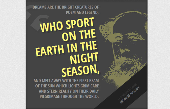
This example is a bit bolder. We’ll create a dark large box with a big sized quotation. The image of the author will be set as background to the whole thing:
这个例子有点大胆。 我们将创建一个带有大报价的深色大盒子。 作者的图像将作为整个背景的背景:
.mb-style-4 {
	width: 600px;
	padding: 20px 240px 50px 20px;
	background: #444 url(../images/dickens.jpg) no-repeat 140% 25%;
	overflow: hidden;
	box-shadow: inset 0 0 10px rgba(0,0,0,0.6);
}
The paragraph of the blockquote will have an RGBA value for its color. This let’s us define an opacity value:
块引用的段落的颜色将具有RGBA值。 这让我们定义一个不透明度值:
.mb-style-4 blockquote p {
	color: rgba(255,255,255,0.95);
	font-size: 21px;
	line-height: 26px;
	text-align: right;
	color: #999;
	text-transform: uppercase;
	font-weight: bold;
}
The span is going to have a special style. We’ll rotate it a bit and give it a larger text size and a different color:
跨度将具有特殊的风格。 我们将它旋转一点,并给它更大的文本大小和不同的颜色:
.mb-style-4 blockquote p span {
	font-weight: 700;
	color: #fcf779;
	font-size: 58px;
	line-height: 58px;
	display: block;
	padding: 10px;
	text-shadow: 7px 7px 2px rgba(0,0,0,0.2);
	transform: rotate(-7deg) translateY(10px);
}
Let’s add a quotation mark from our icon set with the help of the before: pseudo-class:
让我们在之前的帮助下从我们的图标集中添加一个引号:伪类:
.mb-style-4 blockquote p span:before {
	font-family: 'icons';
	content: '275d';
	font-weight: normal;
	opacity: 0.1;
	font-size: 136px;
	position: absolute;
	color: #fff;
	top: -50px;
	left: -25px;
	transform: rotate(45deg);
}
The opacity will be very low and we’ll rotate it in a 45 degrees angle.
不透明度会非常低,我们将其旋转45度角。
The attribution division will be rotated in such a way that we can only see a triangle in the right corner:
归因划分的旋转方式将使我们只能在右上角看到一个三角形:
.mb-style-4 .mb-attribution {
	text-align: right;
	text-transform: uppercase;
	font-weight: bold;
	background: #222;
	position: absolute;
	width: 100%;
	left: 0px;
	bottom: 0px;
	text-align: center;
	padding: 30px;
	transform: rotate(-40deg) translate(175px, 110px);
}
Let’s add a dash to the author element:
让我们在author元素中添加一个破折号:
.mb-style-4 .mb-author:before {
	content: '2014';
	padding-right: 4px;
}

.mb-style-4 .mb-attribution cite a{
	color: #777;
}

.mb-style-4 .mb-attribution cite a:hover{
	color: #fcf779;
}
例子5(Example 5)
The fifth example will appear as a set of circles. We are going to use multiple box shadows for the blockquote element in order to achieve that:
第五个示例将显示为一组圆圈。 我们将为blockquote元素使用多个框阴影,以实现以下目的:
.mb-style-5 {
	width: 390px;
}

.mb-style-5 blockquote {
	text-align: center;
	background: #333;
	width: 350px;
	height: 350px;
	padding: 60px;
	border-radius: 50%;
	box-shadow:
		inset 0 0 0 10px #333,
		inset 0 0 0 12px rgba(255,255,255,0.6),
		80px 0 0 rgba(255,255,255,0.3),
		-80px 0 0 rgba(255,255,255,0.3),
		50px 0 0 rgba(60,185,145,0.2),
		-50px 0 0 rgba(185,60,60,0.2);
}
Let’s style the paragraph:
让我们对段落进行样式设置:
.mb-style-5 blockquote p {
	color: #fff;
	font-size: 20px;
	font-weight: 400;
	padding-top: 25px;
	text-transform: uppercase;
	text-shadow: 0 0 1px #fff, 0 1px 1px #000;
	font-family: 'Annie Use Your Telescope', cursive;
}
In order to separate the quote, we will put the last part of it into a span and give it some top margin and padding:
为了分隔报价,我们将其最后一部分放在一个跨度中,并给其一些上边距和填充:
.mb-style-5 blockquote p span {
	display: block;
	position: relative;
	padding-top: 40px;
	margin-top: 40px;
	border-top: 1px solid rgba(255,255,255,0.3);
}
Let’s add the little circle with the quotation mark:
让我们添加带引号的小圆圈:
.mb-style-5 blockquote p span:before {
	position: absolute;
	width: 50px;
	height: 50px;
	background: #ddd;
	content: "275d";
	font-size: 40px;
	color: #333;
	top: 0px;
	left: 50%;
	margin: -25px 0 0 -25px;
	border-radius: 50%;
}
And finally, some styling for the other text elements:
最后,为其他文本元素设置一些样式:
.mb-style-5 .mb-attribution {
	text-align: center;
	font-family: 'Annie Use Your Telescope', cursive;
	padding: 20px;
	font-size: 16px;
}
.mb-style-5 cite a:hover{
	color: #000;
}
例子6(Example 6)
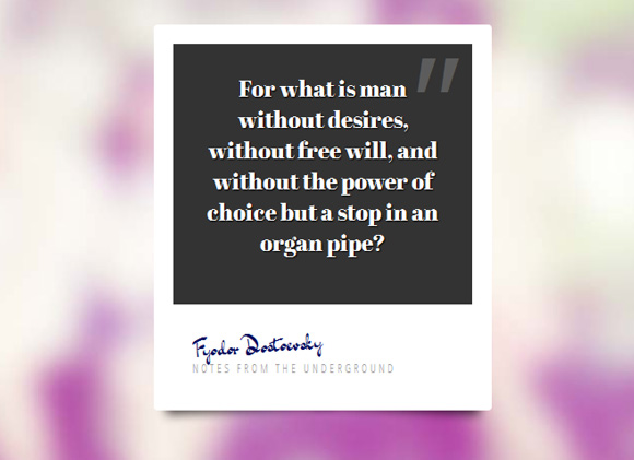
The last example will look like a Polaroid, except that we won’t use an image but a quote. Let’s style the wrapper first:
最后一个示例看起来像拍立得,只是我们不使用图像而是使用引号。 让我们首先设计包装器的样式:
.mb-style-6 {
	width: 350px;
	height: 400px;
	background: #fff;
	border-radius: 4px;
}
Let’s add some nice shadows with this great technique by Nicolas Gallagher:
让我们用Nicolas Gallagher的这项出色技术添加一些漂亮的阴影:
/* Shadow style from Nicolas Gallagher: http://nicolasgallagher.com/css-drop-shadows-without-images/demo/ */
.mb-style-6:before,
.mb-style-6:after {
	content: "";
    position: absolute;
    z-index: -2;
	transform: rotate(-3deg);
    bottom: 15px;
    box-shadow: 0 15px 10px rgba(0, 0, 0, 0.7);
    height: 20%;
    left: 10px;
    max-height: 100px;
    max-width: 300px;
    width: 50%;
}
.mb-style-6:after {
	transform: rotate(3deg);
    left: auto;
    right: 10px;
}
The blockquote will have a dark background:
块引用将具有深色背景:
.mb-style-6 blockquote{
	background: #333;
	height: 75%;
	padding: 30px;
	text-align: center;
}
And we’ll add a quotation mark to the right side:
我们将在右侧添加一个引号:
.mb-style-6 blockquote:before{
	color: rgba(255,255,255,0.2);
	position: absolute;
	content: '022';
	font-size: 150px;
	line-height: 130px;
	font-style: italic;
	top: 0px;
	right: 20px;
	font-family: Cambria, Georgia, serif;
}
The paragraph will have the following style:
该段将具有以下样式:
.mb-style-6 blockquote p {
	color: #fff;
	font-family: 'Abril Fatface', sans-serif;
	font-size: 24px;
	text-shadow: 1px 1px 1px #000;
}
Let’s add some padding to the attribution division:
让我们在归因部门添加一些填充:
.mb-style-6 .mb-attribution {
	padding: 20px;
}
The author element will be slightly rotated and we’ll use a handwritten font to make it look like a signature:
author元素将略微旋转,我们将使用手写字体使其看起来像签名:
.mb-style-6 .mb-author {
	font-size: 24px;
	font-family: 'Dr Sugiyama', cursive;
	-moz-transform: rotate(-4deg);
	color: #070d5f;
}
And last, but not least, the cite link:
最后但并非最不重要的是,引用链接:
.mb-style-6 cite a{
	color: #999;
	text-transform: uppercase;
	letter-spacing: 3px;
	font-size: 12px;
}
.mb-style-6 cite a:hover{
	color: #000;
}
Hope you enjoyed these styles and find them inspiring!
希望您喜欢这些样式并发掘灵感!
翻译自: https://tympanus.net/codrops/2012/07/25/modern-block-quote-styles/
行内块样式


 1586
1586


 被折叠的 条评论
为什么被折叠?
被折叠的 条评论
为什么被折叠?
 到【灌水乐园】发言


