


 这篇博客展示了如何利用CSS3实现各种动画效果的按钮,包括不同的样式、悬停效果和活动状态。作者提供了7个示例,通过HTML结构和CSS样式来详细解释每个示例的实现方式。这些动画在支持CSS3属性的浏览器中有效,适用于提升网页交互体验。
css3动画按钮
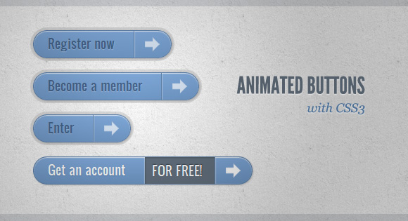
Still hyped by the possibilities of CSS3, I want to share some CSS3 button experiments with you. The idea is to create some animated link elements with different styles, hover effects and active states.
我仍然对CSS3的可能性大肆宣传,我想与您分享一些CSS3按钮实验。 想法是创建一些具有不同样式,悬停效果和活动状态的动画链接元素。
The icons used in some of the examples are by webiconset.com and the symbol font is by Just Be Nice
在某些示例中使用的图标由webiconset.com提供,符号字体由Just Be Nice提供
We’ll go through every example and see how the HTML structure looks and what the styles for the normal, the hover and the active states are.
我们将遍历每个示例,并查看HTML结构的外观以及正常状态,悬停状态和活动状态的样式。
Please note that the animations/transitions will only work in browsers that support those CSS3 properties.
请注意,动画/过渡仅在支持那些CSS3属性的浏览器中有效。
In order not to bloat the tutorial, I will not be using any CSS vendor prefixes. The downloadable files contain them, of course.
为了不使教程过于膨胀,我将不使用任何CSS供应商前缀。 当然,可下载文件包含它们。
例子1 (Example 1)
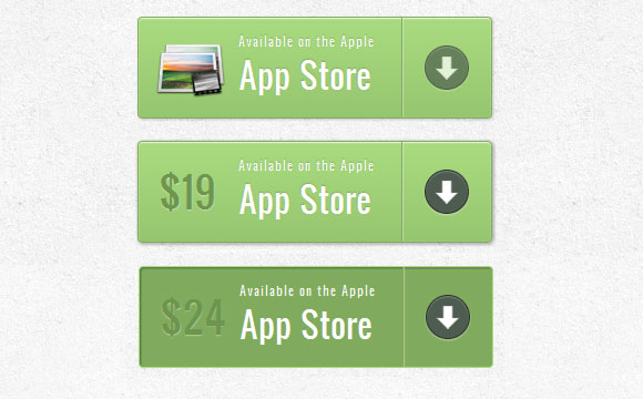
标记 (Markup)
The structure is pretty straightforward: the icon will be an image and the other elements will be spans:
结构非常简单:图标将是图像,其他元素将是spans:
<a href="#" class="a-btn">
	<span class="a-btn-slide-text">$29</span>
	<img src="images/icons/1.png" alt="Photos" />
	<span class="a-btn-text"><small>Available on the Apple</small> App Store</span>
	<span class="a-btn-icon-right"><span></span></span>
</a>
CSS(CSS)
In the style we will make sure that the right transitions are set on the element that we want to animate on hover. The price will be invisible by setting its opacity to 0. Applying mulitple box shadows will allow us to create realistic effects:
在样式中,我们将确保在要悬停时设置动画的元素上设置正确的过渡。 通过将其不透明度设置为0,价格将不可见。应用多个框阴影将使我们能够创建逼真的效果:
.a-btn{
    background: linear-gradient(top, #a9db80 0%,#96c56f 100%);
    padding-left: 90px;
    padding-right: 105px;
    height: 90px;
    display: inline-block;
    position: relative;
    border: 1px solid #80ab5d;
    box-shadow:
		0px 1px 1px rgba(255,255,255,0.8) inset,
		1px 1px 3px rgba(0,0,0,0.2);
    border-radius: 4px;
    float: left;
    clear: both;
    margin: 10px 0px;
    overflow: hidden;
    transition: box-shadow 0.3s ease-in-out;
}
.a-btn img{
    position: absolute;
    left: 15px;
    top: 13px;
    border: none;
    transition: all 0.3s ease-in-out;
}
.a-btn .a-btn-slide-text{
    position: absolute;
    font-size: 36px;
    top: 18px;
    left: 18px;
    color: #6d954e;
    opacity: 0;
    text-shadow: 0px 1px 1px rgba(255,255,255,0.4);
    transition: opacity 0.2s ease-in-out;
}
.a-btn-text{
    padding-top: 13px;
    display: block;
    font-size: 30px;
    text-shadow: 0px -1px 1px #80ab5d;
}
.a-btn-text small{
    display: block;
    font-size: 11px;
    letter-spacing: 1px;
}
.a-btn-icon-right{
    position: absolute;
    right: 0px;
    top: 0px;
    height: 100%;
    width: 80px;
    border-left: 1px solid #80ab5d;
    box-shadow: 1px 0px 1px rgba(255,255,255,0.4) inset;
}
.a-btn-icon-right span{
    width: 38px;
    height: 38px;
    opacity: 0.7;
    border-radius: 20px;
    position: absolute;
    left: 50%;
    top: 50%;
    margin: -20px 0px 0px -20px;
    border: 1px solid rgba(0,0,0,0.5);
    background: #4e5c50 url(../images/arrow_down.png) no-repeat center center;
    box-shadow:
        0px 1px 1px rgba(255,255,255,0.3) inset,
        0px 1px 2px rgba(255,255,255,0.5);
    transition: all 0.3s ease-in-out;
}
When hovering over the buttons we will to change their box shadow and we’ll show the price and fade out
 最低0.47元/天 解锁文章


 扫一扫
扫一扫
 377
377

 被折叠的 条评论
为什么被折叠?
被折叠的 条评论
为什么被折叠?
 到【灌水乐园】发言


