


jquery 图像滑块
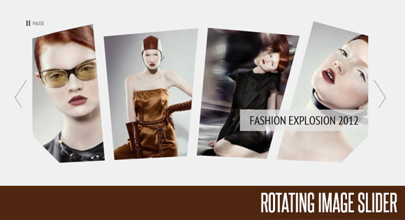
In the following tutorial we will create an asymmetrical image slider with a little twist: when sliding the pictures we will slightly rotate them and delay the sliding of each element. The unusual shape of the slider is created by some elements placement and the use of thick borders. We will also add an autoplay option and the mousewheel functionality.
在下面的教程中,我们将创建一个稍微扭曲的不对称图像滑块:在滑动图片时,我们将略微旋转图片并延迟每个元素的滑动。 滑块的不同寻常形状是由某些元素放置以及使用粗边框造成的。 我们还将添加自动播放选项和鼠标滚轮功能。
We’ll use the jQuery 2D Transformation Plugin for rotating the images and the jQuery Mousewheel Plugin by Brandon Aaron for the mousewheel control.
我们将使用jQuery 2D Transformation Plugin旋转图像,并使用Brandon Aaron的jQuery Mousewheel插件进行鼠标滚轮控制。
The beautiful photos are by Andrew and Lili and you can see their Behance profile here: http://www.behance.net/AndrewLili The images are licensed under the Creative Commons Attribution-NonCommercial 3.0 Unported License.
精美的照片由Andrew和Lili摄,您可以在此处查看其Behance个人资料: http : //www.behance.net/AndrewLili图像已根据“知识共享署名-非商业3.0非端口许可”获得许可。
Allrighty! Let’s start with the HTML!
好吧! 让我们从HTML开始!
标记 (The Markup)
First, we will wrap all our slider elements in a wrapper with the class “rm_wrapper”:
首先,我们将所有滑块元素包装在带有“ rm_wrapper”类的包装器中:
<div class="rm_wrapper">
...
</div>
Inside of that wrapper we will have a container for the actual slider list, some mask and corner elements, the heading and a hidden div that will contain all the image sets:
在该包装器内,我们将有一个容器,用于存放实际的滑块列表,一些蒙版和角元素,标题和一个包含所有图像集的隐藏div:
<div id="rm_container" class="rm_container">
	<ul>
		<li data-images="rm_container_1" data-rotation="-15">
			<img src="images/1.jpg"/>
		</li>
		<li data-images="rm_container_2" data-rotation="-5">
			<img src="images/2.jpg"/>
		</li>
		<li data-images="rm_container_3" data-rotation="5">
			<img src="images/3.jpg"/>
		</li>
		<li data-images="rm_container_4" data-rotation="15">
			<img src="images/4.jpg"/>
		</li>
	</ul>
	<div id="rm_mask_left" class="rm_mask_left"></div>
	<div id="rm_mask_right" class="rm_mask_right"></div>
	<div id="rm_corner_left" class="rm_corner_left"></div>
	<div id="rm_corner_right" class="rm_corner_right"></div>
	<h2>Fashion Explosion 2012</h2>
	<div style="display:none;">
		<div id="rm_container_1">
			<img src="images/1.jpg"/>
			<img src="images/5.jpg"/>
			<img src="images/6.jpg"/>
			<img src="images/7.jpg"/>
		</div>
		<div id="rm_container_2">
			<img src="images/2.jpg"/>
			<img src="images/8.jpg"/>
			<img src="images/9.jpg"/>
			<img src="images/10.jpg"/>
		</div>
		<div id="rm_container_3">
			<img src="images/3.jpg"/>
			<img src="images/11.jpg"/>
			<img src="images/12.jpg"/>
			<img src="images/13.jpg"/>
		</div>
		<div id="rm_container_4">
			<img src="images/4.jpg"/>
			<img src="images/14.jpg"/>
			<img src="images/15.jpg"/>
			<img src="images/16.jpg"/>
		</div>
	</div>
</div>
So the unordered lists will have the first set of four images where each list element has some data attributes for the image sets and the rotation degree. We will use that data to know which images come next and how much each image should be rotated.
因此,无序列表将具有第一组四个图像,其中每个列表元素都具有图像集和旋转度的一些数据属性。 我们将使用该数据来了解接下来要显示哪些图像以及应将每个图像旋转多少。
The mask and corner divs will be absolute elements that we will place on top of the slider, slightly rotated in order to cover some areas. Since we will use the same background color for these elements like the body’s background color, we will create the illusion of the images being shaped in a certain way.
遮罩和转角div将是绝对元素,我们将其放置在滑块的顶部,并稍微旋转以覆盖某些区域。 由于我们将对这些元素使用相同的背景色(例如人体的背景色),因此我们将以某种方式创建图像变形的错觉。
Then we’ll add the elements for the navigation and the autoplay controls:
然后,我们将添加导航和自动播放控件的元素:
<div class="rm_nav">
	<a id="rm_next" href="#" class="rm_next"></a>
	<a id="rm_prev" href="#" class="rm_prev"></a>
</div>
<div class="rm_controls">
	<a id="rm_play" href="#" class="rm_play">Play</a>
	<a id="rm_pause" href="#" class="rm_pause">Pause</a>
</div>
Let’s take a look at the CSS.
让我们看一下CSS。
CSS (The CSS)
First, we’ll reset some styles and define the properties for the body. (Remember, if we would have another background color, we would want to change the background and border colors of some of the elements in our slider, too.)
首先,我们将重置一些样式并定义主体的属性。 (请记住,如果我们要使用另一种背景色,我们也想更改滑块中某些元素的背景色和边框色。)
@import url('reset.css');
body{
	background:#f0f0f0;
	color:#000;
	font-family: 'PT Sans Narrow', Arial, sans-serif;
	font-size:16px;
}
a{
	color:#000;
	text-decoration:none;
}
h1{
	padding:10px;
	margin:20px;
	font-size:40px;
	text-transform:uppercase;
	text-shadow:0px 0px 1px #fff;
	color:#333;
	background:transparent url(../images/line.png) repeat-x bottom left;
}
The main wrapper will have the following style:
主包装将具有以下样式:
.rm_wrapper{
	width:1160px;
	margin:0 auto;
	position:relative;
}
The container for the slider will have any overflow hidden, which will help shaping our slider since we will cut off the outer sides of it:
滑块的容器将隐藏任何溢出物,这将有助于我们的滑块成形,因为我们将切掉滑块的外侧:
.rm_container{
	width:1050px;
	overflow:hidden;
	position:relative;
	height:530px;
	margin:0 auto;
}
The heading will have the following style:
标题将具有以下样式:
.rm_container h2{
	background:transparent url(../images/lines.png) repeat top left;
	padding:10px 30px;
	position:absolute;
	bottom:170px;
	right:0px;
	color:#000;
	font-size:36px;
	text-transform:uppercase;
	text-shadow:1px 0px 1px #fff;
}
Let’s define the width for the ul to be bigger than the container since we want to make the list element float next to each other:
让我们定义ul的宽度大于容器的宽度,因为我们要使list元素彼此相邻浮动:
.rm_container ul{
	width:1170px;
}
By giving a negative left margin and a thick border to the list element, we will overlap the images and cut off the right sides so that we create our asymmetrical shapes by rotating the elements then. The border color will be the same like the background color of the body (or the container).
通过为列表元素提供负的左边距和粗边框,我们将使图像重叠并切掉右侧,以便通过旋转元素来创建非对称形状。 边框颜色将与主体(或容器)的背景颜色相同。
.rm_container ul li{
	float:left;
	margin-left:-80px;
	position:relative;
	overflow:hidden;
	width:310px;
	height:465px;
	border:30px solid #f0f0f0;
	border-width:50px 30px 0px 30px;
	background-color:#f0f0f0;
}
We’ll position the images absolutely:
我们将绝对定位图像:
.rm_container ul li img{
	position:absolute;
	top:0px;
	left:0px;
}
In the following we will style the mask and the corner elements. They will be all positioned absolutely and we’ll give them the grey background color. By rotating them, we’ll make the images to appear as being “shaped”:
在下文中,我们将对蒙版和边角元素设置样式。 它们将被完全定位,我们将为其赋予灰色背景色。 通过旋转它们,我们将使图像看起来像是“成形”的:
.rm_mask_right, .rm_mask_left{
	position: absolute;
	height: 110px;
	background: #f0f0f0;
	width: 530px;
	bottom: -30px;
	left: 0px;
	-moz-transform:rotate(-3deg);
	-webkit-transform:rotate(-3deg);
	transform:rotate(-3deg);
}
.rm_mask_right{
	left:auto;
	right:0px;
	-moz-transform:rotate(3deg);
	-webkit-transform:rotate(3deg);
	transform:rotate(3deg);
}
.rm_corner_right, .rm_corner_left{
	background: #f0f0f0;
	position:absolute;
	width:200px;
	height:100px;
	bottom:0px;
	left:-65px;
	-moz-transform:rotate(45deg);
	-webkit-transform:rotate(45deg);
	transform:rotate(45deg);
}
.rm_corner_right{
	left:auto;
	right:-65px;
	-moz-transform:rotate(-45deg);
	-webkit-transform:rotate(-45deg);
	transform:rotate(-45deg);
}
The navigation elements will be placed to the left and right of the main container:
导航元素将放置在主容器的左侧和右侧:
.rm_nav a{
	position:absolute;
	top:200px;
	width:38px;
	height:87px;
	cursor:pointer;
	opacity:0.7;
}
.rm_nav a:hover{
	opacity:1.0;
}
.rm_nav a.rm_next{
	background:transparent url(../images/next.png) no-repeat top left;
	right:0px;
}
.rm_nav a.rm_prev{
	background:transparent url(../images/prev.png) no-repeat top left;
	left:0px;
}
The pause/play control will be placed to the top left of the main container:
暂停/播放控件将放置在主容器的左上方:
.rm_controls{
	position:absolute;
	top:0px;
	left:-40px;
	height:20px;
}
.rm_controls a{
	cursor:pointer;
	opacity:0.7;
	padding-left:24px;
	font-size:16px;
	text-transform:uppercase;
	height:20px;
	float:left;
	line-height:20px;
}
.rm_controls a:hover{
	opacity:1.0;
}
.rm_controls a.rm_play{
	display:none;
	background:transparent url(../images/play.png) no-repeat center left;
}
.rm_controls a.rm_pause{
	background:transparent url(../images/pause.png) no-repeat center left;
}
And that’s all the style! Let add the spice!
这就是所有样式! 让我们添加香料!
JavaScript (The JavaScript)
The main idea for the slider functionality is to add another image before the current one with a slightly increased rotation degree than the current item. Then we will animate the rotation and make the new images appear. So let’s start by caching some elements and checking if we are dealing with a special needs browser in order to deal with some issues:
滑块功能的主要思想是在当前图像之前添加另一个图像,其旋转度比当前项目略有增加。 然后,我们将对旋转进行动画处理,并使新图像出现。 因此,让我们开始缓存一些元素,并检查是否正在处理特殊需求的浏览器以处理一些问题:
//our 4 items
var $listItems 		= $('#rm_container > ul > li'),
	totalItems		= $listItems.length,

	//the controls
	$rm_next		= $('#rm_next'),
	$rm_prev		= $('#rm_prev'),
	$rm_play		= $('#rm_play'),
	$rm_pause		= $('#rm_pause'),

	//the masks and corners of the slider
	$rm_mask_left	= $('#rm_mask_left'),
	$rm_mask_right	= $('#rm_mask_right'),
	$rm_corner_left	= $('#rm_corner_left'),
	$rm_corner_right= $('#rm_corner_right'),

	//check if the browser is <= IE8
	ieLte8			= ($.browser.msie && parseInt($.browser.version) <= 8),
Then we will define our main function:
然后,我们将定义我们的主要功能:
RotateImageMenu	= (function() {
...
})();

RotateImageMenu.init();
And then we define the following in our function:
然后在函数中定义以下内容:
	//difference of animation time between the items
var	timeDiff			= 300,
	//time between each image animation (slideshow)
	slideshowTime		= 3000,
	slideshowInterval,
	//checks if the images are rotating
	isRotating			= false,
	//how many images completed each slideshow iteration
	completed			= 0,
	/*
	all our images have 310 of width and 465 of height.
	this could / should be dynamically calculated
	if we would have different image sizes.

	we will set the rotation origin at
	x = width/2 and y = height*2
	*/
	origin				= ['155px', '930px'],
	init				= function() {
		configure();
		initEventsHandler();
	},
	//initialize some events
	initEventsHandler	= function() {
		/*
		next and previous arrows:
		we will stop the slideshow if active,
		and rotate each items images.
		1 	rotate right
		-1 	rotate left
		*/
		$rm_next.bind('click', function(e) {
			stopSlideshow();
			rotateImages(1);
			return false;
		});
		$rm_prev.bind('click', function(e) {
			stopSlideshow();
			rotateImages(-1);
			return false;
		});
		/*
		start and stop the slideshow
		*/
		$rm_play.bind('click', function(e) {
			startSlideshow();
			return false;
		});
		$rm_pause.bind('click', function(e) {
			stopSlideshow();
			return false;
		});
		/*
		adds events to the mouse and left / right keys
		*/
		$(document).bind('mousewheel', function(e, delta) {
			if(delta > 0) {
				stopSlideshow();
				rotateImages(0);
			}
			else {
				stopSlideshow();
				rotateImages(1);
			}
			return false;
		}).keydown(function(e){
			switch(e.which){
				case 37:
					stopSlideshow();
					rotateImages(0);
					break;
				case 39:
					stopSlideshow();
					rotateImages(1);
					break;
			}
		});
	},
	/*
	rotates each items images.
	we set a delay between each item animation
	*/
	rotateImages		= function(dir) {
		//if the animation is in progress return
		if(isRotating) return false;

		isRotating = true;

		$listItems.each(function(i) {
			var $item 				= $(this),
				/*
				the delay calculation.
				if rotation is to the right,
				then the first item to rotate is the first one,
				otherwise the last one
				*/
				interval			= (dir === 1) ? i * timeDiff : (totalItems - 1 - i) * timeDiff;

			setTimeout(function() {
					//the images associated to this item
				var	$otherImages		= $('#' + $item.data('images')).children('img'),
					totalOtherImages	= $otherImages.length;

					//the current one
					$img				= $item.children('img:last'),
					//keep track of each items current image
					current				= $item.data('current');
					//out of bounds
					if(current > totalOtherImages - 1)
						current = 0;
					else if(current < 0)
						current = totalOtherImages - 1;

					//the next image to show and its
					//initial rotation (depends on dir)
					var otherRotation	= (dir === 1) ? '-30deg' : '30deg',
						$other			= $otherImages.eq(current).clone();

					//for IE <= 8 we will not rotate,
					//but fade out / fade in ...
					//better than nothing :)
					if(!ieLte8)
						$other.css({
							rotate	: otherRotation,
							origin	: origin
						});

					(dir === 1) ? ++current : --current;

					//prepend the next image to the <li>
					$item.data('current', current).prepend($other);

					//the final rotation for the current image
					var rotateTo		= (dir === 1) ? '80deg' : '-80deg';

					if(!ieLte8) {
						$img.animate({
							rotate	: rotateTo
						}, 1200, function(){
							$(this).remove();
							++completed;
							if(completed === 4) {
								completed = 0;
								isRotating = false;
							}
						});
						$other.animate({
							rotate	: '0deg'
						}, 600);
					}
					else {
						$img.fadeOut(1200, function(){
							$(this).remove();
							++completed;
							if(completed === 4) {
								completed = 0;
								isRotating = false;
							}
						});
					}

			}, interval );
		});

	},
	//set initial rotations
	configure			= function() {
		if($.browser.msie && !ieLte8)
			rotateMaskCorners();
		else if(ieLte8)
			hideMaskCorners();

		$listItems.each(function(i) {
			//the initial current is 1
			//since we already showing the first image
			var $item = $(this).data('current', 1);

			if(!ieLte8)
			$item.transform({rotate: $item.data('rotation') + 'deg'})
				 .find('img')
				 .transform({origin: origin});
		});
	},
	//rotates the masks and corners
	rotateMaskCorners	= function() {
		$rm_mask_left.transform({rotate: '-3deg'});
		$rm_mask_right.transform({rotate: '3deg'});
		$rm_corner_left.transform({rotate: '45deg'});
		$rm_corner_right.transform({rotate: '-45deg'});
	},
	//hides the masks and corners
	hideMaskCorners		= function() {
		$rm_mask_left.hide();
		$rm_mask_right.hide();
		$rm_corner_left.hide();
		$rm_corner_right.hide();
	},
	startSlideshow		= function() {
		clearInterval(slideshowInterval);
		rotateImages(1);
		slideshowInterval	= setInterval(function() {
			rotateImages(1);
		}, slideshowTime);
		//show the pause button and hide the play button
		$rm_play.hide();
		$rm_pause.show();
	},
	stopSlideshow		= function() {
		clearInterval(slideshowInterval);
		//show the play button and hide the pause button
		$rm_pause.hide();
		$rm_play.show();
	};

return {init : init};
As you noticed, we will treat older browsers a bit differently so that the slider works properly.
如您所见,我们将较旧的浏览器稍有不同,以使滑块正常工作。
And that’s it! We really hope you enjoyed the tutorial and like the result!
就是这样! 我们真的希望您喜欢本教程并喜欢结果!
翻译自: https://tympanus.net/codrops/2011/04/28/rotating-image-slider/
jquery 图像滑块


 167
167


 被折叠的 条评论
为什么被折叠?
被折叠的 条评论
为什么被折叠?
 到【灌水乐园】发言


