


过滤器过滤css

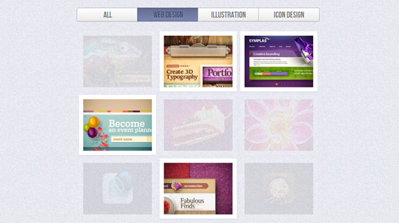
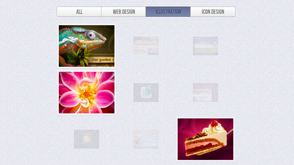
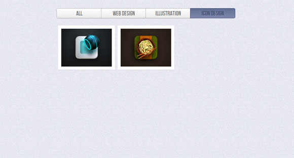
Using the general sibling combinator and the :checked pseudo-class, we can toggle states of other elements by checking a checkbox or a radio button. In this tutorial we will be exploring those CSS3 properties by creating a experimental portfolio filter that will toggle the states of items of a specific type.
使用通用的同级组合器和:checked伪类,我们可以通过选中复选框或单选按钮来切换其他元素的状态。 在本教程中,我们将通过创建实验性投资组合过滤器来探索那些CSS3属性,该过滤器将切换特定类型的项目的状态。
The idea is inspired by Roman Komarov’s brilliant “Filtering elements without JS” experiment where he uses checkboxes and radio buttons for filtering colored shapes.
这个想法是受罗曼·科马罗夫(Roman Komarov)出色的“没有JS过滤元素”实验的启发,他使用复选框和单选按钮过滤彩色形状。
The beautiful Dribbble shots used in the demos are by Mike from Creative Mints.
演示中使用的精美Dribbble镜头是Creative Mints的Mike制作的。
标记 (The Markup)
Let’s start with the markup. Our aim is to have four filter buttons that, once clicked, will make the respective type appear or stand out. So, we’ll use some radio buttons that all have the same name since they should belong to the same group (hence only one can have the “checked” state). By default, we want the “all” radio button to be selected or checked. We’ll add some labels for the radio buttons that we will use in order to hide the radio buttons. Clicking a label will select the radio buttons with the respective ID:
让我们从标记开始。 我们的目标是有四个过滤器按钮,一旦单击它们,它们将使相应的类型出现或突出。 因此,我们将使用一些具有相同名称的单选按钮,因为它们应属于同一组(因此,只有一个可以具有“已选中”状态)。 默认情况下,我们希望选中或选中“所有”单选按钮。 我们将为单选按钮添加一些标签,以便隐藏单选按钮。 单击标签将选择具有相应ID的单选按钮:
<section class="ff-container">

	<input id="select-type-all" name="radio-set-1" type="radio" class="ff-selector-type-all" checked="checked" />
	<label for="select-type-all" class="ff-label-type-all">All</label>

	<input id="select-type-1" name="radio-set-1" type="radio" class="ff-selector-type-1" />
	<label for="select-type-1" class="ff-label-type-1">Web Design</label>

	<input id="select-type-2" name="radio-set-1" type="radio" class="ff-selector-type-2" />
	<label for="select-type-2" class="ff-label-type-2">Illustration</label>

	<input id="select-type-3" name="radio-set-1" type="radio" class="ff-selector-type-3" />
	<label for="select-type-3" class="ff-label-type-3">Icon Design</label>

	<div class="clr"></div>

	<ul class="ff-items">
		<li class="ff-item-type-1">
			<a href="http://dribbble.com/shots/366400-Chameleon">
				<span>Chameleon</span>
				<img src="images/1.jpg" />
			</a>
		</li>
		<li class="ff-item-type-2">
			<!-- ... -->
		</li>
		<li class="ff-item-type-3">
			<!-- ... -->
		</li>
		<!-- ... -->
	</ul>

</section>
The unordered list will contain all the portfolio items as anchors with an image and a span. Each list element will have a type class that will make it possible to identify those elements and “filter” them when we click on one of the radio buttons.
无序列表将包含所有投资组合项目,作为带有图像和跨度的锚点。 每个列表元素都有一个类型类,当我们单击一个单选按钮时,将可以识别这些元素并对其进行“过滤”。
CSS (The CSS)
We’ll be going through three example effects, but first, let’s take a look at the common style.
我们将介绍三个示例效果,但首先,让我们看一下常见样式。
I will omit all the vendor prefixes, but you will, of course, find them in the files.
我将省略所有供应商前缀,但是您当然会在文件中找到它们。
The main section container will have a specific width:
主部分容器将具有特定的宽度:
.ff-container{
	width: 564px;
	margin: 10px auto 30px auto;
}
The labels will cover the radio buttons and we’ll give them a fancy gradient and some subtle box shadows:
标签将覆盖单选按钮,我们将为它们提供精美的渐变和一些细微的框阴影:
.ff-container label{
	font-family: 'BebasNeueRegular', 'Arial Narrow', Arial, sans-serif;
	width: 25%;
	height: 30px;
	cursor: pointer;
	color: #777;
	text-shadow: 1px 1px 1px rgba(255,255,255,0.8);
	line-height: 33px;
	font-size: 19px;
	background: linear-gradient(top, #ffffff 1%,#eaeaea 100%);
	float:left;
	box-shadow:
		0px 0px 0px 1px #aaa,
		1px 0px 0px 0px rgba(255,255,255,0.9) inset,
		0px 1px 2px rgba(0,0,0,0.2);
}
At the corners we want some rounded edges, so the first label and the last one will get this specific border radius:
在拐角处,我们需要一些圆角的边缘,因此第一个标签和最后一个标签将获得此特定的边界半径:
.ff-container label.ff-label-type-all{
	border-radius: 3px 0px 0px 3px;
}
.ff-container label.ff-label-type-3{
	border-radius: 0px 3px 3px 0px;
}
For every checked radio button, we want the respective label to have this “pressed” style:
对于每个选中的单选按钮,我们希望各个标签具有这种“按下”样式:
.ff-container input.ff-selector-type-all:checked ~ label.ff-label-type-all,
.ff-container input.ff-selector-type-1:checked ~ label.ff-label-type-1,
.ff-container input.ff-selector-type-2:checked ~ label.ff-label-type-2,
.ff-container input.ff-selector-type-3:checked ~ label.ff-label-type-3{
	background: linear-gradient(top, #646d93 0%,#7c87ad 100%);
	color: #424d71;
	text-shadow: 0px 1px 1px rgba(255,255,255,0.3);
	box-shadow:
		0px 0px 0px 1px #40496e,
		0 1px 2px rgba(0,0,0,0.1) inset;
}
Since we have all our elements in one level, we use the general sibling combinator which is represented by a “tilde” (~) character, in order to reach the respective label. With this “trick” we will also get to all those different types in the portfolio list.
由于我们所有元素都在一个级别中,因此我们使用由“代字号”(〜)字符表示的通用同级组合器,以到达各个标签。 通过这个“技巧”,我们还将了解投资组合列表中的所有这些不同类型。
The inputs can be hidden, since we have our labels that will do the job:
输入可以隐藏,因为我们有可以完成此工作的标签:
.ff-container input{
	display: none;
}
Let’s move on to the item list:
让我们进入项目列表:
.ff-items{
	position: relative;
	margin: 0px auto;
	padding-top: 20px;
}
The anchor and the span element will have the following style:
anchor和span元素将具有以下样式:
.ff-items a{
	display: block;
	position: relative;
	padding: 10px;
	background: #fff;
	box-shadow: 0 1px 2px rgba(0, 0, 0, 0.1);
	margin: 4px;
	width: 160px;
	height: 120px;
}
.ff-items a span{
	display: block;
	background: rgba(113,123,161, 0.9);
	font-style: italic;
	color: #fff;
	font-weight: bold;
	padding: 20px;
	position: absolute;
	bottom: 10px;
	left: 10px;
	width: 120px;
	height: 0px;
	overflow: hidden;
	opacity: 0;
	text-align: center;
	text-shadow: 1px 1px 1px #303857;
	transition: all 0.3s ease-in-out;
}
.ff-items a:hover span{
	height: 80px;
	opacity: 1;
}
.ff-items li img{
	display: block;
}
When we hover over an anchor, we’ll make the span appear from the bottom, animating its opacity with a transition.
当我们将鼠标悬停在锚点上时,将使跨度从底部开始显示,并通过过渡设置其不透明度的动画。
Allright, that was all the “common” style. Now, let’s see how we can filter those elements in style!
好吧,那就是所有的“普通”风格。 现在,让我们看看如何过滤样式中的那些元素!
例子1 (Example 1)
In the first example, we’ll simply make the items that are selected (i.e. when the respective radio button is “checked”) have the highest opacity. We’ll add a transition to the list item for the opacity:
在第一个示例中,我们将简单地使选中的项目(即,当相应的单选按钮被“选中”时)具有最高的不透明度。 我们将为不透明度添加一个过渡到列表项:
.ff-items li{
	margin: 0px;
	float: left;
	opacity: 0;
	width: 188px;
	height: 148px;
	transition: opacity 0.6s ease-in-out;
}
Then we’ll use the general sibling combinator to target the selected type and set the opacity to one:
然后,我们将使用通用的同级组合器来定位所选类型并将不透明度设置为1:
.ff-container input.ff-selector-type-all:checked ~ .ff-items li,
.ff-container input.ff-selector-type-1:checked ~ .ff-items .ff-item-type-1,
.ff-container input.ff-selector-type-2:checked ~ .ff-items .ff-item-type-2,
.ff-container input.ff-selector-type-3:checked ~ .ff-items .ff-item-type-3{
	opacity: 1;
}
Since we have the “all” type checked by default, all items will initially have the opacity 1.
由于我们默认选中了“所有”类型,因此所有项目最初的不透明度为1。
Now, all the other items should get a very low opacity once we choose a type other than “all”. We’ll use the :not() selector to specify that the list elements that don’t have the selected type class should have an opacity of 0.1:
现在,一旦选择“ all”以外的其他所有类型,其他所有项目的透明度都将非常低。 我们将使用:not()选择器来指定没有选定类型类的列表元素的不透明度应为0.1:
.ff-container input.ff-selector-type-1:checked ~ .ff-items li:not(.ff-item-type-1),
.ff-container input.ff-selector-type-2:checked ~ .ff-items li:not(.ff-item-type-2),
.ff-container input.ff-selector-type-3:checked ~ .ff-items li:not(.ff-item-type-3){
	opacity: 0.1;
}
The description span of those list elements should not be shown on hover:
这些列表元素的描述范围不应在悬停时显示:
.ff-container input.ff-selector-type-1:checked ~ .ff-items li:not(.ff-item-type-1) span,
.ff-container input.ff-selector-type-2:checked ~ .ff-items li:not(.ff-item-type-2) span,
.ff-container input.ff-selector-type-3:checked ~ .ff-items li:not(.ff-item-type-3) span{
	display: none;
}
And that was the first example. Let’s take a look at the next one.
那是第一个例子。 让我们看下一个。
例子2 (Example 2)
In this example, we want the selected items to scale up while the others scale down and become more transparent. So, let’s add a transition to the list elements:
在此示例中,我们希望所选项目按比例放大,而其他项目按比例缩小并变得更加透明。 因此,让我们向列表元素添加过渡:
.ff-items li{
	margin: 0px;
	float: left;
	width: 188px;
	height: 148px;
	transition: all 0.6s ease-in-out;
}
By default, we will have all the list items scaled normally and with full opacity. When checking one type, we want those respective item to scale up a bit and have full opacity, too:
默认情况下,我们将所有列表项正常缩放并具有完全不透明性。 在检查一种类型时,我们希望那些相应的项稍微扩大一点并具有完全的不透明性:
.ff-container input.ff-selector-type-1:checked ~ .ff-items .ff-item-type-1,
.ff-container input.ff-selector-type-2:checked ~ .ff-items .ff-item-type-2,
.ff-container input.ff-selector-type-3:checked ~ .ff-items .ff-item-type-3{
	opacity: 1;
	transform: scale(1.1);
}
Note here, that we did not include the “all” type like before.
请注意,我们没有像以前那样包含“全部”类型。
The other items we’ll scale down and apply a low opacity level:
我们将缩小其他项目并应用较低的不透明度级别:
.ff-container input.ff-selector-type-1:checked ~ .ff-items li:not(.ff-item-type-1),
.ff-container input.ff-selector-type-2:checked ~ .ff-items li:not(.ff-item-type-2),
.ff-container input.ff-selector-type-3:checked ~ .ff-items li:not(.ff-item-type-3){
	opacity: 0.1;
	transform: scale(0.5);
}
And we’ll again hide the description span for the items that don’t have the selected type:
我们将再次隐藏没有选定类型的商品的描述范围:
.ff-container input.ff-selector-type-1:checked ~ .ff-items li:not(.ff-item-type-1) span,
.ff-container input.ff-selector-type-2:checked ~ .ff-items li:not(.ff-item-type-2) span,
.ff-container input.ff-selector-type-3:checked ~ .ff-items li:not(.ff-item-type-3) span{
	display:none;
}
例子3(Example 3)
The last example is just an experiment. We want to do something a bit more tricky here: upon selecting a type, we want to scale all items down and then scale only the items with the selected type back up again.
最后一个例子只是一个实验。 我们想在这里做些棘手的事情:选择一种类型后,我们希望将所有项目缩小,然后仅将具有所选类型的项目再备份一次。
We basically want to make the other items disappear and since we cannot really animate the display property (not even with some combination of opacity), we use this little trick: when we scale the items down, we’ll also animate the width of the ones that should disappear to 0.
我们基本上想使其他项目消失,并且由于我们不能真正使显示属性动画化(即使不结合某些不透明度),因此我们使用了这个小技巧:当我们缩小项目的比例时,我们还将对动画的宽度进行动画处理应该消失为0的那些。
So, let’s give the list items 0 width initially and scale them down to 0 (careful, you will want to avoid this practice for older browsers):
因此,让我们将列表项的初始宽度设置为0,然后将其缩小为0(注意,对于较旧的浏览器,您应该避免这种做法):
.ff-items li{
	margin: 0px;
	float: left;
	height: 148px;
	width: 0px;
	transform: scale(0,0);
}
When the “all type” get’s checked, we will want the scale to be 1 and the width 188px:
选中“所有类型”后,我们希望比例尺为1,宽度为188px:
.ff-container input.ff-selector-type-all:checked ~ .ff-items li{
	width: 188px;
	transform: scale(1,1);
	transition: transform 0.3s linear;
}
Remember, we are in this state initially, since we have the “all types” check by default, but we will also transition into the state, if we are currently viewing another type and go back to the “all types”.
请记住,由于我们默认情况下具有“所有类型”检查功能,因此我们最初处于此状态,但是如果我们当前正在查看另一种类型并返回“所有类型”,我们也将过渡到该状态。
Now, when we check one specific type, the items with that type class will first transition to their initial state, first scale down and with a delay of 0.3 seconds, get a width of 0 again.
现在,当我们检查一种特定的类型时,具有该类型类的项目将首先转换为其初始状态,然后先缩小比例并延迟0.3秒,然后再次获得宽度0。
At the same time, the items that are not of the selected type (those ones that we get with the :not() selector) will have the “scaleDown” animation running, which will basically do the same thing: scale them down and give them a width of 0.
同时,非选定类型的项目(通过:not()选择器获得的那些项目)将运行“ scaleDown”动画,这基本上将执行相同的操作:将它们缩小并给出它们的宽度为0。
After 0.4 seconds, well make the selected type appear again, with the “scaleUp” animation:
0.4秒后,使用“ scaleUp”动画再次使所选类型出现:
.ff-container input.ff-selector-type-1:checked ~ .ff-items .ff-item-type-1,
.ff-container input.ff-selector-type-2:checked ~ .ff-items .ff-item-type-2,
.ff-container input.ff-selector-type-3:checked ~ .ff-items .ff-item-type-3
{
	transition: transform 0.3s linear, width 0s linear 0.3s;
	animation: scaleUp 0.3s linear 0.4s forwards;
}
.ff-container input.ff-selector-type-1:checked ~ .ff-items li:not(.ff-item-type-1),
.ff-container input.ff-selector-type-2:checked ~ .ff-items li:not(.ff-item-type-2),
.ff-container input.ff-selector-type-3:checked ~ .ff-items li:not(.ff-item-type-3)
{
	animation: scaleDown 0.3s linear forwards;
}
@keyframes scaleUp {
	50% { width: 188px; transform: scale(0,0); }
    100% { width: 188px; transform: scale(1,1); }
}
@keyframes scaleDown {
	0% { width: 188px; transform: scale(1,1);}
	99% { width: 188px; transform: scale(0,0);}
    100% { width: 0px; transform: scale(0,0); }
}
Note that this example is very experimental and it will only work properly in browsers supporting CSS animations. In Firefox 9.0.1 the behavior is not as expected (hovering over the labels seems to falsely trigger something) but it works in Aurora 11.0a2, so it might be some kind of bug.
请注意,此示例是非常实验性的,仅在支持CSS动画的浏览器中才能正常运行。 在Firefox 9.0.1中,行为不是预期的(将鼠标悬停在标签上似乎错误地触发了某些内容),但是在Aurora 11.0a2中可以使用,因此可能是某种错误。
演示版 (Demos)
And that’s it! I hope you enjoyed this tutorial and find it inspiring!
就是这样! 希望您喜欢本教程并从中获得启发!
翻译自: https://tympanus.net/codrops/2012/01/09/filter-functionality-with-css3/
过滤器过滤css


 扫一扫
扫一扫
 1208
1208

 被折叠的 条评论
为什么被折叠?
被折叠的 条评论
为什么被折叠?
 到【灌水乐园】发言


