


creative tim

Being in the mood for experimenting with CSS3, I’d like to show you some creative menu hover effects in today’s tutorial. The idea is to have a simple composition of elements, an icon, a main title and a secondary title, that will be animated on hover using only CSS transitions and animations. We’ll be exploring some different effects for the elements.
为了尝试CSS3,我想在今天的教程中向您展示一些创造性的菜单悬停效果。 想法是使元素,图标,主要标题和次要标题组成简单,将仅使用CSS过渡和动画在悬停时对其进行动画处理。 我们将探索元素的一些不同效果。
The icons used in the demos are actually a Web Symbols typeface that we’ll include with @font-face. The typeface is done by the Just Be Nice studio.
演示中使用的图标实际上是我们将在@ font-face中包含的Web Symbols字体。 字体由Just Be Nice工作室完成。
标记 (The Markup)
The HTML structure for the menu will be an unordered list where each item is a link element that consists of an icon span and a content div that will contain the main title and the secondary title:
菜单HTML结构将是一个无序列表,其中每个项目都是一个链接元素,该链接元素由图标范围和内容div组成,其中div包含主标题和副标题:
<ul class="ca-menu">
	<li>
		<a href="#">
			<span class="ca-icon">A</span>
			<div class="ca-content">
				<h2 class="ca-main">Exceptional Service</h2>
				<h3 class="ca-sub">Personalized to your needs</h3>
			</div>
		</a>
	</li>
	...
</ul>
As we are using a symbol font for the icons, we write letters for the icons.
因为我们在图标上使用符号字体,所以我们为图标写字母。
CSS (The CSS)
The common style for all the examples will be the inclusion of the symbol typeface:
所有示例的通用样式将包括符号字体:
@font-face {
    font-family: 'WebSymbolsRegular';
    src: url('websymbols/websymbols-regular-webfont.eot');
    src: url('websymbols/websymbols-regular-webfont.eot?#iefix') format('embedded-opentype'),
         url('websymbols/websymbols-regular-webfont.woff') format('woff'),
         url('websymbols/websymbols-regular-webfont.ttf') format('truetype'),
         url('websymbols/websymbols-regular-webfont.svg#WebSymbolsRegular') format('svg');
    font-weight: normal;
    font-style: normal;
}
The path of the files is relative to the CSS file, hence, they will be in the folder css/websymbols/.
文件的路径是相对于CSS文件的,因此,它们将位于文件夹css / websymbols /中。
The great advantage of having a font for the icons is that we can apply all those nice effects to it, for example a text shadow. We can also scale it to our needs.
为图标使用字体的最大好处是,我们可以将所有这些漂亮的效果应用于它,例如文本阴影。 我们还可以根据需要扩展它。
The style for the unordered list will almost be the same for every example, we’ll just adapt the width of it, so that we can center it on the screen:
对于每个示例,无序列表的样式几乎相同,我们将调整其宽度,以便将其在屏幕上居中:
.ca-menu{
    padding: 0;
    margin: 20px auto;
    width: 500px;
}
In the following examples, I will show you the styling of the elements that will be subject to the effects. In the first example we’ll look at the styling of all elements and in the other example we’ll be focusing on the adaptions.
在以下示例中,我将向您展示将受效果影响的元素的样式。 在第一个示例中,我们将研究所有元素的样式,在另一个示例中,我们将重点研究适应性。
Note: In the following examples I will not write any browser specific prefixes because I don’t want to bloat the CSS, but you’ll find all the necessary prefixes in the demo files.
注意:在以下示例中,我不想编写任何浏览器特定的前缀,因为我不想膨胀CSS,但是您会在演示文件中找到所有必需的前缀。
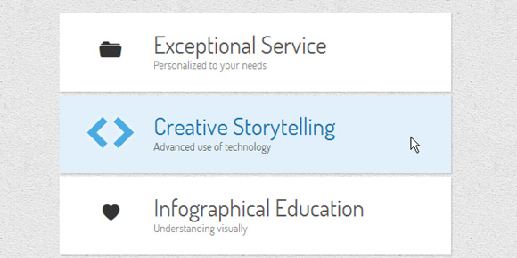
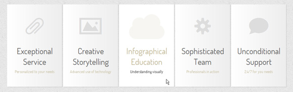
例子1 (Example 1)

In this example we’ll have stacked menu where we will change the sizes of the elements and the background color of the whole item.
在这个例子中,我们将有一个堆叠的菜单,在这里我们将改变元素的大小和整个项目的背景色。
Let’s define the list item style:
让我们定义列表项样式:
.ca-menu li{
	width: 500px;
	height: 100px;
	overflow: hidden;
	display: block;
	background: #fff;
	box-shadow: 1px 1px 2px rgba(0,0,0,0.2);
	margin-bottom: 4px;
	border-left: 10px solid #000;
	transition: all 300ms ease-in-out;
}
.ca-menu li:last-child{
    margin-bottom: 0px;
}
The transition will be for all properties since we’ll want to change the border color and the background color.
过渡将适用于所有属性,因为我们要更改边框颜色和背景颜色。
The link element will have the following style:
link元素将具有以下样式:
.ca-menu li a{
    text-align: left;
    display: block;
    width: 100%;
    height: 100%;
    color: #333;
    position:relative;
}
Let’s define the style for the single elements. The icon span will have the following style, placing it at the left side:
让我们为单个元素定义样式。 图标范围将具有以下样式,将其放置在左侧:
.ca-icon{
    font-family: 'WebSymbolsRegular', cursive;
    font-size: 20px;
    text-shadow: 0px 0px 1px #333;
    line-height: 90px;
    position: absolute;
    width: 90px;
    left: 20px;
    text-align: center;
    transition: all 300ms linear;
}
As you can see, we’ll use the web symbols as the font family. Each letter will be an icon. The wrapper for the content elements will have the following style:
如您所见,我们将使用Web符号作为字体系列。 每个字母将是一个图标。 内容元素的包装将具有以下样式:
.ca-content{
    position: absolute;
    left: 120px;
    width: 370px;
    height: 60px;
    top: 20px;
}
The content elements will vary in their font size and have a linear transition:
内容元素的字体大小会有所不同,并且具有线性过渡:
.ca-main{
    font-size: 30px;
    transition: all 300ms linear;
}
.ca-sub{
    font-size: 14px;
    color: #666;
    transition: all 300ms linear;
}
And now it comes the interesting part. On hover over the list element we will change the font sizes and the colors:
现在,它是有趣的部分。 将鼠标悬停在list元素上时,我们将更改字体大小和颜色:
.ca-menu li:hover{
    border-color: #fff004;
    background: #000;
}
.ca-menu li:hover .ca-icon{
    color: #fff004;
    text-shadow: 0px 0px 1px #fff004;
    font-size: 50px;
}
.ca-menu li:hover .ca-main{
    color: #fff004;
    font-size: 14px;
}
.ca-menu li:hover .ca-sub{
    color: #fff;
    font-size: 30px;
}
Since we defined a transition for each of those elements, the change will be “animated”.
由于我们为每个元素定义了一个过渡,因此更改将被“动画化”。
例子2 (Example 2)
.ca-menu li:hover{
    background: #e1f0fa;
}
.ca-menu li:hover .ca-icon{
    font-size: 40px;
    color: #259add;
    opacity: 0.8;
    text-shadow: 0px 0px 13px #fff;
}
.ca-menu li:hover .ca-main{
    opacity: 1;
    color:#2676ac;
    animation: moveFromTop 300ms ease-in-out;
}
.ca-menu li:hover .ca-sub{
    opacity: 1;
    animation: moveFromBottom 300ms ease-in-out;
}
Let’s define the two animations. The first one will start from putting the respective element 200% down the Y Axis which means that it will be pushed down. Also, it will have an opacity of 0. Then it will animate to the origin by setting the translateY to 0%, basically saying we’ll go back to the point we were initially:
让我们定义两个动画。 第一个将从将各个元素沿Y轴向下放置200%开始,这意味着将其向下推。 此外,它的不透明度为0。然后将其转化为原点,方法是将translateY设置为0%,基本上是说我们要回到最初的位置:
@keyframes moveFromBottom {
    from {
        opacity: 0;
        transform: translateY(200%);
    }
    to {
        opacity: 1;
        transform: translateY(0%);
    }
}
The second animation will move an element from the top with the same principles:
第二个动画将按照相同的原理从顶部移动一个元素:
@keyframes moveFromTop {
    from {
        opacity: 0;
        transform: translateY(-200%);
    }
    to {
        opacity: 1;
        transform: translateY(0%);
    }
}
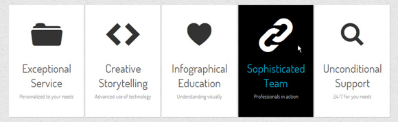
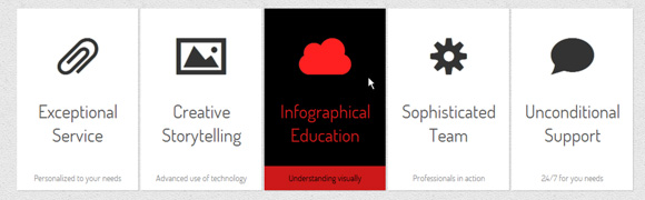
例子3(Example 3)
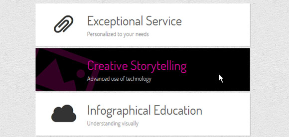
.ca-menu li:hover{
    background-color: #000;
}
.ca-menu li:hover .ca-icon{
    color: #f900b0;
    font-size: 120px;
    opacity: 0.2;
    left: -20px;
    transform: rotate(20deg);
}
.ca-menu li:hover .ca-main{
    color: #f900b0;
    opacity: 0.8;
}
.ca-menu li:hover .ca-sub{
    color: #fff;
    opacity: 0.8;
}
例子4(Example 4)
.ca-menu li{
    width: 200px;
    height: 300px;
    overflow: hidden;
    position: relative;
    float: left;
    border: 5px solid #fff;
    background: #e2f0ff;
    box-shadow: 1px 1px 2px rgba(0,0,0,0.2);
    margin-right: 4px;
    transition: all 300ms linear;
}
.ca-menu li:last-child{
    margin-right: 0px;
}
The icon will be placed on the upper half in the center of the item:
图标将放置在项目中心的上半部分:
.ca-icon{
    font-family: 'WebSymbolsRegular', cursive;
    color: #c5e4f4;
    font-size: 90px;
    text-shadow: 1px 0px 1px rgba(255,255,255,0.7);
    line-height: 150px;
    position: absolute;
    width: 100%;
    height: 50%;
    left: 0px;
    top: 0px;
    text-align: center;
    transition: all 200ms linear;
}
The content wrapper will be placed on the lower part of the item:
内容包装器将放置在该项目的下部:
.ca-content{
    position: absolute;
    left: 0px;
    width: 100%;
    height: 50%;
    top: 50%;
}
The main title and the secondary title will have the following style:
主标题和副标题将具有以下样式:
.ca-main{
    font-size: 30px;
    color: #005382;
    opacity: 0.8;
    text-align: center;
    transition: all 200ms linear;
}
.ca-sub{
    text-align:center;
    font-size: 14px;
    color: #666;
    line-height: 40px;
    opacity: 0.8;
    transition: all 200ms linear;
}
On hover we want to blur the icon while we slide it from the top, change the background color and slide the content items from the top and bottom:
在悬停时,我们要在从顶部滑动图标,更改背景颜色以及从顶部和底部滑动内容项的同时模糊图标:
.ca-menu li:hover{
    background-color: #fff;
}
.ca-menu li:hover .ca-icon{
    text-shadow: 0px 0px 20px #c5e4f4;
    color: transparent;
    animation: moveFromTop 400ms ease;
}
.ca-menu li:hover .ca-main{
    color: #000;
    animation: moveFromTop 300ms ease;
}
.ca-menu li:hover .ca-sub{
    color: #000;
    animation: moveFromBottom 500ms ease;
}
The blurring of the icon happens when we set its color to transparent and give it a text shadow with a lot of fuzziness. The animations will be the same ones we used in one of the previous examples with the exception of the translate values for the moveFromTop animation. Here we will set the translateY to -300%.
当我们将其颜色设置为透明并给它一个带有很多模糊性的文本阴影时,就会发生图标的模糊。 除了moveFromTop动画的转换值之外,这些动画与我们在前面的示例之一中使用的动画相同。 在这里,我们将translateY设置为-300%。
例子5 (Example 5)
.ca-menu li:hover{
    background:#fff;
}
.ca-menu li:hover .ca-icon{
    color: #afa379;
    font-size: 90px;
    opacity: 0.1;
    animation: moveFromLeft 400ms ease;
}
.ca-menu li:hover .ca-main{
    color: #afa379;
    animation: moveFromRight 300ms ease;
}
.ca-menu li:hover .ca-sub{
    color: #000;
    animation: moveFromBottom 500ms ease;
}
The moveFromBottom animation we know already, let’s take a look at moveFromLeft that moves the respective element to the left by setting the translateX to -100% and then moves it back to its origin:
我们已经知道的moveFromBottom动画,让我们看一下moveFromLeft ,它通过将transformX设置为-100%然后将其移回原点,从而将各个元素向左移:
@keyframes moveFromLeft{
    from {
        transform: translateX(-100%);
    }
    to {
        transform: translateX(0%);
    }
}
In the moveFromRight animation we’ll set it to translateX(100%) initially.
在moveFromRight动画中,我们首先将其设置为translationX(100%)。
例子6 (Example 6)
.ca-menu li:hover{
    background-color: #000;
}
.ca-menu li:hover .ca-icon{
    color: #fff;
    font-size: 90px;
}
.ca-menu li:hover .ca-main{
    color: #00ccff;
    animation: moveFromLeftRotate 300ms ease;
}
.ca-menu li:hover .ca-sub{
    color: #fff;
    animation: moveFromBottom 500ms ease;
}
The moveFromLeftRotate animation will move an item and rotate it:
moveFromLeftRotate动画将移动并旋转一个项目:
@keyframes moveFromLeftRotate{
    from {
        transform: translateX(-100%) rotate(-90deg);
    }
    to {
        transform: translateX(0%) rotate(0deg);
    }
}
例子7(Example 7)
.ca-sub{
    text-align:center;
    font-size: 14px;
    color: #666;
    line-height: 40px;
    opacity: 0.8;
    position: absolute;
    bottom: 0;
    width: 100%;
    transition: all 200ms linear;
}
We want to slide it in from the bottom and change its background color. The icon will slide in from the bottom while the main title will appear to increase from small to big:
我们想将其从底部滑入并更改其背景颜色。 图标将从底部滑入,而主标题似乎从小到大增加:
.ca-menu li:hover{
    background-color: #000;
}
.ca-menu li:hover .ca-icon{
    color: #ff2020;
    animation: moveFromBottom 300ms ease;
}
.ca-menu li:hover .ca-main{
    color: #ff2020;
    animation: smallToBig 300ms ease;
}
.ca-menu li:hover .ca-sub{
    color: #000;
    background-color: #ff2020;
    animation: moveFromBottom 500ms ease;
}
The smallToBig animation is an example on how to use the scale transfrom:
smallToBig动画是有关如何使用比例转换的示例:
@keyframes smallToBig{
    from {
        transform: scale(0.1);
    }
    to {
        transform: scale(1);
    }
}
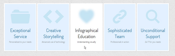
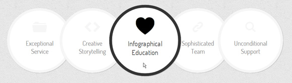
例子8(Example 8)

.ca-menu li:hover{
    background-color: #000;
    z-index:999;
    transform: scale(1.1);
}
.ca-menu li:hover .ca-icon{
    color: #ccff00;
    font-size: 90px;
    opacity:0.3;
}
.ca-menu li:hover .ca-icon#heart{
    animation: smallToBig 900ms alternate infinite ease;
}
.ca-menu li:hover .ca-main{
    color: #ccff00;
    animation: smallToBig 300ms ease;
}
.ca-menu li:hover .ca-sub{
    color: #ccff00;
    animation: moveFromBottom 500ms ease;
}
例子9(Example 9)
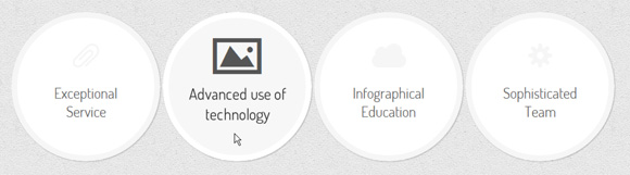
.ca-menu li{
    width: 230px;
    height: 230px;
    border: 10px solid #f6f6f6;
    overflow: hidden;
    position: relative;
    float:left;
    background: #fff;
    margin-right: 4px;
    box-shadow: 1px 1px 2px rgba(0,0,0,0.2);
    border-radius: 125px;
    transition: all 400ms linear;
}
In order to create a circle we need to set the border radius to half of the element’s outer width/height. Placing the elements in the list item absolutely and centering them, we’ll do the following on hover:
为了创建一个圆,我们需要将边界半径设置为元素外部宽度/高度的一半。 将元素完全放在列表项中并居中,我们将在悬停时执行以下操作:
.ca-menu li:hover{
    background: #f7f7f7;
    border-color: #fff;
    transform: rotate(360deg);
}
.ca-menu li:hover .ca-icon{
    color: #555;
    font-size: 60px;
}
.ca-menu li:hover .ca-main{
    display: none;
}
.ca-menu li:hover .ca-sub{
    opacity: 0.8;
}
The item will be rotated 360 degrees and the main title will disappear, letting the secondary item appear (its opacity was initially set to 0).
该项目将旋转360度,并且主标题将消失,让第二个项目出现(其不透明度最初设置为0)。
例子十 (Example 10)
.ca-menu li:hover{
    border-color: #333;
    z-index: 999;
    transform: scale(1.1);
}
.ca-menu li:hover .ca-icon{
    color: #000;
    font-size: 60px;
    text-shadow: 0px 0px 1px #000;
    animation: moveFromBottom 300ms ease;
}
.ca-menu li:hover .ca-main{
    color: #000;
    animation: moveFromBottom 500ms ease;
}
And that’s it! I hope you enjoyed these little experiments and find them inspiring and useful!
就是这样! 希望您喜欢这些小实验,并发现它们对您有启发性和实用性!
Please note that these animation and transitions will only work in the latest versions of truly modern web browsers, such as Google Chrome, Apple Safari and Mozilla Firefox.
请注意,这些动画和过渡效果仅在真正现代的Web浏览器的最新版本中有效,例如Google Chrome,Apple Safari和Mozilla Firefox。
翻译自: https://tympanus.net/codrops/2011/10/24/creative-css3-animation-menus/
creative tim


 扫一扫
扫一扫
 236
236

 被折叠的 条评论
为什么被折叠?
被折叠的 条评论
为什么被折叠?
 到【灌水乐园】发言


