


css3滑动图像
Today we’ll show you how to create some neat sliding image panels with CSS only. The idea is to use background images for the panels and animate them when clicking on a label. We’ll use radio buttons with labels and target the respective panels with the general sibling selector.
今天,我们将向您展示如何仅使用CSS创建一些简洁的滑动图像面板。 想法是在面板上使用背景图像并在单击标签时对其进行动画处理。 我们将使用带有标签的单选按钮,并使用通用的同级选择器定位各个面板。
The beautiful images are by Joanna Kustra and they are licensed under the Attribution-NonCommercial 3.0 Unported Creative Commons License.
精美图片由Joanna Kustra制作,并根据Attribution-NonCommercial 3.0 Unported Creative Commons License授权。
You might as well be interested in Filter Functionality with CSS3 where we have used a similar technique for filtering elements based on their type.
您可能还对CSS3的过滤器功能感兴趣,在CSS3中我们使用了类似的技术来根据元素的类型过滤元素。
Please note: the result of this tutorial will only work as intended in browsers that support CSS transitions and animations.
请注意:本教程的结果只能在支持CSS过渡和动画的浏览器中按预期工作。
标记 (The Markup)
The HTML will consist of three major parts: the radio buttons and the labels, the container with the panels and their “slices” for each image, and the titles. The container with the class cr-bgimg part will have a division for each of the panels and inside we’ll place spans for every image with the right background position. So, the first panel will have four slices, each having the one of the images as background with the left-most position. The second panel will have again four slices but now the background position will be moved to be showing the next part of the respective image:
HTML将包括三个主要部分:单选按钮和标签,带有面板的容器以及每个图像的“切片”以及标题。 带有cr-bgimg类的容器将对每个面板进行划分,在内部,我们将为背景位置正确的每个图像放置跨度。 因此,第一个面板将具有四个切片,每个切片都将其中一个图像作为背景,并且位于最左侧。 第二个面板将再次具有四个切片,但是现在背景位置将被移动以显示相应图像的下一部分:
<section class="cr-container">
<!-- radio buttons and labels -->
<input id="select-img-1" name="radio-set-1" type="radio" class="cr-selector-img-1" checked/>
<label for="select-img-1" class="cr-label-img-1">1</label>
<input id="select-img-2" name="radio-set-1" type="radio" class="cr-selector-img-2" />
<label for="select-img-2" class="cr-label-img-2">2</label>
<input id="select-img-3" name="radio-set-1" type="radio" class="cr-selector-img-3" />
<label for="select-img-3" class="cr-label-img-3">3</label>
<input id="select-img-4" name="radio-set-1" type="radio" class="cr-selector-img-4" />
<label for="select-img-4" class="cr-label-img-4">4</label>
<div class="clr"></div>
<!-- panels -->
<div class="cr-bgimg">
<div>
<span>Slice 1 - Image 1</span>
<span>Slice 1 - Image 2</span>
<span>Slice 1 - Image 3</span>
<span>Slice 1 - Image 4</span>
</div>
<div>
<span>Slice 2 - Image 1</span>
<span>Slice 2 - Image 2</span>
<span>Slice 2 - Image 3</span>
<span>Slice 2 - Image 4</span>
</div>
<div>
<span>Slice 3 - Image 1</span>
<span>Slice 3 - Image 2</span>
<span>Slice 3 - Image 3</span>
<span>Slice 3 - Image 4</span>
</div>
<div>
<span>Slice 4 - Image 1</span>
<span>Slice 4 - Image 2</span>
<span>Slice 4 - Image 3</span>
<span>Slice 4 - Image 4</span>
</div>
</div>
<!-- titles -->
<div class="cr-titles">
<h3>
<span>Serendipity</span>
<span>What you've been dreaming of</span>
</h3>
<h3>
<span>Adventure</span>
<span>Where the fun begins</span>
</h3>
<h3>
<span>Nature</span>
<span>Unforgettable eperiences</span>
</h3>
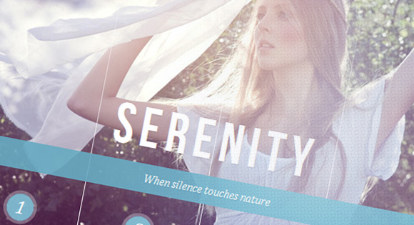
<h3>
<span>Serenity</span>
<span>When silence touches nature</span>
</h3>
</div>
</section>
The h3 elements for the titles will have two spans, one for the main headline and one for the sub-headline.
标题的h3元素将具有两个范围,一个用于主标题,一个用于子标题。
Let’s style this baby.
让我们为这个婴儿造型。
CSS (The CSS)
I will omit all the vendor prefixes, but you will, of course, find them in the files. We’ll be going through the style of demo 1.
我将省略所有供应商前缀,但是您当然会在文件中找到它们。 我们将演示演示1的样式。
Our aim is to first hide those radio buttons by covering them up with labels. In web browsers, clicking on a label will make the respective checkbox or radio button selected. Giving an ID to the input, we can use the for = idref attribute of the label to reference the respective input.
我们的目的是首先通过用标签覆盖单选按钮来隐藏它们。 在网络浏览器中,单击标签将选中相应的复选框或单选按钮。 给输入一个ID,我们可以使用标签的for = idref属性来引用相应的输入。
Second, we want to place all the background images correctly and third, we want to show the respective image slices and titles when clicking on a label.
第二,我们要正确放置所有背景图像,第三,我们要在单击标签时显示相应的图像切片和标题。
So, lets first syle the section and give it a white border with some subtle box box shadow:
因此,让我们先对部分进行syle处理,然后给它一个带有一些细微盒子阴影的白色边框:
.cr-container{
	width: 600px;
	height: 400px;
	position: relative;
	margin: 0 auto;
	border: 20px solid #fff;
	box-shadow: 1px 1px 3px rgba(0,0,0,0.1);
}
Since we want to use the general sibling selector in order to “reach” the right image slices and titles, we need to place the labels before those containers. Let’s make sure that they are on top as a layer (z-index) and push its position down by adding a top margin of 350px;
由于我们要使用通用的同级选择器来“到达”正确的图像切片和标题,因此我们需要将标签放置在这些容器之前。 让我们确保它们作为图层(z索引)位于顶部,并通过添加350px的上边距来向下推其位置;
.cr-container label{
	font-style: italic;
	width: 150px;
	height: 30px;
	cursor: pointer;
	color: #fff;
	line-height: 32px;
	font-size: 24px;
	float:left;
	position: relative;
	margin-top: 350px;
	z-index: 1000;
}
Let’s prettify the label by adding a little circle. We’ll create a pseudo element and place it centered behind the label text:
让我们加一个小圆圈来美化标签。 我们将创建一个伪元素,并将其放置在标签文本的中央:
.cr-container label:before{
	content:'';
	width: 34px;
	height: 34px;
	background: rgba(130,195,217,0.9);
	position: absolute;
	left: 50%;
	margin-left: -17px;
	border-radius: 50%;
	box-shadow: 0px 0px 0px 4px rgba(255,255,255,0.3);
	z-index:-1;
}
In order to create a separation between the panels we’ll use a little trick. We’ll create another pseudo-element for the label and extend it to stretch over the panel. Using a gradient, we’ll make the line “fade out” at the top:
为了在面板之间建立分隔,我们将使用一些技巧。 我们将为标签创建另一个伪元素,并将其扩展以在面板上延伸。 使用渐变,使该行在顶部“淡出”:
.cr-container label:after{
	width: 1px;
	height: 400px;
	content: '';
	background: linear-gradient(top, rgba(255,255,255,0) 0%,rgba(255,255,255,1) 100%);
	position: absolute;
	bottom: -20px;
	right: 0px;
}
The last panel should not have that line so we simply give it 0 width:
最后一个面板不应包含该行,因此我们仅将其宽度设置为0:
.cr-container label.cr-label-img-4:after{
	width: 0px;
}
Now, that we’ve taken care of the label look, we can hide the inputs:
现在,我们已经处理了标签外观,可以隐藏输入:
.cr-container input{
	display: none;
}
Whenever we click on a label, the respective input gets checked. Now we can target the respective label using the general sibling selector. So, we will change the color the “selected” label:
每当我们单击标签时,都会检查相应的输入。 现在,我们可以使用通用的同级选择器定位各个标签。 因此,我们将更改“选定”标签的颜色:
.cr-container input.cr-selector-img-1:checked ~ label.cr-label-img-1,
.cr-container input.cr-selector-img-2:checked ~ label.cr-label-img-2,
.cr-container input.cr-selector-img-3:checked ~ label.cr-label-img-3,
.cr-container input.cr-selector-img-4:checked ~ label.cr-label-img-4{
	color: #68abc2;
}
And we’ll also change the background color and box shadow of its cicle pseudo-element:
我们还将更改其cicle伪元素的背景颜色和框阴影:
.cr-container input.cr-selector-img-1:checked ~ label.cr-label-img-1:before,
.cr-container input.cr-selector-img-2:checked ~ label.cr-label-img-2:before,
.cr-container input.cr-selector-img-3:checked ~ label.cr-label-img-3:before,
.cr-container input.cr-selector-img-4:checked ~ label.cr-label-img-4:before{
	background: #fff;
	box-shadow: 0px 0px 0px 4px rgba(104,171,194,0.6);
}
The container for the image panels will occupy all the width and it will be positioned absolutely. This container will be used later in order to set the background image to the currently selected image. We need to do this in order to have an image visible by default. So we’ll also add some background properties already:
图像面板的容器将占据所有宽度,并且将完全定位。 稍后将使用此容器,以将背景图像设置为当前选定的图像。 我们需要执行此操作以使图像在默认情况下可见。 因此,我们还将添加一些背景属性:
.cr-bgimg{
	width: 600px;
	height: 400px;
	position: absolute;
	left: 0px;
	top: 0px;
	z-index: 1;
	background-repeat: no-repeat;
	background-position: 0 0;
}
Since we have four panels/images, one panel will have the width of 150 pixels (600 divided by 4). The panels will be floating left and we’ll hide their overflow since we don’t want to see the slices coming out when we slide them:
由于我们有四个面板/图像,因此一个面板的宽度为150像素(600除以4)。 面板将向左浮动,我们将隐藏它们的溢出,因为我们不希望在滑动它们时看到切片出来:
.cr-bgimg div{
	width: 150px;
	height: 100%;
	position: relative;
	float: left;
	overflow: hidden;
	background-repeat: no-repeat;
}
Each slice span will be positioned absolutely and initially, they will be hidden by placing them out of the panel with a left of -150px:
每个切片跨度将被绝对定位,并且最初,将其放置在面板外(-150px的左侧)将其隐藏:
.cr-bgimg div span{
	position: absolute;
	width: 100%;
	height: 100%;
	top: 0px;
	left: -150px;
	z-index: 2;
	text-indent: -9000px;
}
Now, let’s take care of the background of the image container and the respective image slices:
现在,让我们注意图像容器的背景以及相应的图像切片:
.cr-container input.cr-selector-img-1:checked ~ .cr-bgimg,
.cr-bgimg div span:nth-child(1){
	background-image: url(../images/1.jpg);
}
.cr-container input.cr-selector-img-2:checked ~ .cr-bgimg,
.cr-bgimg div span:nth-child(2){
	background-image: url(../images/2.jpg);
}
.cr-container input.cr-selector-img-3:checked ~ .cr-bgimg,
.cr-bgimg div span:nth-child(3){
	background-image: url(../images/3.jpg);
}
.cr-container input.cr-selector-img-4:checked ~ .cr-bgimg,
.cr-bgimg div span:nth-child(4){
	background-image: url(../images/4.jpg);
}
We also need to give the right background position to the slices depending on the panel:
我们还需要根据面板为切片提供正确的背景位置:
.cr-bgimg div:nth-child(1) span{
	background-position: 0px 0px;
}
.cr-bgimg div:nth-child(2) span{
	background-position: -150px 0px;
}
.cr-bgimg div:nth-child(3) span{
	background-position: -300px 0px;
}
.cr-bgimg div:nth-child(4) span{
	background-position: -450px 0px;
}
When we click on a label we will simply slide all the slices out to the right:
当我们点击标签时,我们只需将所有切片滑到右侧即可:
.cr-container input:checked ~ .cr-bgimg div span{
	animation: slideOut 0.6s ease-in-out;
}
@keyframes slideOut{
	0%{
		left: 0px;
	}
	100%{
		left: 150px;
	}
}
…all except the slices with the respective background image. Those will slide in from -150px to 0px:
…除带有各自背景图像的切片以外的所有图像。 这些将从-150px滑到0px:
.cr-container input.cr-selector-img-1:checked ~ .cr-bgimg div span:nth-child(1),
.cr-container input.cr-selector-img-2:checked ~ .cr-bgimg div span:nth-child(2),
.cr-container input.cr-selector-img-3:checked ~ .cr-bgimg div span:nth-child(3),
.cr-container input.cr-selector-img-4:checked ~ .cr-bgimg div span:nth-child(4)
{
	transition: left 0.5s ease-in-out;
	animation: none;
	left: 0px;
	z-index: 10;
}
Last, but not least, we want to style the h3 title elements and their spans. The h3 will have a opacity transition and once we select the respective label/input the opacity will increase from 0 to 1:
最后但并非最不重要的一点是,我们要为h3 title元素及其跨度设置样式。 h3将具有不透明度过渡,一旦我们选择了相应的标签/输入,不透明度将从0增加到1:
.cr-titles h3{
	position: absolute;
	width: 100%;
	text-align: center;
	top: 50%;
	z-index: 10000;
	opacity: 0;
	color: #fff;
	text-shadow: 1px 1px 1px rgba(0,0,0,0.1);
	transition: opacity 0.8s ease-in-out;
}
.cr-titles h3 span:nth-child(1){
	font-family: 'BebasNeueRegular', 'Arial Narrow', Arial, sans-serif;
	font-size: 70px;
	display: block;
	letter-spacing: 7px;
}
.cr-titles h3 span:nth-child(2){
	letter-spacing: 0px;
	display: block;
	background: rgba(104,171,194,0.9);
	font-size: 14px;
	padding: 10px;
	font-style: italic;
	font-family: Cambria, Palatino, "Palatino Linotype", "Palatino LT STD", Georgia, serif;
}
.cr-container input.cr-selector-img-1:checked ~ .cr-titles h3:nth-child(1),
.cr-container input.cr-selector-img-2:checked ~ .cr-titles h3:nth-child(2),
.cr-container input.cr-selector-img-3:checked ~ .cr-titles h3:nth-child(3),
.cr-container input.cr-selector-img-4:checked ~ .cr-titles h3:nth-child(4){
	opacity: 1;
}
If you don’t want to use the label trick on mobile devices you could, for example, use a media query:
例如,如果您不想在移动设备上使用标签技巧,则可以使用媒体查询:
@media screen and (max-width: 768px) {
	.cr-container input{
		display: inline;
		width: 24%;
		margin-top: 350px;
		z-index: 1000;
		position: relative;
	}
	.cr-container label{
		display: none;
	}
}
This is just a quick solution and it might be better to check, if the label trick is supported.
这只是一个快速的解决方案,如果支持标签技巧,可能最好检查一下。
And that’s it! There are many possibilities of animations that can be done here. Check out the demos to see more.
就是这样! 可以在此处完成动画的多种可能性。 查看演示以了解更多信息。
演示版 (Demos)
And that’s it! I hope you enjoyed this tutorial and find it inspiring!
就是这样! 希望您喜欢本教程并从中获得启发!
翻译自: https://tympanus.net/codrops/2012/01/17/sliding-image-panels-with-css3/
css3滑动图像


 1142
1142

 被折叠的 条评论
为什么被折叠?
被折叠的 条评论
为什么被折叠?
 到【灌水乐园】发言


