


axure灯箱
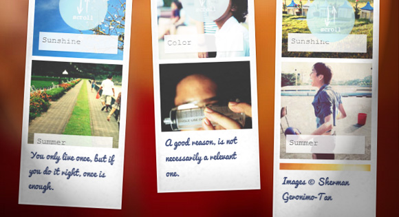
In today’s tutorial we’ll show you how to create some cute looking photo strips and integrate Lightbox 2, one of the most popular and widely used lightbox scripts. The idea is to show some photo strips and make them navigable by scrolling with the mousewheel. When clicking on a picture we will show the larger version using jQuery Lightbox 2. We will also optimize it for touch devices.
在今天的教程中,我们将向您展示如何创建看起来很可爱的照片带,以及如何集成Lightbox 2 ( Lightbox 2) , Lightbox 2是最受欢迎和使用最广泛的lightbox脚本之一。 想法是显示一些照片条,并通过使用鼠标滚轮滚动使它们可导航。 单击图片时,我们将使用jQuery Lightbox 2显示更大的版本。我们还将针对触摸设备对其进行优化。
The amazing images are by talented Sherman Geronimo-Tan and they are licensed under Creative Commons Attribution 2.0 Generic (CC BY 2.0).
令人惊叹的图像是由才华横溢的谢尔曼·杰罗尼莫·坦(Sherman Geronimo-Tan)制作的,并已根据知识共享署名2.0通用(CC BY 2.0)授权。
Lightbox 2 is by Lokesh Dhakar and you can find the script and examples of usage here: Lightbox 2
灯箱2由Lokesh Dhakar制作,您可以在此处找到脚本和用法示例:灯箱2
标记 (The Markup)
Let’s first write the HTML for the four photo strips. Each photo strip will consist of a main container with the class pb-wrapper. The strip itself is an unordered list and we will wrap it into the pb-scroll division. At the bottom of the photo strip we’ll add the title of the strip:
首先,为这四个照片带编写HTML。 每个照片带将由一个带有pb-wrapper类的主容器组成。 条带本身是无序列表,我们将其包装到pb-scroll分区中。 在照片带的底部,我们将添加照片带的标题:
<div class="pb-wrapper pb-wrapper-1">

	<div class="pb-scroll">

		<ul class="pb-strip">
			<li>
				<a href="images/large/1.jpg" rel="lightbox[album1]" title="Spring">
					<img src="images/small/1.jpg" />
				</a>
			</li>
			<li>
				<a href="images/large/2.jpg" rel="lightbox[album1]" title="Sunshine">
					<img src="images/small/2.jpg" />
				</a>
			</li>
			<li> <!--...--> </li>

			<!--...-->
		</ul>

	</div>

	<h3 class="pb-title">Pure Serenity</h3>

</div>
Each photo strip wrapper will also have a position class like pb-wrapper-1, pb-wrapper-2, etc. We will then define custom positions, heights and rotations for each.
每个照片带包装纸还将具有一个位置类,例如pb-wrapper-1,pb-wrapper-2等。然后,我们将为每个照片带定义自定义位置,高度和旋转度。

As you can see, we use the “rel” attribute for the Lightbox 2 script. Here we will add the path to a larger version of the thumbnail.
如您所见,我们为Lightbox 2脚本使用了“ rel”属性。 在这里,我们将路径添加到较大版本的缩略图。
Let’s take a look at the style.
让我们看一下样式。
CSS (The CSS)
The wrappers for the photo strips will have a fixed position. This will help us define a height relative to the screen size. We’ll add some nice box shadow and a textured repeated background image to make it look more like paper:
相纸的包装纸将处于固定位置。 这将帮助我们定义相对于屏幕尺寸的高度。 我们将添加一些漂亮的框阴影和重复的纹理背景图像,使其看起来更像纸张:
.pb-wrapper {
	position: fixed;
	background: #fff url(../images/paper.jpg) repeat center bottom;
	width: 170px;
	margin-top: 10px;
	padding: 20px 10px 100px;
	overflow: hidden;
	box-shadow:
		inset 1px 0 0 3px rgba(255,255,255,0.6),
		0 1px 4px rgba(0,0,0,0.3),
		inset 0 0 20px rgba(0,0,0,0.05),
		inset 0 -25px 40px rgba(0,0,0,0.08);
}
The large padding at the bottom will leave some space for the title of the photo strip.
底部的大填充物将为照片带的标题留出一些空间。
Let’s use the :after pseudo-element for the little circle that will indicate to the user that he needs to scroll with the mousewheel, and the :before pseudo-element in order to add some extra shadow effect to the left side of the strip, just for a subtle effect:
让我们使用:after伪元素表示小圆圈,该小圆圈将向用户指示他需要使用鼠标滚轮滚动;而使用:before伪元素,以便在条形图的左侧添加一些额外的阴影效果,只是为了产生微妙的效果:
.pb-wrapper:before {
	content: '';
    position: absolute;
	width: 2px;
	left: 0;
	top: 3px;
	bottom: 3px;
	box-shadow: 0 0 10px rgba(0,0,0,0.2);
}

.pb-wrapper:after{
	position: absolute;
	content: '';
	background: rgba(192,227,232, 0.8) url(../images/scroll.png) no-repeat center center;
	width: 80px;
	height: 80px;
	top: 50%;
	left: 50%;
	margin: -75px 0 0 -35px;
	border-radius: 50%;
	z-index: 1000;
}
Since we will be using Modernizr, we can define that on a touch device we should not be showing the circle. We’ll add a hover effect which removes the circle for non-touch browsers:
由于我们将使用Modernizr ,因此我们可以定义在触摸设备上不应该显示圆圈。 我们将添加一个悬停效果,以删除非触摸式浏览器的圆圈:
.touch .pb-wrapper:after,
.pb-wrapper:hover:after {
	display: none;
}
The title will have the following style:
标题将具有以下样式:
h3.pb-title {
	padding: 5px;
	font-family: 'Pacifico', Cambria, Georgia, serif;
	color: #374571;
	font-size: 14px;
	font-weight: 300;
	margin: 0;
	user-select: none;
}
The scroll wrapper for the thumbnail list will have an extra padding and since its parent overflow is set to hidden, we won’t see the scrollbar:
缩略图列表的滚动包装将有一个额外的填充,并且由于其父溢出设置为隐藏,因此我们不会看到滚动条:
.pb-scroll {
	position: relative;
	height: 100%;
	width: 150px;
	padding-right: 30px;
	overflow-y: scroll;
	overflow-x: hidden;
	box-sizing: content-box;
}
The box-sizing is set to “border-box” in our normalize.css so we need to set it back to “content-box” in this case, because we really want the width to enlarge.
在我们的normalize.css中将box-sizing设置为“ border-box”,因此在这种情况下,我们需要将其重新设置为“ content-box”,因为我们确实希望宽度变大。
For touch devices, we’ll simply not add that padding. (Just thinking about optimization for the iPad, we know that the scrollbars won’t be shown.)
对于触摸设备,我们不会简单地添加该填充。 (仅考虑优化iPad,我们知道不会显示滚动条。)
.touch .pb-scroll {
	padding-right: 0px;
}
The photo strip list will have a transition for the opacity when we hover:
当我们将鼠标悬停在照片清单上时,其不透明度将发生过渡:
ul.pb-strip {
	padding: 0;
	list-style: none;
	position: relative;
	margin: 0 auto;
	width: inherit;
	opacity: 0.8;
	transition: all 0.3s ease-in-out;
}
On hover, we’ll change the opacity and for touch devices we’ll reset it:
悬停时,我们将更改不透明度,对于触摸设备,我们将其重置:
.pb-wrapper:hover ul.pb-strip,
.touch .pb-wrapper ul.pb-strip{
	opacity: 1;
}
The list items will have a specified width and a little margin for the gap between the images:
列表项将具有指定的宽度,并为图像之间的间隙留出一些空白:
ul.pb-strip li {
	display: block;
	width: 150px;
	position: relative;
	margin-bottom: 7px;
}
The anchor will be set to display: block:
锚点将设置为显示:块:
ul.pb-strip li a {
	display: block;
}
In order not to repeat any content, we’ll simply use the title attribute to add a little tag on each thumbnail. This we will do with the pseudo-class :after. We’ll add a semi-transparent background and center it:
为了不重复任何内容,我们将简单地使用title属性在每个缩略图上添加一个小标签。 我们将使用伪类:after。 我们将添加一个半透明的背景并将其居中:
ul.pb-strip li a:after {
	position: absolute;
	z-index: 999;
	height: 20px;
	width: 120px;
	left: 10px;
	padding: 5px;
	bottom: 10px;
	background: rgba(255,255,255,0.6);
	content: attr(title);
	font-size: 13px;
	text-shadow: 0 1px 1px rgba(255,255,255,0.9);
	box-shadow: 1px 1px 2px rgba(0,0,0,0.2);
}
Let’s add a subtle box shadow to the image since we will rotate the whole strip and we don’t want the edges to look too jagged in some browsers:
让我们为图像添加一个微妙的盒子阴影,因为我们将旋转整个条带,并且我们不希望边缘在某些浏览器中看起来参差不齐:
ul.pb-strip li img {
	display: block;
	box-shadow: 0 0 1px 1px #fff;
}
Let’s define the positions of our four photo strips. We’ll separate them by 20% meaning that we’ll have them slightly overlapping for smaller screens and with a larger gap between each other for wider screens. Each photo strip will be slightly rotated in a different angle:
让我们定义四个照片条的位置。 我们将它们分开20%,这意味着对于较小的屏幕,我们将使它们稍微重叠,对于较宽的屏幕,我们之间的间隙将较大。 每个照片带都会以不同角度稍微旋转:
.pb-wrapper-1 {
	height: 89%;
	left: 20%;
	transform: rotate(3deg);
}

.pb-wrapper-2 {
	height: 85%;
	left: 40%;
	transform: rotate(-2deg);
}

.pb-wrapper-3 {
	height: 95%;
	left: 60%;
	transform: rotate(1deg);
}

.pb-wrapper-4 {
	height: 75%;
	left: 80%;
}
We are using the Lightbox 2 script and we’ll adapt some style to fit our needs. First of all, let’s define that the default font should be inherited. We’ll also add a padding because we will move the navigation arrows outside the image. This will guarantee the space for the arrows:
我们正在使用Lightbox 2脚本,我们将调整一些样式来满足我们的需求。 首先,让我们定义默认字体应该被继承。 我们还将添加一个填充,因为我们会将导航箭头移动到图像之外。 这将保证箭头的空间:
#lightbox {
	font-family: inherit;
	padding: 0 85px;
}
We need to set the overflow of the following container to visible because we want to set our navigation arrows outside. We’ll also add our paper background to the lightbox. The max-width of 100% will make the lightbox responsive. We’ll also need to set the height to auto. This will take away the resize effect of the lightbox but it’s a quick fix for our needs:
我们需要将以下容器的溢出设置为可见,因为我们希望将导航箭头设置在外部。 我们还将纸张背景添加到灯箱中。 100%的最大宽度将使灯箱具有响应性。 我们还需要将高度设置为自动。 这将消除灯箱的调整大小效果,但可以快速解决我们的需求:
.lb-outerContainer {
	overflow: visible !important;
	background: #fff url(../images/paper.jpg) fixed repeat top left;
	border-radius: 0px;
	max-width: 100%;
	height: auto !important;
}
We’ll take away the padding of the lb-container and add it instead to the image so that we don’t see anything in the transition moment (otherwise we would see a white 20px high container, because of our auto height):
我们将去掉lb容器的填充并将其添加到图像中,以便在过渡时刻看不到任何东西(否则,由于我们的自动高度,我们会看到一个20px高的白色容器):
.lb-container {
	padding: 0;
}

#lightbox img.lb-image {
	padding: 10px;
	max-width: 100%;
}
Setting max-width: 100% to the image will also ensure that it fits into smaller viewports; it will resize if it exceeds the container width.
设置最大宽度:图像的100%也将确保它适合较小的视口; 如果超过容器宽度,它将调整大小。
The navigation needs to be bigger, so that we set the arrows to the left and right outside of the lightbox image container:
导航需要更大,以便我们将箭头设置在灯箱图片容器的左侧和右侧:
.lb-nav {
	box-sizing: content-box;
	padding: 0 80px;
	left: -80px;
}
Now we want to position the closing element absolutely. For that we set the parent to position: relative and position the element to our needs. We’ll also add a max-width of 100%, again, to be responsive:
现在我们要完全定位关闭元素。 为此,我们将父级设置为position:relative并将元素定位为我们的需求。 我们还将再次添加100%的最大宽度以进行响应:
.lb-dataContainer {
	position: relative;
	max-width: 100%;
}

.lb-data .lb-close {
	bottom: 10px;
	position: absolute;
	width: 73px;
	height: 73px;
	right: 5px;
}
Let’s show those navigation arrows all the time; this will make our life easier when it comes to mobile devices. We’ll also position them absolutely and not float them like in the default style:
让我们一直显示那些导航箭头; 在移动设备方面,这将使我们的生活更轻松。 我们还将绝对放置它们,而不是像默认样式一样将它们浮动:
.lb-prev, .lb-next {
	position: absolute;
	cursor: pointer;
	width: 60px;
	height: 60px;
	top: 50%;
	margin-top: -30px;
}
.lb-prev,
.lb-prev:hover{
	background: url(../images/prev.png) no-repeat 50% 50%;
}
.lb-next,
.lb-next:hover{
	background: url(../images/next.png) no-repeat 50% 50%;
}
The styling for the text elements is going to be the following:
文本元素的样式将如下所示:
.lb-data .lb-caption {
	font-family: 'Pacifico', Cambria, Georgia, serif;
	font-weight: 300;
	font-size: 30px;
	color: #fff;
	line-height: 32px;
	text-shadow: 1px 1px 1px rgba(0,0,0,0.6);
}

.lb-data .lb-number {
	text-indent: 4px;
	color: #c0e3e8;
}
Last but not least: a tiny media query for small devices:
最后但并非最不重要的一点:针对小型设备的小型媒体查询:
@media screen and (max-width: 650px) {
	div.pb-wrapper {
		position: relative;
		margin: 20px auto;
		height: 500px;
		left: auto;
	}
}

@media screen and (max-width: 350px) {
	#lightbox {
		padding: 0 20px;
	}
	.lb-nav {
		padding: 0;
		left: 0;
	}
}
The fist media-query will set a fixed height for the strips and make them appear centered, under each other. The second one is for the lightbox style. We’ll put the navigation arrows on top of the image for smaller devices so that we have more space for the image.
拳头媒体查询将为条带设置一个固定的高度,并使它们在彼此下方居中。 第二个是灯箱样式。 对于较小的设备,我们将导航箭头放在图像的顶部,以便为图像留出更多空间。
And that’s it! I hope you liked this little experiment and find it useful and inspiring!
就是这样! 希望您喜欢这个小实验,并发现它对您有帮助并启发您!
翻译自: https://tympanus.net/codrops/2012/08/01/photo-booth-strips-with-lightbox/
axure灯箱


 2305
2305


 被折叠的 条评论
为什么被折叠?
被折叠的 条评论
为什么被折叠?
 到【灌水乐园】发言


