


 本文介绍了一种使用SVG和Segment库将汉堡菜单图标转换为带有弹性动画的关闭图标的方法。通过详细步骤解释如何绘制路径、设置动画,并解决浏览器兼容性问题。
把svg图标制作成字体图标
Today we are very happy to share an interesting menu icon effect with you. The idea is based on the Dribbble shot hamburger menu by Tamas Kojo. At first, the icon is the classic burger menu icon. But when you click on it, it becomes a close icon with a fun “ninja” effect. The animation is reversed when you click on the close icon which turns it into the initial hamburger icon again. Take a look:
今天,我们非常高兴与您分享有趣的菜单图标效果。 这个主意是基于Tamas Kojo的Dribbble射击汉堡菜单。 首先,该图标是经典的汉堡菜单图标。 但是,当您单击它时,它将变成带有有趣“忍者”效果的关闭图标。 当您单击关闭图标时,动画将反转,从而将其再次变为初始汉堡包图标。 看一看:
In this tutorial we are going to recreate this effect using SVG and a new library called Segment. First, we will do some initial planning, then we’ll introduce Segment a bit and later on we will draw and animate our hamburger icon.
在本教程中,我们将使用SVG和一个名为Segment的新库来重新创建这种效果。 首先,我们将进行一些初步的计划,然后再介绍一下细分,然后再绘制汉堡图标并为其设置动画。
规划 (Planning)
To achieve this effect, I cannot imagine anything better than SVG. And the new library Segment (which is an alternative to the DrawSVGPlugin from GSAP) provides the necessary utilities to implement it.
为了达到这种效果,我无法想象有什么比SVG更好的了。 新的库Segment (这是GSAP的DrawSVGPlugin的替代品)提供了实现它所必需的实用程序。
The main idea is to create three paths that describe the trajectory of each bar on the burger icon when it transforms to the close icon. The Segment library will allow us to animate the path strokes in the way we want. To draw paths, any vector editor (like Adobe Illustrator or Inkscape) can be used; in this case we’ll be drawing the paths manually (tying lines, curves and arcs), because we want to get the best possible accuracy. Keep in mind that we are doing an animation that contains “elastic” movements, therefore these must be considered in the length of each path. But before we continue, let’s have a look at Segment.
主要思想是创建三个路径来描述当汉堡图标转换为关闭图标时每个图标的轨迹。 Segment库将允许我们以所需的方式对路径笔触进行动画处理。 要绘制路径,可以使用任何矢量编辑器(如Adobe Illustrator或Inkscape)。 在这种情况下,我们将手动绘制路径(打结直线,曲线和圆弧),因为我们希望获得尽可能最佳的精度。 请记住,我们正在制作包含“弹性”运动的动画,因此必须在每个路径的长度中考虑这些运动。 但是在继续之前,让我们看一下Segment。
细分市场 (Introducing Segment)
The main tool we’ll be using is Segment, a little JavaScript class (without dependencies) for drawing and animating SVG path strokes. Using Segment is pretty straightforward:
我们将使用的主要工具是Segment,这是一个小JavaScript类(无依赖项),用于绘制和动画SVG路径笔触。 使用细分非常简单:
<!-- Add the segment script (less than 2kb) -->
<script src="/dist/segment.min.js"></script>

<!-- Define a path somewhere -->
<svg>
    <path id="my-path" ...>
</svg>

<script>
    // Initialize a new Segment with the path
    var myPath = document.getElementById("my-path"),
        segment = new Segment(myPath);

    // Draw a segment of a stroke at the time you want
    // Syntax: .draw(begin, end[, duration, options])
    segment.draw("25%", "75% - 10", 1);

    /* Full example with all possible options */

    // Define a normalized easing function (t parameter will be in the range [0, 1])
    function cubicIn(t) {
        return t * t * t;
    }

    // Define a callback function
    function done() {
        alert("Done!");
    }

    // Draw the complete path
    segment.draw(0, "100%", 1, {delay: 1, easing: cubicIn, callback: done});
</script>
To learn more you can play with the demo and check out the documentation on GitHub. Also, if you want to understand how Segment works, you can read more about it in this article.
要了解更多信息,您可以玩演示并查看GitHub上的文档。 此外,如果您想了解Segment的工作原理,可以在本文中阅读有关它的更多信息。
It is important to note that Segment does not include any easing function (except the default linear one), so we will be using the excellent d3-ease library for this.
重要的是要注意,Segment不包含任何缓动函数(默认线性函数除外),因此我们将为此使用出色的d3-ease库。
画画 (Drawing)
It’s a very quick animation, but if we analyze the animation frame by frame, we can draw each path. The result is something like this:
这是一个非常快的动画,但是如果我们逐帧分析动画,则可以绘制每条路径。 结果是这样的:
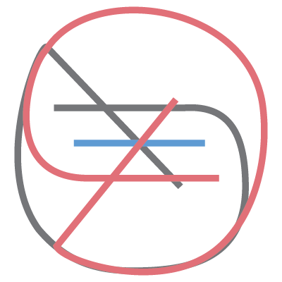
Created from the following code we’ve developed piece by piece:
根据以下代码创建的代码,我们已经逐步开发:
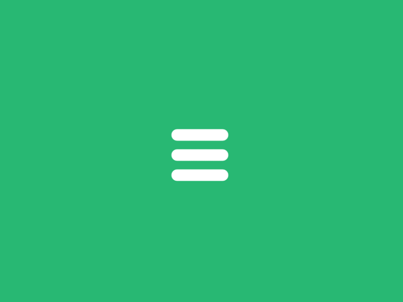
<svg width="100px" height="100px">
    <path d="M 30 40 L 70 40 C 90 40 90 75 60 85 A 40 40 0 0 1 20 20 L 80 80"></path>
    <path d="M 30 50 L 70 50"></path>
    <path d="M 70 60 L 30 60 C 10 60 10 20 40 15 A 40 38 0 1 1 20 80 L 80 20"></path>
</svg>
Now we need to add the proper CSS styles to the paths to achieve the desired effect, and an id to access them easily from our script. This is the HTML structure we’ll be using:
现在,我们需要在路径中添加适当CSS样式以获得所需的效果,并添加一个id以便从脚本中轻松访问它们。 这是我们将使用HTML结构:
<!-- Wrapper -->
<div id="menu-icon-wrapper" class="menu-icon-wrapper">
    <!-- SVG element with paths -->
    <svg width="100px" height="100px">
        <path id="pathA" d="M 30 40 L 70 40 C 90 40 90 75 60 85 A 40 40 0 0 1 20 20 L 80 80"/>
        <path id="pathB" d="M 30 50 L 70 50"/>
        <path id="pathC" d="M 70 60 L 30 60 C 10 60 10 20 40 15 A 40 38 0 1 1 20 80 L 80 20"/>
    </svg>
    <!-- Trigger to perform the animations -->
    <button id="menu-icon-trigger" class="menu-icon-trigger"></button>
</div>
And the CSS styles:
和CSS样式:
// The wrapper was defined with a fixed width and height
// Note, that the pointer-events property is set to 'none'.
// We don't need any pointer events in the entire element.
.menu-icon-wrapper{
    position: relative;
    display: inline-block;
    width: 34px;
    height: 34px;
    pointer-events: none;
    transition: 0.1s;
}

// To perform the scaled transform for the second demo
.menu-icon-wrapper.scaled{
    transform: scale(0.5);
}

// Adjusting the position of the SVG element
.menu-icon-wrapper svg{
    position: absolute;
    top: -33px;
    left: -33px;
}

// Defining the styles for the path elements
.menu-icon-wrapper svg path{
    stroke: #fff;
    stroke-width: 6px;
    stroke-linecap: round;
    fill: transparent;
}

// Setting the pointer-events property to 'auto',
// and allowing only events for the trigger element
.menu-icon-wrapper .menu-icon-trigger{
    position: relative;
    width: 100%;
    height: 100%;
    cursor: pointer;
    pointer-events: auto;
    background: none;
    border: none;
    margin: 0;
    padding: 0;
}
动画制作 (Animating)
With the SVG code ready, our task now is to figure out or to guess the easing functions used in each section of the animation, and to achieve a proper synchronization, always guided by the animated GIF. Let’s see how to animate the top and bottom bars of the hamburger icon. First, we need to initialize a segment for each bar with the initial begin and end values. Because we don’t have the information at hand but only the visual animation of the GIF, this is a trial and error process until we find the right values.
准备好SVG代码后,我们的任务是找出或猜测动画各部分中使用的缓动函数,并始终在动画GIF的指导下实现正确的同步。 让我们看看如何为汉堡包图标的顶部和底部栏设置动画。 首先,我们需要使用初始begin和end值为每个条形初始化一个段。 因为我们手头没有信息,而只有GIF的视觉动画,所以这是一个反复试验的过程,直到我们找到正确的值为止。
var pathA = document.getElementById('pathA'),
    pathC = document.getElementById('pathC'),
    segmentA = new Segment(pathA, 8, 32),
    segmentC = new Segment(pathC, 8, 32);
With that we are ready to animate, always keeping the same length (end - begin = 24) during the whole animation. Analyzing the animation sequence, we can see that the first part starts with a linear easing function, and ends with an elastic one. We’ll be using functions that receive the segment as a parameter to reuse the same function with the top and bottom bars, because they will be animated in the same way.
这样我们就可以进行动画制作了,在整个动画过程中始终保持相同的长度( end - begin = 24 )。 通过分析动画序列,我们可以看到第一部分以线性缓动函数开始,以弹性缓和函数结束。 我们将使用将segment作为参数接收的函数,以使用顶部和底部的条重复使用相同的函数,因为它们将以相同的方式进行动画处理。
// Linear section, with a callback to the next
function inAC(s) { s.draw('80% - 24', '80%', 0.3, {delay: 0.1, callback: function(){ inAC2(s) }}); }

// Elastic section, using elastic-out easing function
function inAC2(s) { s.draw('100% - 54.5', '100% - 30.5', 0.6, {easing: ease.ease('elastic-out', 1, 0.3)}); }

// Running the animations
inAC(segmentA); // top bar
inAC(segmentC); // bottom bar
We just need to repeat the same process for the middle bar:
我们只需要对中间条重复相同的过程:
// Initialize
var pathB = document.getElementById('pathB'),
    segmentB = new Segment(pathB, 8, 32);

// Expand the bar a bit
function inB(s) { s.draw(8 - 6, 32 + 6, 0.1, {callback: function(){ inB2(s) }}); }

// Reduce with a bounce effect
function inB2(s) { s.draw(8 + 12, 32 - 12, 0.3, {easing: ease.ease('bounce-out', 1, 0.3)}); }

// Run the animation
inB(segmentB);
To reverse the animation back to the hamburger icon we’ll be using:
要将动画反转回汉堡图标,我们将使用:
function outAC(s) { s.draw('90% - 24', '90%', 0.1, {easing: ease.ease('elastic-in', 1, 0.3), callback: function(){ outAC2(s) }}); }
function outAC2(s) { s.draw('20% - 24', '20%', 0.3, {callback: function(){ outAC3(s) }}); }
function outAC3(s) { s.draw(8, 32, 0.7, {easing: ease.ease('elastic-out', 1, 0.3)}); }

function outB(s) { s.draw(8, 32, 0.7, {delay: 0.1, easing: ease.ease('elastic-out', 2, 0.4)}); }

// Run the animations
outAC(segmentA);
outB(segmentB);
outAC(segmentC);
Finally, in order to perform the respective animation with the a click event, we can do something like this:
最后,为了通过click事件执行相应的动画,我们可以执行以下操作:
var trigger = document.getElementById('menu-icon-trigger'),
    toCloseIcon = true;

trigger.onclick = function() {
    if (toCloseIcon) {
        inAC(segmentA);
        inB(segmentB);
        inAC(segmentC);
    } else {
        outAC(segmentA);
        outB(segmentB);
        outAC(segmentC);
    }
    toCloseIcon = !toCloseIcon;
};
The animation is complete, but there is a little problem. It does not look exactly the same in all browsers. The path lengths seem to be calculated slightly different and so there is a small (but significant) difference, mainly between Firefox and Chrome. How do we fix it?
动画已经完成,但是有一点问题。 在所有浏览器中,它看起来并不完全相同。 计算出的路径长度似乎略有不同,因此主要是在Firefox和Chrome之间存在很小(但很明显)的差异。 我们该如何解决?
The solution is quite simple. We can simply make our SVG larger so that the paths are much longer, and then resize or scale down to the desired dimensions. In this case we have resized our SVG drawing to be 10 times larger than before, so we have the following code:
解决方案非常简单。 我们可以简单地使SVG更大,使路径更长,然后调整大小或缩小到所需的尺寸。 在这种情况下,我们将SVG绘图的大小调整为比以前大10倍,因此我们具有以下代码:
<svg width="1000px" height="1000px">
    <path id="pathA" d="M 300 400 L 700 400 C 900 400 900 750 600 850 A 400 400 0 0 1 200 200 L 800 800"></path>
    <path id="pathB" d="M 300 500 L 700 500"></path>
    <path id="pathC" d="M 700 600 L 300 600 C 100 600 100 200 400 150 A 400 380 0 1 1 200 800 L 800 200"></path>
</svg>
Then we have scaled down to the original dimensions with CSS:
然后,我们使用CSS缩小到原始尺寸:
.menu-icon-wrapper svg {
    transform: scale(0.1);
    transform-origin: 0 0;
}
Note that we also need to increase the float values in the JavaScript code (multiply by ten) and we’ll have to adjust the stroke-width attribute in the CSS. If you don’t mind very small cross-browser differences then you can also stick to the original size, but this workaround might help you troubleshoot some differences.
请注意,我们还需要增加JavaScript代码中的float值(乘以10),并且必须调整CSS中的stroke-width属性。 如果您不介意跨浏览器之间的差异很小,那么您也可以坚持使用原始大小,但是这种解决方法可以帮助您解决一些差异。
Today we’ve explored how to use the Segment library to achieve an elastic SVG animation. This is one of the possible ways to achieve this kind of effect. Now it’s your turn to do some creative SVG animations 🙂
今天,我们探讨了如何使用Segment库来实现弹性SVG动画。 这是达到这种效果的可能方法之一。 现在该轮到一些创意SVG动画了🙂
We hope you enjoyed this tutorial and find it useful!
我们希望您喜欢本教程并发现它有用!
Browser Support: 浏览器支持:ChromeSupported
支援Chrome
FirefoxSupported
Firefox支持
Internet ExplorerSupported from version 9+
9+版本开始支持Internet Explorer
SafariSupported
Safari支持
OperaSupported
歌剧支持
翻译自: https://tympanus.net/codrops/2015/11/12/animating-svg-menu-icon-segment/
把svg图标制作成字体图标


 530
530

 被折叠的 条评论
为什么被折叠?
被折叠的 条评论
为什么被折叠?
 到【灌水乐园】发言


