


纯css带更多选项卡
Content tabs are a very common and familiar element in web design, and often their turn out to be pretty useful. So, in this tutorial we are going to implement some simple CSS3 content tabs using radio buttons together with the :checked pseudo-class and sibling combinators.
内容选项卡是Web设计中非常常见且熟悉的元素,通常它们非常有用。 因此,在本教程中,我们将使用单选按钮以及:checked伪类和同级组合器来实现一些简单CSS3内容选项卡。
Note that the CSS3 properties will only work in browsers that support them.
请注意,CSS3属性仅在支持它们的浏览器中起作用。
标记 (The Markup)
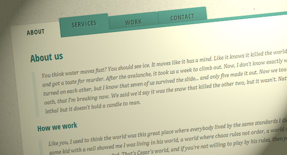
We will be using input elements to connect to the division with the class content. The content division includes all of the “tab pages”. For each input element we’ll have a label element. All labels will be styled like tabs.
我们将使用输入元素连接到具有类内容的部门。 内容划分包括所有“标签页”。 对于每个输入元素,我们将有一个label元素。 所有标签的样式将类似于标签。
<section class="tabs">
    <input id="tab-1" type="radio" name="radio-set" class="tab-selector-1" checked="checked" />
	<label for="tab-1" class="tab-label-1">About us</label>

	<input id="tab-2" type="radio" name="radio-set" class="tab-selector-2" />
	<label for="tab-2" class="tab-label-2">How we work</label>

	<input id="tab-3" type="radio" name="radio-set" class="tab-selector-3" />
	<label for="tab-3" class="tab-label-3">References</label>

	<input id="tab-4" type="radio" name="radio-set" class="tab-selector-4" />
	<label for="tab-4" class="tab-label-4">Contact us</label>

	<div class="clear-shadow"></div>

	<div class="content">
		<div class="content-1">
            <p>Some content</p>
		</div>
		<div class="content-2">
            <p>Some content</p>
		</div>
		<div class="content-3">
            <p>Some content</p>
		</div>
		<div class="content-4">
            <p>Some content</p>
		</div>
	</div>
</section>
Every input element has a value, and we can always make an input selected by default by adding the checked attribute.
每个输入元素都有一个值,我们总是可以通过添加选中的属性来默认选择一个输入。
CSS (The CSS)
The first thing we need to do is to define some dimension and hide the inputs by setting their opacity to 0:
我们需要做的第一件事是定义一些尺寸并通过将输入的不透明度设置为0来隐藏输入:
tabs {
    position: relative;
	margin: 40px auto;
	width: 750px;
}

.tabs input {
	position: absolute;
	z-index: 1000;
	width: 120px;
	height: 40px;
	left: 0px;
	top: 0px;
	opacity: 0;
	cursor: pointer;
}
.tabs input#tab-2{
	left: 120px;
}
.tabs input#tab-3{
	left: 240px;
}
.tabs input#tab-4{
	left: 360px;
}
The inputs will be covering the labels. It will seem, as if we click on the label, but actually we are clicking on the input. This is a trick that will also work in mobile browsers (in some mobile browsers, simply clicking the label will not focus the associated input).
输入将覆盖标签。 看起来好像我们单击了标签,但是实际上我们正在单击输入。 这是一个技巧,也可以在移动浏览器中使用(在某些移动浏览器中,仅单击标签不会使相关输入集中)。
Next, we will make the labels look like tabs by defining some neat style for them. Note that each of the labels has a different z-index. A box-shadow will add depth and realism to the tabs.
接下来,通过为标签定义一些整洁的样式,使标签看起来像标签。 请注意,每个标签都有不同的z-index 。 盒子阴影将为选项卡增加深度和真实感。
.tabs label {
	background: linear-gradient(top, #5ba4a4 0%,#4e8c8a 100%);
	font-size: 15px;
	line-height: 40px;
	height: 40px;
	position: relative;
	padding: 0 20px;
    float: left;
	display: block;
	width: 80px;
	color: #385c5b;
	letter-spacing: 1px;
	text-transform: uppercase;
	font-weight: bold;
	text-align: center;
	text-shadow: 1px 1px 1px rgba(255,255,255,0.3);
    border-radius: 3px 3px 0 0;
    box-shadow: 2px 0 2px rgba(0,0,0,0.1), -2px 0 2px rgba(0,0,0,0.1);
}

.tabs input:hover + label {
	background: #5ba4a4;
}

.tabs label:first-of-type {
    z-index: 4;
    box-shadow: 2px 0 2px rgba(0,0,0,0.1);
}

.tab-label-2 {
    z-index: 3;
}

.tab-label-3 {
    z-index: 2;
}

.tab-label-4 {
    z-index: 1;
}
Since we don’t want the bottom part of the box-shadow to show, we will cover it by using a :after pseudo-element with no content:
由于我们不希望显示框阴影的底部,因此我们将使用:after伪元素将其覆盖,其中不包含任何内容:
.tabs label:after {
    content: '';
	background: #fff;
	position: absolute;
	bottom: -2px;
	left: 0;
	width: 100%;
	height: 2px;
	display: block;
}
When we click on a tab (label), it will be different in style and color from the others. The important thing is to make sure that the “checked” label will be on top of all of the other layers in the tabs. So, we will give it the highest z-index:
当我们单击一个选项卡(标签)时,它的样式和颜色将与其他样式不同。 重要的是要确保“已选中”标签将位于选项卡中所有其他层的顶部。 因此,我们将为其赋予最高的z-index:
.tabs input:checked + label {
    background: #fff;
	z-index: 6;
}
As mentioned before, the content division will contain all of the tab pages, and we will set its z-index to 5, just to be under the selected label. In this way, the box-shadow of content area will cover all of the other labels.
如前所述,内容分区将包含所有标签页,我们将其z-index设置为5,仅在所选标签下。 这样,内容区域的盒子阴影将覆盖所有其他标签。
Inside the content area, there are four divisions and each of them has their own content. By default (when their respective label is not selected/clicked) we want them to be hidden. So, we set the opacity to zero and the z-index to 1. We cannot use the display: none property because it’s not supported in transitions.
在内容区域内,有四个部门,每个部门都有自己的内容。 默认情况下(当未选择/单击它们各自的标签时),我们希望它们被隐藏。 因此,我们将不透明度设置为零,将z-index设置为1。我们不能使用display:none属性,因为transitions不支持该属性。
.content {
    background: #fff;
	position: relative;
    width: 100%;
	height: 370px;
	z-index: 5;
    box-shadow: 0 -2px 3px -2px rgba(0,0,0,0.2), 0 2px 2px rgba(0,0,0,0.1);
    border-radius: 0 3px 3px 3px;
}

.content div {
    position: absolute;
	top: 0;
	left: 0;
	padding: 10px 40px;
	z-index: 1;
    opacity: 0;
    transition: all linear 0.1s;
}

.content div h2,
.content div h3{
	color: #398080;
}
.content div p {
	font-size: 14px;
	line-height: 22px;
	font-style: italic;
	text-align: left;
	margin: 0;
	color: #777;
	padding-left: 15px;
	font-family: Cambria, Georgia, serif;
	border-left: 8px solid rgba(63,148,148, 0.1);
}
When we want a content to appear (label clicked) we set the opacity to 1 and raise the z-index because we want this content division to be on top of all the others:
当我们希望某个内容出现(单击标签)时,我们将不透明度设置为1并提高z-index,因为我们希望该内容划分位于所有其他内容之上:
.tabs input.tab-selector-1:checked ~ .content .content-1,
.tabs input.tab-selector-2:checked ~ .content .content-2,
.tabs input.tab-selector-3:checked ~ .content .content-3,
.tabs input.tab-selector-4:checked ~ .content .content-4 {
    z-index: 100;
    opacity: 1;
    transition: all ease-out 0.2s 0.1s;
}
In this tutorial we just went through the basic example that will fade in/out the contents. You can find more styles and effects in the demos.
在本教程中,我们仅介绍了将内容淡入/淡出的基本示例。 您可以在演示中找到更多样式和效果。
This tutorial is part of the CSS3 series on Codrops. Check out the other experiments:
本教程是Codrops上CSS3系列的一部分。 查看其他实验:
翻译自: https://tympanus.net/codrops/2012/04/12/animated-content-tabs-with-css3/
纯css带更多选项卡


 357
357


 被折叠的 条评论
为什么被折叠?
被折叠的 条评论
为什么被折叠?
 到【灌水乐园】发言


