


 本文是关于如何在Power BI中利用ArcGIS Maps进行深入的地理地图分析的教程。介绍了ArcGIS的基本概念,以及如何在Power BI中使用ArcGIS Maps进行空间分析,包括设置地图主题、数据聚类、颜色和大小表示,以及时间分析等功能。通过实例展示了如何结合人口数据和机场交通数据,揭示地理信息的关联性和趋势。
介绍 (Introduction)
This is the fourth article of a series dedicated to discovering geographic map tools in Power BI.
这是致力于在Power BI中发现地理地图工具的系列文章的第四篇。
In the ToC below the article you can find out references to the previous article and the project’s goal.
在文章下面的目录中,您可以找到对上一篇文章和项目目标的引用。
So, this time I want to introduce another visual that goes beyond the simple concept of mapping as it provides tools and features for spatial analysis: ArcGIS.
因此,这一次,我想介绍另一种超越简单映射概念的视觉效果,因为它提供了用于空间分析的工具和功能: ArcGIS 。
什么是GIS? (What is a GIS?)
A GIS (Geographical Information System) is a computer-based tool that analyzes, stores, manipulates and visualizes geographic information on a map. GIS main purpose is to show correlation among spatial data, analyze spatial information, query geographic data and show the results in form of reports, maps, tables or any other output is suitable for you.
GIS(地理信息系统)是一种基于计算机的工具,可以分析,存储,操纵和可视化地图上的地理信息。 GIS的主要目的是显示空间数据之间的相关性,分析空间信息,查询地理数据并以报告,地图,表格或任何其他适合您的输出形式显示结果。
GIS analysis can be used in various fields of activity as it is powerful and flexible enough to address many needs in different disciplines. Just to mention few examples: business, public and private transport, education, natural hazards assessment, public health, resources optimization…
GIS分析功能强大且足够灵活,可以满足不同学科的许多需求,因此可以用于各种活动领域。 仅举几个例子:商业,公共和私人交通,教育,自然灾害评估,公共卫生,资源优化……
用于Power BI的ArcGIS Maps (ArcGIS Maps for Power BI)
ArcGIS is the software developed by Esri (Environmental System Research Institute), for creating and using maps, performing spatial analysis, sharing and discovering geographic information.
ArcGIS是由Esri (环境系统研究所)开发的软件,用于创建和使用地图,执行空间分析,共享和发现地理信息。
自2016年9月以来,Power BI团队与Esri合作发布了可在Power BI中使用ArcGIS Maps的图像 。
Recently the visual came into General Availablity, so it can also be used in PowerBI Service (www.powerbi.com).
最近,该图像已进入通用范围 ,因此也可以在PowerBI Service(www.powerbi.com)中使用。
The visual includes a set of map tools that let you use powerful spatial capabilities going beyond the simple representation. For instance, you can change the map theme, make area-based selections, add layers with demographic data, etc. Going forward in the explanation, you’ll got the right feeling on how you can “Take Your Map Visualizations to the Next Level”.
视觉效果包括一组地图工具,可让您使用除简单表示之外的强大空间功能。 例如,您可以更改地图主题,进行基于区域的选择,添加包含人口统计数据的图层等。在进行解释时,您将对如何“将地图可视化效果提升到一个新水平 ”有正确的感觉。 ”。
To start with demo, as usual we need some data. Download the same .csv dataset with 50 world’s busiest airports we used in the first article. You can find at the end of the article.
要开始演示,像往常一样,我们需要一些数据。 下载与我们在第一篇文章中使用的50个世界上最繁忙的机场相同的.csv数据集。 您可以在文章末尾找到。
Once downloaded, start Power BI open a new report and click Get Data > Text/CSV. Select the location for the dataset and then in the dialog click Load to import it. For this dataset we need to perform the same transformation as in the first article How to create geographic maps using Power BI – Filled and bubble maps. ArcGIS is capable of geocode many kinds of geographic attributes such as addresses, cities, postal codes, etc. but it’s preferable to retrieve coordinates when available, for having a perfect matching with locations.
下载后,启动Power BI打开一个新报告,然后单击获取数据 > 文本/ CSV 。 选择数据集的位置,然后在对话框中单击“ 加载”以将其导入。 对于此数据集,我们需要执行与第一篇文章如何使用Power BI-填充地图和气泡地图创建地理地图相同的转换。 ArcGIS可以对多种地理属性(例如地址,城市,邮政编码等)进行地理编码,但最好在可用时检索坐标,以与位置完美匹配。
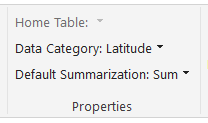
Select the field Latitude then in the menu bar click Modeling > Data Category > Latitude
选择字段纬度,然后在菜单栏中单击建模>数据类别>纬度
Repeat the same steps for the field Longitude.
对“ 经度 ”字段重复相同的步骤。
Notice the globe sign beside the fields’ name.
注意字段名称旁边的地球符号。
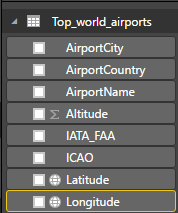
It means that Power BI marked the two fields as containing geographic coordinates.
这意味着Power BI将这两个字段标记为包含地理坐标。
The second group of data is the “List of busiest airport by passenger traffic” from Wikipedia, we already used in the first article. You can either refer to the article for data handling or download the ready-made dataset “passengers traffic statistics 2016.csv” at the end of the article.
第二组数据是Wikipedia中的“按客运量列出最繁忙的机场列表”,我们已经在第一篇文章中使用过。 您可以参考本文进行数据处理,也可以在文章末尾下载现成的数据集“ 旅客交通统计数据2016.csv ”。
Once downloaded and imported the dataset, one step more is needed in order to have some data to display.
一旦下载并导入了数据集,则需要多一步才能显示一些数据。
Switch from report view to Relationship
从报告视图切换到关系
Power BI tries to establish a connection between the two datasets and suggests the ICAO code as common key.
Power BI尝试在两个数据集之间建立连接,并建议将ICAO代码作为通用密钥。
This could work for us, although I prefer the standard three-letters IATA code. So double click on the connection’s yellow line and in the Edit Relationship dialog select the IATA field from both datasets, then click OK. Don’t forget to save your file and get back to the report page.
尽管我更喜欢标准的三字母IATA代码,但这可能对我们有用。 因此,双击连接的黄线,然后在“ 编辑关系”对话框中,从两个数据集中选择IATA字段,然后单击“确定”。 不要忘记保存文件并返回报告页面。
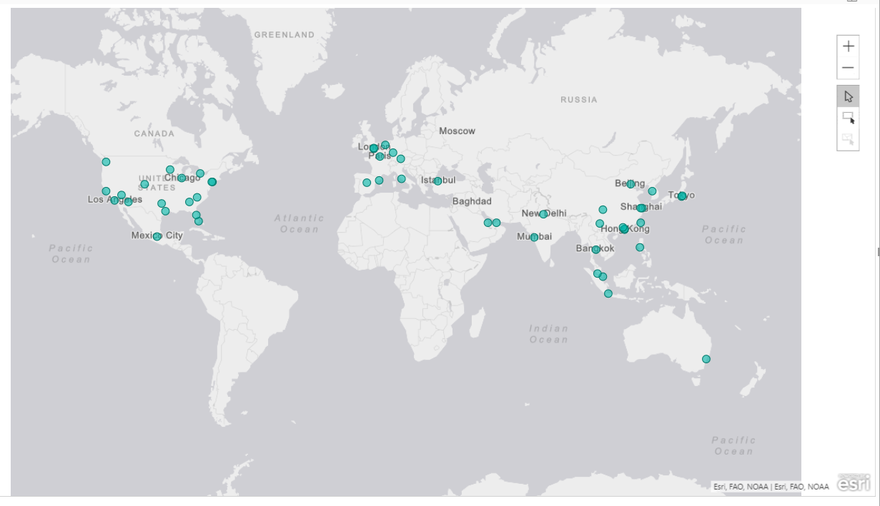
Now that we have some data, let’s see the visual in action. Click on the ArcGIS map icon
现在我们有了一些数据,让我们看一下视觉效果。 单击ArcGIS地图图标
Drag and drop Latitude and Longitude from “Top_world_airports” into the respective boxes; a simple world maps shows up where the points represent the airports location.
将“ 经度和纬度 ”从“ Top_world_airports ” 拖放到相应的框中; 会显示一个简单的世界地图,这些点代表机场的位置。
 最低0.47元/天 解锁文章


 3919
3919

 被折叠的 条评论
为什么被折叠?
被折叠的 条评论
为什么被折叠?
 到【灌水乐园】发言


