


 本文介绍了Bootstrap网格系统中响应式列、嵌套列和偏移列的概念及使用方法。响应列根据设备视口大小使用不同网格布局,嵌套列通过在现有列内添加ROW和col-*-*实现内容测试,偏移列提供特殊布局,通过offset-*-*增加列的左边距。文中给出了实例说明。
wrf 嵌套网格作用
介绍 (Introduction)
In the previous article, we have learnt what is grid and grid system and how it works? Now, we will learn about how Responsive column, Nesting Columns and Offset Columns works and how to use them? If you have any doubt, feel free to ask in the comment section.
在上一篇文章中,我们了解了什么是网格和网格系统以及它如何工作 ? 现在,我们将了解响应列,嵌套列和偏移列的工作方式以及如何使用它们 ? 如有任何疑问,请随时在评论部分提问。
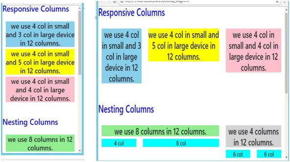
响应列 (Responsive Columns)
We know that we have four grid classes (xs, sm, md, lg). So, in these Responsive columns, we use one or all four grid for layout, according to the device or viewport size. It’s up to you in how many columns you want to divide Grid individually in your page; on different devices and how many columns group you want on different devices.
我们知道我们有四个网格类( xs , sm , md , lg )。 因此,在这些“响应式”列中,根据设备或视口的大小,我们使用一个或所有四个网格进行布局。 由您决定要在页面中分别划分Grid的几列; 在不同的设备上,以及您希望在不同的设备上有多少列组。
Example:
例:
In the following example, the layout has been divided into two grid class (sm & md) for different device viewport. We are dividing here columns for small devices as .col-sm-4, .col-sm-4, .col-sm-4 and for large device.col-md-4 .col-md-3, .col-md-5.
在以下示例中,针对不同的设备视口,布局已分为两个网格类( sm & md )。 对于小型设备,我们在这里划分列为.col-sm-4 , .col-sm-4 , .col-sm-4和大型设备 .col-md- 4.col -md-3 , .col-md -5 。
<! ---------- Responsive columns ---------->
<h2 style="color:blue;">Responsive Columns</h2><br />

<div class="container-fluid">
	<div class="row">
		<div class="col-sm-4 col-md-3">
			<h3 style="background-color:skyblue;text-align:center;">
				we use 4 col in small and 3 col in large device in 12 columns.
			</h3>
		</div>

		<div class="col-sm-4 col-md-5">
		<h3 style="background-color:yellow;text-align:center;">
			we use 4 col in small and 5 col in large device in 12 columns.
		</h3>
		</div>
		<div class="col-sm-4 col-md-4">
		<h3 style="background-color:pink;text-align:center;">
			we use 4 col in small and 4 col in large device in 12 columns.
		</h3>
		</div>
	</div>
</div>
嵌套列 (Nesting Columns)
It is similar to something we have already used, that is; the nested loop and conditional statement in programming languages (In C, C++ & other). To test your content, you have to add a row and col-*-* class within an existing col-*-* class.
它类似于我们已经使用过的东西,即; 编程语言(在C,C ++和其他语言中)的嵌套循环和条件语句。 要测试你的内容,你必须添加一个ROW和COL - * - - *类现有的山坳内*类- *。
Note: The nested row should include scales up to 12 columns as the device or viewport.
注意:嵌套的行最多应包含12列作为设备或视口的比例。
Example:
例:
In the following example, layout has been divided into two columns .col-sm-8 and .col-sm-4 both are split into two parts, In which first one is split into .col-sm-4 and .col-sm-8 & second is split into .col-sm-6 and .col-sm-6.
在下面的示例中,布局已分为两列。.col-sm-8和.col-sm-4都分为两部分,其中第一个部分分为.col-sm-4和.col-sm -8 &秒分为.col-sm-6和.col-sm-6 。
<!----------- Nesting Columns --------------->
<h2 style="color:blue;">Nesting Columns</h2><br />

<div class="container-fluid">
	<div class="row">
		<div class="col-sm-8">
			<h3 style="background-color:lightgreen;text-align:center;">
				we use 8 columns in 12 columns.
			</h3>
			<div class="row">
				<div class="col-sm-4">
					<h5 style="background-color:Aqua;text-align:center;">4 col</h5>
				</div>
				<div class="col-sm-8">
					<h5 style="background-color:Aqua;text-align:center;">8 col</h5> </div>
				</div>
		</div>

		<div class="col-sm-4">
			<h3 style="background-color:lightgrey;text-align:center;">
				we use 4 columns in 12 columns.
			</h3>
			<div class="row">
				<div class="col-sm-6">
					<h5 style="background-color:Aqua;text-align:center;">6 col</h5>
				</div>
				<div class="col-sm-6">
					<h5 style="background-color:Aqua;text-align:center;">6 col</h5>
				</div>
			</div>
		</div>
	</div>
</div>
Mobile and tablet view for Both Responsive and Nesting columns:
响应式和嵌套式列的移动设备和平板电脑视图:
Desktop view for Both Responsive and Nesting columns:
响应列和嵌套列的桌面视图:

偏移列 (Offset Columns)
You can also use offset grid columns. It provides a specialized layout. It also has four grid classes. For this, we have to use offset -*-*. These classes are used to increase the left margin of columns where columns can move an only right side and we increase left margin to the columns by using offset -*-* and it ranges from 1-11. Margins are more useful for quick layouts where the variable is the width of the offsets.
您也可以使用偏移网格列。 它提供了专门的布局。 它还具有四个网格类别。 为此,我们必须使用offset -*-* 。 这些类用于增加列的左边距,其中列只能向右移动,我们通过使用偏移量-*-*来增加列的左边距,范围为1-11。 边距对于变量为偏移宽度的快速布局更有用。

Example:
例:
In the following example, specialized layout is used and divided into two columns (col-md-4 col-sm-4 col-lg-4) and (col-md-4 col-sm-4 col-lg-4). Here, we use offset in both the splitted columns offset-md-2 & offset-md-1 as you can see in the example. Under this spitted two columns we again use offset in contact; we use offset for margin where offset-md-2 & offset-md-0 moves over columns col-md-4 col-sm-4 col-lg-4 offset-md-2 & col-md-4 col-sm-4 col-lg-4 offset-md-1.
在以下示例中,使用专用布局并将其分为两列( col-md-4 col-sm-4 col-lg-4 )和( col-md-4 col-sm-4 col-lg-4 )。 在此示例中,我们在两个拆分列中使用了offset偏移量offset-md-2和offset-md-1 。 在这个分散的两列下,我们再次使用偏移量接触; 我们使用offset作为余量,其中offset-md-2和offset-md-0在列col-md-4 col-sm-4 col-lg-4 offset-md-2和col-md-4 col-sm-上移动4 col-lg-4 offset-md-1 。
<!----------- Offset Columns --------------->
<h2 style="color:blue;">Offset Columns</h2>
<br />
<div class="container-fluid">
<div class="row">
<div class= "col-md-4 col-sm-4 col-lg-4 offset-md-2">
<h1>Contact</h1>
<br>
<div class="row">
   <div class="col-sm-8 col-lg-5 offset-md-2">
      <form action="" target="_blank">
         <p><input type="text" placeholder="Name" class="box" required name="Name"></p>
         <p><input	type="text"
            placeholder="Comments"	required	name="Comment"	class="box"
            style=" height:150px;"></p>
         <p><button style="color:black; margin-left:35%" class="btn btn-info" type="submit"><b>SUBMIT</b></button></p>
      </form>
   </div>
</div>
<div class= "col-md-4 col-sm-4 col-lg-4 offset-md-1">
   <h1>Contact</h1>
   <br>
   <div class="col-md-5 col-lg-5 offset-md-0">
      <form action="" target="_blank">
         <p><input type="text" placeholder="Name" class="box" required name="Name"></p>
         <p><input	type="text"
            placeholder="Comments"	required	name="Comment"	class="box"
            style=" height:150px;"></p>
         <p><button style="color:black; margin-left:35%" class="btn btn-info" type="submit"><b>SUBMIT</b></button></p>
      </form>
   </div>
</div>
Mobile and tablet view for Offset columns:
偏移列的移动设备和平板电脑视图:

Desktop view for Offset columns:
偏移列的桌面视图:

Conclusion:
结论:
So, Let’s conclude with what we have learnt here.like-what is Responsive columns, Nesting columns, Offset Columns and how to use them, with examples. I hope now, you gained an insight into how can we use these different amazing classes for creating a responsive page. Stay tuned for the next article. We will dig deeper and discover more about Bootstrap. See you in the next Article! Happy Learning!
因此,让我们以在这里学到的内容作为结束。例如-什么是响应列,嵌套列,偏移列以及如何使用它们,并带有示例。 我希望现在,您了解了我们如何使用这些不同的惊人类来创建响应式页面。 请继续关注下一篇文章。 我们将更深入地探索并发现更多有关Bootstrap的信息。 下篇再见! 学习愉快!
wrf 嵌套网格作用


 1622
1622

 被折叠的 条评论
为什么被折叠?
被折叠的 条评论
为什么被折叠?
 到【灌水乐园】发言


