


css 2d转换
CSS | 2D转换 (CSS | 2D Transformation)
2D transformation in CSS allows you to move, rotate, scale, and skew elements shape, size and position along the x-axis and y-axis.
CSS中的2D转换使您可以沿x轴和y轴移动 , 旋转 , 缩放和倾斜元素的形状,大小和位置。
In CSS, 2D transform property allows you to use the following 2D transformation methods,
在CSS中, 2D变换属性允许您使用以下2D变换方法,
rotate()
旋转()
translate()
翻译()
scale()
规模()
Skew()
偏斜()
matrix()
矩阵()
Let's look at each method one by one.
让我们逐一查看每种方法。
1)旋转() (1) rotate())
rotate() property defines a transformation that moves the element around a fixed point on the x-axis in either clockwise or anti-clockwise direction.
rotation()属性定义了一种转换,该转换可沿x轴上的固定点沿顺时针或逆时针方向移动元素。
Syntax:
句法:
Element{
	transform:rotate(30deg);
}
Example:
例:
<!DOCTYPE html>
<html>

<head>
    <style>
        div {
            width: 300px;
            height: 100px;
            background-color: pink;
            border: 1px solid black;
        }

        div#myDiv {
            transform: rotate(45deg);
        }
    </style>
</head>

<body>
    <div>
        this is div
    </div>
    <div id="myDiv">
        this div element is rotated clockwise 45 degrees.
    </div>
</body>

</html>
Output
输出量
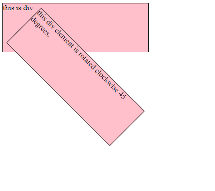
In the above example, the <div> element is rotated clockwise 45 degrees.
在上面的示例中, <div>元素顺时针旋转45度。
2)translate() (2) translate())
translate() property moves the position of the element from the current position on the X-axis and Y-axis.
translate()属性将元素的位置从X轴和Y轴上的当前位置移开。
translateX() - Moves the position of the element on the X-axis.
translateX() -在X轴上移动元素的位置。
translateY() - Moves the position of the element on the Y-axis.
translateY() -在Y轴上移动元素的位置。
Syntax:
句法:
Element{
	transform:translate(30px,10px);
}
Example:
例:
<!DOCTYPE html>

<html>
<head>
    <style>
        div {
            width: 300px;
            height: 100px;
            background-color: pink;
            border: 1px solid black;
            transform: translate(60px, 80px);
        }
    </style>
</head>

<body>
    <h1>2D transformation</h1>
    <div>
        This is a div element.
    </div>
</body>

</html>
Output
输出量

In the above example, <div> element 60 pixels to the right, and 80 pixels down from its current position.
在上面的示例中, <div>元素向右60像素,从当前位置向下80像素。
3)scale() (3) scale())
scale() property modifies the size of the element on the X and Y-axis.
scale()属性修改X和Y轴上元素的大小。
scaleX() - Modifies the size of the element on the X-axis. scaleY() - Modifies the size of the element on the Y-axis.
scaleX() -修改X轴上元素的大小。 scaleY() -修改Y轴上元素的大小。
Syntax:
句法:
Element{
	transform:scale(2,3);
}
Example:
例:
<!DOCTYPE html>

<html>

<head>
    <style>
        div {
            margin: 150px;
            width: 200px;
            height: 100px;
            background-color: pink;
            border: 1px solid black;
            transform: scale(2, 3);
        }
    </style>
</head>

<body>
    <h1>2D transformation</h1>
    <div>
        This is div element.
    </div>
</body>

</html>
Output
输出量

In the above example, element <div> increases to 3 times of its original height, and 2 times of its original width.
在上面的示例中,元素<div>增加到其原始高度的3倍和其原始宽度的2倍。
4)偏斜() (4) skew())
Shear mapping or skewing each point of an element by a certain angle along the X-axis or Y-axis.
沿着X轴或Y轴以一定角度剪切或映射元素的每个点。
skewX() - Horizontally skewing each point of an element by a certain angle in the horizontal direction.
skewX() -将元素的每个点沿水平方向水平倾斜一定角度。
skewY() - Vertically skewing each point of an element by a certain angle in the vertical direction.
skewY() -在垂直方向上将元素的每个点垂直倾斜一定角度。
Syntax:
句法:
Element{
	transform:skew(3,4);
}
Example:
例:
<!DOCTYPE html>
<html>

<head>
    <style>
        div {
            margin: 150px;
            width: 200px;
            height: 100px;
            background-color: pink;
            border: 1px solid black;
            transform: scale(1, 2);
        }
    </style>
</head>

<body>
    <h1>2D transformation</h1>
    <div>
        This is div element.
    </div>
</body>

</html>
Output
输出量

In the above example, skews the <div> element 1px along the X-axis, and 2px along the Y-axis.
在上面的示例中, <div>元素在X轴上倾斜1px,在Y轴上倾斜2px。
5)matrix() (5) matrix())
matrix() property defines a 2D transformation in the form of a transformation matrix. The method matrix() takes six parameters which allow you to rotate, scale, translate, and skew elements in respective order.
matrix()属性以转换矩阵的形式定义2D转换。 方法matrix()具有六个参数,这些参数使您可以按相应顺序旋转,缩放,平移和倾斜元素。
Syntax:
句法:
Element{
	transform:matrix(1, -0.3, 0, 1, 0, 0);
}
Example:
例:
<!DOCTYPE html>
<html>

<head>
    <style>
        div {
            width: 300px;
            height: 100px;
            background-color: pink;
            border: 1px solid black;
            transform: matrix(1, -0.3, 0, 1, 0, 0);
        }
    </style>
</head>

<body>
    <h1>2D transformation</h1>
    <div>
        This a div element..
    </div>
</body>

</html>
Output
输出量

In the above example, matrix() property is used.
在上面的示例中,使用了matrix()属性。
翻译自: https://www.includehelp.com/code-snippets/2d-transformation-using-css.aspx
css 2d转换


 扫一扫
扫一扫
 221
221

 被折叠的 条评论
为什么被折叠?
被折叠的 条评论
为什么被折叠?
 到【灌水乐园】发言


