


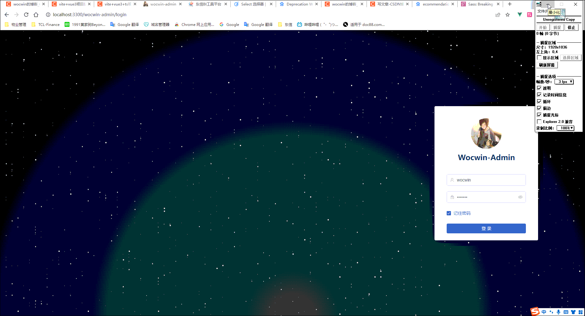
最终效果
具体代码实现
1、html
<div class="content">
      <div class="star1"></div>
      <div class="star2"></div>
      <div class="star3"></div>
      <div class="star4"></div>
      <div class="star5"></div>
</div>
2、scss
<style lang="scss">
@function getShadows($n) {
  $shadows: "#{random(100)}vw #{random(100)}vh #fff";
  @for $i from 2 through $n {
    $shadows: "#{$shadows},#{random(100)}vw #{random(100)}vh #fff";
  }
  @return unquote($shadows);
}
@keyframes moveUp {
  100% {
    transform: translateY(-100vh);
  }
}
$duration: 500s;
$count: 1200;
 .content {
     display: flex;
	 align-items: center;
	 justify-content: center;
	 height: 100vh;
	 overflow: hidden;
	 background: radial-gradient(ellipse at bottom, #1b2735 0%, #090a0f 100%);
	 background-size: cover;
    @for $i from 1 through 5 {
      $duration: floor(calc($duration / 2));
      $count: floor(calc($count / 2));
      .star#{$i} {
        $size: #{$i}px;
        position: fixed;
        top: 0;
        left: 0;
        width: $size;
        height: $size;
        border-radius: 50%;
        box-shadow: getShadows($count);
        animation: moveUp $duration linear infinite;
        &::after {
          position: fixed;
          top: 100vh;
          left: 0;
          width: $size;
          height: $size;
          content: "";
          border-radius: inherit;
          box-shadow: inherit;
        }
      }
    }
  }
</style>
相关文章
Vue3 + Vite4 + Ts + Qiankun 后台管理系统模板


 6644
6644


 被折叠的 条评论
为什么被折叠?
被折叠的 条评论
为什么被折叠?
 到【灌水乐园】发言


