One of my personal favorite things about good code and well-designed features is self-documentation. For the most part, a successful implementation of a feature without having to dive into online documentation feels like...well, magic.

Auto Layout however, has a few features that aren't very self-explanatory. Among these features are Content Hugging & Content Compression Priorities. BUT, before we go into these two features, we need to understand something else first - Intrinsic Content Size
INTRINSIC CONTENT SIZE
You may have seen this property on UIView and it's fairly simple to understand. For most cases, a view knows more about what it's size should be than the system laying it out. Auto Layout takes advantage of this when determining what size a view should be. A view, such as a UILabel, will know what size it's content is. In the case of a UILabel, it determines it from the text. For other cases like a UIImageView, it gets determined through the size of the original image, etc. View's with intrinsic content sizesgenerally size themselves. However, this is not always a hard and fast rule. In many cases, your NSLayoutConstraints can be defined in a way that can be satisfied in multiple ways. To restrict how many ways constraints can be satisfied and define more strict behaviors, we can take advantage of content hugging and content compression resistance priorities to help a brotha out.

THE MORE YOU LEARN, THE MORE YOU KNOW
Both of these properties can be set along both Vertical & Horizontal axes. This means that you can set priorities for both the width and height of a view.
Along either of these axes, you also have levels that you can set for them. These levels map to a number from 1-1000 where 1 is aLow priority and 1000 is a Required priority. These priority values are really important because their values are what determine a view's sizing behavior. What's also important to remember is that they are comparative values. In the cases where there are constraint conflicts between two or more views, Auto Layout looks at these values and sizes them in order from highest priority to the smallest priority.
CONTENT HUGGING PRIORITY
When you want a view to resist growing larger than it's intrinsic content size, this is the property you want to be looking at. Let's take an easy example: two labels (a multi-line title label and a multi-line description label) stacked on top of each other in aUITableViewCell like so:

Currently, our titleLabel and descriptionLabel have equal vertical content hugging priorities of 250 each. This is fine because of how big the cell currently is, but what happens when we make the cell bigger than that? Which label should grow with it? Should they both grow at the same time? Can you guess which label grows and which hugs it's content? I can't.
"Well, what's the answer?!", you say?
SPOILERS: raising the height of the cell in the storyboard actually produces this result and even gives us a nifty error:
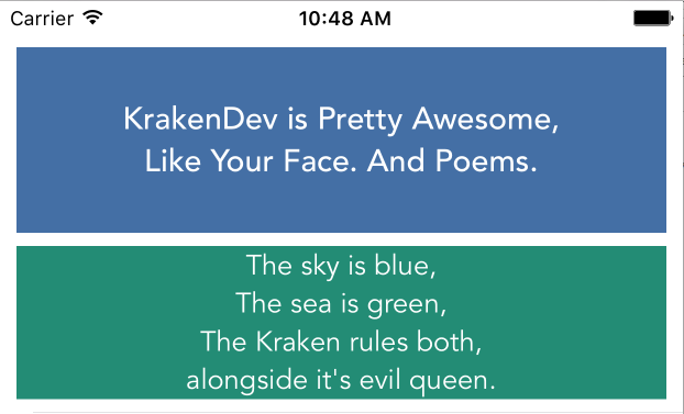

In a situation like our two stacked labels, Auto Layout needs a way to figure out which of the two labels to expand. It does so by inspecting each label's priority behaviors. In the case of content hugging, the label with the lowest priority will lose and in turn, willgrow with it's container. The label with the higher priority does the inverse; it wins the battle of priorities and keeps it's size to match it's intrinsic content size. If both happen to be equal to each other, then the system can choose any view to expand that it feels like. Undefined behavior like this is never good as it can vary from OS to OS.
In our example, it's obvious that we want our single line title label to be as tall as it's content, and our multi line description label to be flexible in height. To do so, we simply have to make sure the title label's vertical content hugging priority is higher than our description label's content hugging priority. By making our titleLabel's content hugging priority higher than our descriptionLabel, we get this result:
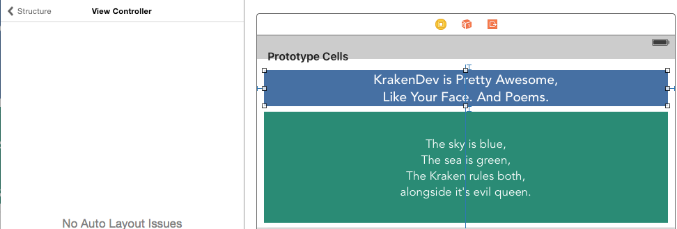
Hooray! No Auto Layout issues!
CONTENT COMPRESSION RESISTANCE PRIORITY
When you want a view to resist being resized smaller than it's content, then this is the property that you want to be looking at. As indicated in it's name, a higher Compression Resistance Priority on a view ensures that it doesn't shrink enough to truncate it's contents.
In the case of our stacked label example, this can happen when the cell shrinks smaller than the contents of our two labels. In a situation like that, Auto Layout needs to figure out which label to shrink first. How it chooses is by shrinking the label with thelower compression resistance. Since both our titleLabel and descriptionLabel's compression resistances are equal, we can't tell right away which label is going to shrink. Which label is going to shrink with the cell? Do they both clip? Well, as it turns out, this happens:
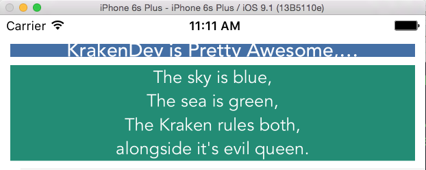
Sad titleLabel is sad.
This result isn't necessarily what we want. In our example, the label we don't want shrinking, again, is the title label since the description label can be truncated if need be. To ensure our title label doesn't truncate it's contents, we want to make sure it's compression resistance priority is higher than our description label's compression resistance. This will make sure that Auto Layout will have to shrink the description label if it faces a situation like the one we just came from. By making the compression resistance priority of the titleLabel higher than the description label, we get this nice truncated result:
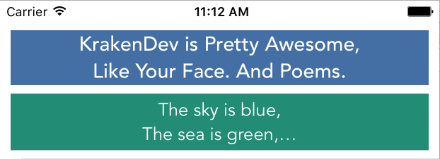

DOING THE DEED
For both Content Hugging and Content Compression Resistance Priorities, there are two ways to set them: Programmatically & through Interface Builder.
Here's how it looks programmatically:
titleLabel.setContentCompressionResistancePriority(UILayoutPriorityRequired, forAxis: .Horizontal)
descriptionLabel.setContentHuggingResistancePriority(UILayoutPriorityDefaultLow, forAxis: .Horizontal)
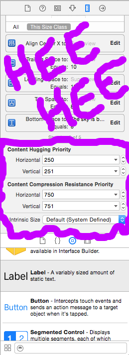
Interface Builder (as it is for most view related properties) has been by far the easiest way to set them. In your storyboard, navigate to the Size Inspector (where your constraints normally live) and scroll to the bottom. You should see these two fields:
TL;DR
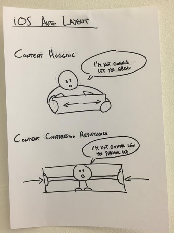
All that said, here's a cute picture from @mokagio that demonstrates the difference between Content Hugging and Content Compression Resistance at a high level (perfect for a TL;DR):
And in case Mr. Balloon Man wasn't enough of a TL;DR for you, then here you go:
- Intrinsic Content Size - Pretty self-explanatory, but views with variable content are aware of how big their content is and describe their content's size through this property. Some obvious examples of views that have intrinsic content sizes are
UIImageViews,UILabels, *UIButtons. - Content Hugging Priority - The higher this priority is, the more a view resists growing larger than it's intrinsic content size.
- Content Compression Resistance Priority - The higher this priority is, the more a view resists shrinking smaller than it's intrinsic content size.
CONCLUSION
Content Sizing Priorities have always been a bit of a sore spot for iOS Developers in general. When I first started out, I actually wish I could have had something like this guide to help me out. Luckily enough, I was able to make do by guessing priorities and running a thousand times until it did what I wanted it to do. Hopefully what I've written can help someone out there figure this out for their own. As always, feel free to comment below if I got anything terribly wrong
http://krakendev.io/blog/autolayout-magic-like-harry-potter-but-real


 874
874

 被折叠的 条评论
为什么被折叠?


